Ever walked into a room that felt just a little too… floaty? You know the type. Everything is white. The walls, the trim, maybe even the sofa. It’s clean, sure. But it lacks soul. It feels like a hospital waiting room or an empty gallery before the art arrives. We’ve all been there. For years, the "all-white" aesthetic dominated our feeds and magazines. It promised clarity. Minimalism. Peace. But by 2026, the pendulum has swung back. People are craving weight. They want their homes to feel lived-in, grounded, and warm.
That’s where dark wood comes in. It’s not just a trend; it’s a design necessity if you want to keep a bright space from feeling sterile. Think of white as the canvas and dark wood as the frame. Without the frame, the painting just drifts off the wall. Walnut, mahogany, ebony, or even stained oak—these rich, deep tones provide the visual anchor your eyes are desperately searching for. They stop the gaze. They create depth. And surprisingly, they make the white look brighter by contrast.
But here’s the tricky part. You can’t just throw a dark chair in a white box and call it a day. That looks disjointed. It looks like an afterthought. The magic lies in how you introduce those dark accents. It’s about rhythm, texture, and balance. Over the last few years, designers have refined this mix. They’ve moved away from heavy, oppressive dark rooms and toward airy spaces punctuated by strategic, moody touches. Let’s dive into five proven ways to get this right, so your home feels both light and substantial.
The Power of the Single Anchor Piece
Start with one big thing. Just one. When you’re dealing with a sea of white, your eye needs a place to rest. If you scatter small dark items everywhere, the room feels cluttered and anxious. Instead, choose a single, substantial piece of furniture to act as the "anchor." This could be a sprawling walnut dining table, a massive ebony sideboard, or a vintage mahogany desk. This piece grounds the entire room. It tells the viewer, "This space has weight. It has history."
Why does this work? It’s basic visual physics. A large, dark object creates a focal point that stabilizes the surrounding emptiness. In 2026, we’re seeing a shift away from matching sets. People prefer that one standout item that feels collected over time. Imagine a stark white living room. Now, picture a low-slung, dark teak coffee table in the center. Suddenly, the white rug pops. The white walls feel intentional rather than accidental. The room has a center of gravity.
Be bold with this choice. Don’t shy away from size. A tiny dark accent gets lost. You need something with presence. If you’re worried it’ll feel too heavy, remember the white surroundings will offset it. The contrast is your friend. Also, consider the legs and structure. A solid block of dark wood feels different than a piece with slender, tapered legs. The latter lets light pass through, keeping the vibe airy while still providing that crucial dark tonal base. It’s about finding the sweet spot between solidity and grace.
Repeating the Tone for Visual Rhythm
Okay, so you have your anchor. Great. But if that’s the only dark thing in the room, it might look like it fell out of a moving truck. To make the design feel cohesive, you need to repeat that dark wood tone elsewhere. This creates a visual rhythm. It leads the eye around the room. Think of it like a melody. The anchor is the chorus, and the smaller accents are the verses. They connect. They make sense together.
How do you do this without overdoing it? Look for opportunities to echo the wood. If your anchor is a walnut table, maybe your picture frames are also walnut. Or perhaps the legs of a white accent chair are stained to match. Even small details matter. A dark wood bowl on a shelf. The handle of a cabinet. The frame of a mirror. These subtle repetitions tie the room together. They signal that the dark wood was chosen with purpose, not just grabbed at random.
This technique also helps bridge the gap between different zones in an open-plan space. In many modern homes, the kitchen, dining, and living areas flow into one another. Repeating the dark wood tone across these zones creates unity. It prevents the space from feeling fragmented. For instance, if you have dark wood flooring in the dining area, carrying that same tone into the living room via a media console or bookshelf creates a seamless transition. It’s a simple trick, but it’s incredibly effective for making a large, white space feel curated and calm.
Layering Textures to Soften the Contrast
White and dark wood is a high-contrast pairing. Visually, it’s striking. But sometimes, that sharp contrast can feel a bit cold or hard. That’s where texture comes in. Texture softens the blow. It adds a tactile quality that invites you to touch, to sit, to stay. In 2026, interiors are all about sensory experience. We don’t just want to look at a room; we want to feel it. Mixing materials like leather, stone, linen, and wool with your wood and white surfaces adds depth and warmth.
Consider the surfaces around your dark wood pieces. If you have a sleek, dark wood desk, pair it with a soft, nubby wool rug. The roughness of the wool contrasts beautifully with the smooth finish of the wood. Or, if you have dark wood shelving, style it with ceramic vases, woven baskets, and stacked books. These objects break up the solid blocks of color. They add interest. They make the space feel lived-in and personal.
Don’t forget about fabrics, either. A white linen sofa might feel too crisp on its own. But throw a dark brown leather pillow on it, or drape a charcoal wool blanket over the arm. Suddenly, the sofa feels inviting. The dark textiles echo the dark wood, creating a layered look that feels sophisticated and cozy. It’s about balancing the hard and the soft, the smooth and the rough. This interplay keeps the eye engaged and prevents the room from feeling flat or one-dimensional.
Bridging the Gap with Mid-Tone Transitions
Jumping straight from pure white to deep ebony can be jarring. It’s a big leap for the eye. Sometimes, you need a stepping stone. Enter the mid-tone wood. Using woods like oak, ash, or lighter walnut can help bridge the gap between the extremes. These transitional tones soften the contrast and create a more gradual, natural flow. It’s like adding a gradient to a digital image. It makes the transition feel organic rather than abrupt.
One of the best ways to use mid-tones is with floating shelves or open cabinetry. Imagine white upper cabinets in a kitchen with dark wood floors. It can feel disconnected. But if you install floating shelves made of a mid-tone wood between them, it creates a visual link. The shelves connect the light above to the dark below. This technique was highlighted in recent design trends where clients loved the "editorial" look of displaying dinnerware on these transitional shelves. It adds warmth and breaks up the monotony.
You can also use mid-tones in flooring rugs or area mats. A jute or sisal rug has a natural, beige-brown hue that sits perfectly between white walls and dark furniture. It grounds the furniture without competing with it. This layering of tones—white, mid-tone, dark—creates a rich, complex palette that feels timeless. It avoids the starkness of black-and-white while maintaining the clarity of a light-filled space. It’s a nuanced approach that pays off in spades.
Balancing Vertical and Horizontal Elements
Design is all about balance. If you have heavy dark wood on the floor, you might need some weight up high to balance it out. Otherwise, the room can feel top-heavy or bottom-heavy, depending on your setup. This is especially true in rooms with high ceilings or large windows. Consider using dark wood for vertical elements like door frames, window casings, or even an accent wall. This draws the eye upward and creates a sense of enclosure and coziness.
Conversely, if you have dark wood paneling on the walls, keep the ceiling and floor lighter. This prevents the room from feeling like a cave. The white ceiling reflects light, keeping the space airy, while the dark walls provide drama and intimacy. It’s a classic technique that works well in bedrooms or studies where you want a more subdued, relaxing atmosphere. The key is to understand how light moves through your space and use the wood to guide it.
In 2026, we’re also seeing a resurgence of dark wood beams on white ceilings. This adds architectural interest and a touch of rustic charm without overwhelming the space. The beams create lines that lead the eye across the room, enhancing the sense of scale. Whether you go vertical or horizontal, the goal is to create a balanced composition. Think of the room as a scale. You’re adding weights to different sides to keep it level. It’s a dynamic process that requires a bit of experimentation, but the results are worth it.
Never underestimate the power of light. Lighting can make or break a white and dark wood scheme. Without proper lighting, dark wood can look muddy or black, and white walls can look gray and dingy. You need layers of light to bring out the richness of the wood and the brightness of the white. Start with ambient lighting to illuminate the whole room. Then, add task lighting for specific activities. Finally, use accent lighting to highlight your dark wood features.
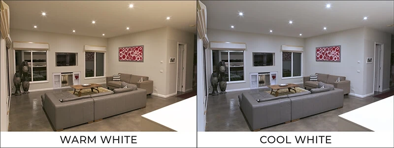
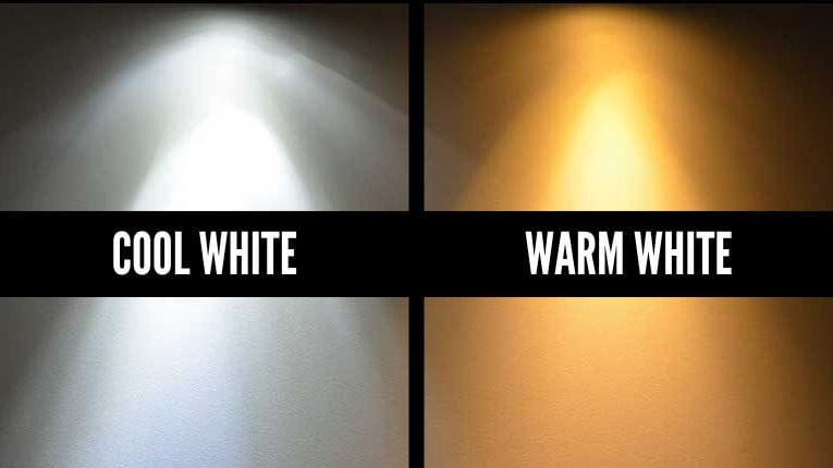
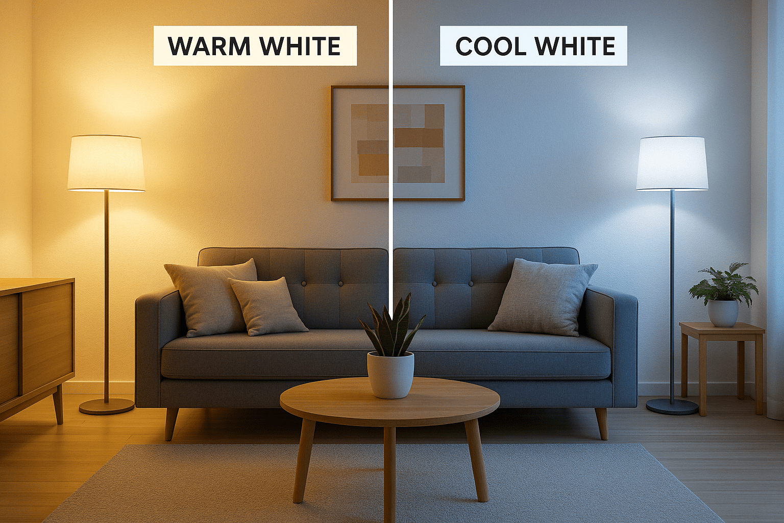
Warm light is your best friend here. Cool, blue-toned light can make dark wood feel cold and unwelcoming. Warm, golden light enhances the natural grains and tones of the wood, making it glow. Use bulbs with a color temperature around 2700K to 3000K. This creates a cozy, inviting atmosphere that complements the warmth of the wood. Place lamps near your dark wood pieces to draw attention to them. A well-placed floor lamp next to a walnut chair can turn it into a sculptural element.
Also, consider natural light. How does the sunlight hit your dark wood throughout the day? Does it create harsh shadows? Use sheer curtains to diffuse the light if needed. The goal is to create a soft, even illumination that allows both the white and the dark wood to shine. In the evening, dimmers are essential. They allow you to adjust the mood and intensity of the light, ensuring the room always feels balanced and comfortable. Lighting is the glue that holds the whole design together.
So, there you have it. Five ways to ground your white spaces with dark wood. It’s not about following rigid rules. It’s about understanding how these elements interact. The anchor gives you stability. The repetition creates rhythm. The texture adds softness. The mid-tones provide transition. The balance ensures harmony. And the lighting brings it all to life.
As you experiment with these ideas, trust your instincts. Walk around your space. See how it feels. Does it feel calm? Inviting? Grounded? If yes, you’re on the right track. If not, tweak it. Move a piece. Add a rug. Change a bulb. Design is a process, not a destination. By 2026, we’ve learned that our homes should reflect our need for both clarity and comfort. White gives us the clarity. Dark wood gives us the comfort. Together, they create a space that is truly livable.
Don’t be afraid to mix eras and styles either. A modern white sofa can look stunning with an antique dark wood chest. The contrast highlights the beauty of both. It’s about creating a narrative in your home. A story of collected moments and cherished objects. So go ahead. Bring in that dark wood. Let it anchor your space. And enjoy the warmth it brings to your everyday life.