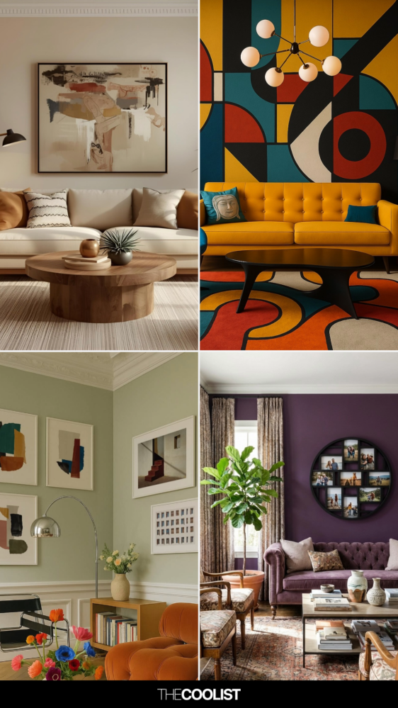
You know that feeling. You’re staring at a blank canvas, or maybe a half-finished living room wall, or a website mockup that looks… well, kinda muddy. Your brain is screaming for inspiration, but all you get is static. You pick a blue. It feels cold. You add some orange. Now it looks like a sports team logo from the nineties. You delete everything. Start over. Repeat.
It’s exhausting, isn’t it?
We’ve all been there. Whether you’re a seasoned graphic designer having a bad day, a homeowner trying to pick paint swatches without losing your mind, or just someone who wants their Instagram feed to look cohesive, color is tricky. It’s emotional. It’s subjective. And frankly, most advice out there makes it sound like you need a degree in physics to get it right. But here’s the secret nobody tells you: you don’t. You just need a system. A simple one. One that stops the guessing game before it even starts.
Why Your Brain Hates Choosing Colors (And How to Fix It)
Let’s get real for a second. Why is picking colors so hard? It’s not because you lack taste. It’s because our brains are wired to look for patterns, and when faced with infinite choices, we freeze. Psychologists call this "choice paralysis." In 2026, with thousands of digital paint tools and endless Pantone libraries at our fingertips, the problem is worse than ever. We have too much data and not enough direction.
The fix isn’t to limit your creativity. It’s to limit your options upfront. Think of it like ordering food. If the menu has five items, you decide quickly. If it has five hundred, you leave hungry. By using a structured approach, you remove the anxiety of the blank page. You aren’t guessing anymore; you’re filling in the blanks of a proven formula. This shift changes everything. It turns a stressful creative block into a playful exercise.
When you stop treating color selection as a magical talent and start treating it like a recipe, you free up mental space for the actual design work. You stop worrying if the blue matches the green and start focusing on whether the layout flows. That’s the power of a system. It’s not about restricting you; it’s about giving you a safety net so you can jump higher.
The 60-30-10 Rule: Your New Best Friend
If you only remember one thing from this guide, let it be this: the 60-30-10 rule. It’s an old interior design principle that works surprisingly well for almost any visual project, from web pages to wedding invitations. Here’s how it breaks down. Sixty percent of your space should be a dominant color. Thirty percent is a secondary color. And ten percent is an accent.
Why does this work? Because it creates balance. Our eyes need a place to rest. If everything is loud, nothing stands out. If everything is quiet, it’s boring. The 60% is your neutral base—think walls, background colors, or large blocks of space. It sets the tone. The 30% supports it, adding interest without overwhelming. Maybe it’s furniture, headers, or secondary graphics. Then, the 10%? That’s the punch. The button you want people to click. The throw pillow that pops. The tiny detail that makes people go, "Oh, nice."
Try applying this to your next project. Before you pick a single hue, decide what plays which role. Sketch it out roughly. Don’t worry about the specific shades yet. Just map the proportions. You’ll find that once you have this skeleton, picking the actual colors becomes way easier. You’re not asking, "What color should this be?" You’re asking, "What color fits into this 30% slot?" It’s a subtle shift, but it cuts through the noise.
Understanding Temperature: Warm vs. Cool Vibes
Colors have temperature, and ignoring this is where most designs go sideways. Warm colors—reds, oranges, yellows—feel energetic, cozy, and urgent. They advance toward the eye. Cool colors—blues, greens, purples—feel calm, professional, and distant. They recede. Mixing them carelessly can create visual vibration that literally hurts to look at.
In 2026, we’re seeing a huge trend toward "biophilic" design, which leans heavily on cool, natural tones to reduce stress. But that doesn’t mean warm colors are out. It means you need to be intentional. If you’re designing a meditation app, you probably want 80% cool tones. If you’re designing a clearance sale banner, you want warmth and urgency. The key is consistency.
Pick a primary temperature for your project. Stick to it for your 60% and 30%. Then, use the opposite temperature sparingly for your 10% accent. This creates natural contrast without clashing. For example, a mostly cool blue palette with a tiny splash of warm coral for buttons. The coral pops because it’s different, but it doesn’t fight the blue because it’s small. It’s simple physics, really. Opposites attract, but only in small doses.
The Magic of Monochromatic Palettes
Sometimes, the best way to stop guessing is to stop looking for multiple colors altogether. Enter the monochromatic palette. This doesn’t mean "all one color" in a flat, boring way. It means using one hue and varying its saturation and brightness. Think of a deep navy, a soft sky blue, and a pale icy blue. They’re all blue, but they create depth and sophistication.
Monochromatic schemes are foolproof. You literally cannot clash with yourself. It’s elegant, modern, and incredibly easy to execute. In a world that’s getting louder and more chaotic, there’s something deeply appealing about the calm of a single-color story. Plus, it forces you to focus on texture and shape, which often makes for stronger design overall.
To make this work, you need contrast. If all your blues are mid-tone, it’ll look muddy. You need a very dark version for text or borders, a medium version for main elements, and a very light version for backgrounds. Use a tool to generate tints and shades automatically. Don’t eyeball it. Let the math do the heavy lifting. You’ll be surprised how rich a single color can feel when you stretch it across its full range.
Using Nature as Your Cheat Code
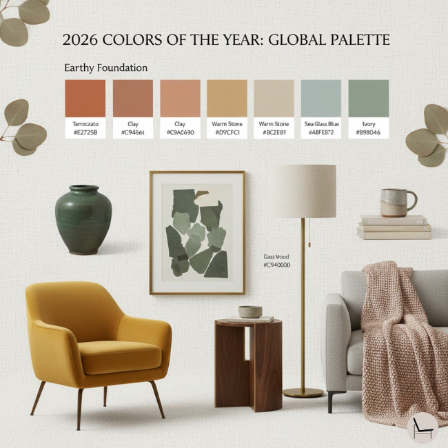
Here’s a trick that never fails: steal from nature. Seriously. Look at a photo of a forest, a sunset, or a beach. Nature has spent millions of years perfecting color combinations. Those colors always work together because they exist together. If you’re stuck, find an image that evokes the mood you want. Pull the top three colors from it. Boom. Instant palette.
This works because our brains are evolved to find natural scenes pleasing. It’s called biophilia again. We feel safe and comfortable with these combinations. A sandy beige, a seafoam green, and a driftwood gray. A sunset pink, a deep purple, and a golden yellow. These aren’t random. They’re harmonious by definition.
There are plenty of online tools in 2026 that can extract hex codes from images instantly. Upload a photo of your favorite hiking trail or a piece of fruit. Let the algorithm pick the dominant hues. Then, apply the 60-30-10 rule to those extracted colors. You’ve just bypassed hours of trial and error. You’re not guessing; you’re curating. It feels less like work and more like discovery. And honestly? It’s kind of fun.
Even with a guide, we slip up. The most common mistake? Ignoring accessibility. In 2026, this isn’t just a nice-to-have; it’s essential. If your text doesn’t have enough contrast against the background, people can’t read it. Period. There are free checker tools online. Use them. Don’t assume that because it looks pretty to you, it’s readable for everyone. High contrast isn’t ugly; it’s clear.
Another big one is forgetting context. A color that looks great on a glowing screen might look terrible printed on matte paper. Or a shade that feels cheerful in bright sunlight might feel gloomy in a dim room. Always test your colors in the environment where they’ll live. Print a swatch. View your design on a phone in direct sunlight. Check it in dark mode. Context changes everything.
Lastly, don’t over-complicate it. You don’t need six colors. You rarely need four. Stick to three. Maybe four if you’re brave. Every extra color adds cognitive load for the viewer. They have to process more information. Keep it simple. Let your content breathe. If you find yourself adding a fourth color because the design feels flat, the problem probably isn’t the number of colors. It’s likely the contrast or the spacing. Fix the structure first, not the palette.
So, where does this leave us? Color doesn’t have to be a mystery. It doesn’t have to be a source of stress or a barrier to creating something beautiful. By using simple frameworks like 60-30-10, respecting temperature, embracing monochrome, and borrowing from nature, you take the guesswork out of the equation. You give yourself permission to play within boundaries.
Remember, the goal isn’t perfection. It’s connection. You’re using color to guide the eye, set a mood, and communicate a feeling. When you stop worrying about whether the shades are "right" and start focusing on whether they work together, you unlock a new level of creative freedom. You spend less time tweaking sliders and more time actually designing.
Next time you face that blank canvas, don’t panic. Take a breath. Pick your structure. Choose your temperatures. Keep it simple. And trust the process. You’ve got this. The colors are already there, waiting for you to organize them. Now go make something that feels good.