The metallic hum of a high-end voice recorder resting on a velvet ottoman is a sound I know intimately. Over the past decade, I have sat across from more than a hundred interior designers, color consultants, and architectural colorists. I have interviewed them in drafty Brooklyn brownstones undergoing gut renovations, in sun-drenched Los Angeles compounds, and over crackling audio lines when travel ground to a halt. My job was simple on paper: extract the secret formula behind rooms that look effortlessly expensive, deeply personal, and completely cohesive.
At first, I hunted for magic bullet paint codes. I wanted the exact shade of putty, the singular olive green, or the elusive white that would instantly transform a standard builder-grade living room into an architectural masterpiece. But the more designers I spoke with, the more I realized I was asking the wrong question. The best designers rarely rely on a single miracle shade. Instead, they operate with a rigorous, almost psychological framework for how color behaves within a volumetric space, how natural light warps pigments throughout the day, and how human behavior dictates the mood of a room.
What years of chasing these professionals taught me fundamentally rewired how I look at interior color. It shifted my perspective from picking paint swatches out of a fan deck to understanding the choreography of light, shadow, texture, and human comfort. The living room is rarely a static gallery space; it is a high-traffic theater of daily life where we read, argue, nap, host guests, and decompress. Designing its color palette requires a rare blend of structural intuition and raw emotional intelligence.
Historically, the evolution of living room color palettes has swung wildly between eras of austere minimalism and riotous maximalism. We have weathered the all-gray sterile modernism of the 2010s, watched warm earth tones and moody darks take over, and now, in 2026, we are seeing a sophisticated synthesis where tactile organic warmth meets refined heritage hues. Designers today are leaning away from fleeting trends that demand total room overhauls every few years. Instead, they focus on enduring palettes that age gracefully alongside the inhabitants of the home.
When you strip away the glossy magazine styling and the marketing hype from paint manufacturers, professional design comes down to a few hard-won truths. The stakes are surprisingly high: a poorly chosen living room color can induce visual fatigue, make expensive furniture look cheap, and turn a gathering space into a cave. Conversely, a masterfully engineered color scheme acts as an invisible scaffolding that makes everything else in the room look intentional, expensive, and grounded.
The Psychology of Light and How Pigments Actually Behave
Ask any seasoned colorist what the most important element of a living room is, and they will almost never point to the paint can. They will point to the windows. Light is the invisible author of every color story in your home. A chalky linen white that looks crisp and airy in a south-facing California living room will often turn bruised, gray, and institutional when painted on the walls of a north-facing apartment in Chicago. Designers spend years learning how ambient daylight bends through different geographical orientations, altering the temperature of every surface it touches.
South-facing rooms receive bright, golden, direct sunlight for the majority of the day. This forgiving light can handle cool tones, deep charcoals, and crisp blues without feeling freezing. North-facing rooms, by contrast, receive weak, indirect light that has a distinctly blue or cool undertone. Designers working with north-facing living rooms almost universally avoid stark whites and icy grays, opting instead for high-LRV (Light Reflectance Value) warm creams, rich terracottas, and buttery yellows that actively manufacture their own internal sunshine.
Beyond orientation, the phenomenon of metamerism—how colors shift under artificial illumination—trips up even experienced homeowners. Incandescent bulbs throw off a warm, yellow-red glow that flatters earthy greens and deep reds, while modern LED lighting can be dialed into specific Kelvin temperatures that either wash out or hyper-accentuate underlying pigments. Master designers never judge a paint sample on a white poster board under store fluorescent lighting. They paint large squares directly onto multiple walls of the living room, observing how the hue reacts at 8:00 AM during coffee, at 2:00 PM under harsh overhead sun, and at 9:00 PM under lamplight.
Another critical lesson revolves around sheen. The finish of your paint is just as vital as the color pigment itself. While flat and matte finishes absorb light to create a velvety, high-end absorption that hides wall imperfections, they are notoriously difficult to clean in high-traffic living spaces. Designers have increasingly pivoted toward ultra-matte washable mineral paints or low-sheen eggshells that offer the luxurious, light-absorbing look of chalk paint while providing the durability required for a room where pets, children, and parties happen daily.
Building a Cohesive Palette Without Relying on Matching Sets
One of the most liberating realizations I gathered from interviewing top-tier designers is that matching furniture, walls, and textiles is an amateur trap. When every element in a living room shares the exact same color family, the room instantly flattens out, losing all visual tension and depth. True sophistication relies on a delicate balance of contrast, repetition, and tonal layering. Designers approach a living room color scheme not as a single color choice, but as a three-tier architecture: dominant, secondary, and accent colors.
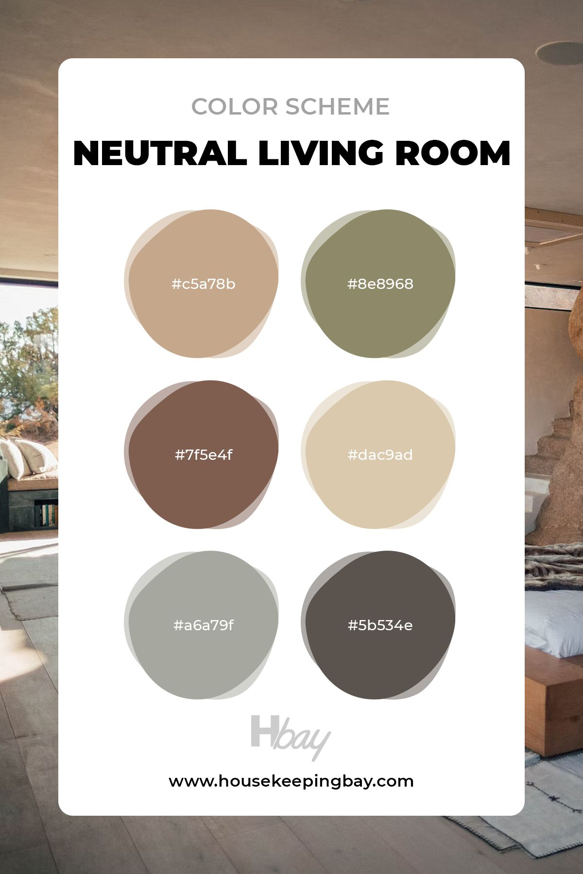
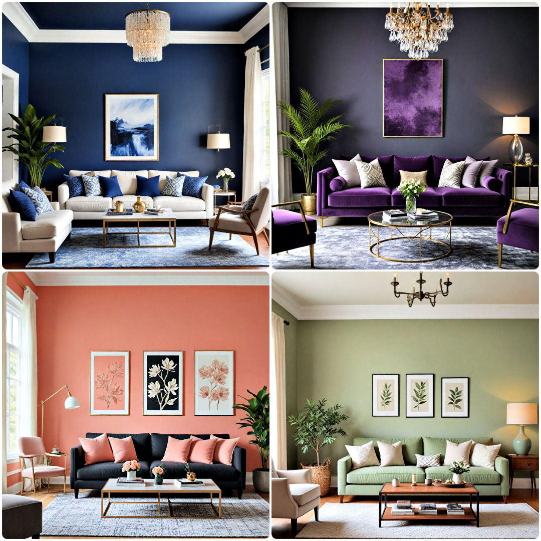
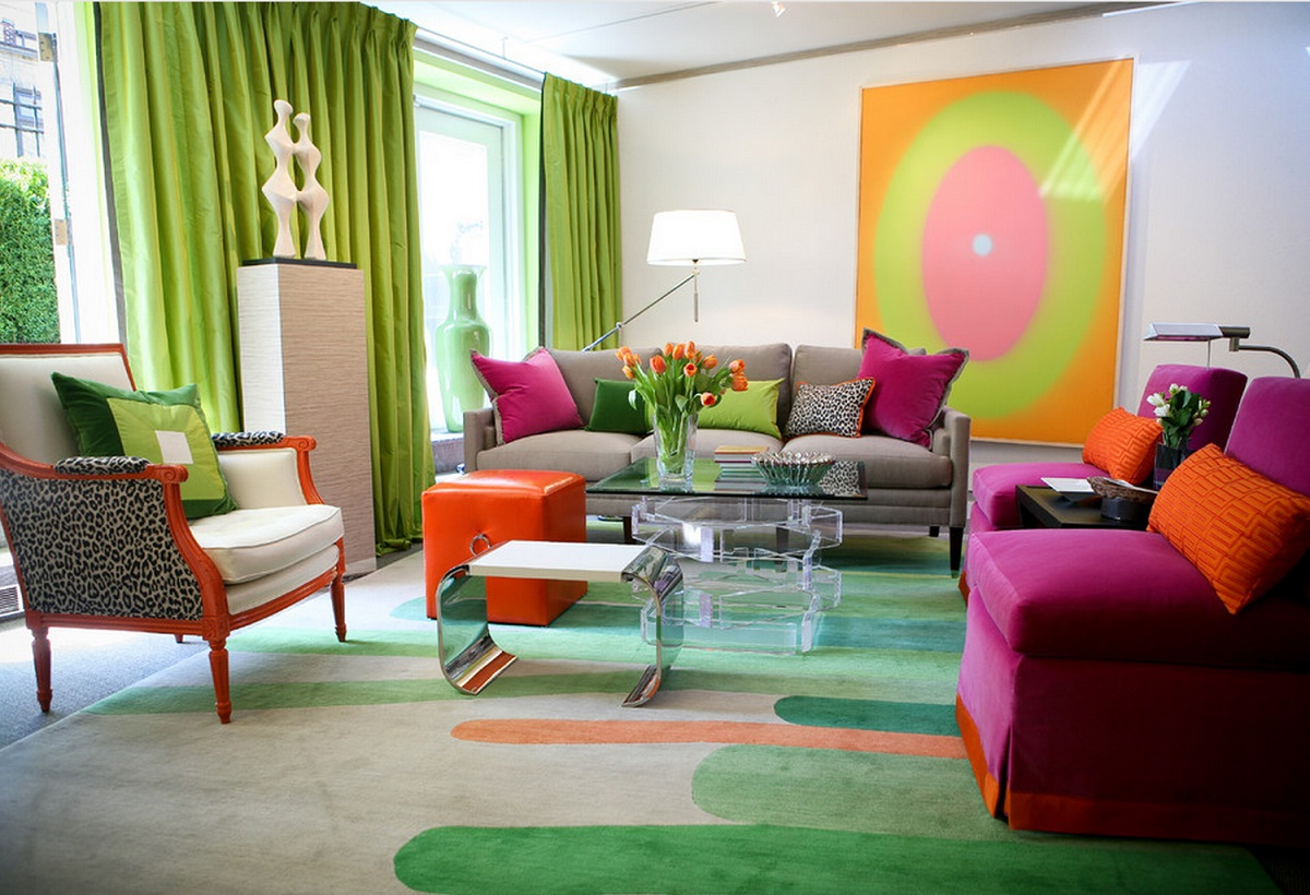
The dominant color typically claims roughly sixty percent of the room—usually the walls, large structural elements, and foundational rugs. However, experienced designers know that this dominant color does not have to be neutral. A living room wrapped entirely in a moody, enveloping olive green or rich chocolate brown can feel remarkably cozy rather than claustrophobic, provided the scale and lighting support it. The secondary color, taking up about thirty percent of the visual real estate, is introduced through larger furniture pieces, window treatments, and upholstered seating, creating a dialogue with the walls rather than disappearing into them.
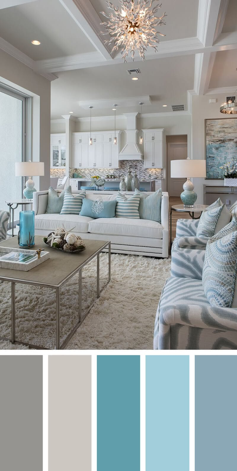
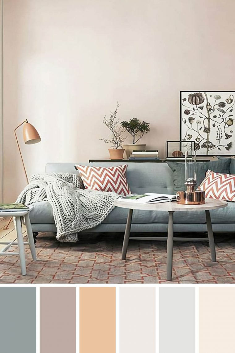
The final ten percent belongs to the accent colors—the punctuation marks of the room. This is where designers introduce unexpected pops of saturated pigment through ceramic objects, art framing, throw pillows, and books. Crucially, these accent colors are rarely random. They are pulled from secondary tones hidden within a piece of abstract art or the complex weave of a vintage kilim rug. This creates a subconscious visual harmony that makes the entire room feel unified, even if it contains a wild mix of modern and antique furnishings.
Texture also plays an inseparable role in how we perceive color. A flat navy blue wall will look harsh and cold; that same navy blue rendered in heavy velvet, limewash, or slubby linen takes on an entirely different dimension because the physical texture catches light and creates micro-shadows. Designers manipulate this principle constantly, ensuring that monochromatic rooms never feel boring by mixing matte surfaces with polished brass, raw wood grain, chunky bouclé, and smooth leather.
A Field-Tested Methodology for Selecting Your Living Room Color
Translating designer wisdom into your own home renovation requires a systematic, step-by-step approach. You cannot rush color selection; it is an iterative process that demands patience and testing. Here is the exact methodology distilled from countless conversations with professional colorists and interior architects for nailing your living room palette on the first try.
- Step 1 (Assess Architectural Light and Orientation): Determine which direction your living room windows face. Note how many hours of direct sunlight the space receives and document whether the existing light reads warm, golden, cool, or gray.
- Step 2 (Audit Your Existing Unchangeable Elements): Catalog fixed architectural features that will not be replaced, such as stone fireplaces, hardwood floor undertones (red oak versus white oak), and permanent tile. Your new wall color must harmonize with these undertones to avoid visual friction.
- Step 3 (Sample with Generous Scale): Paint at least two-foot by two-foot sample squares on different walls—ideally adjacent to corners or windows so you can see how light wraps around the pigment. Never paint samples directly over an existing patterned or brightly colored wall; prime the test patch with white first so the background doesn’t skew your perception.
- Step 4 (Test Temporal Transitions): Live with your paint samples for a minimum of seventy-two hours. Observe them during morning twilight, midday glare, and evening artificial lighting to ensure the undertones don’t flash an unexpected pink, green, or purple.
- Step 5 (Select the Sheen and Finish): Choose your paint finish based on lifestyle demands and light absorption needs, opting for scrubbable matte or ultra-low sheen formulations that provide durability without sacrificing a high-end architectural aesthetic.
Common Pitfalls and Practitioner Workarounds
Even with the best intentions, homeowners stumble into predictable traps when picking living room colors. Over the years, I have heard designers vent about the same recurring mistakes—and more importantly, I have learned the exact workarounds they use to rescue a room gone wrong.
- Pitfall 1 (Falling in Love with Swatches on a Screen): Digital screens emit light and use RGB color models, making paint swatches look completely different than physical pigment suspended in liquid. Workaround: Always order large physical peel-and-stick paint swatches or brush sample pots onto heavy cardstock before making a final commitment.
- Pitfall 2 (Ignoring the Undertone Trap): Choosing a "neutral" gray or beige without realizing it has strong green or pink undertones that clash violently with your warm wood floors. Workaround: Hold a pure white sheet of printer paper up against your paint sample card; the true underlying pigment (yellow, blue, red, or green) will instantly reveal itself against the stark white baseline.
- Pitfall 3 (Going Monochromatic with the Wrong Scale): Attempting an all-white or all-dark moody living room without varying textures, resulting in a sterile or cave-like environment. Workaround: Introduce at least four distinct tactile finishes within the same color family—such as matte plaster, woven rattan, brushed metal, and plush velvet.
- Pitfall 4 (Neglecting the Fifth Wall): Leaving the ceiling a default, lifeless bright white, which can create an aggressive contrast box in rooms with darker wall colors. Workaround: Consider painting the ceiling the same color as the walls at a reduced percentage of saturation, or pick a complementary warm ceiling hue to pull the eye upward and make the room feel taller.
- Pitfall 5 (Failing to Account for Neighboring Rooms): Designing the living room in complete isolation, creating a jarring, disorienting color shock when walking in from the hallway or kitchen. Workaround: Ensure visual continuity by carrying at least one undertone or accent hue from adjacent spaces into your living room palette.
The Long-Term Impact of Living Room Color on Daily Well-Being
We spend a staggering amount of our waking lives inside our living rooms. Beyond mere aesthetics, color is a silent psychological environmental factor that directly impacts our cortisol levels, heart rates, and social behaviors. Designers who specialize in residential spaces often talk about designing for "emotional zoning." A living room color palette should support the specific emotional arc you want your household to experience throughout the day.
For families with high-stress corporate careers, living rooms painted in over-stimulating, high-chroma primary colors can subconsciously sustain anxiety. Conversely, wrapping a living room in soothing sage greens, muted clays, or warm mineral tones creates a physiological sanctuary that signals the nervous system to downshift. This is not mere interior design fluff; environmental psychology studies consistently show that biophilic color palettes—those inspired by soil, stone, foliage, and water—lower blood pressure and foster a deeper sense of psychological safety.
Furthermore, economic value and sustainability tie directly into thoughtful color selection. When homeowners chase hyper-fast micro-trends driven by social media algorithms, they frequently find themselves repainting and replacing furniture every two years. Designers who build enduring, heritage-inspired palettes help clients create spaces that outlast trends. Choosing colors with staying power is inherently sustainable; it reduces material waste, honors the craftsmanship of quality furniture, and prevents the financial drain of perpetual redecoration.
Investing in a well-considered living room color scheme also changes how you inhabit your home. When a room feels authentically calibrated to your personal aesthetic and the natural light of your architecture, you spend more time in it. It stops being a formal showcase room that remains pristine and untouched, evolving instead into the true hearth of the home where memories are made, conversations linger, and life unfolds organically.
Strategic Frameworks and Final Takeaways for Your Project
Synthesizing a decade of professional insights into a concrete action plan boils down to embracing restraint, patience, and personal history. The best living rooms do not look like catalog showrooms; they look like collections of a life well-lived, anchored by a confident, sophisticated color foundation.
- Prioritize Flow Over Trends: Let the natural architecture, geographical orientation, and adjoining spaces guide your palette choices rather than chasing whatever color happens to be viral this season.
- Embrace Imperfection and Patina: Remember that colors interact with age, natural patina, and changing light. Allow your space to evolve naturally rather than forcing a pristine, static look.
- Invest in Testing: Never skip the physical sampling phase. Spending a few extra dollars on sample pots saves hundreds of dollars in costly repainting mistakes.
- Balance Contrast and Cohesion: Use the 60-30-10 rule to distribute dominant, secondary, and accent colors while incorporating a rich variety of textures to keep monochromatic schemes visually alive.
Looking back on all those hours of interviews, audio transcripts, and designer portfolio walkthroughs, I realize the ultimate lesson wasn’t about color theory at all. It was about confidence. The homeowners who achieve the most breathtaking living rooms are those who stop second-guessing their own instincts and start listening to what their physical space is telling them.
Your living room is not a canvas meant to impress anonymous strangers on the internet; it is the physical backdrop of your daily life. By understanding how light behaves, respecting the undertones of your architecture, and building layers of texture and tone rather than flat matching sets, you can create a space that feels both timeless and deeply, uniquely yours. The paint brush is in your hand now—use it wisely, test your samples patiently, and create a room you never want to leave.