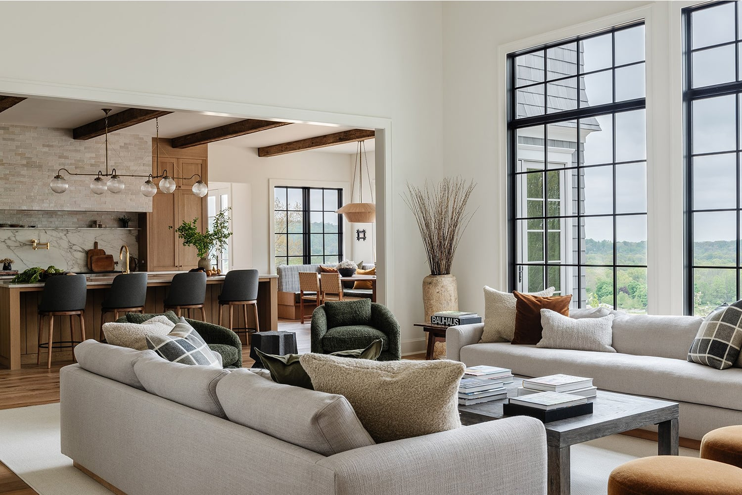
The front door swings inward, and immediately, reality presses against your ribs. You are standing in a room that feels less like a sanctuary and more like a padded cell. Most people respond to this claustrophobic squeeze by stripping everything away. They buy miniature furniture, paint the walls a flat, uninspired hospital white, and push every single chair and table flat against the baseboards like frightened citizens hugging a wall during a storm.
It feels logical. If a room lacks square footage, subtracting bulk should logically create breathing room. Yet, anyone who has tried this minimalist purge knows the heartbreaking truth: it rarely works. The room doesn’t feel expansive; it simply feels empty and sad, highlighting its awkward proportions rather than masking them. The air remains trapped, the corners cast heavy shadows, and your gaze stumbles across the jarring, disjointed layout.
True spatial expansion requires a radical shift in perspective. Interior designers and master home stagers have long understood that making a compact bedroom, office, or living room feel vast has very little to do with actual square meters and everything to do with visual psychology. By manipulating light pathways, playing tricks with optical weights, and embracing bold design moves that conventional wisdom tells you to avoid, you can completely dissolve the physical boundaries of a tight interior.
Why Conventional Wisdom Fails Small Spaces and What Optical Psychology Tells Us Instead
For decades, domestic advice columns have peddled a tired playbook for small rooms. They tell you to use tiny furniture, keep your walls pale, and scatter a dozen pocket-sized items across every surface to maintain proportion. This approach fundamentally misunderstands how human vision processes physical environments. Our eyes do not measure a room with a laser tape measure when we walk through the threshold; instead, they scan for continuity, depth cues, and focal anchor points.
When you crowd a small room with miniature furniture, your brain instantly recognizes the trickery. It reads the miniature pieces not as proof of a spacious room, but as doll furniture in a cramped box. This creates cognitive friction, making the room feel smaller, more disjointed, and profoundly cluttered. Conversely, introducing a single, substantial anchor piece—such as an oversized sofa with exposed legs or a massive, dramatic canvas art piece—tricks the brain into scaling up the entire envelope of the room. The logic is simple: a tiny room could not possibly house something so grand, therefore the room itself must be much larger than it appears.
Another major misstep involves the fear of dark colors. Homeowners often panic at the thought of saturated hues, fearing a cave-like effect. Yet, flat white paint actually highlights the sharp, rigid corners of a small room, drawing a literal box around you. Darker, deeply saturated tones or continuous monochromatic color-drenching—where walls, baseboards, crown molding, and even doors are painted the exact same matte or satin shade—blur the perimeter lines entirely. Without high-contrast boundaries to define where the wall ends and the ceiling begins, the room’s edges recede into soft shadows, creating a boundless, cocoon-like expanse.
Mastering the Art of Visual Continuity and Monochromatic Color Drenching
Creating an illusion of vastness demands an aggressive war on visual fragmentation. Every time your eye hits a harsh line of contrast, your brain logs a boundary. Baseboards that contrast sharply with the wall, crown molding painted in stark white against a colored ceiling, and disjointed flooring transitions all conspire to chop a small space into microscopic, suffocating bites. Eliminating these visual speed bumps is the fastest route to an expansive atmosphere.
Color drenching has emerged as a premier tool among modern residential designers. By coating every vertical and horizontal plane in a single rich color—think deep olive, moody charcoal, or warm clay—you completely erase the corners. Light behaves differently in a color-drenched room, wrapping softly around objects rather than bouncing aggressively off high-contrast boundaries. When selecting a paint finish for this technique, choose a low-sheen matte for walls to absorb light and hide surface imperfections, paired with a satin or eggshell for trim to catch just enough ambient reflection to maintain subtle depth without creating harsh glare.
Flooring continuity plays an equally critical role in this optical illusion. If you are renovating or updating a compact home, carrying the exact same flooring material seamlessly from the entryway through the hallway and into the small living room or bedroom is non-negotiable. Stop using mismatched area rugs or abrupt threshold strips between adjacent rooms. An uninterrupted sweep of wide-plank white oak or continuous large-format porcelain tile draws the eye forward, tricking the brain into perceiving an unbroken landscape that extends far beyond the physical walls.
A Practical Step-by-Step Blueprint for Restructuring Your Compact Layout
Transforming a cramped interior requires a methodical, hands-on approach. You cannot simply rearrange the sofa on a whim and hope for the best. You must audit every physical element within the four walls, stripping away visual noise and building back with deliberate, space-multiplying strategies. Follow this structured roadmap to execute a complete spatial overhaul over a single weekend.
- Step 1 (The Brutal Visual Audit): Empty the room completely, clearing out every piece of furniture, art, and decor. Stand in the center and identify where your eyes naturally land, noting any awkward architectural protrusions, radiator vents, or chopped-up sightlines that need softening.
- Step 2 (The Unified Color Application): Apply a monochromatic color scheme using high-pigment paint across the walls, baseboards, doors, and trim to eliminate hard contrast lines and blur the physical boundaries of the room.
- Step 3 (The Leggy Furniture Swap): Choose furniture items that feature exposed legs—such as mid-century modern sofas, armchairs with slender wooden pegs, and open-frame console tables—to allow unhindered light and floor space to flow underneath the furniture footprint.
- Step 4 (Strategic Vertical Scaling): Hang your window treatments as close to the ceiling line as possible, extending the drapery rods at least six to twelve inches past the window frame to create the illusion of grand, soaring architectural heights and massive windows.
- Step 5 (Multi-Point Layered Lighting): Banish the harsh single overhead central flush-mount light. Install warm, dimmable floor lamps in dark corners, directional picture lights above art, and low-profile wall sconces to wash the vertical planes in a soft, ambient glow.
Avoiding Dangerous Design Traps That Shrink Your Living Space Instantly
Even with the best intentions, homeowners frequently sabotage their spatial expansion efforts by falling for common decorating myths and lazy habits. Recognizing these hidden traps can save you from spending hundreds of dollars on upgrades that inadvertently make your room feel like a broom closet.
- Pitfall 1 (Pushing All Furniture Against the Walls): Leaving the center of the room totally empty while lining every piece of furniture tightly against the perimeter makes a room look like a waiting area. Pull your seating arrangement slightly away from the walls, even if it is just by a few inches, to create a sense of breathing room and depth behind the furniture.
- Pitfall 2 (Cluttering Surfaces with Tiny Decor): Scattering dozens of small picture frames, figurines, and knick-knacks creates immediate visual chaos and dust traps. Instead, curate your collection down to a few bold, oversized statement pieces that command attention without looking cluttered.
- Pitfall 3 (Using Undersized Area Rugs): Tossing a tiny 4×6 rug in the middle of a small living room acts as a visual tripwire that chops the floor space in half. Invest in a generously sized rug that allows the front legs of all major seating pieces to rest comfortably upon it, anchoring the zone.
- Pitfall 4 (Relying Solely on Minimalism): Mistaking minimalism for emptiness leaves rooms cold, sterile, and uninviting. Layer rich textures—such as boucle, linen, woven jute, and brushed brass—to create sensory warmth and depth that distracts from the modest physical dimensions.
- Pitfall 5 (Hanging Curtains at the Window Frame): Mounting curtain rods directly above the window glass cuts the wall height in half and makes the window look tiny. Always elevate your drapery hardware high up toward the crown molding to elongate the vertical axis of the room.
The Broader Impact of Spatial Design on Mental Well-Being and Daily Function
Living in tightly confined quarters exerts a subtle, persistent tax on human psychology. When physical surroundings feel congested, chaotic, and unyielding, our nervous systems respond with heightened levels of cortisol and mental fatigue. The ancient practice of spatial optimization is not merely about aesthetic vanity or real estate staging tricks; it is about reclaiming mental clarity, tranquility, and emotional breathing room within the domestic sphere.
As urban densities rise and average residential floor plans continue to shrink across metropolitan centers, the demand for intelligent interior architecture has never been higher. Designers and occupants alike are moving away from the sprawling, excessive floor plans of previous decades, choosing instead to invest in compact, highly functional, and thoughtfully engineered living capsules. In these environments, every square inch must earn its keep through dual-purpose utility and psychological release.
Moreover, embracing these design shifts fosters a more sustainable relationship with material possessions. When you learn to curate a small room using oversized focal points, high-impact finishes, and multi-functional statement pieces, you naturally consume less. You stop buying disposable filler items designed to plug empty corners and start investing in heirloom-quality pieces that serve multiple purposes while elevating the entire architectural envelope of your home.
Actionable Frameworks for Maintaining an Expansive Atmosphere Over Time
Achieving a spacious feel during an initial redesign is a major victory, but maintaining that openness requires ongoing discipline and mindful household habits. Without active maintenance, small rooms have a natural tendency to accumulate clutter, slowly creeping inward until the walls feel tight once again. Implementing a structured maintenance framework ensures your space remains open, airy, and functional for the long haul.
- The One-In, One-Out Inventory Rule: Whenever you introduce a new decorative item, throw pillow, or piece of furniture into a small room, commit to removing an existing item of equal or greater physical volume to prevent spatial inflation.
- Vertical Storage Maximization: Utilize hidden vertical cavities—such as tall, ceiling-height shelving units, back-of-door organizers, and built-in under-bed storage drawers—to keep horizontal surfaces ruthlessly clear of loose clutter.
- Seasonal Textile Swaps: Keep visual fatigue at bay by rotating lightweight, airy linen textiles in the spring and summer months with slightly richer, textured wools and velvets in the winter, keeping the room dynamic without altering the layout.
- Regular Lighting Audits: Periodically check your light bulbs and fixture placements to ensure that corners are not slipping back into dark, shadow-heavy zones that visually compress the room’s perimeter.
The physical dimensions of your room are nothing more than a baseline, a set of raw coordinates waiting for your interpretive touch. You do not need to knock down load-bearing walls, expand your foundation, or secure a massive real estate loan to experience the liberating sensation of an expansive home. By letting go of timid, outdated decorating conventions and leaning into bold optical strategies—such as continuous color drenching, leggy furniture, elevated drapery, and layered ambient lighting—you can fundamentally rewrite the geometry of your living space.
Step inside your smallest room today, look past the rigid corners and the restrictive square footage, and see the canvas for what it truly is. With a clear vision and a willingness to defy conventional rules, you hold the power to dissolve the walls and transform even the most modest nook into an open, breathtaking sanctuary.