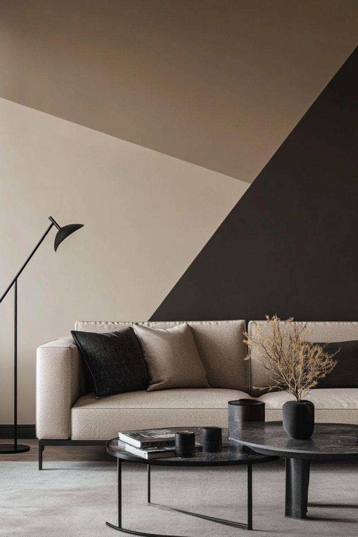
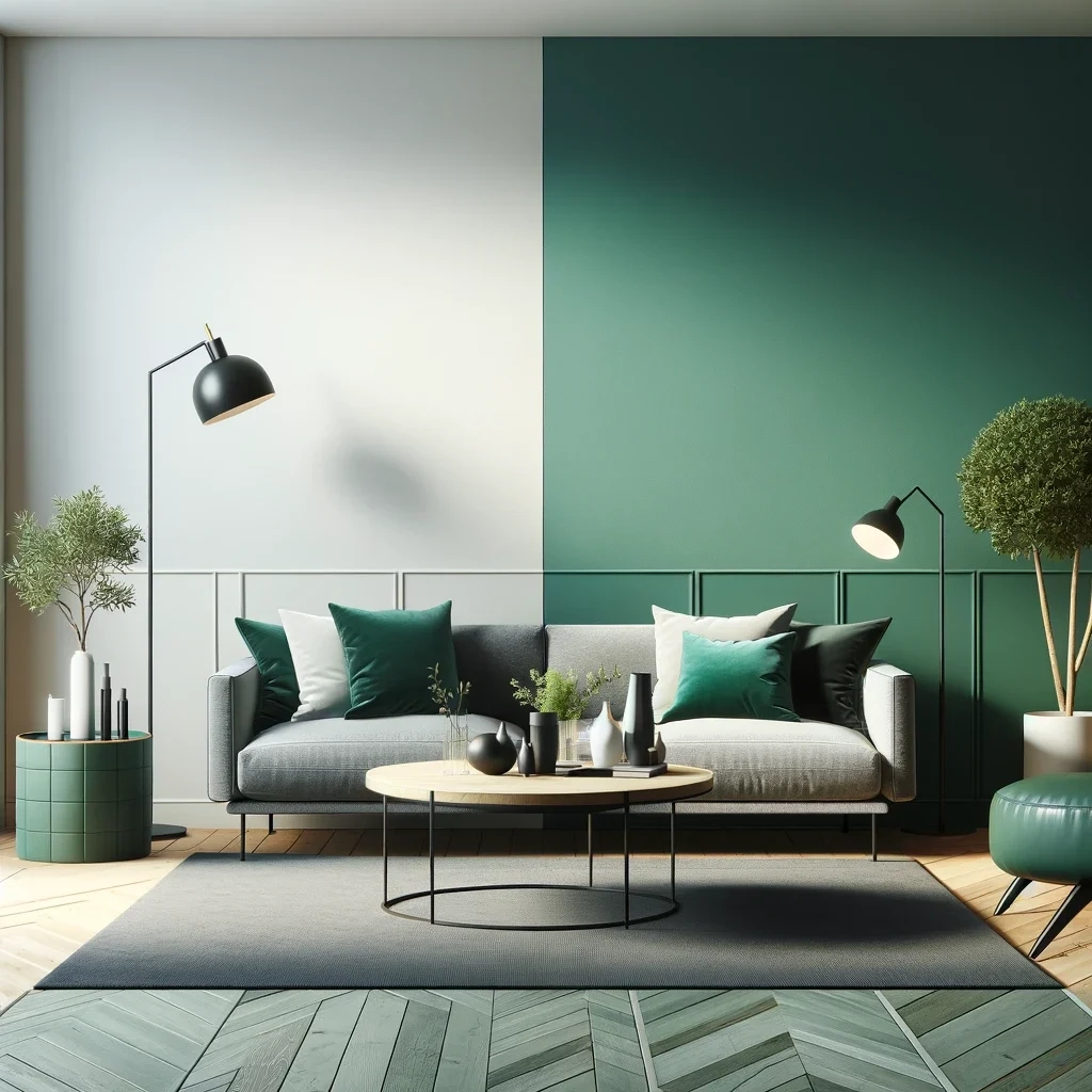
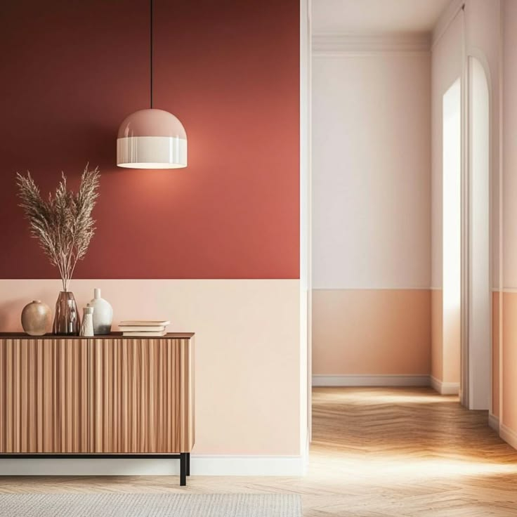
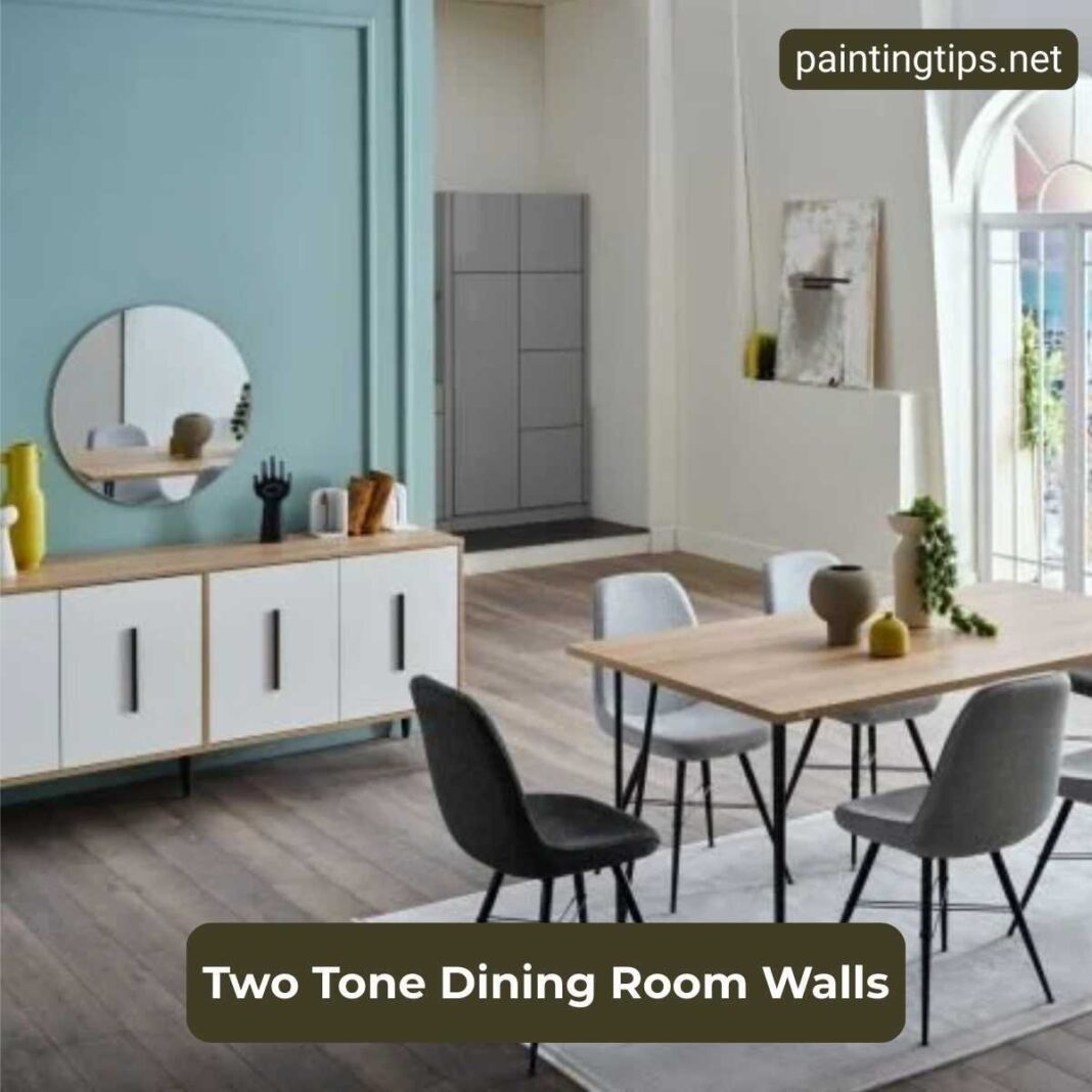
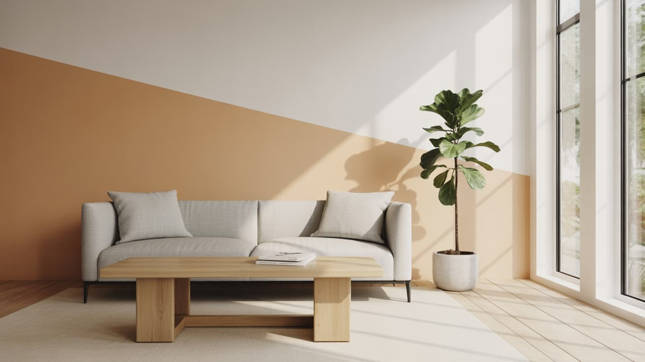
Step into a newly renovated suburban home built during the great housing boom of the late twentieth century, and you will likely recognize the architectural symptom: flat, unbroken drywall stretched across four corners, begging for a visual anchor. For decades, the default prescription was a gallon of predictable eggshell paint slapped from baseboard to crown molding, leaving rooms feeling either clinical or suffocatingly monotonous. Homeowners tried to break the void with accent walls, painting a single surface a bold jewel tone, only to realize it felt disjointed—like an uninvited guest crashing a quiet dinner party.
The aesthetic tide has officially turned. Across residential design projects, a more nuanced, tactile solution has taken over. Two-tone wall treatments have moved out of historic Victorians and high-end boutique hotels to become the defining surface finish of the decade. This is not merely a passing seasonal color trend. It is a fundamental shift in how we manipulate spatial geometry, manage domestic wear-and-tear, and inject psychological warmth into everyday rooms without undertaking structural renovations.
Behind this design shift lies a collective fatigue with minimalist sterility and an urgent desire for rooms that feel layered, grounded, and deeply personal. We spend more time in our living spaces now, blurring the boundaries between home offices, sanctuaries, and entertainment hubs. Flat paint can no longer carry the weight of these multi-functional spaces. Two-tone walls solve this by introducing an invisible architecture—tricking the eye into perceiving higher ceilings, wider perimeters, and a comforting sense of enclosure that flat walls simply cannot achieve.
The Architecture of Illusion: Why Split-Color Surfaces Reshape Small Spaces
The structural logic of a two-tone wall rests on age-old architectural principles borrowed from classical wainscoting and board-and-batten traditions, translated for the modern DIYer and professional painter alike. By dividing a vertical surface into distinct horizontal zones—traditionally a darker, heavier base and a lighter, reflective upper tier—you introduce a deliberate horizon line. This visual boundary alters our perception of gravity and scale. In rooms suffering from low, oppressive ceilings, a strategic paint split tricks the human eye into looking upward, while a dark lower anchor prevents the room from feeling unmoored or cavernous.
Materiality plays an equally vital role in this transformation. Traditional color blocking relied purely on flat emulsion paints meeting at a sharp tape line. Today’s residential applications incorporate tactile thresholds: smooth plaster meeting raw wood battens, micro-cement skirts paired with breathable lime wash, or flat latex transitioning into tactile beadboard. This layering of texture introduces tactile richness, engaging multiple senses rather than relying solely on visual stimulation. When light hits a room with split-level finishes, shadows and highlights dance across the boundaries, giving static drywall an organic, breathing quality.
Beyond geometry, this approach addresses the psychological need for sanctuary versus stimulation. Color theory tells us that heavy, saturated pigments ground us, making spaces feel secure and intimate, while light hues expand our field of view and invite clarity. Two-tone walls let you have both in a single room. You can anchor your seating area in a deep, cocooning olive or muddy terracotta up to chair rail height, keeping the upper expanse in a soft, airy chalk or warm greige that captures morning light. The result is a room that feels simultaneously expansive and protective—an antidote to the sensory overload of the outside world.
Moving Past the Accent Wall: Data, Balance, and Visual Flow
For years, the accent wall reigned supreme as the go-to remedy for decorating anxiety. Typically, it involved painting the wall behind a bed or a sofa in a contrasting, highly saturated color. Yet, spatial psychologists and interior architects frequently critique the accent wall for creating visual stutter. It forces the eye to stop abruptly at a single corner, often making the adjacent walls look neglected or washed out by comparison. Two-tone walls resolve this fragmentation by wrapping the entire perimeter of the room in a continuous dialogue, distributing color weight evenly rather than dumping it onto a single surface.
The secret to this visual harmony lies in proportion. Professional designers rarely split a wall down the exact mathematical middle—the dreaded 50/50 split, which cuts a room in half awkwardly and lowers perceived ceiling heights. Instead, they rely on time-tested compositional ratios: the classic one-third to two-thirds rule, or positioning the paint break precisely at historic architectural markers like window sills, desk heights, or the traditional two-fifth mark. This intentionality prevents the room from feeling like a circus tent and grounds the furniture resting against those walls, creating a seamless backdrop for art, shelving, and textiles.
Furthermore, color selection for split walls requires an understanding of undertones and LRV (Light Reflectance Value). If the lower half of a wall features an LRV of 15 (absorbing most light to hide scuffs), pairing it with an upper wall featuring an LRV of 70 or higher ensures the room maintains its luminosity. Ignoring these technical thresholds often results in muddy transitions where the colors fight for dominance. When balanced correctly, the two-tone wall acts as a stabilizing framework, allowing rugs, upholstery, and wooden furniture to speak without visual competition.
Executing the Split: A Masterclass in Clean Lines and Material Transitions
Achieving a professional-grade two-tone wall requires more than a roll of blue tape and an optimistic attitude. Drywall texture, painter’s bleed, and uneven baseboards can turn a weekend project into a frustrating exercise in patch-up work. Whether you are creating a modern color-blocked look or installing a traditional chair rail to separate the finishes, precision execution separates amateur results from magazine-worthy interiors.
- Step 1 (Surface Assessment and Preparation): Inspect your walls for texture inconsistencies, dents, and imperfections. Sand down any raised patches and wipe the surface clean of dust. If your walls have a heavy knockdown or orange-peel texture, plan to apply a skim coat of joint compound to the lower section if you are aiming for a crisp, ultra-modern modern micro-cement or flat paint finish.
- Step 2 (Establishing the Datum Line): Determine your paint split height using a laser level rather than a standard tape measure from the floor, as baseboards and flooring are rarely level. Mark your height at multiple points around the room and snap a chalk line or connect the dots with a pencil to create a continuous, level perimeter.
- Step 3 (Taping and Sealing the Edge): Apply a high-adhesion, low-tack painter’s tape along your pencil line, pressing the edge firmly down with a plastic putty knife or credit card. To eliminate paint bleed—the number one enemy of two-tone walls—seal the edge of the tape by painting over it with a thin coat of the upper wall color first, letting it dry, which locks the microscopic gaps.
- Step 4 (Applying Base and Upper Coats): Paint the darker, lower section first, overlapping slightly onto the taped line. Once dry to the touch, apply your upper wall color. Roll right over the taped boundary to ensure uniform thickness, and carefully peel the painter’s tape away at a 45-degree angle while the final coat is still slightly tacky (usually within 30 to 45 minutes of application).
- Step 5 (Adding Architectural Trims or Transitions): If you prefer a physical transition over a painted tape line, install a piece of primed MDF chair rail, picture rail, or flat stock molding directly over the color break using construction adhesive and brad nails. Fill the nail holes, caulk the top and bottom edges where the wood meets the drywall, and paint the molding to match either the lower or upper wall color.
Navigating the Trapdoors: Common Pitfalls and Field-Tested Workarounds
Even experienced DIYers stumble when translating a Pinterest inspiration photo of a two-tone wall into their own awkwardly lit, uniquely shaped living rooms. Without anticipating common execution errors, you risk ending up with a room that feels dizzying, cramped, or poorly proportioned. Recognizing these hidden hurdles before opening a paint can saves hours of frustrating repainting.
- Pitfall 1 (The Midpoint Split Error): Splitting the wall exactly down the middle (50/50) creates visual confusion, making ceilings feel low and rooms look boxy. Workaround: Always apply the rule of thirds. Place your split line at either one-third height from the floor (great for high ceilings) or two-thirds height (ideal for standard 8-foot ceilings to maximize vertical pull).
- Pitfall 2 (Ignoring Natural Light and Shadow Paths): Selecting colors without tracking how sunlight moves across the room throughout the day leads to jarring contrasts. Workaround: Paint large sample boards (at least 2×2 feet) of both your top and bottom colors, tape them to the wall at your intended split height, and observe them morning, noon, and evening for 48 hours before committing.
- Pitfall 3 (Paint Bleed on Textured Drywall): Standard blue tape fails to seal properly on textured walls, resulting in ragged, bleeding paint lines. Workaround: After applying your painter’s tape, run a bead of clear acrylic latex caulk along the edge you plan to paint, smooth it with your finger, and wipe away excess. Paint over this dried caulk; it fills every microscopic gap in the texture, guaranteeing a razor-sharp line.
- Pitfall 4 (Neglecting Baseboards and Trim Logic): Painting a dark lower wall that clashes with existing bright white baseboards and window casings can chop the room up visually. Workaround: Match your baseboards to the lower wall color for a seamless, grounding effect, or use a neutral trim color that bridges the gap between your upper and lower paint selections.
- Pitfall 5 (Overcomplicating Color Palettes): Pairing two wildly contrasting, high-saturation colors (like bright cobalt blue and hot mustard) overwhelms the nervous system in everyday living spaces. Workaround: Stick to tonal harmony—pair a desaturated, muted dark shade on the bottom (such as forest green, muddy plum, or charcoal) with a soft, warm neutral or light pastel on top.
The Long-Term Return: Maintenance, Durability, and Evolving Aesthetics
Beyond immediate visual appeal, two-tone walls offer pragmatic, long-term dividends that outlast single-color paint jobs, particularly in high-traffic zones. Households with young children, pets, or busy entryways know all too well the heartbreak of pristine white walls meeting muddy paws, scuffed shoes, and sticky fingers. By assigning a washable, highly durable satin or semi-gloss finish to the lower third of the wall—often in a darker, forgiving shade—you create an invisible shield against everyday household abuse. The upper third can remain in a flat or matte finish, which diffuses light beautifully and hides minor surface imperfections without attracting scuffs.
Economically, this technique represents one of the highest-yield, lowest-cost upgrades available to homeowners and renovators. A gallon of premium paint covers a lot of ground, and splitting a room vertically often means you only need a quart or a half-gallon of your accent color, making designer looks accessible on a modest budget. Furthermore, because the color break establishes a distinct architectural plane, changing the mood of a room later becomes remarkably simple. If you tire of the lower color in three years, you only need to repaint the bottom third, leaving your upper walls untouched.
This adaptability aligns perfectly with contemporary shifts toward sustainable, low-waste home improvement. Rather than stripping rooms down to the studs or replacing expensive built-ins, homeowners are discovering that paint is the ultimate tool for spatial reinvention. Two-tone walls honor the bones of older properties while injecting modern energy into cookie-cutter new builds. They prove that sophistication does not require sprawling square footage or custom millwork; it simply requires a deliberate eye, a level hand, and the courage to break up the horizon.
Curating Your Palette: A Practical Guide to Color Pairing and Room Zoning
Selecting the right color combination for a split-wall treatment requires moving away from individual color swatches and thinking about how colors interact across horizontal planes. The lower third of your wall acts as the optical anchor of the room—it bears the visual weight and interacts directly with your flooring, baseboards, and heavy furniture pieces. If your floors are warm oak or walnut, your lower wall color must harmonize with those wood undertones rather than fighting them. Pairing a cool, icy blue base with warm honey-colored hardwood floors creates an immediate visual discord that no amount of styling can fix.
For living rooms and dens, grounding combinations like deep olive paired with soft parchment, or charcoal paired with warm greige, create an immediate sense of refuge. In dining rooms, where drama is welcomed after sunset, leaning into a moody lower third—such as midnight navy or rich aubergine—paired with a warm, reflective cream above elevates the entire dining experience under ambient lighting. Meanwhile, nurseries and home offices benefit from softer tonal shifts: sage green meeting a creamy off-white, or muted clay transitioning into pale plaster. These subtle transitions keep the mind calm during long hours of work or rest.
Integrating furniture and art against a two-tone wall requires a deliberate styling strategy. If your sofa or headboard rests against the lower, darker portion of the wall, ensure your art pieces hung above bridge the color line, or stay entirely within the upper zone to maintain breathing room. Floating shelves painted the exact same color as the wall they rest on create a seamless, architectural display, while contrasting shelves draw the eye purposefully. By treating the two-tone wall as a canvas rather than a simple backdrop, you turn every corner of your home into an intentional composition.
The resurgence of the two-tone wall in modern interiors is much more than a fleeting aesthetic preference—it is a reclamation of human scale in spaces that risk becoming sterile and uniform. By dividing surfaces with intention, we give our rooms a heartbeat, balancing the need for cozy sanctuaries with the desire for expansive, light-filled living areas. This design approach proves that transformational interior change does not demand a wrecking ball or an extravagant renovation budget; it simply requires thoughtful geometry, careful color placement, and an appreciation for how our environments shape our daily lives.
As we look further into the decade, the homes that feel the most alive will be those that embrace tactile depth, historical nod, and functional wisdom over minimalist perfection. Two-tone walls bridge that gap effortlessly, turning neglected drywall into architectural statements. Whether you tackle a powder room this weekend or map out a split-color scheme for your entire main floor, remember that design is ultimately about how a space makes you feel when you cross the threshold at the end of a long day.