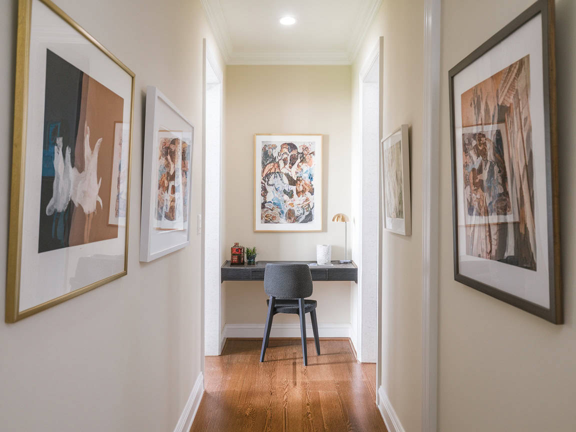
You know that feeling when you walk into a hotel lobby or a friend’s perfectly curated living room, and you just… stop? It’s not just about expensive furniture. It’s something else. A vibe. A sense of calm and intentionality that seems to hug you the moment you cross the threshold. We’ve all been there, staring at our own four walls, wondering why they feel a bit flat, a bit "meh," despite our best efforts. Maybe you’ve bought the trendy rug. You’ve painted the accent wall. But it still doesn’t sing.
Here’s the truth: professional designers aren’t wizards. They don’t have a secret handshake with the furniture gods. What they do have is a toolkit of failsafe rules—little tweaks and shifts in perspective—that consistently elevate a space from ordinary to extraordinary. In 2026, with so much inspiration flooding our screens, it’s easy to get overwhelmed by the noise. But strip away the trends, and you’re left with timeless principles that work every single time. Let’s pull back the curtain and steal those secrets for ourselves.
The Magic of Layered Lighting (And Why One Overhead Light Is The Enemy)
If you take only one thing away from this, let it be this: kill the big light. Seriously. Relying on a single overhead fixture is the fastest way to make a room feel like a dentist’s office or a interrogation room. It casts harsh shadows, flattens textures, and kills the mood. Designers know that lighting is the jewelry of the home. It needs to be layered. Think of it in three distinct levels: ambient, task, and accent.
Ambient lighting is your base layer, but it shouldn’t come from a cold, central ceiling source. Use floor lamps with upward-facing shades to bounce light off the ceiling, creating a soft, diffuse glow. Task lighting is for doing things—reading, cooking, working. This is where your desk lamps and under-cabinet lights come in. But the real secret sauce? Accent lighting. This is the stuff that makes a room feel expensive. A small picture light over a piece of art. A LED strip hidden behind a headboard. A tiny lamp on a bookshelf highlighting a ceramic vase. These little pools of light create depth and drama, drawing the eye around the room and making the space feel larger and more inviting.
In recent years, the tech has gotten smarter, too. You don’t need to rewire your house to get this effect. Plug-in sconces are having a massive moment in 2026 because they offer that hardwired, custom look without the electrician bill. Dimmers are non-negotiable. If you can’t lower the light, you can’t control the mood. Try swapping out your standard bulbs for warm-white LEDs (around 2700K to 3000K). Anything cooler than that starts to feel clinical. By mixing these sources, you create a visual rhythm that feels intentional and cozy, rather than just "lit."
The Rule of Three and The Art of Intentional Clutter
Humans are wired to find odd numbers more appealing and natural than even ones. It’s a psychological quirk that designers exploit constantly. When you’re styling a coffee table, a mantel, or a bookshelf, group items in threes or fives. A trio of candles with varying heights. A stack of books topped with a small plant and a sculptural object. This creates a visual triangle that leads the eye around the grouping, keeping it interesting. Even numbers can feel static and boxed-in, like soldiers standing at attention. Odd numbers feel dynamic and relaxed.
But here’s where people trip up: they think "styling" means being sparse. Actually, the secret is what some pros call "intentional clutter." It’s not about mess; it’s about personality. A shelf that looks like a showroom display is boring. It lacks soul. Designers mix high and low, old and new. They’ll place a vintage, chipped bowl next to a sleek, modern vase. They’ll lean a framed print against the wall instead of hanging it, sitting it atop a stack of magazines. This juxtaposition tells a story. It says, "I live here. I collect things. I have history."
Don’t be afraid to edit, though. There’s a fine line between curated and chaotic. The trick is to leave breathing room. If every surface is covered, the eye has nowhere to rest. Start with your anchor pieces—the big stuff—and then fill in the gaps with these smaller, grouped vignettes. Step back. Squint your eyes. Does it feel balanced? If one side feels heavy, move something. It’s a dance. And remember, you don’t have to get it right the first time. Move things around until they feel right in your gut. That’s the real metric.
Texture Is The Secret Ingredient To Cozy Sophistication
Color gets all the glory, but texture is the unsung hero of interior design. You can have a monochromatic beige room, and if the textures are rich and varied, it will look incredibly high-end. If everything is flat and smooth, it will look cheap and sterile. Think about the surfaces in your room. Do you have wood? Metal? Glass? Fabric? Stone? A designer haven engages the senses, not just the eyes. It invites you to touch.
In 2026, we’re seeing a huge return to tactile materials. Bouclé fabrics, rough-hewn woods, brushed brass, matte ceramics, and plush wool rugs. The key is contrast. If you have a sleek leather sofa (smooth and cool), throw a chunky knit blanket over it (soft and warm). If you have glossy tile floors, add a jute or sisal rug to ground the space with natural fiber. This interplay of hard and soft, rough and smooth, creates a tension that keeps the eye interested. It adds weight and substance to the room.
Lighting plays a role here, too. Remember those accent lights? When light grazes a textured surface—like a plaster wall or a woven basket—it creates shadows and highlights that emphasize the texture. Flat light hides it. So, use your lighting to show off your textures. And don’t forget the windows. Layering window treatments is a classic pro move. Sheer curtains for privacy and light diffusion, paired with heavier drapes for warmth and sound dampening. The way the fabric pools on the floor adds a vertical line of texture that draws the eye up, making ceilings feel higher. It’s a small detail with a huge impact.
Scale, Proportion, and The "Float" Factor
One of the most common mistakes everyday homeowners make is buying furniture that’s too small for the space. It’s counterintuitive. We think a small room needs small furniture to "save space." But actually, a few well-scaled, substantial pieces make a small room feel bigger and more luxurious. Tiny furniture floats around awkwardly, making the room feel cluttered and disjointed. Designers go big. A large area rug that extends under all the furniture legs anchors the seating area. A substantial sofa commands the room. It creates a sense of permanence and comfort.
Speaking of rugs, size matters. A lot. Your rug should be big enough to define the zone. In a living room, at least the front legs of all your seating furniture should sit on the rug. Ideally, all legs do. This ties the conversation area together. If your rug is too small, it looks like an island in a sea of flooring, shrinking the perceived size of the room. Don’t be shy. Go larger than you think you need. It’s one of the easiest ways to instantly upgrade the feel of a space.
Then there’s the concept of "floating" furniture. Pushing everything against the walls is a habit from childhood, but it’s not how designers arrange rooms. Pulling furniture off the walls—even just a few inches—creates shadow lines and makes the room feel more intimate and conversational. In larger rooms, you might float a sofa in the middle of the space to create a walkway behind it. This breaks up the boxiness of the room and creates distinct zones for different activities. It feels more organic, more like a journey through the space rather than a perimeter check. Give your furniture room to breathe, and it will give your room room to shine.
The Power of Paint: It’s Not Just About Color
We all know paint is the most cost-effective transformation tool in the arsenal. But the secret isn’t just picking the right hue; it’s about sheen and application. Designers rarely use flat or eggshell finishes for trim and doors. They use semi-gloss or satin. Why? Because the slight shine reflects light, making the architectural details pop. It creates a subtle contrast between the walls and the trim that feels crisp and tailored. In 2026, we’re also seeing a trend toward "color drenching"—painting the walls, trim, ceiling, and even doors in the same color. This blurs the boundaries of the room, making it feel expansive and enveloping. It’s bold, but incredibly sophisticated.
Don’t ignore the ceiling. It’s often called the "fifth wall" for a reason. Painting it a crisp white can lift the lid off the room, making it feel airier. But painting it a slightly darker shade than the walls can make a large, cavernous room feel cozier and more intimate. It draws the eye down. And if you have beautiful moldings or a interesting beam structure, highlighting them with a contrasting color or sheen turns them into features rather than afterthoughts.
Test your paints properly. Never pick a color from a tiny chip in the store. Light changes everything. Buy sample pots and paint large swatches (at least 2×2 feet) on different walls in the room. Watch them at morning, noon, and night. Artificial light vs. natural light will shift the tone dramatically. A gray that looks chic in the showroom might look purple in your north-facing living room. Patience here saves regret later. And remember, primer is your friend. A good primer ensures the true color comes through and lasts longer. It’s the foundation of a professional finish.
Mirrors are the oldest trick in the book, but they work because they’re magic. They bounce light, double views, and create the illusion of depth. But placement is key. Don’t just hang a mirror anywhere. Place it opposite a window to reflect the outdoors and bring natural light deeper into the room. Or, position it to reflect a beautiful vignette—a chandelier, a piece of art, a lush plant. Avoid reflecting clutter or blank walls. A large, floor-leaning mirror can make a small bedroom feel twice its size. A cluster of smaller mirrors can act as art. The frame matters, too. An ornate gold frame adds glamour; a simple black frame adds modern edge. Choose based on the vibe you want.
Then, bring in life. Plants are non-negotiable for a designer feel. They add color, texture, and a sense of vitality that no object can replicate. A fiddle leaf fig in a corner. A trailing pothos on a high shelf. A snake plant on the bathroom sink. They soften hard edges and clean the air. If you can’t keep plants alive (no judgment), high-quality faux greens have come a long way. Just dust them regularly. The goal is to break up the straight lines of architecture with organic shapes. Nature is irregular, and that irregularity is pleasing to the human eye.
Finally, the polish. This is the step most people skip. It’s the editing. It’s taking away one thing from each surface. It’s fluffing the pillows. It’s straightening the rug. It’s ensuring the hardware on your cabinets is tight and clean. These micro-actions signal care. A designer space feels cared for. It’s not perfect, but it’s considered. Walk through your home with a critical eye. What’s distracting? What’s missing? Add a tray to corral remotes. Swap out a generic shower curtain for a textured linen one. Hang your curtains high and wide—close to the ceiling and extending beyond the window frame—to maximize light and height. These small, almost invisible tweaks are what separate a decorated house from a designed home.
So, there you have it. The secrets aren’t really secrets at all. They’re just habits of attention. Lighting, layering, texture, scale, paint, and polish. You don’t need a massive budget to implement them. You just need to look at your space with fresh eyes. Start small. Change a bulb. Move a chair. Add a plant. See how it feels. Design is a process, not a product. It’s about creating a backdrop for your life that supports you, calms you, and inspires you. And honestly? That’s worth more than any trend.