Ever walked into a room or opened an app and instantly felt… something. Maybe it was a sudden wave of calm, or a spark of pure excitement. You didn’t just see the colors; you felt them. That isn’t an accident. It is the result of a meticulous, behind-the-scenes alchemy that creators use to pull at our heartstrings.
In 2026, we are bombarded with more visual media than ever before. To stand out, designers have to move beyond just picking shades that look pretty together. They need to craft color harmonies that actually tell a story, turning simple hues into powerful emotional roadmaps. Let’s peel back the curtain on how this magic actually happens.
The Emotional Blueprint
Before a designer even touches a color wheel, they start with a mood. What is the emotional core of the story? A tech startup aiming to build trust will lean in a completely different direction than a indie film director trying to evoke nostalgia.
Think of colors like characters in a book. You have your main lead, the sidekick, and the quiet background extras. Creators map out these roles by understanding color psychology, but they don’t just stick to the basic rules like "blue means sad." They dig deeper into the subtle shifts in shade and tone to spark specific, complex feelings.
Tweaking the Triads and Analogous Mixes
We all remember the basic color wheels from school, right. You have your complementary pairs (opposites like blue and orange) and your analogous blending (neighbors like red, orange, and yellow). But the real wizardry lies in how these classic formulas are twisted to fit a narrative.
An analogous palette feels deeply harmonious and peaceful because the eyes don’t have to jump across the wheel. It feels natural, like a sunset. But if a designer wants to hint that something is slightly wrong under the surface, they might inject a tiny, unexpected splash of a complementary color. That tiny bit of friction instantly grabs attention and builds silent tension.
The Power of the Dominant Hue
A common mistake is trying to give every color equal screen time. When everything screams for attention, nothing gets heard. Memorable palettes almost always rely on one dominant hue to establish the universe, while the others play supporting roles.
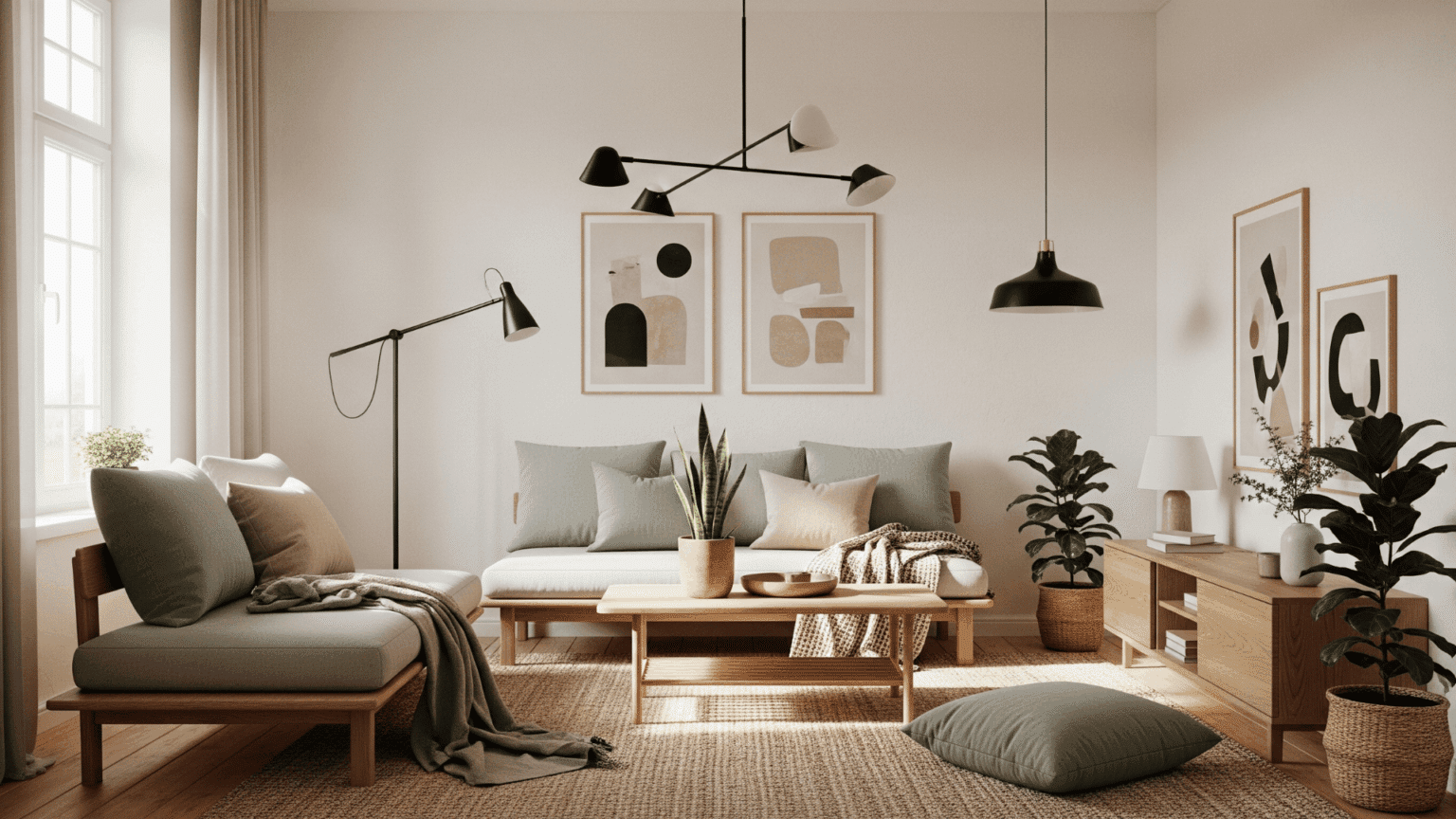
Take a look at modern filmmaking or brand design today. Creators often use a 60-30-10 rule. Sixty percent of the visual space is your main background color, thirty percent is the secondary tone that builds the atmosphere, and that last ten percent is your punchy accent color. That tiny ten percent is usually where the big story beats happen.
Sampling from Real Life
Where do these unforgettable mixes come from. The best designers usually look away from their screens and step outside. Nature is the ultimate master of color harmony, having spent billions of years perfecting combinations that feel inherently "right" to human eyes.
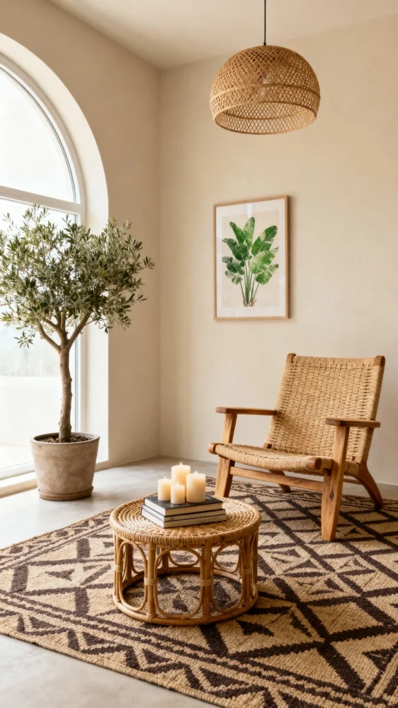
A mossy green paired with a damp soil brown and a slate gray doesn’t just look organic; it tells a story of grounding, survival, and quiet strength. Designers frequently snap photos of peeling paint, changing seasons, or rusty city streets to capture authentic palettes that evoke real-world memories.
Context and Culture Shift Meanings
Color stories aren’t created in a vacuum. A palette that whispers luxury in one part of the world might mean something totally different somewhere else. White can symbolize purity in Western cultures, but it represents mourning in many Asian traditions.
In our deeply connected world, creators have to be incredibly mindful of these shifting definitions. A truly great color story respects its audience’s background, using shared cultural symbols to make the visual narrative feel deeply personal and impactful.
Testing the Palette in Darkness and Light
A color harmony might look incredible on a pristine monitor, but how does it behave out in the wild. The final step of the creative journey involves stress-testing the palette across different lighting conditions and mediums.
Whether it is adjusting for dark mode on a phone screen or seeing how a print layout holds up under harsh fluorescent lights, designers tweak the brightness and saturation until the mood remains unbroken. It’s a tedious process of endless refinement, but it ensures the emotional message stays intact no matter how the viewer encounters it.
At the end of the day, creating memorable color harmonies is a beautiful dance between science and intuition. It requires a deep understanding of visual mechanics, balanced with a willingness to experiment and break the rules when the story demands it.
When you master this balance, colors cease to be mere decoration. They become the silent narrator of your project, guiding the audience’s eyes and shaping their feelings before they’ve even read a single word. Next time a visual catches your eye, pause for a second and ask yourself: what story are these colors trying to tell me.