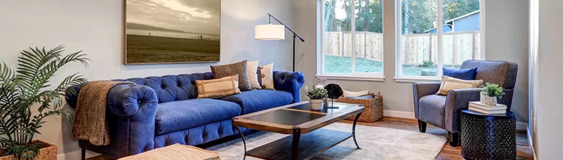
We all love scrolling through social media and seeing gorgeous, freshly painted rooms that look like they belong in a luxury magazine. It makes you want to run straight to the local hardware store, grab a couple of rollers, & completely transform your living room over the weekend. But here is the catch: what looks amazing on a smartphone screen doesn’t always translate well to real life.
Lately, certain shades have been blowing up online, but behind closed doors, professional desingers are quietly shaking their heads. They know that some of these hyper-trendy colors are incredibly tough to live with, fade out of fashion fast, or make buyers run away when it is time to sell.
1. Cold Stark Gray
For years, cool gray was the ultimate king of modern design. It was everywhere, from minimalist apartments to suburban kitchens. But in 2026, designers are begging homeowners to put down the gray paint swatch.
When you cover a whole room in a cold, blue-toned gray, it easily ends up looking like a hospital waiting room or a gloomy rainy day. It drains the life right out of your furniture. If you want a clean look, experts suggest reaching for warm beige, soft taupe, or creamy off-whites instead. These shades still keep things bright but won’t make your home feel like a chilly concrete box.
2. Neon and Bright Yellows
Yellow sounds great on paper because it feels cheerful and full of sunshine. But there is a huge difference between a soft, buttery cream & an aggressive neon yellow that feels like a highlighter marker.
Bright yellows bounce light around in a way that can genuinely hurt your eyes after an hour. It stimulates the brain a bit too much, making it a terrible choice for bedrooms or cozy spaces where you want to relax. If you really love yellow, pick a muted mustard or an earthy ochre that feels grounded rather than blinding.
3. Hospital White
Stark, blinding white is another color that looks incredible in heavily edited photos but feels sterile in reality. Unless your home gets massive amounts of natural sunlight and is filled with warm wood accents, a pure white can feel incredibly aggressive.
It shows every single smudge, fingerprint, and speck of dust instantly. This makes it a nightmare for families with kids or pets. Instead of a pure, optical white, desingers secretly lean toward whites with warm undertones, like ivory or alabaster, which soften the walls and feel way more welcoming.
4. Oversaturated Barbie Pink
Thanks to recent pop culture trends, bright blush and vivid pinks took the interior world by storm. While a tiny splash of it can be fun in a powder room, painting an entire bedroom or accent wall in this shade is a fast track to design regret.
Trendy pinks can date a house faster than almost any other color palette. It tends to overwhelm the senses and makes it difficult to match with other decor pieces. If you love the romance of pink, think about switching to a dusty mauve or a terracotta shade that offers that same warmth without feeling childish.
5. Heavy Muddy Browns
Earth tones are definitely having a moment right now, which is wonderful. However, some homeowners are accidentally choosing dark, muddy browns that make spaces feel incredibly heavy and small.
If a brown has too many gray or green undertones, it can start to look like actual mud on the walls. It absorbs all the light in the room, making even a spacious area feel cramped & a bit depressing. If you want that rich, earthy vibe, choose a deep chocolate with warm reddish undertones, or stick to lighter tan shades.
Sage green has been the darling of the design world for a long time, but it has officially reached the point of oversaturation. Because everyone has been painting their kitchens and bathrooms sage green for the last few years, it is starting to lose its special charm.
It is not that sage is an ugly color, it is just that it has become a bit predictable and safe. If you want your home to have a fresh personality, look toward deeper olive greens, rich forest tones, or even a soft mossy green. These choices give you that beautiful connection to nature without looking exactly like your neighbor’s house.
Choosing a paint color is an investment of your time, effort, and hard-earned money. While it is always fun to experiment with what is popular on social media, the most important thing is how a color makes you feel when you sit down to relax at the end of a long day.
Before you commit to a full gallon, always buy a small sample and paint a test patch on your wall. Watch how the color changes in the morning light versus the evening shadows. By avoiding these tricky, hyper-trendy traps, you will create a beautiful space that feels classic, comfortable, and uniquely yours for years to come.