Ever walked into a tiny room and felt like the walls were closing in? Or perhaps you’ve longed for a cozy corner that feels expansive instead of constricting. It’s a common dilemma, isn’t it? In our bustling, modern lives, especially in cities where every square foot counts, many of us are making the most of smaller living areas. But here’s a little secret, one that designers and everyday folks have been quietly applying for ages: color isn’t just about pretty hues. It’s a powerful tool, a master of deception, capable of completely altering how a space feels and functions.
Think about it. We often believe a small room means limited options, but that’s just not true. What if I told you that with a thoughtful approach to color, you could visually push back walls, elevate ceilings, and even carve out distinct zones in a single, compact area? It’s not magic, though it often feels like it. It’s the art and science of color illusion, and it’s something anyone can harness to transform their humble dwelling into a true sanctuary. Let’s peel back the layers and see how this works, shall we.
Embracing Light and Airy Shades: The Foundation of Expansion
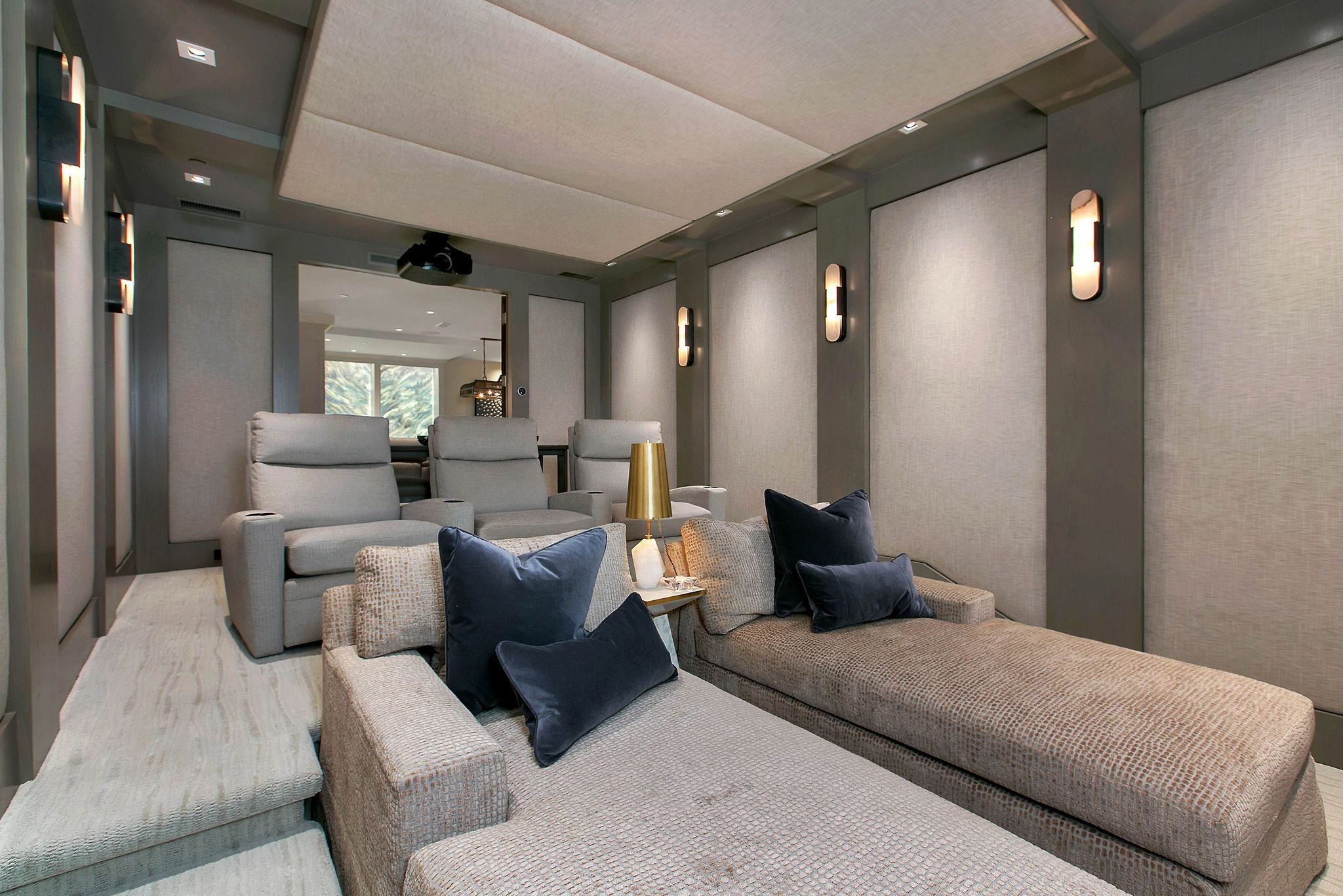
When aiming for a sense of openness, lighter colors are your best pals. Pale blues, gentle greys, and creamy whites don’t just reflect light; they bounce it around, making a room feel brighter and, consequently, bigger. Picture a compact urban apartment from 2026, maybe a studio. Painting the main living area in a soft, ethereal white or a very light greige can instantly make it feel less like a box and more like a breathable space. These shades sort of dissolve the boundaries, giving your eyes room to roam.
It’s not just about white, though. A whisper of sage green or a delicate lavender can also work wonders, especially if they have cool undertones. Cool colors, you see, have this neat trick of receding visually. They seem farther away than they actually are. This optical illusion is incredibly useful in a small room where you want to create depth without adding physical distance. Consider using an eggshell finish, too; its subtle sheen helps diffuse light even more effectively.
The Power of a Singular Palette: Unifying and Stretching
A common mistake in smaller spaces is to chop them up with too many different colors. This creates visual clutter and makes the room feel even more fragmented and smaller. Instead, think about a monochromatic or analogous color scheme. This means sticking to one main color, or colors that are close to each other on the color wheel. For example, various shades of blue – from a deep navy on an accent wall to a sky blue on the others and even lighter blue accessories.
This unified approach allows the eye to flow smoothly across the room without interruption, making the space feel more cohesive and, yes, larger. Imagine a small home office where the walls, trim, and even some furniture pieces are in varying tones of a soft, sandy beige. The lack of sharp color contrasts blurs the lines, giving the impression of continuous space. It’s a clever way to trick the brain into perceiving more room than there actually is, and it feels wonderfully calming, too.
Strategic Accent Walls: Drawing the Eye and Adding Depth
Now, just because we’re talking about light and unified doesn’t mean you can’t have a bit of drama. An accent wall, used wisely, can be a game-changer. The trick is to use it to lengthen or widen the room. If your room is long and narrow, painting the shorter end wall a slightly darker, richer color can draw the eye to it, making that wall feel closer and the room appear wider. It’s counter-intuitive, but it works to balance proportions.
Conversely, in a square room, painting one wall a deeper hue can create an illusion of depth, pushing that wall back. A deep teal or a warm charcoal on a single wall can add sophistication and character without overwhelming the space. Just ensure the other walls remain light and neutral to maximize the contrast and the expansive effect. It’s about careful placement and intention, not just picking a pretty color.
Elevating Ceilings and Grounding Floors: Vertical Illusions
Don’t forget the fifth and sixth walls – your ceiling and floor. These surfaces play a huge role in how tall or wide a room feels. For ceilings, painting them a lighter shade than your walls, ideally a crisp white or a very pale version of your wall color, can make them appear higher. It draws the eye upwards, creating a sense of lift and airiness. It’s like giving your room a little stretch.
On the flip side, a slightly darker floor can ground the room, providing a stable foundation and allowing the lighter walls to "float" above. Think of a rich wood tone or a deeper carpet against light walls. This contrast helps define the space without making it feel enclosed. And if you’re really daring, painting your ceiling a glossy, reflective finish can also create an illusion of height by mirroring the room below, though that’s a more advanced technique.
Beyond the Walls: Furniture and Fabric Color Choices
The magic of color doesn’t stop at the paint can. Your furniture and fabrics also contribute significantly to the overall feel. Opting for larger pieces in colors that are similar to your wall color can help them blend in rather than stand out and visually "eat up" space. A sofa in a tone similar to your wall, for instance, won’t create a harsh line that interrupts the flow of the room.
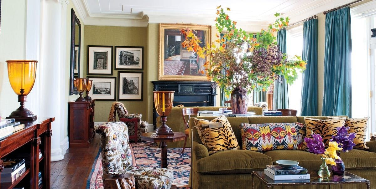
When it comes to smaller accents like throw pillows, artwork, or decorative objects, this is where you can introduce pops of vibrant color without overwhelming the space. These little bursts of hue add personality and interest, guiding the eye around the room without making it feel cluttered. It’s about strategic splashes, not a full-on color riot. Think of a cozy reading nook in a small bedroom; a comfy armchair in a neutral tone with a bright saffron yellow cushion can be just the right touch.
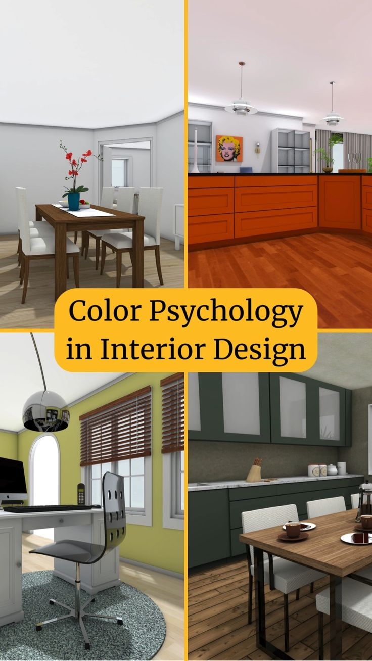
Finally, beyond the visual tricks, consider the emotional impact of color. After all, you’re not just making a room look bigger; you’re crafting a sanctuary. Cool colors like blues and greens are known for their calming and serene qualities, perfect for a bedroom or a meditation space. Warm colors like soft yellows and gentle oranges can create a feeling of coziness and welcome, ideal for a living area where you want to relax and entertain.
Even in a tiny space, you can evoke different moods. Perhaps a soft, dusty rose for a feminine and comforting feel, or a warm grey with purple undertones for a sophisticated yet tranquil vibe. In 2026, we’re seeing a real trend towards creating mindful spaces, and color is at the heart of that. It’s about choosing shades that resonate with you, that make you feel at peace and truly at home, regardless of the square footage. Your small space can be a haven, a place of personal restoration, and color is your guide.
So, don’t let a small footprint intimidate you. See it as an exciting canvas, ripe for transformation. With a thoughtful application of color, you can not only expand the perceived dimensions of your room but also infuse it with an atmosphere that nourishes your soul. It’s about understanding how light plays, how hues interact, and most importantly, how to make your home feel like the expansive, personal haven you deserve. Go on, pick up that paint swatch; your sanctuary awaits.