Ever walked into a kitchen that felt like it was closing in on you? You know the feeling. The walls seem to lean forward, the ceiling dips low, and suddenly you’re tripping over your own feet just trying to grab a coffee mug. It’s frustrating. Especially when you know the square footage says there should be plenty of room. But here’s the thing—our eyes are easily fooled. And for decades, designers have been using a simple trick to hack our perception: color.
It’s not magic. It’s physics mixed with a bit of psychology. In 2026, we aren’t just picking shades because they look pretty on a swatch. We’re choosing them based on how light bounces, how our brains process depth, and how specific wavelengths interact with the limited space we have. If you’ve got a compact cooking zone or an awkward galley layout, the right hue can literally push the walls back. Let’s dive into why some colors shrink a room while others blow it wide open.
The Physics of Light Reflection
At its core, making a space feel larger is about managing light. Dark colors absorb light. They soak it up like a sponge. When light gets absorbed, shadows deepen, corners disappear into darkness, and the boundaries of the room become unclear but in a cramped, heavy way. Light colors, on the other hand, reflect light. They bounce it around the room, hitting every surface and illuminating those tricky dark corners.
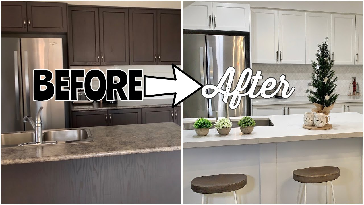
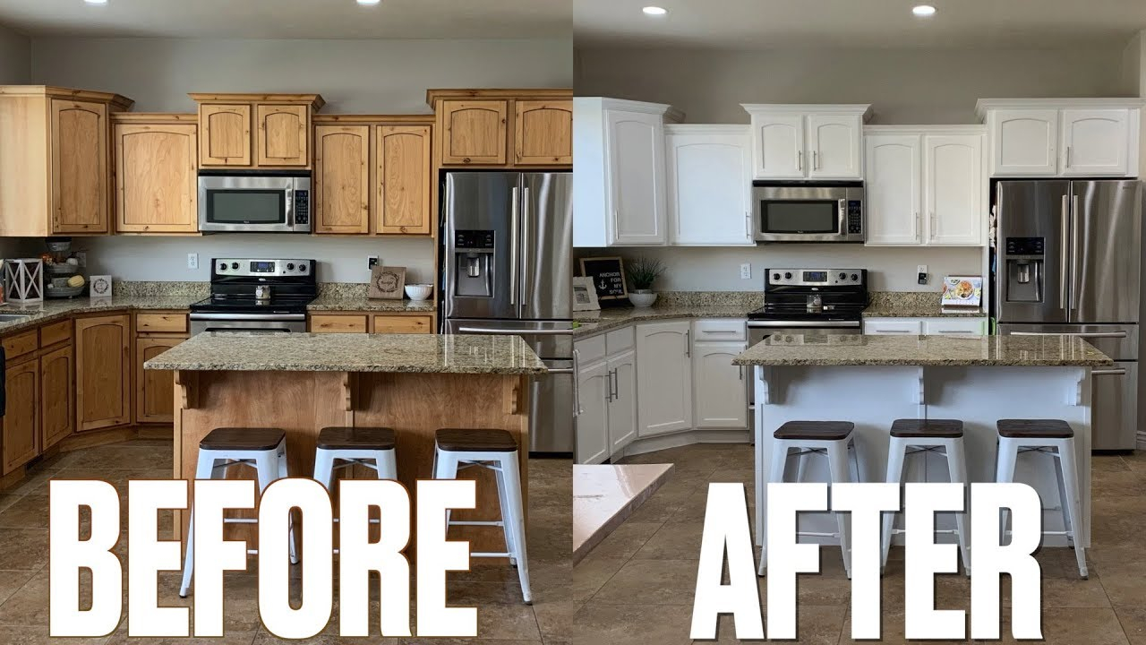
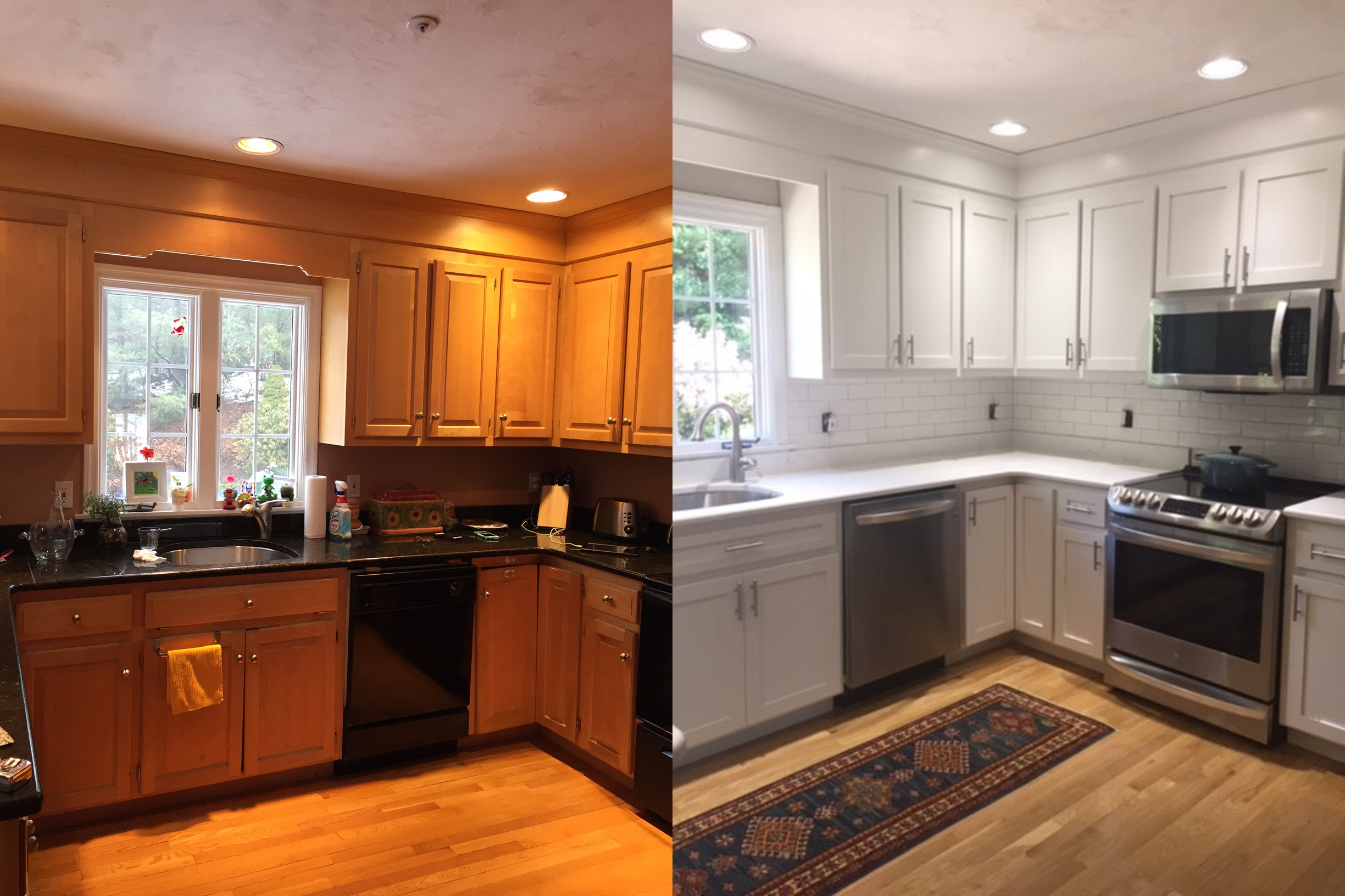
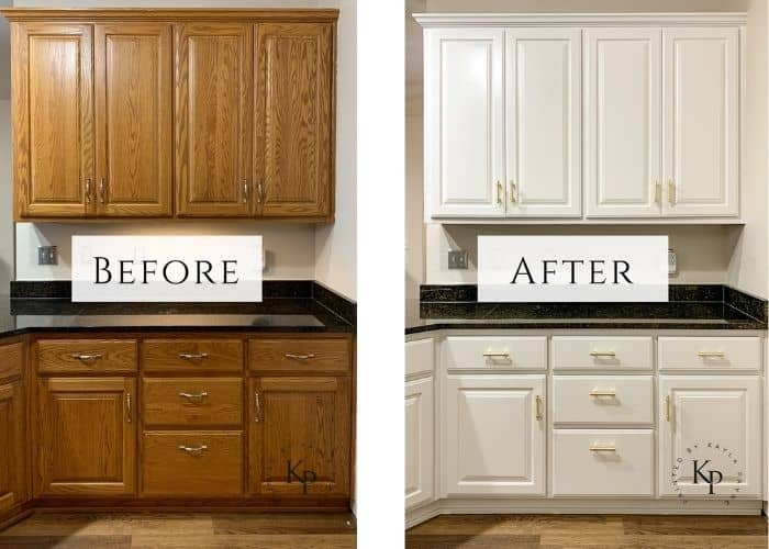
Think of white paint not just as a color, but as a mirror. Well, maybe not a perfect mirror, but close. High-reflectance paints send photons bouncing off the walls and back into your eyes from multiple angles. This creates a sense of airiness. Recent studies in environmental psychology suggest that spaces with higher luminance levels are perceived as more spacious because our brains associate brightness with openness. It’s an evolutionary trait—we feel safer and more comfortable in well-lit, open areas.
But it’s not just about slapping on the brightest white you can find. The sheen matters too. A flat finish absorbs more light than a satin or semi-gloss. For kitchens, where grease and grime are constant enemies, a satin finish is often the sweet spot. It reflects enough light to help expand the visual field but isn’t so shiny that it looks like a hospital. In 2026, many homeowners are opting for "soft-gloss" hybrids that offer durability and a subtle light-bounce effect without the glare.
Cool Tones vs. Warm Tones
Here’s where it gets interesting. Not all light colors behave the same way. There’s a big difference between a warm beige and a cool icy blue. Cool tones—blues, greens, grays, and crisp whites—tend to recede. When you look at a wall painted in a cool shade, your eye perceives it as being further away than it actually is. It’s an optical illusion known as atmospheric perspective. Think about looking at distant mountains; they appear blueish and hazy because of the atmosphere. Our brains apply this same logic indoors.
Warm tones—reds, oranges, yellows, and creamy beiges—do the opposite. They advance. They come forward toward you. This can make a room feel cozy and intimate, which is great for a bedroom or a dining nook. But in a tiny kitchen? It can feel suffocating. A warm yellow might make the walls feel like they’re inching closer to your elbows while you chop vegetables. That’s not the vibe we’re going for if we want space.
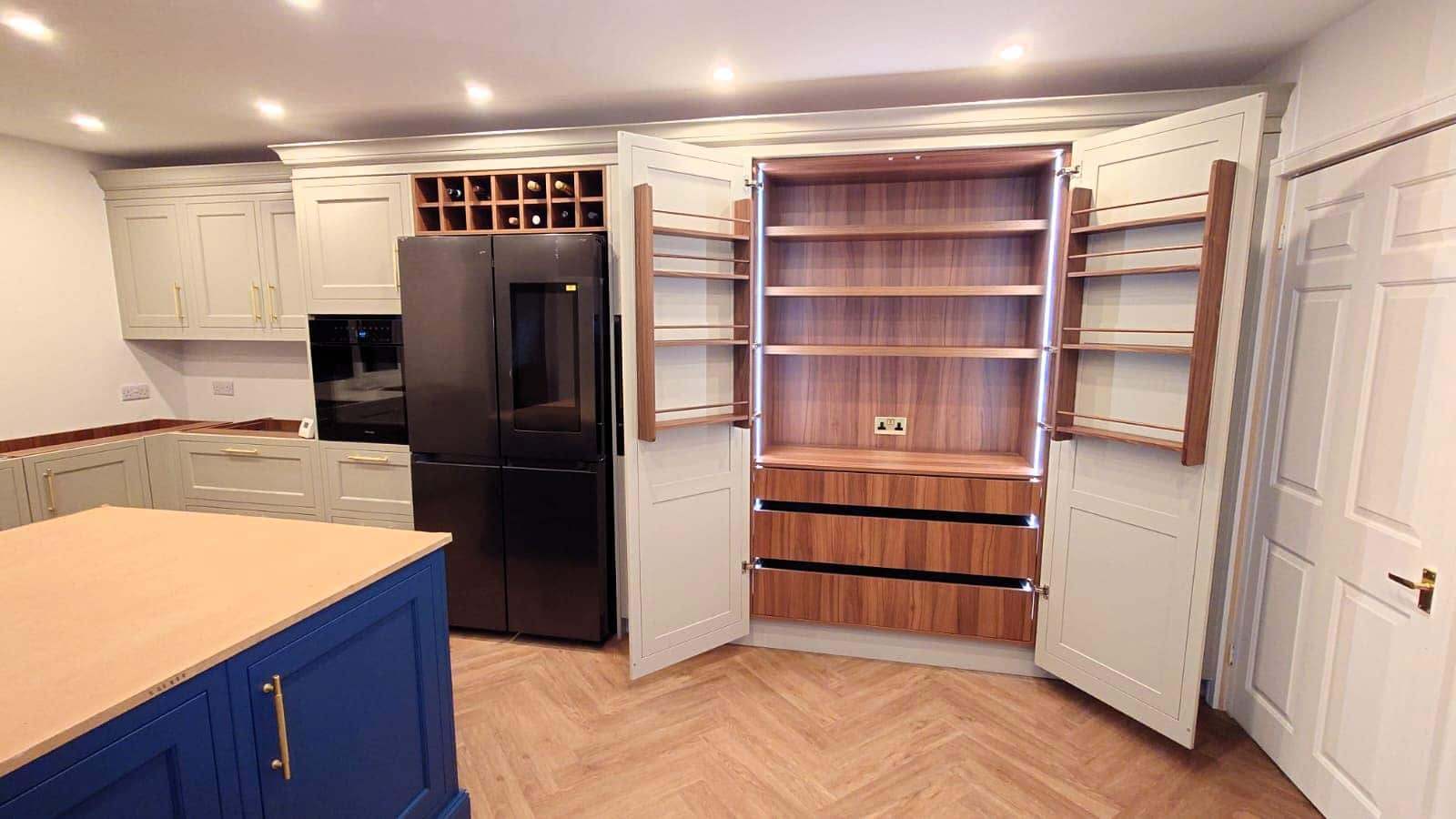
This doesn’t mean you have to live in a sterile ice box. You can still use warmth, but you have to be strategic. Maybe you use a very pale, cool-toned gray for the walls to push them back, and then add warmth through wood accents, brass hardware, or a rug. This layering technique keeps the spatial expansion intact while adding the human touch that makes a kitchen feel like home. It’s about balance. Too much cool can feel clinical. Too much warm feels tight.
The Ceiling Hack
Most people forget the fifth wall. The ceiling. If you paint your ceiling the same color as your walls, or worse, a darker color, you lower the visual height of the room. It feels like a lid has been placed on top of your kitchen. To make a space feel larger, you need verticality. You need your eyes to travel upward without hitting a hard stop.
The classic trick? Paint the ceiling a shade lighter than the walls. Or just go pure white. This draws the eye up and creates an illusion of height. In 2026, we’re seeing a trend toward "ceiling washing," where the paint color extends slightly down the top few inches of the wall before transitioning. This softens the corner where the wall meets the ceiling, blurring the boundary. When the edge is blurry, the brain has trouble determining exactly where the room ends, which translates to a feeling of more space.
If you have exposed beams or ductwork, painting them the same color as the ceiling helps them disappear. Contrast creates definition, and definition creates boundaries. By minimizing contrast on the upper portion of the room, you remove visual clutter. It’s like decluttering your countertops, but for your architecture. The less your eye has to process, the more open the space feels.
Monochromatic Magic
One of the most powerful tools in the designer’s toolkit is monochromatic color schemes. This doesn’t mean everything has to be the exact same shade of white. It means using variations of the same color family. Imagine walls in a pale sage green, cabinets in a slightly deeper sage, and the island in a muted olive. Because the hues are related, the eye flows smoothly from one surface to another without stopping.
Contrast is the enemy of spaciousness. When you have stark black cabinets against white walls, your eye stops at the boundary. It registers two distinct objects. This breaks up the visual field and makes the room feel segmented and smaller. By keeping the tonal value similar across different elements, you create a seamless visual experience. The kitchen becomes one cohesive unit rather than a collection of separate boxes.
This approach also works wonders for blending appliances. In 2026, panel-ready fridges and dishwashers are huge. If you can match your cabinet fronts to your wall color, or at least keep them in the same tonal family, the large bulky appliances vanish into the background. Suddenly, that massive refrigerator isn’t a looming obstacle; it’s just part of the wall. It’s a subtle shift, but the impact on perceived space is massive.
The Role of Natural Light and Orientation
You can pick the perfect expanding color, but if your kitchen faces north and gets zero direct sunlight, it’s going to look different than it did in the store. Light quality changes everything. North-facing rooms get cool, blue-ish light. South-facing rooms get warm, golden light. East and West change throughout the day.
If you have a north-facing kitchen, avoid cool grays or blues. They will look dull and cold, making the space feel cavernous in a bad way—like a cave. Instead, opt for a warm white or a very pale cream. These colors will counteract the blue light and keep the room feeling bright and airy. Conversely, if you have a south-facing kitchen that gets blasted with sun all day, you can get away with cooler tones. The warm sunlight will balance out the cool paint, preventing it from feeling sterile.
Test your colors at different times of day. Paint a large sample board and move it around the room. Look at it in the morning, noon, and evening. Does it still feel open? Does it feel inviting? Sometimes a color that looks expansive in bright midday sun feels flat and closed-in at dusk. Adjust accordingly. It’s better to spend a few days testing than to repaint three months later.
So, how do you actually do this? Start by clearing out the visual noise. Clutter makes any color feel cramped. Once your surfaces are clear, choose your base color. Go for high-LRV (Light Reflectance Value) paints. Look for numbers above 70 on the paint can. The higher the number, the more light it reflects.
Don’t be afraid of white. It’s not boring if you pick the right undertone. Try samples like Chantilly Lace, Simply White, or White Dove. Test them against your flooring and countertops. If your floors are warm wood, a cool white might look stark. If your counters are marble with gray veining, a warm white might look yellow. Match the undertones.
Use gloss strategically. Paint your trim and cabinets in a semi-gloss to catch the light. Keep walls in eggshell or satin. This variation in sheen adds depth without adding visual weight. And finally, use mirrors or reflective backsplashes. A glass tile backsplash or a mirrored splashback behind the stove can double the visual depth of that specific area. It’s a cheat code, but it works.
Making a small kitchen feel big isn’t about knocking down walls. It’s about understanding how light and color dance together. It’s about tricking the eye gently. By choosing cool, light-reflecting hues, keeping the ceiling bright, and minimizing contrast, you can create a space that breathes. It feels open. It feels calm. And honestly, who doesn’t want their kitchen to feel like a breath of fresh air? Give it a try. Your eyes—and your sanity—will thank you.