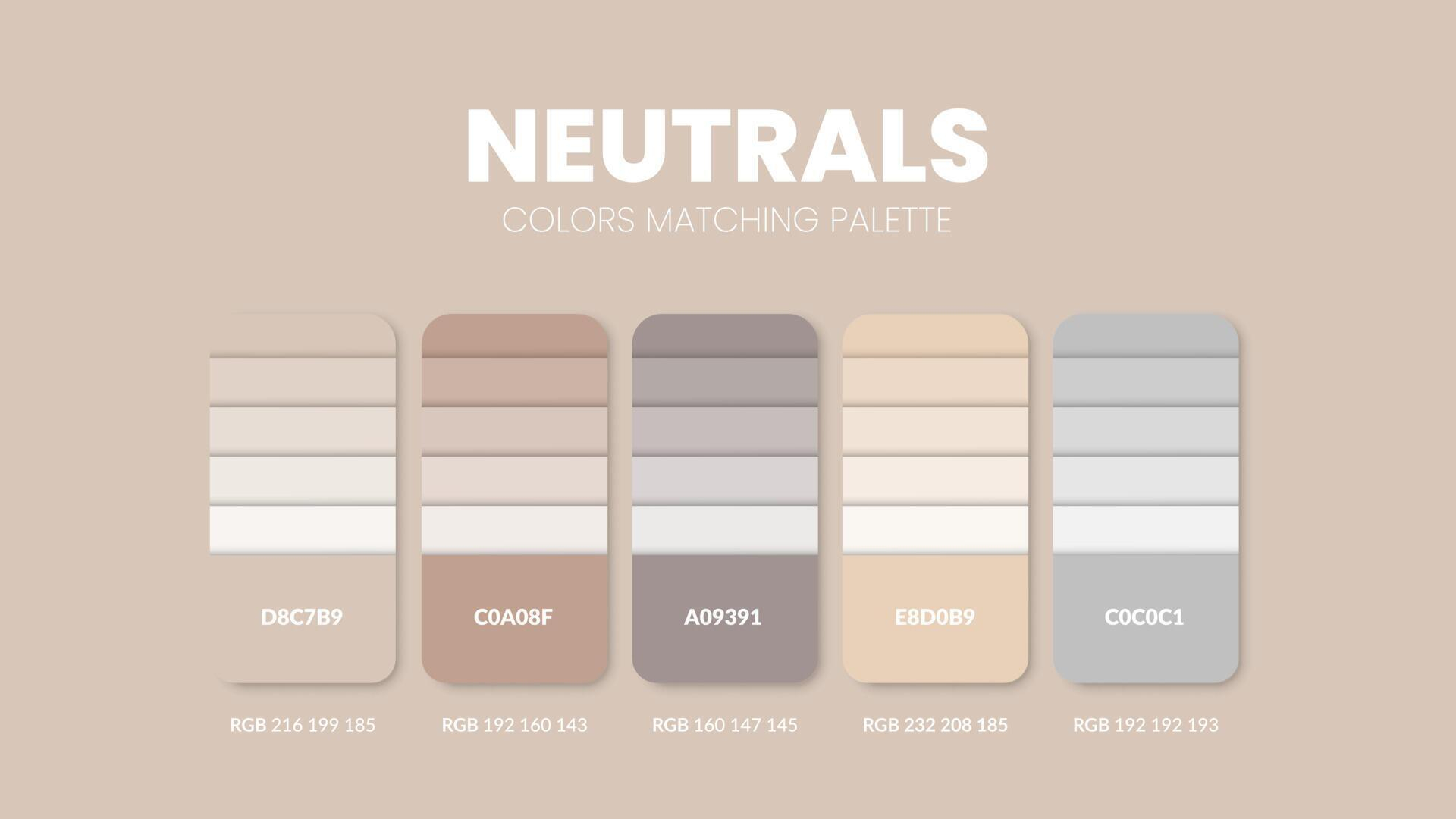
We’ve all been there. You walk into a room and just… exhale. It’s not because the furniture is expensive or the layout is perfect. It’s because the space feels right. It breathes. In 2026, that feeling has a name, and it’s painted in shades we used to call boring. But they aren’t boring anymore. They’re essential.
For years, we chased the loud. Dopamine decor had its moment, filling our feeds with electric blues and saturated oranges. It was fun. It was energetic. But let’s be honest, it was also exhausting. Now, the pendulum has swung back. Not to the sterile, cold minimalism of the early 2010s, but to something warmer. Something human. Neutral colors have become the quiet backbone of great design, acting less like a backdrop and more like a nervous system regulator for our homes.
This shift isn’t just about aesthetics. It’s about how we live now. After years of chaos, noise, and digital overload, our spaces need to hold us gently. That’s where neutrals come in. They are the unsung heroes of interior design, providing the stability needed to let our lives unfold without visual screaming matches. If you’re wondering why every designer seems to be talking about "emotional neutrals" or "nature-tech" palettes this year, you’re not alone. Let’s dig into why these quiet hues are actually the loudest statement you can make in 2026.
The Death of Sad Beige and the Rise of Warmth
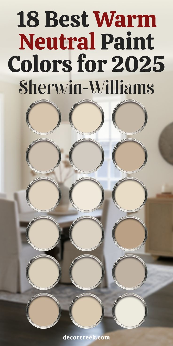
Remember when "Millennial Gray" took over everything? Or when "Sad Beige" became a meme for interiors that lacked soul? Those days are gone. The neutrals of 2026 have personality. They’ve got warmth. They’ve got depth. We are moving away from crisp, clinical whites and cool grays that felt more like a hospital lobby than a home. Instead, we’re embracing hues that feel like they’ve been baked in the sun.
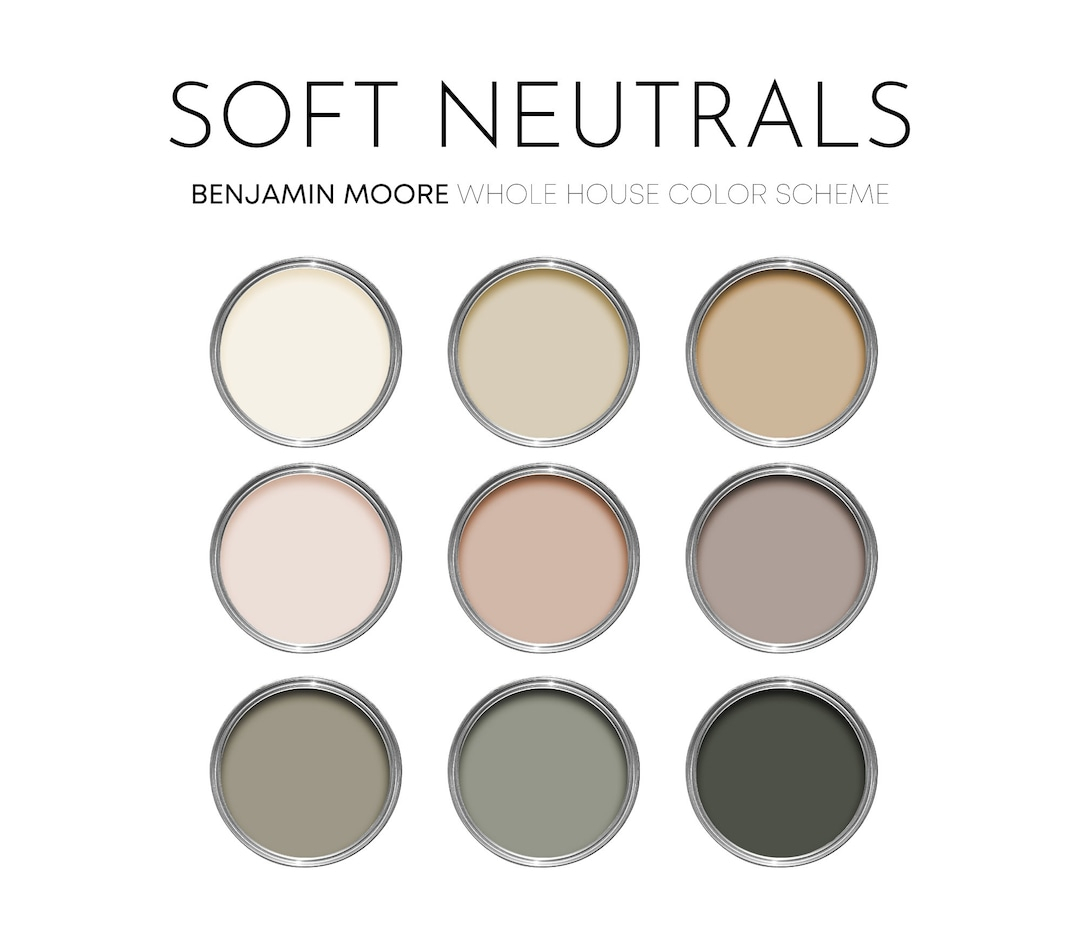
Think terra cotta, dusty pink, and rich ochres. These aren’t your grandmother’s beige. These are complex colors that shift with the light. Forbes noted that warm tones are replacing the bold hues of dopamine decor, and they’re right. It’s a subtle change, but it makes a massive difference in how a room feels. A wall painted in a warm, clay-like tone doesn’t just sit there; it interacts with you. It softens the harsh edges of modern life.
This evolution is also about longevity. Trends come and go, but warmth is timeless. When you choose a neutral with an underlying warmth, you’re choosing a color that will look good in five years, ten years, maybe even twenty. It’s an antidote to the fast-fashion mentality of interior design. You don’t have to repaint every time TikTok decides a new color is "in." You just live in your space, and it grows with you. That’s the power of getting the undertone right.
Emotional Neutrals as Wellbeing Tools
Here’s a thought: what if your paint color could lower your heart rate? In 2026, that’s not just a nice idea; it’s a design principle. Color has become a wellbeing tool. It’s a form of self-care that doesn’t require a spa day. SampleBoard’s forecast highlights two dominant directions: Emotional Neutrals and Nature-Tech hybrids. Both are rooted in the idea that our environment directly impacts our mental state.
Emotional neutrals are colors that evoke a specific feeling of calm or grounding. They aren’t empty. They’re full of intention. When you walk into a bedroom painted in a soft, muted sage or a deep, comforting taupe, your body recognizes the cue to slow down. It’s biological. We are wired to respond to natural cues, and these colors mimic the soothing aspects of the natural world. It’s why so many people are reporting better sleep and reduced anxiety after switching to warmer, nature-derived palettes.
This isn’t just woo-woo science. Designers are seeing it firsthand. Clients are asking for spaces that support their mental health, not just their Instagram feeds. They want rooms that feel like a hug. By prioritizing longevity over virality, as TheDecorHolic pointed out, we’re creating homes that actually serve us. It’s a permanent shift. We’re done with designing for the camera. We’re designing for the nervous system. And honestly? It’s about time.
Nature-Tech Hybrids and the New Organic
You might think "tech" and "nature" don’t mix. But in 2026, they’re best friends. The Nature-Tech hybrid palette is all about blending the organic warmth of the earth with the sleek precision of modern life. It’s not about choosing one or the other. It’s about finding the balance. Think of it as biophilic design for the digital age. We spend so much time on screens, so our physical spaces need to ground us in reality.
This trend shows up in interesting ways. You might see a smooth, concrete-like finish paired with rough, textured linen. Or a sleek, minimalist kitchen cabinet in a warm stone color, contrasted with live-edge wood shelving. It’s the juxtaposition that makes it work. The neutral colors here act as the bridge. They allow the high-tech elements to feel less cold and the natural elements to feel more curated.
Glenna Stone mentioned that the 2026 Color of the Year is white, which sparked some debate. But it’s not just any white. It’s a white that acknowledges the need for clarity and restraint after years of saturation. It’s a reset button. When paired with natural materials like stone, wood, and plants, this "quiet white" becomes part of a larger ecosystem. It reflects light, yes, but it also reflects our desire for balance. It’s clean, but it’s not sterile. It’s simple, but it’s not empty.
Texture Is the New Color
If you’re worried that neutrals will look flat, don’t be. In 2026, texture is doing the heavy lifting. Since we’re not relying on bold colors to create interest, we’re using touch and sight to add depth. SouthernLiving highlighted that designers are loving neutral patterns, prints, and textures. It’s not just about the paint on the walls. It’s about the weave of the rug, the grain of the wood, the nubby feel of a bouclé chair.
Imagine a living room where everything is in the same family of cream and tan. Sounds boring, right? Now imagine that room has a chunky knit throw, a smooth marble coffee table, a rough jute rug, and velvet cushions. Suddenly, it’s fascinating. Your eye moves around the space, discovering new details. The lack of color noise allows you to appreciate the materiality of objects. It’s a more sophisticated way to design.
This approach also makes a space feel more luxurious. High-end design has always relied on quality materials, and neutrals showcase those materials best. When you strip away the distraction of bright colors, you see the craftsmanship. You notice the joinery in the cabinetry. You feel the weight of the ceramic vase. It invites you to engage with your home on a tactile level. And in a world that’s increasingly virtual, that tactile connection is priceless.
Practical Ways to Layer Neutrals
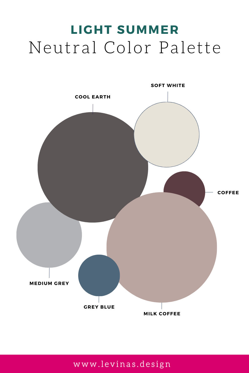
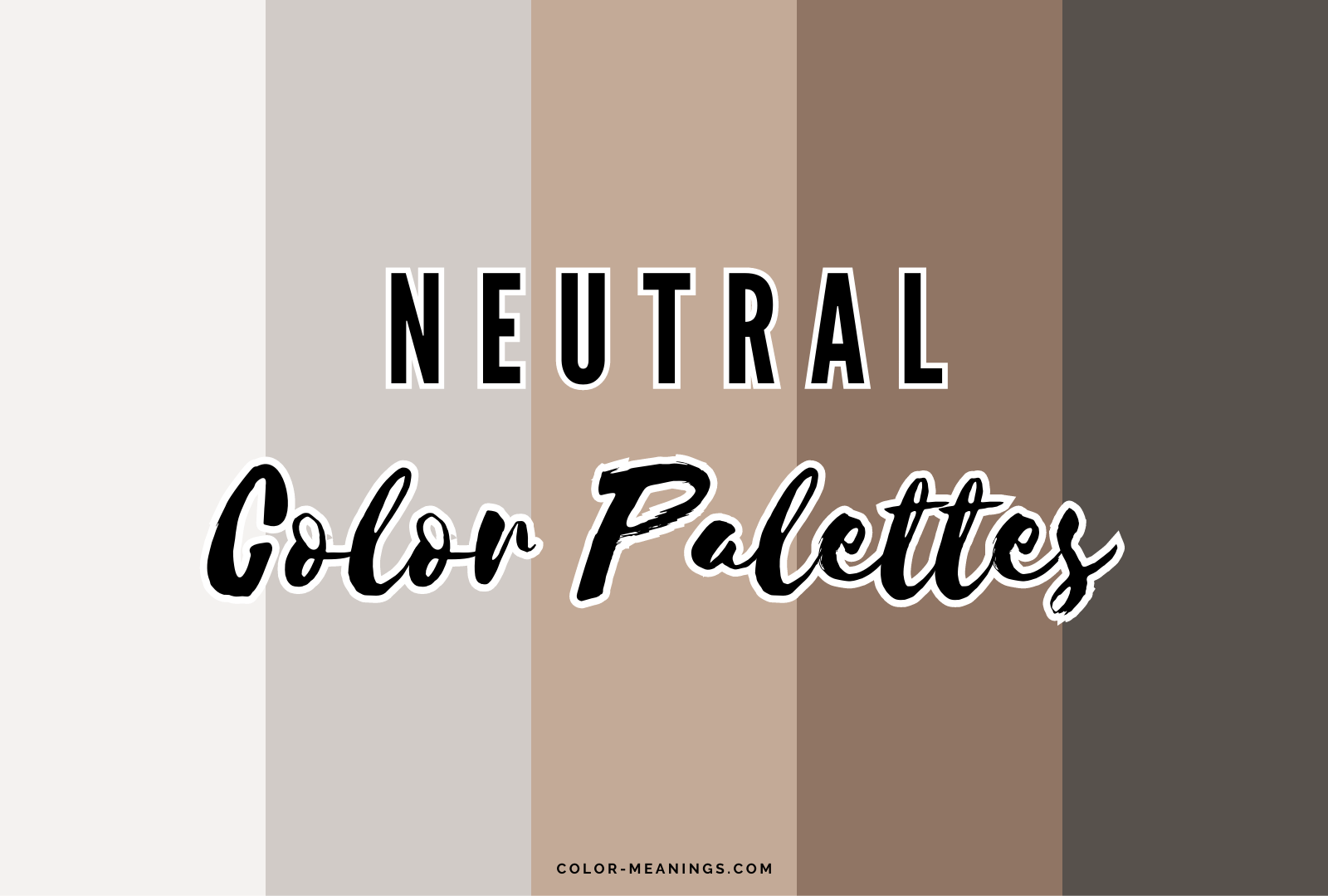
So, how do you actually do this? It’s easy to get stuck in the "everything matches" trap. The key is layering. You want variation, not uniformity. Start with your base. This is usually your walls and large furniture pieces. Choose a warm neutral here—maybe a soft greige or a warm white. This sets the stage. Then, bring in slightly darker or lighter shades for your secondary pieces, like sofas or curtains.
Next, add contrast through accessories. This is where you can play with those earthy tones mentioned earlier. A terracotta pillow, a dusty pink throw, or a rug with hints of olive green. These small pops of color keep the space from feeling monotonous. They add just enough interest to keep the eye engaged without overwhelming the senses. It’s like seasoning food. You don’t want too much salt, but you need enough to bring out the flavors.
Lighting is also crucial. Neutrals change dramatically depending on the light source. A warm gray might look purple in the evening if you have cool LED bulbs. Make sure you’re using warm-toned bulbs (around 2700K to 3000K) to enhance the warmth of your neutrals. Test your paint samples at different times of day. Watch how the color shifts from morning to night. This attention to detail ensures your space feels cohesive and inviting, no matter when you’re in it.
Beyond Paint: Patterns and Prints in Neutral
We often think of neutrals as solid blocks of color, but 2026 is proving that wrong. Patterns and prints are huge, as long as they stay within the neutral territory. Think subtle stripes, organic shapes, or tonal florals. These patterns add rhythm to a room. They break up large surfaces without introducing jarring color contrasts. It’s a way to add personality without sacrificing the calm vibe.
For example, a wallpaper with a faint, textural pattern can add incredible depth to a powder room or a hallway. It’s barely there when you first walk in, but once you notice it, you can’t unsee it. It adds a layer of sophistication. Same goes for textiles. A curtain with a subtle herringbone weave or a rug with a low-contrast geometric pattern can anchor a space beautifully.
The trick is to keep the scale varied. If you have a large-scale pattern on a rug, keep the upholstery solids or small-scale prints. If your walls are busy, keep the floor simple. It’s about balance. And remember, "neutral" doesn’t mean "beige." You can have neutral patterns in black and white, or in shades of brown and cream. The goal is harmony. You want the pattern to feel like it belongs, not like it’s shouting for attention. It’s a quiet confidence that speaks volumes.
At the end of the day, the rise of neutral colors in 2026 is about more than just trends. It’s about a collective exhale. We’re tired of the noise. We’re tired of the constant demand for our attention. Our homes should be the place where we can turn that off. Neutrals provide the silence we crave. They offer a canvas for our lives, rather than a distraction from them.
This doesn’t mean you have to banish all color forever. If you love blue, paint your door blue. But let the walls be the quiet support system. Let the floors be the steady ground. By building your space on a foundation of warm, thoughtful neutrals, you create a home that can adapt to your changing moods and needs. It’s a flexible, forgiving approach to design.
So, don’t be afraid of the quiet. Embrace it. Look for the warmth in the shades you choose. Pay attention to how the light hits your walls in the afternoon. Feel the textures under your fingers. Your home is your sanctuary. Make it a place that holds you, supports you, and lets you breathe. That’s the true power of the neutral backbone. It’s not about being invisible. It’s about being present. And in 2026, that’s the most stylish thing you can be.