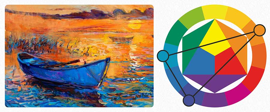
Have you ever walked into a store and felt an instant sense of calm? Or maybe you saw an app icon and felt a sudden spike of urgency to click it? That wasn’t an accident. It was design. Specifically, it was color working its quiet magic on your brain before you even read a single word. We like to think we’re logical creatures, making decisions based on facts and figures. But the truth is, we’re emotional beings who use logic to justify our feelings. And nothing triggers those feelings faster than hue, saturation, and brightness.
In the crowded digital landscape of 2026, where attention spans are shorter than ever, your brand’s color palette isn’t just decoration. It’s communication. It’s the first handshake, the first impression, and often, the deciding factor between a scroll-past and a conversion. Whether you’re launching a new startup or refreshing an old identity, understanding the psychology behind your color choices is no longer optional. It’s essential. Let’s dive into why this matters, how it works, and how you can use it to build a brand that doesn’t just look good, but feels right.
The First Seven Seconds
They say you never get a second chance to make a first impression. In branding, that window is tiny. Research suggests that people make a subconscious judgment about a product or person within the first seven seconds of interaction. A significant portion of that assessment is based on color alone. Some studies even push that number higher, suggesting up to 90% of snap judgments about products can be based on color alone. That’s a lot of pressure on a pigment, isn’t it?
Think about it. Before a customer reads your mission statement, checks your pricing, or looks at your portfolio, they see your logo. They see your website background. They see the button they need to click. If those colors clash with what your brand stands for, you’ve lost them before you’ve even started. It’s like showing up to a black-tie event in swim trunks. The message is wrong, even if the intent is good.
This isn’t just about aesthetics. It’s about cognitive ease. When colors align with consumer expectations, the brain processes the information faster. It feels familiar. Safe. Trustworthy. But when there’s a mismatch—like a bright neon pink for a serious law firm—the brain stumbles. It creates friction. And in a world where users can switch to a competitor with a single tap, friction is the enemy. You want your brand to feel like slipping into a favorite pair of jeans, not trying on a suit that’s two sizes too small.
Beyond Blue Means Trust
We’ve all heard the basics. Blue is trustworthy. Red is urgent. Green is natural. While these generalizations hold some water, relying on them blindly is a recipe for a generic brand. In 2026, consumers are smarter. They’ve seen thousands of blue tech logos and green eco-brands. They crave nuance. They want authenticity. And authenticity comes from using color in a way that reflects your specific brand personality, not just industry standards.
Take blue, for example. It’s the world’s favorite color, favored by 57% of men and 35% of women according to recent data. It’s safe. It’s reliable. That’s why banks and social media platforms love it. But if every fintech app uses the same shade of corporate blue, how do you stand out? Maybe you use a deep, midnight blue to suggest sophistication and exclusivity. Or perhaps you pair it with a vibrant electric teal to signal innovation and energy. The context changes everything.
And let’s talk about red. Yes, it raises heart rates. It’s great for clearance sales and food apps because it stimulates appetite. But it’s also the color of passion, love, and danger. A luxury lingerie brand might use a soft, dusty rose-red to evoke intimacy rather than urgency. A high-performance sports car brand might use a sharp, aggressive crimson to signal power. The same hue, completely different emotional resonance. It’s not just about picking a color; it’s about picking the right shade and pairing it with the right story.
The Cultural Context Trap
Here’s where things get tricky. Color isn’t universal. It’s deeply cultural. What signifies purity in one country might signify mourning in another. If you’re building a global brand, or even just a local brand in a diverse community, ignoring cultural context is a risky move. In Western cultures, white is often associated with weddings and cleanliness. In many Eastern cultures, it’s the color of death and funerals. Imagine the backlash if a wedding planning app launched in China with an all-white interface. Yikes.
This complexity has only grown in 2026 as brands become more global and digital borders dissolve. You can’t just copy-paste your US branding strategy to Japan or Brazil. You need to do the homework. Look at local symbolism. Understand historical associations. Sometimes, this means creating regional variations of your brand identity. Other times, it means choosing a neutral palette that transcends cultural specificities, letting your imagery and copy do the heavy lifting.
But it’s not just about national culture. There’s also subculture. Think about the difference between how a Gen Z audience perceives pastel goth aesthetics versus how a Baby Boomer might view them. One sees creativity and rebellion; the other might see confusion. Your color choices signal who belongs in your tribe. They act as a shibboleth, a secret handshake that tells your ideal customer, "We get you." So, ask yourself: Who are you talking to? And what colors speak their language?
The ROI of Getting It Right
Let’s talk money. Because at the end of the day, branding is a business tool. Does color psychology actually impact the bottom line? Absolutely. Data from recent years shows that consistent color presentation across all platforms can increase brand recognition by up to 80%. That’s huge. When people recognize your brand instantly, they’re more likely to trust it. And trust leads to sales.
Consider the power of the "call to action" button. Changing the color of a CTA button from green to red, or vice versa, can significantly impact conversion rates. But here’s the catch: there’s no single "best" color. It depends on the surrounding context. If your site is mostly green, a red button will pop. If it’s mostly red, a green button will stand out. It’s about contrast and visual hierarchy. Testing is key. A/B testing different color schemes can reveal surprising insights about what drives your specific audience to click.
Moreover, color affects perceived value. Studies have shown that people are willing to pay more for products packaged in colors that align with premium perceptions. Black, gold, and deep purple often signal luxury and exclusivity. Bright, primary colors might signal affordability and fun. If you’re selling a high-end consulting service, a cartoonish yellow logo might undermine your pricing strategy. You’re not just selling a service; you’re selling an experience. And color sets the stage for that experience before the curtain even rises.
Sustainability and the New Green
In 2026, sustainability isn’t just a buzzword; it’s a baseline expectation. Consumers are increasingly aware of the environmental impact of the products they buy, and this extends to branding materials. There’s a growing trend towards "eco-conscious" color palettes, but it’s deeper than just slapping a leaf green on your logo. It’s about authenticity. Are you using earthy tones because they reflect your actual supply chain practices? Or is it just greenwashing?
Customers can smell inauthenticity from a mile away. If you’re using muted, natural tones to signal sustainability, but your packaging is wrapped in non-recyclable plastic, the disconnect will hurt you. The psychology here is about alignment. The color promises a value, and the product must deliver it. We’re seeing a rise in brands using unbleached, raw paper colors, or inks derived from natural sources, not just for the aesthetic, but as a proof point of their commitment.
This shift also influences digital design. "Dark mode" isn’t just easier on the eyes; it’s marketed as energy-saving for OLED screens. Brands are adapting their palettes to look good in both light and dark modes, showing a consideration for user well-being and environmental impact. It’s a subtle signal, but it says, "We care about your experience and the planet." And in a world facing climate anxiety, that care goes a long way in building loyalty.
Practical Steps for Your Palette
So, how do you actually apply all this? Start with your brand values. Write them down. Are you playful? Serious? Innovative? Traditional? Once you have your core adjectives, look for colors that match those emotions. Don’t start with "I like blue." Start with "I want to feel trustworthy and calm," then explore which blues achieve that. Use tools like Adobe Color or Coolors to experiment with combinations, but always keep accessibility in mind. Ensure there’s enough contrast for people with visual impairments. It’s not just ethical; it’s good business.
Next, look at your competitors. What are they doing? If everyone is using blue, maybe you shouldn’t. Or maybe you should, but with a twist. Find the gap in the market. Look for the white space (or the colored space) that no one else is occupying. Then, test your choices. Show your palette to people in your target demographic. Ask them what words come to mind. Do they say "cheap" when you meant "affordable"? Do they say "aggressive" when you meant "bold"? Feedback is gold.
Finally, remember that consistency is king. Once you’ve chosen your palette, stick to it. Use it everywhere. Your website, your social media, your business cards, your email signatures. Repetition builds recognition. And recognition builds trust. Don’t be afraid to evolve over time, but make sure any changes are intentional and communicated clearly. Your color palette is a living part of your brand, but it needs a strong foundation to grow from. Take your time. Get it right.
Choosing the right colors for your brand isn’t a one-and-done task. It’s an ongoing conversation with your audience. It’s about listening, adapting, and staying true to who you are. In a world that’s getting louder and more chaotic every day, your brand’s color palette is a anchor. It provides stability. It provides meaning. It provides a way for people to connect with you on a visceral, human level.
Don’t underestimate the power of a well-chosen hue. It can turn a stranger into a customer, and a customer into a advocate. It can convey complex ideas in a split second. It can make your brand memorable in a sea of sameness. So, take the time to dig deep. Explore the psychology. Respect the culture. Test the results. And most importantly, choose colors that feel authentic to you. Because when you believe in your brand, others will too.
At the end of the day, branding is about connection. And color is one of the most powerful tools we have to forge that connection. Use it wisely. Use it boldly. And don’t be afraid to make a mistake along the way. Sometimes, the most memorable brands are the ones that dared to be different. So, what color will you choose?