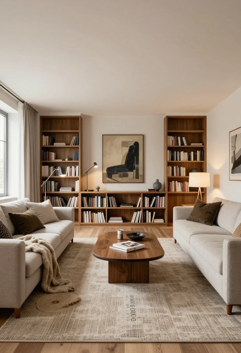
The midday sun tracks across the white oak floors of a downtown loft, creeping past the living room sectional, sliding over the waterfall quartz kitchen island, and finally resting against the dining room accent wall. In an older home, this shifting light would cross architectural boundaries, hitting stark color changes that sliced the floor plan into disjointed boxes. But here, the light moves uninterrupted. The walls do not clash; they whisper to one another in subtle shades of warm clay, quiet cream, and deep, grounding moss.
Open-concept living promised freedom when it first swept residential architecture, trading cramped, compartmentalized Victorian-style rooms for sweeping, light-filled vistas. Yet, anyone who has ever tried to paint an expansive great room that bleeds directly into a kitchen and dining area knows the hidden trap of this architectural layout. Without doors to act as natural circuit breakers, a color choice is no longer an isolated design decision. It is a commitment that ripples across the entire field of vision, capable of turning a high-end architectural space into a choppy, visually claustrophobic labyrinth if handled without care.
The challenge of 2026 interior architecture is not creating spaces, but connecting them. As homeowners lean away from stark minimalism and cold grays toward spaces that offer psychological shelter, the demand for sophisticated, flowing color palettes has reached an all-time high. Major color authorities like Benjamin Moore, Sherwin-Williams, and Dunn-Edwards have pivoted sharply toward palettes that mimic the natural world—warm neutrals, earthy foundations, and soft, restorative greens. Achieving this flow requires moving past old-fashioned ideas of matching paint chips and adopting a more sophisticated approach to visual continuity, lighting physics, and architectural rhythm.
The Architecture of Visual Continuity and Light Physics
Light is the ultimate master of interior color, and in an open-concept floor plan, it behaves like an itinerant traveler. A paint color that looks like a serene, overcast sky on a north-facing kitchen wall can instantly turn clinical and sterile when exposed to the blazing southern sun hitting the living room windows two puluh feet away. Understanding this variability is the foundation of any successful color flow strategy. When you strip away interior walls, you eliminate the natural light barriers that allow different rooms to hold entirely different micro-climates of color.
To master continuity, one must look at how color values shift across changing lighting conditions. This is where advanced metrics like Light Reflectance Value (LRV) and OKLCH color spaces become essential tools for the modern designer. LRV measures the percentage of light a paint color reflects, ranging from absolute zero for a pitch-black surface to 100 for pure white. In an open space, keeping the LRV values of your main wall colors within a tight window—typically a variance of no more than 10 to 15 points—prevents jarring visual leaps as the eye travels from the cooking zone to the lounging area.
Furthermore, the integration of adjacent materials dictates how color is perceived. A massive brick fireplace, black metal window frames, or walnut cabinetry act as fixed anchors in an open floor plan. Paint cannot simply be slapped onto drywall in isolation; it must engage in a visual dialogue with these permanent textures. By evaluating the undertones of your fixed elements—whether they lean toward the red warmth of cherry wood or the cool blue-grey of stainless steel—you establish a baseline anchor. From here, every color choice in the flowing palette becomes an echo or a subtle contrast of these foundational materials, ensuring the entire volume feels deliberate rather than assembled by accident.
Navigating 2026 Color Trends Through Quiet Luxury and Earthy Foundations
The design zeitgeist has firmly rejected the cold, flat greys of the past decade, replacing them with complex, living neutrals and rich biophilic tones. The 2026 trend landscape, as highlighted by forecasting groups and major paint manufacturers, centers around the concepts of "Quiet Luxury" and "Earthy Foundations." These are not merely passing fads; they represent a fundamental shift toward creating environments that soothe the nervous system while offering tactile sophistication. Quiet luxury relies on tonal layering—using varying shades of the same warm stone, ecru, or greige family across different zones to create depth without relying on high-contrast accent walls.
Simultaneously, biophilic influences have integrated organic pigments into mainstream palettes. Think of desaturated olive greens, sun-baked terracotta, chalky clay, and rich butterscotch neutrals. These hues work exceptionally well in open-plan layouts because they are derived from nature, where colors naturally transition without clashing. For example, pairing a soft linen neutral like Sherwin-Williams’ accessible beige alternatives in the main living space with a deeper, cocooning forest hue in a sunken den or a kitchen island creates a sense of journey. The eye moves naturally from the sunlit meadow of the neutral walls to the deeper woods of the kitchen cabinetry, maintaining an unbroken narrative of organic space.
The strategic application of these trend palettes requires matching color psychology directly to the functional zones of the floor plan. High-activity cooking and gathering areas benefit from "Dopamine Neutrals"—warm, uplifting shades that encourage social interaction and energy. Meanwhile, adjacent quiet zones or reading corners within the same open footprint can transition smoothly into restorative, muted greens or deep taupes. The secret lies in the bridge: an intermediate tone, often used in hallways, stairwells, or transitional architectural columns, that shares the exact undertones of both spaces, acting as a translator for the eye.
The Step-by-Step Blueprint for Crafting an Unbroken Color Flow
Creating a harmonious open-concept color scheme is a methodical design process that bridges architectural intuition with precise color science. Rushing straight to the paint store with a handful of random Pinterest saves is the quickest way to end up with a disjointed interior. Follow this field-tested methodology to build a bulletproof color flow across your connected spaces.
- Step 1 (Inventory Fixed Elements): Catalog every immovable material in your open space, including hardwood floors, tile, stone countertops, brickwork, and window frames. Identify whether their undertones are warm (yellow, red, orange) or cool (blue, green, violet) to establish your palette’s mandatory baseline.
- Step 2 (Establish the Anchor Neutral): Select your primary background color—the shade that will cover 60% of your walls. This should be a versatile, high-LRV neutral that adapts well to changing natural light throughout the day. Test large sample boards on multiple walls, observing them at 9 AM, 1PM, and sunset.
- Step 3 (Define the Functional Zones with Tonal Shifts): Choose secondary supporting colors for distinct functional areas, such as the dining nook or kitchen accent wall. Ensure these colors belong to the same color family or share the exact same chromatic saturation and undertone to maintain visual cohesion.
- Step 4 (Implement the 60-30-10 Rule Across Spaces): Distribute your palette intentionally across the entire open area: 60% dominant wall neutral, 30% secondary structural or furniture tone (like upholstery and cabinetry), and 10% accent color (found in art, ceramics, and textiles) that pulls the entire scheme together.
- Step 5 (Test the Sightlines): Stand at the primary entry points of your home and look straight through the open floor plan. Ensure that as your gaze travels from room to room, no single color shouts louder than its neighbors, and every transition feels as natural as the horizon meeting the sea.
Common Pitfalls and Field-Tested Workarounds in Open-Plan Coloring
Even seasoned designers occasionally stumble when tackling sprawling, wall-free floor plans. The absence of physical boundaries makes certain design errors much more punishing. Recognizing these traps before the first drop cloth is laid can save thousands of dollars in repainting costs and endless aesthetic frustration.
- Pitfall 1 (Chasing the Accent Wall Obsession): Applying a high-contrast, saturated accent wall in one corner of an open great room instantly traps the eye and shatters spatial flow. Workaround: If you want drama, use tonal depth instead of chromatic shock. Shift three shades darker within the same paint strip rather than introducing an entirely foreign hue.
- Pitfall 2 (Ignoring Undertone Clashes): Pairing a cool greige wall with warm honey oak floors creates an immediate, subconscious visual friction that makes a room feel uncomfortably "off." Workaround: Always use large peel-and-stick color samples placed directly against your flooring and fixed cabinetry rather than evaluating them on blank white paper.
- Pitfall 3 (Treating Rooms in Isolation): Selecting paint colors room-by-room without considering what is visible from adjacent spaces leads to a choppy, patchwork effect. Workaround: Create a unified master palette of four to five coordinated colors before starting, and use sample pots to paint large swatches where rooms intersect.
- Pitfall 4 (Overlooking Architectural Break Points): Stopping a paint color arbitrarily on a flat, continuous stretch of drywall looks amateurish and unplanned. Workaround: Always transition paint colors at natural architectural breaking points, such as an inside corner, the edge of a structural pillar, or the terminus of a ceiling beam.
- Pitfall 5 (Neglecting Finish Sheen Consistency): Mixing high-gloss, satin, and matte finishes haphazardly across contiguous walls creates distracting, uneven light reflections. Workaround: Keep your wall sheen consistent—preferably an ultra-matte or washable low-sheen eggshell—and reserve higher sheens strictly for trim, cabinetry, and ceilings.
The Macro View: Spatial Psychology, Resale Value, and Sustainable Design
The movement toward flowing, harmonious color palettes is more than an aesthetic preference; it is a direct response to our growing need for psychological sanctuary within the built environment. Environmental psychology confirms that our nervous systems process visual clutter and chaotic color shifts as low-level stress. In an open-plan home where the eye can roam freely across fifty feet of interior space, visual harmony translates directly into mental calm. When colors flow without interruption, the brain stops working overtime to reconcile jarring contrasts, allowing occupants to truly unwind in their living spaces.
From an economic perspective, mastering color flow directly impacts long-term property value. Homes with cohesive, thoughtfully executed open-concept designs consistently command higher market valuations because they project a custom, architect-designed feel. Prospective buyers walking into a home with a chaotic color scheme immediately calculate the time and expense required to neutralize the space. Conversely, a home that demonstrates sophisticated tonal flow feels larger, more luxurious, and instantly move-in ready.
Furthermore, sustainable design principles heavily influence how we select and apply these palettes today. Choosing high-quality, low-VOC mineral and clay-based paints not only improves indoor air quality within tightly sealed modern homes but also offers a richer, chalkier depth of finish that synthetic latex simply cannot replicate. These natural finishes age gracefully, developing a patina over time that interacts beautifully with natural light. By investing in timeless, earth-rooted palettes rather than fleeting, high-saturation novelties, homeowners reduce renovation waste, ensuring their interiors remain relevant and deeply comforting for years to come.
Actionable Frameworks for Lasting Interior Harmony
Translating the philosophy of flowing color into everyday reality requires a reliable framework that you can reference throughout your design journey. Whether you are building a new home from the ground up or undertaking a whole-house renovation, maintaining discipline in your color application is the single most important factor in achieving a magazine-worthy result.
First, build a physical mood board that includes not just paint chips, but physical clippings of your flooring, fabric swatches for large upholstery pieces, cabinet door samples, and metal finishes. Take this board and view it under different light sources—incandescent warm bulbs, daylight-balanced LEDs, and direct natural sunlight. If any element fights for dominance or looks muddy, swap it out before a single gallon of paint is purchased.
Second, embrace the power of the neutral bridge. Hallways, stairwells, and transitional entries are not dead spaces; they are the connective tissue of your open-plan home. Use these areas to anchor your primary neutral, allowing the more specialized functional zones to branch off gently into slightly deeper or lighter variations of the same tonal family.
Finally, remember that decorating an open-concept home is an evolutionary process. Resist the urge to fill every corner and paint every surface immediately. Live with your base neutral for a few weeks, observe how the light tracks across your architectural layout through different seasons, and let your supporting colors reveal themselves naturally through art, textiles, and carefully curated accents.
The modern open-concept home is a canvas that demands patience, restraint, and an acute sensitivity to light and space. By stepping away from the impulse to treat every room as an independent island and instead viewing your home as a single, continuous landscape, you unlock a profound sense of architectural grace. Color ceases to be merely a decorative coating; it becomes the very atmosphere of your daily life.
As we navigate an increasingly fast-paced world, the value of a home that breathes together cannot be overstated. When your kitchen, dining, and living areas converse in a unified visual language, the home transforms from a mere collection of rooms into a sanctuary of flow and light. Take your time, test your samples, respect the natural light, and let your open spaces find their true, enduring harmony.