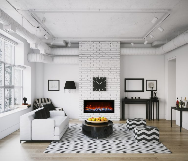
You walk into the living room, coffee mug in hand, and freeze. Something feels fundamentally wrong with the space. Your eyes bounce erratically from side to side, unable to rest. You trace the chaos to the built-in shelving unit flanking the fireplace—a jagged skyline of mismatched paperbacks, glossy art monographs squeezed in at odd angles, rogue knick-knacks, and dust-gathering souvenirs from a 2018 vacation. It was supposed to be a sophisticated display of your intellectual life and design sensibility. Instead, it looks like a warehouse explosion.
Books are dense, textured, and inherently chaotic. When we bring thousands of pages, varied typefaces, neon spines, and random decorative objects together in one vertical footprint, we create a sensory bottleneck. Most people assume that a cluttered bookshelf simply means they own too many books. They think the only solution is a ruthless purge or resigning themselves to visual disorder.
The reality is far more nuanced. Bookshelf clutter is rarely an issue of volume; it is almost always a failure of visual hierarchy, density control, and spatial rhythm. Interior designers do not necessarily own fewer books than you do. They simply apply strict, physics-based design principles to manipulate how the human eye moves across a surface. Understanding these rules shifts your shelves from an overwhelming storage dump into a calming, curated architectural feature.
The Cognitive Load of Chaotic Shelving and Why Your Eye Rejects It
Human vision seeks patterns, symmetry, and moments of visual rest. When an entire wall is packed edge-to-edge with clashing colors, competing spine heights, and haphazardly shoved objects, the human brain has to process an enormous amount of unstructured data simultaneously. This cognitive friction triggers a subtle sense of stress. It is the exact same reason a messy kitchen counter or an overflowing desk makes it difficult to concentrate. Your living room bookshelves are among the largest continuous surface areas in your home, meaning their visual impact dictates the psychological tone of the entire room.
Part of the problem stems from how we acquire books. They enter our homes one by one over decades—a neon-pink thriller bought at an airport, a muted linen-bound classic inherited from a grandparent, a stark white technical manual, and a stack of trade paperbacks with mismatched publisher logos. Left to accumulate naturally, these objects fight one another for dominance. Spine heights fluctuate wildly from eight inches to fourteen inches, creating an erratic jagged line that pulls the eye up and down in a jittery, exhausting dance.
Furthermore, people treat bookshelves as purely utilitarian drop zones rather than curated displays. We shove board games, stray charging cables, unread mail, and decorative items onto the closest available empty gap. This accumulation of miscellaneous items breaks the continuity required for a clean aesthetic. To reclaim your space, you have to look past the physical weight of the books and start evaluating them as geometric shapes, color fields, and blocks of texture that require intentional arrangement.
Deconstructing the Five Major Styling Traps That Create Instant Visual Chaos
Before attempting any layout overhaul, you must diagnose the specific mechanical errors that sabotage your shelves. Professional stylists consistently encounter the same five architectural mistakes in residential homes. The first is the "Wall-to-Wall Brick" trap. This happens when every single cubic inch of shelf space is crammed with books shoved all the way to the back wall. This eliminates depth, trapping light and casting heavy shadows that make the entire structure look heavy and oppressive.
The second trap is the "Uniformity Fallacy." Many homeowners read an organizing tip online and decide to arrange every single book strictly by height or strictly by color. While color-coding can look striking in a stylized photograph, doing it without variation can render your collection entirely unusable if you actually need to find a specific reference book. More importantly, absolute uniformity strips a bookshelf of its organic soul, making it look less like an intellectual’s library and more like a retail display in a fast-fashion home goods store.
The third mistake involves the misuse of decorative objects. Trinkets, plants, ceramics, and framed photographs are meant to punctuate a shelf, not overwhelm it. When decor items are scattered haphazardly or sized too small for the deep shelves, they look like floating debris. The fourth error is neglecting negative space—the deliberate absence of items. Negative space is the architectural breathing room that allows the eye to appreciate the surrounding objects. Without it, your styling has no cadence or rhythm. Finally, the fifth trap is ignoring the weight distribution of the shelves themselves, putting all the heavy hardcovers on the top tiers and lightweight paperbacks on the bottom, which violates our innate gravitational expectations and creates unconscious visual unease.
A Step-by-Step Methodology to Strip, Sort, and Restyle Your Bookcase
Transforming a chaotic shelving unit requires a systematic approach. You cannot fix a messy shelf by shuffling items around while they are still on display. You must wipe the slate entirely clean, evaluate every individual object, and rebuild with ruthless intentionality. Follow this step-by-step framework to overhaul your space over a single weekend.
- Step 1 (The Total Strip Down): Remove every single book, object, and piece of dust from the shelving unit. Place them in broad categories on the floor—hardcovers, paperbacks, art books, and decor items. Wipe down the raw shelves with a microfiber cloth and appropriate wood or metal cleaner.
- Step 2 (The Relentless Editorial Cull): Inspect every book. Ask yourself if you will realistically read it again, if it holds deep sentimental value, or if its physical design contributes positively to your home. Donate damaged paperbacks with missing pages or yellowed, brittle stock. Box up books you have outgrown and send them to local libraries or shelters.
- Step 3 (Categorization and Size Mapping): Group your remaining books by physical height and depth rather than strictly by genre. Measure the vertical clearance of your shelves to ensure oversized coffee table books or tall folios will actually fit before you attempt to place them.
- Step 4 (Establishing the Anchor Elements): Begin placing your largest, heaviest books first. Anchor the bottom shelves with heavy hardcovers and large art monographs. Distribute these weighty items diagonally across the unit rather than clumping them all on one side to create balanced visual weight.
- Step 5 (Balancing Vertical and Horizontal Rhythms): Mix vertical book rows with horizontal stacks. Use horizontal stacks of three to five books as elevated platforms for smaller decorative objects, heavy ceramic bookends, or trailing plants like a Pothos or Philodendron hederaceum that soften the harsh lines of the woodwork.
Advanced Styling Adjustments and How to Sidestep Common Frustrations
Even after a complete overhaul, you might step back and notice that something still feels slightly "off." Master stylists rely on specific fine-tuning techniques to correct these lingering issues. One common frustration is the awkward gap left at the back of deep bookshelves, which causes books to slip backward and look swallowed by darkness.
- Pitfall 1 (The Sunken Book Syndrome): Books pushed all the way to the back wall lose their presence and cast deep shadows. Practitioner Workaround: Pull all your books forward until their front edges are flush with the outer rim of the shelf. If your shelves are exceptionally deep, place a small piece of wood, a folded piece of cardboard, or foam board behind the books as a spacer to keep them permanently pushed forward to the front edge.
- Pitfall 2 (Visual Monotony): All books look the same color family or create a dull, uniform block. Practitioner Workaround: Remove paper dust jackets from hardcovers to reveal the raw, textured linen, buckram, or matte paper bindings underneath, which instantly adds sophisticated, tactile warmth and mutes loud publisher marketing text.
- Pitfall 3 (Overcrowded Trinkets): Too many tiny decorative objects competing for attention. Practitioner Workaround: Follow the "Rule of Three" or odd-numbered groupings. Group small objects together on top of horizontal book stacks to create a unified focal point rather than letting them float independently.
- Pitfall 4 (Lack of Breathing Room): Every single shelf is packed with items from end to end. Practitioner Workaround: Intentionally leave at least 30 to 40 percent of total shelf space completely empty. Let the wall behind the shelf show through; this negative space is what elevates a storage unit into a high-end designer display.
- Pitfall 5 (Unstable Bookends): Books leaning at awkward forty-degree angles because there is no structural support. Practitioner Workaround: Invest in heavy, solid brass, cast iron, or stone bookends weighing at least three to five pounds. Alternatively, use heavy decorative sculptures or large ceramic vessels as functional bookends at the terminal ends of every row.
The Architectural Integration of Bookshelves in Modern Interior Design
Shelving is never just furniture; it is an extension of the room’s architecture. In contemporary interior design trends, built-in floor-to-ceiling bookcases are treated as major millwork investments that dictate the focal point of a room, often rivaling fireplaces or expansive windows. When you style these large installations, you are essentially designing a three-dimensional composition that interacts with natural light, room acoustics, and traffic flow.
Consider how light interacts with your shelves throughout the day. Direct afternoon sun can bleach colorful paperbacks and damage delicate bindings, making UV-filtering window treatments or strategic placement essential for valuable collections. Furthermore, the materials of your shelving unit matter immensely. Warm white oak, walnut, or ebonized ash absorb light differently than painted MDF or industrial steel framing. A glossy lacquer shelf reflects ambient light and requires tighter editing to avoid looking chaotic, whereas a matte wood finish absorbs visual noise and forgives minor styling imperfections.
By treating your bookshelves as an evolving gallery rather than a permanent storage locker, you unlock a dynamic design element that can shift with the seasons. Swapping out heavy ceramic objects for lighter glass vessels in the spring, or introducing rich-toned velvet boxes and brass accents in the autumn, keeps the display feeling fresh and intentional without requiring you to buy a single new book.
Practical Frameworks for Maintaining a Curated Look Year-Round
Achieving a clean bookshelf is a milestone, but maintaining it requires a sustainable maintenance routine. Without simple guardrails, entropy takes over within months as new titles arrive and household items migrate onto your pristine surfaces. Implement these straightforward operational rules to keep your shelves looking immaculate long-term.
- The One-In, One-Out Rule: For every new hardcover or paperback you purchase and add to your primary display shelves, an existing book must be evaluated for donation, relocation to basement storage, or gifting. This caps your volume at a sustainable visual threshold.
- The Seasonal Reset: Dedicate twenty minutes four times a year—at the turn of each season—to walk up to your shelves, remove any rogue mail or coffee mugs that have crept onto the ledges, dust the surfaces, and shift a few displays to keep the composition dynamic.
- The Functional Divide: Designate specific, lower-tier zones for utilitarian items if your home lacks closed storage, but conceal them behind woven baskets, linen storage boxes, or architectural storage bins that match your room’s color palette.
- The Readability Test: Never sacrifice the primary function of your library for pure aesthetics. Ensure that your most frequently referenced cookbooks, field guides, or professional volumes remain accessible without requiring a ten-minute teardown of decorative styling objects.
Your bookshelves are living testaments to your intellectual curiosities, aesthetic evolutions, and personal history. They are not museum exhibits meant to remain frozen in time, nor are they industrial dumping grounds for the things you do not know what to do with. By understanding the visual mechanics of clutter—managing density, honoring negative space, anchoring with weight, and breaking up monotonous rows—you bridge the gap between utility and high design.
Take a step back from your home library today with fresh eyes. Strip away the visual noise, embrace the breathing room of empty space, and let your favorite stories finally take center stage in an environment designed to showcase them with grace and clarity.