You know that feeling. The one where your chest feels tight, your jaw is clenched so hard it hurts, and your brain won’t stop replaying that awkward email you sent at 4 PM. It’s Friday night, or maybe just Tuesday evening, and you are exhausted. Not the good kind of tired from a long hike, but the drained, frayed-at-the-edges kind. You walk through your front door, drop your bag, and look around. What do you see? If your walls are screaming bright red or your lighting is harsh and clinical, your nervous system might be getting the wrong memo. It thinks the stress isn’t over.
But what if the answer to switching off wasn’t another app, another meditation session, or a glass of wine? What if it was already on your walls? We spend so much time curating our digital feeds and optimizing our work schedules that we forget our physical environment is talking to our brains constantly. And most of the time, we aren’t even listening. In 2026, as burnout rates continue to climb and remote work blurs the lines between office and sanctuary, understanding the hidden language of color has become less about interior design trends and more about mental health survival.
Let’s be real for a second. You don’t need a degree in psychology to feel the difference between a sterile white hospital room and a cozy, dimly lit cabin with wood tones. Your body knows. Your heart rate slows down. Your breathing deepens. This isn’t magic; it’s biology. By tweaking the colors in your immediate surroundings, you can send a direct signal to your amygdala—the part of your brain responsible for fight-or-flight responses—that says, "Hey, we’re safe now. You can stand down." It’s a subtle shift, but over time, it changes everything.
The Science of Seeing: Why Your Eyes Talk to Your Nervous System
It starts with light. When photons hit your retina, they don’t just create an image; they trigger a cascade of neurological events. Recent studies from late 2025 have reinforced what designers have known for decades: color affects physiological markers like blood pressure, heart rate, and even hormone production. When you stare at a bright, saturated red, your body prepares for action. It’s primal. Red is the color of blood, of fire, of danger. It spikes adrenaline. That’s great if you’re running from a bear, but terrible if you’re trying to decompress after a Zoom marathon.
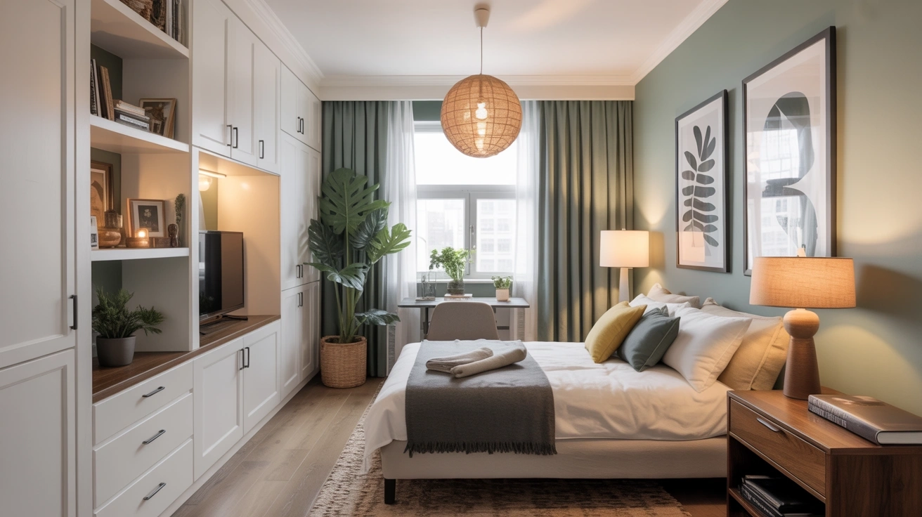
On the flip side, cooler tones like blues and greens have a measurable sedative effect. Research published earlier this year showed that participants who spent just twenty minutes in a room painted in soft sage green had significantly lower levels of cortisol, the primary stress hormone, compared to those in beige or gray rooms. It’s not just about preference; it’s about wavelength. Longer wavelengths (reds, oranges) are stimulating. Shorter wavelengths (blues, violets) are calming. Your brain processes these signals before you’re even consciously aware of them.
This is why walking into a spa feels different than walking into a fast-food joint. Spas use earth tones, soft greens, and muted blues to induce a parasympathetic state—the "rest and digest" mode. Fast-food chains use red and yellow to make you eat quickly and leave. When you’re stressed, your body is stuck in sympathetic overdrive. Choosing the right colors in your home is essentially hacking your autonomic nervous system. You’re manually overriding the alarm bells. It’s a simple biological trick, but in our hyper-stimulated world, it’s powerful.
Blue Is Not Just a Color, It’s a Brake Pedal
If there’s one color that acts as a universal tranquilizer, it’s blue. But not all blues are created equal. Think about the difference between a neon electric blue and the soft, hazy blue of the sky just before dusk. The latter is what we’re after. Psychologists call this "soft blue" or "powder blue," and it’s associated with openness, peace, and stability. In 2026, with anxiety disorders on the rise, interior therapists are prescribing pale blue accents for bedrooms and living areas more than ever before.
Why does it work? Evolutionarily, humans have always looked to the sky and water for safety. Clear skies meant good weather; calm water meant safe passage. These associations are hardwired into our DNA. When you surround yourself with these hues, you’re tapping into an ancient sense of security. A 2024 survey found that people who painted their bedroom walls a light shade of blue reported falling asleep 15 minutes faster on average than those with white or gray walls. That’s fifteen extra minutes of rest, every single night.
However, there’s a catch. Too much blue, especially cool-toned blue, can feel cold or depressing if not balanced. It’s important to add warmth through textures—think wool throws, wooden furniture, or warm lighting. The goal isn’t to turn your home into an iceberg. It’s to create a backdrop that allows your mind to slow down. Try adding a navy accent pillow or a teal rug if you’re not ready to commit to painting walls. Even small doses can lower your heart rate. It’s about creating a visual exhale.
Green: The Original Antidote to Digital Fatigue
We spend roughly ten hours a day looking at screens. By the time evening rolls around, our eyes are strained, and our brains are fried from processing infinite scrolls and rapid-fire information. This is where green comes in. Green sits right in the center of the visible light spectrum, making it the easiest color for the human eye to process. It requires zero effort to look at. That’s why nature feels so restorative. It’s literally easier on your hardware.
In recent years, the concept of "biophilic design" has moved from a niche architectural trend to a mainstream necessity. This approach integrates natural elements into built environments, and green is the star player. But it’s not just about paint. It’s about plants. Real, living plants. Studies in 2025 highlighted that the combination of the color green and the presence of actual foliage reduces mental fatigue by up to 30%. The color signals nature, and the plant provides proof of life. Together, they ground you.
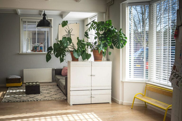
If you don’t have a green thumb, don’t worry. You don’t need a jungle. A single large monstera plant in a corner, or a few pots of herbs on the windowsill, can shift the energy of a room. If live plants aren’t an option, opt for artwork featuring landscapes or forests. The key is saturation. Avoid neon greens or lime shades, which can be jarring. Stick to olive, sage, moss, or forest green. These deeper, muted tones evoke the feeling of being under a canopy of trees. It’s a shield against the digital noise outside.
Warm Neutrals: The Hug You Didn’t Know You Needed
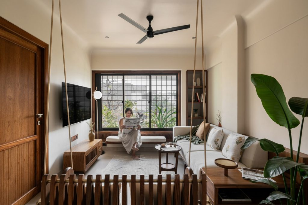
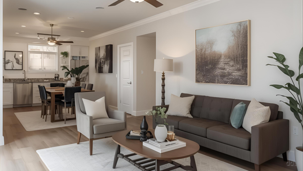
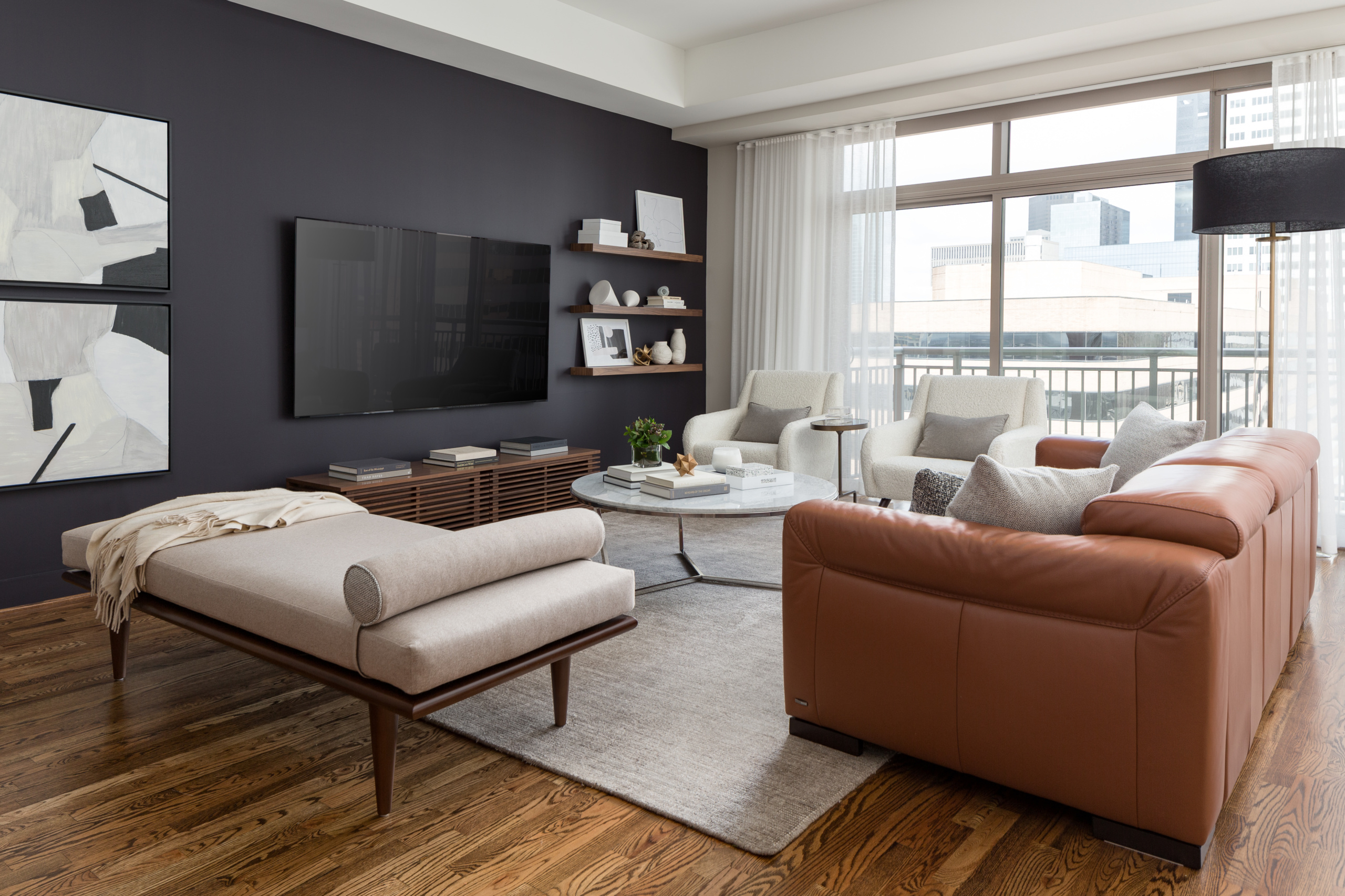
Sometimes, cool colors feel too distant. When you’re stressed, you might crave warmth, comfort, and containment. This is where warm neutrals shine. We’re talking about creams, beiges, taupes, and soft terracottas. These colors mimic the earth, sand, and stone. They are grounding. Unlike stark white, which can feel clinical and expose every flaw, warm neutrals wrap around you. They create a sense of cocooning. In psychological terms, they reduce sensory overload.
Think about the last time you felt truly cozy. Chances are, you weren’t in a room with bright white walls and chrome fixtures. You were probably somewhere with soft, warm tones and soft textures. Warm neutrals reflect light gently, avoiding harsh shadows and glare. This softness is crucial for relaxation. Harsh contrasts keep the brain alert, scanning for details. Soft, low-contrast environments allow the brain to rest. It’s the visual equivalent of whispering.
In 2026, there’s been a shift away from the "millennial gray" trend toward what experts are calling "warm minimalism." This style uses layered neutrals to create depth without chaos. It’s not boring; it’s intentional. By stripping away visual clutter and using a palette of soothing earth tones, you create a space that feels stable. Stability is the opposite of stress. When your environment feels predictable and soft, your guard comes down. You can finally let go of the tension you’ve been carrying in your shoulders all day.
The Trap of Yellow and the Power of Dimming
Yellow is tricky. On one hand, it’s the color of sunshine and happiness. On the other, it’s the most fatiguing color for the eye. Bright yellows stimulate the anxiety centers of the brain. If you’re already stressed, a room with bright yellow walls can make you feel agitated and unable to focus. It’s too much energy. However, soft, buttery yellows or gold tones can be warm and inviting. The key is intensity. High saturation equals high arousal. Low saturation equals calm.
This brings us to lighting, which is arguably more important than paint color. You can have the perfect calming blue wall, but if you blast it with 5000K daylight bulbs at 8 PM, you’re sabotaging your efforts. Light temperature matters. In the evening, you want warm light—around 2700K or lower. This mimics the setting sun and triggers the release of melatonin, the sleep hormone. Cool, blue-rich light suppresses melatonin and keeps you awake and alert.
Make it a habit to dim your lights as the day progresses. Use lamps instead of overhead fixtures. Overhead lighting creates shadows on faces and feels interrogative. Lamps create pools of light that feel intimate and safe. Consider smart bulbs that automatically shift from cool to warm as the sun sets. It’s a small change, but it aligns your indoor environment with your circadian rhythm. When your body’s internal clock is in sync with your environment, stress dissipates naturally. It’s about working with your biology, not against it.
So, how do you actually do this? You don’t need to renovate your entire house. Start small. Identify the one spot in your home where you go to decompress. Is it your bedroom? Your reading nook? The bathtub? Focus there first. Look at the dominant colors. Are they loud? Are they clashing? If so, introduce a calming element. Buy a throw blanket in sage green. Swap out a bright red poster for a landscape print. Change your lightbulbs to warm white.
Next, pay attention to your digital environment. Your phone and computer screens are huge sources of color stress. Enable "night shift" or "eye comfort" modes on all your devices after sunset. These features filter out blue light, warming up the screen. It makes a huge difference in how relaxed you feel while scrolling. Also, consider your wallpaper. A chaotic, busy background adds subconscious visual noise. Switch to a solid, muted color or a simple, dark pattern. Less is more.
Finally, trust your instincts. Psychology provides guidelines, but personal association matters. If you hate blue, painting your room blue won’t help, no matter what the science says. Maybe you find calm in deep purple or soft pink. The goal is to identify what makes you feel safe and still. Experiment. Notice how you feel in different spaces. Keep a mental note of which colors make your shoulders drop. Then, invite more of those into your life. It’s not about following rules; it’s about creating a sanctuary that speaks your language.
Stress isn’t going away. The world is loud, fast, and demanding. But your home doesn’t have to be. By understanding the hidden psychology of color, you gain a tool that’s always available, free, and immediate. You can’t control your boss, your inbox, or the news cycle. But you can control the light in your living room. You can choose the color of your sheets. You can decide what your eyes rest on when you walk through the door. These small choices add up. They build a buffer between you and the chaos. And sometimes, that buffer is exactly what you need to breathe again.