Ever walked into a friend’s house and felt instantly relaxed? You couldn’t quite put your finger on why. The furniture wasn’t necessarily new. The walls weren’t painted some exotic shade of blue. But something just… worked. It felt right. Chances are, it wasn’t luck. It was layout.
We often think design is about buying the right sofa or finding the perfect rug. But the real magic happens before you spend a dime. It’s about how things sit in relation to each other. It’s about flow, balance, and those tiny adjustments that turn a chaotic room into a sanctuary. In 2026, with homes getting smaller and our need for comfort getting bigger, mastering these spatial tricks is more important than ever.
Let’s be honest. Most of us are working with what we’ve got. We aren’t all knocking down walls or buying custom-built everything. But you don’t need a massive budget to make a space feel high-end. You just need to know where to put stuff. Here are the layout secrets pros have been using for years, simplified for the rest of us.
Floating Furniture Instead of Pushing Against Walls
The biggest mistake people make? Shoving every piece of furniture against the wall. It feels like it saves space, but it actually kills the vibe. It creates a "dance floor" effect in the middle of the room that no one uses. It makes the space feel empty in the center and cramped at the edges.
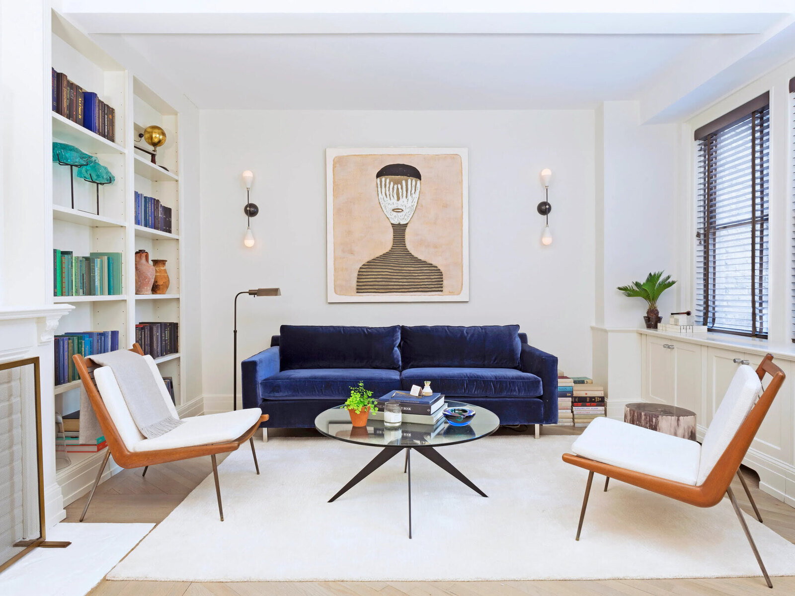
Try pulling your sofa even just six inches away from the wall. Better yet, float it entirely in the room if you have the square footage. This creates a pathway behind it, which adds depth. It makes the room feel larger because your eye can travel further. It also defines the seating area as its own little zone, separate from the rest of the house.
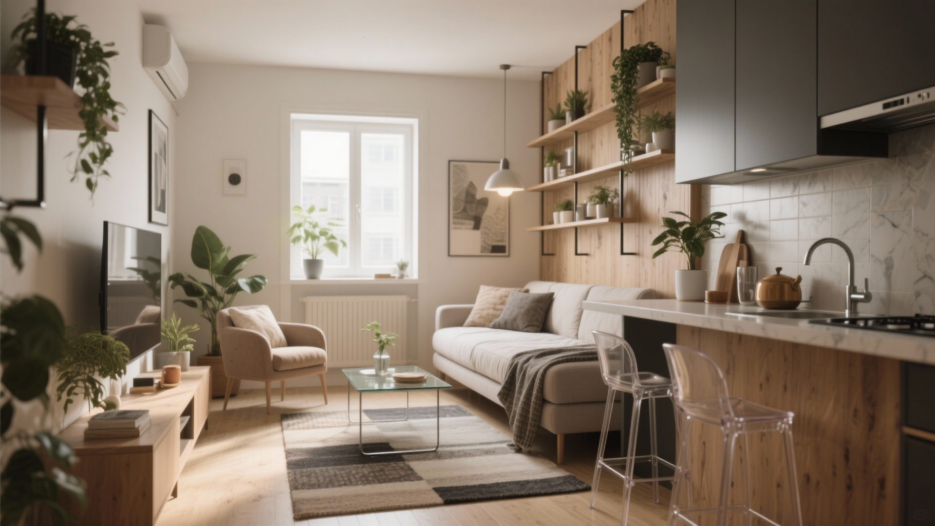
If you’re worried about stability, use a console table behind the sofa. It gives you a spot for lamps, books, or that cup of coffee you always seem to lose. This trick works in tiny apartments too. Just scale it down. A small loveseat floated slightly off the wall can make a studio feel like it has distinct "rooms." It’s about creating intentionality. When furniture floats, it feels curated. When it hugs the walls, it feels like storage.
Creating Intimate Conversation Zones
Have you ever been in a living room where you had to shout to hear the person sitting across from you? That’s a layout fail. Good design is about connection. It’s about making sure people can talk without straining their necks or their voices. The goal is to create intimate clusters, not a lecture hall setup.
Arrange your seating so that faces are within eight to ten feet of each other. If you have a large sectional, break it up with a couple of armchairs angled inward. Think of it like a campfire circle. Everyone should feel included. If you have a huge room, don’t try to fill it with one giant grouping. Split it into two smaller zones. Maybe one area for watching TV and another for reading or playing games.
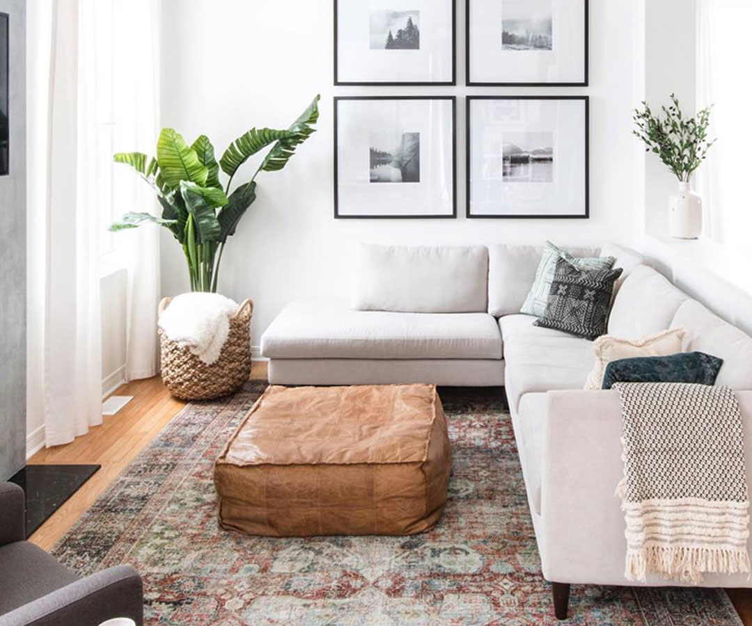
Use rugs to anchor these zones. A rug acts like a visual boundary. It tells your brain, "This is where the chatting happens." Even if the furniture isn’t touching the rug, having all the front legs on it helps tie the group together. This is a classic hack that costs nothing but rearranging. It instantly makes a space feel cozier and more inviting. People linger longer in rooms where they feel physically comfortable and socially connected.
Mastering the Art of Vertical Balance
We spend so much time looking at the floor plan that we forget to look up. But vertical space is huge. Literally. If all your furniture is low to the ground, the room can feel flat. If everything is tall, it feels claustrophobic. You need a mix. You need eye movement to travel up and down, not just side to side.
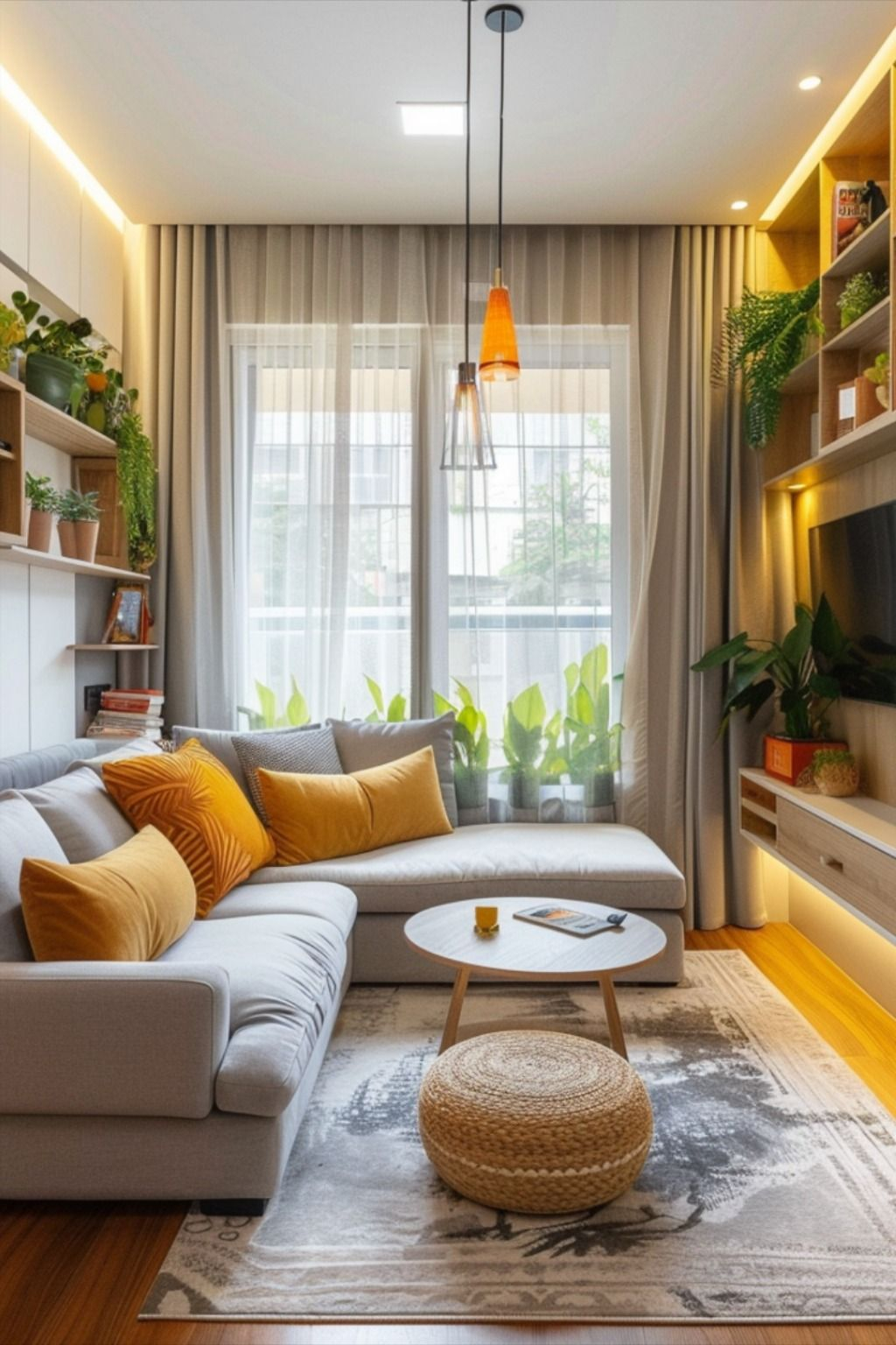
Start with your curtains. Hang them high. Like, really high. Close to the ceiling, not just above the window frame. This draws the eye upward and makes the ceilings feel taller. It’s an old trick, but it works every single time. Pair this with a tall floor lamp or a vertical piece of art. Something that stretches the space vertically.
Then, balance it with low profiles. A low coffee table or a sleek media console keeps the sightlines open. This contrast creates rhythm. It stops the room from feeling boxy. In 2026, we’re seeing a lot of mixed heights in shelving units too. Don’t line up all your bookshelves to be the same height. Mix a tall cabinet with a lower credenza. It breaks up the visual weight and makes the wall feel dynamic rather than static. It’s less about symmetry and more about balance.
Using Mirrors to Multiply Light and Space
Mirrors are basically cheat codes for interior design. They bounce light around. They reflect views. They make a small room feel twice as big if you place them right. But most people hang them wrong. They treat them like pictures, sticking them at eye level in the middle of a blank wall. That’s okay, but it’s not maximizing their potential.
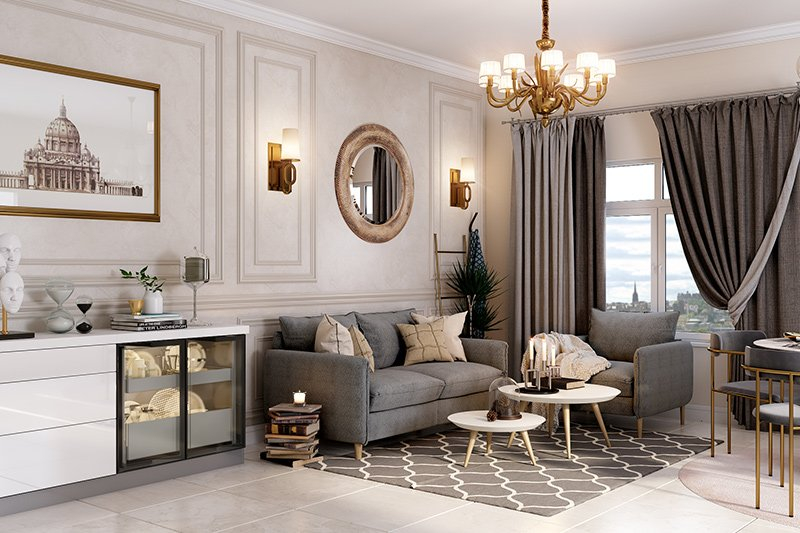
Place a mirror opposite a window. This captures the natural light and throws it back into the room. It brightens up dark corners instantly. If you have a nice view, even if it’s just a tree outside, mirror it. It brings the outdoors in. For narrow hallways or small entryways, a large floor-leaning mirror can make the space feel wide open. It adds depth where there was none.
You can also use mirrors to reflect a beautiful part of the room. Got a stunning chandelier? A cool piece of art? Put a mirror where it reflects that feature. It doubles the impact. Just be careful what you’re reflecting. You don’t want to mirror a cluttered corner or a messy pile of laundry. Keep it intentional. A chic oval mirror or a set of smaller mirrored tiles can add texture too. It’s not just about size; it’s about sparkle and dimension.
Layering Lighting for Depth and Mood
One overhead light is the enemy of coziness. It flattens everything. It creates harsh shadows. It makes a room feel like a dentist’s office. To elevate a space, you need layers. You need ambient light, task light, and accent light. This sounds technical, but it’s actually pretty simple. It just means having different types of lights turned on at different times.
Start with the ambient layer. This is your general illumination. Maybe it’s recessed lighting or a central fixture. But don’t rely on it alone. Add task lighting where you need it. A reading lamp next to the chair. A small lamp on the desk. Then, add accent lighting. This is the secret sauce. LED strips behind a TV. A small spotlight on a plant. Candles on the mantle.
In 2026, smart bulbs make this easier than ever. You can change the color temperature with your phone. Warm light (around 2700K) is best for relaxing. Cooler light is better for working. Mix them. Have warm lamps for the evening and brighter overheads for cleaning or reading fine print. The key is to have multiple switches. Never let one switch control the whole room. Give yourself options. Dimmers are your best friend. They let you adjust the mood instantly. A well-lit room feels expensive. A poorly lit one feels cheap, no matter how nice the furniture is.
This is the hardest one. We love our stuff. We hold onto things because they were gifts, or because they were expensive, or because we might need them someday. But clutter kills design. Not just physical clutter, but visual clutter. Too many patterns. Too many knick-knacks. Too many competing focal points.
Designers edit ruthlessly. They take things away until the room breathes. Try removing one item from every surface. See how it feels. Often, less is more. Leave some walls bare. You don’t need art in every single spot. Negative space—the empty areas—lets the eye rest. It highlights the pieces you do have. If everything is special, nothing is special.
Focus on flow. Can you walk through the room without bumping into things? Is there a clear path? If not, move something. Sometimes moving a chair three feet to the left opens up the whole room. It’s about airiness. In small spaces, this is critical. Keep surfaces clear. Use hidden storage. Let the architecture of the room shine. It feels calmer. It feels more luxurious. Luxury is often just space and light. By editing your layout, you’re creating both. It takes courage to remove things, but the result is always worth it. Your home should feel like a exhale, not a holding pen for objects.
So, where do you start? Pick one room. Just one. Look at it with fresh eyes. Move the sofa. Hang that mirror higher. Swap a lamp. See what happens. You don’t need a renovation. You just need a new perspective. These hacks aren’t about following rigid rules. They’re about understanding how space affects feeling. And honestly, isn’t that what home is supposed to be? A place that feels good.