You know that feeling when you walk into a room that looks like it belongs in a magazine, yet something feels… wrong? It’s not the color. The furniture is nice. But the air feels heavy, or maybe too empty. You can’t quite put your finger on it. Chances are, you’re staring at a proportion problem. Specifically, a mid-century modern proportion problem. We’ve all seen it. The oversized sofa swallowing a tiny living room. The wall of windows that feels more like a fishbowl than a connection to nature.
It’s frustrating because mid-century modern (MCM) is supposed to be easy. It’s supposed to be livable. Between 1945 and 1969, designers weren’t just making art; they were solving problems for real people. They wanted homes that worked. But somewhere along the way, we started treating MCM like a costume party. We buy the "look" without understanding the logic. And the logic is almost entirely about scale. If you get the proportions wrong, the whole house feels like it’s holding its breath.
Let’s talk about what’s actually going on. Because fixing this isn’t about buying more expensive stuff. It’s about seeing space differently.
The Window Trap: Bigger Isn’t Always Better
Here is the biggest lie we tell ourselves about mid-century design: more glass equals more modern. You see it everywhere in 2026 renovations. People tear out standard windows and slap in floor-to-ceiling sheets of glass, thinking they’re channeling Case Study House vibes. But here’s the thing. Original mid-century homes were built with rhythm. The windows had frames. They had mullions. They broke up the view into manageable, human-sized chunks.
When you install a single pane of glass that spans twenty feet, you destroy that rhythm. It doesn’t look modern; it looks like a commercial storefront. As noted by experts in classical proportion design for mid-century homes, oversized windows often break the harmony of the facade. The original architects used window placement to frame specific views, not to erase the wall entirely. They understood that a window is a picture frame, not a hole in the wall.
Think about the human eye. We scan scenes in segments. A series of three vertical windows allows the eye to rest and travel. One giant sheet of glass overwhelms the senses. It creates a visual vacuum. If you’re renovating an older tract home from the 50s or 60s, respect the existing openings. If you must expand them, keep the divisions. Use black steel or wood mullions to recreate that grid. It grounds the space. It makes the vastness of the outdoors feel digestible, rather than intrusive.
Furniture Scale: The Low-Slung Lie
We love the idea of low-profile furniture. It’s iconic. But there’s a massive difference between "low-slung" and "invisible." A common mistake in 2026 interiors is choosing pieces that are so low and shallow they disappear into the carpet. This isn’t sleek; it’s uncomfortable. And it throws off the vertical balance of the room. Mid-century modern wasn’t just about horizontal lines; it was about the interplay between horizontal and vertical.
Consider the classic Eames lounge chair. It’s low, yes. But it’s also deep and substantial. It has weight. Contrast that with some of the flimsy reproductions flooding the market today. They look like toys. When you fill a room with furniture that lacks visual mass, the ceiling feels like it’s crushing down on you. The room feels unanchored. You need pieces that occupy space with confidence.
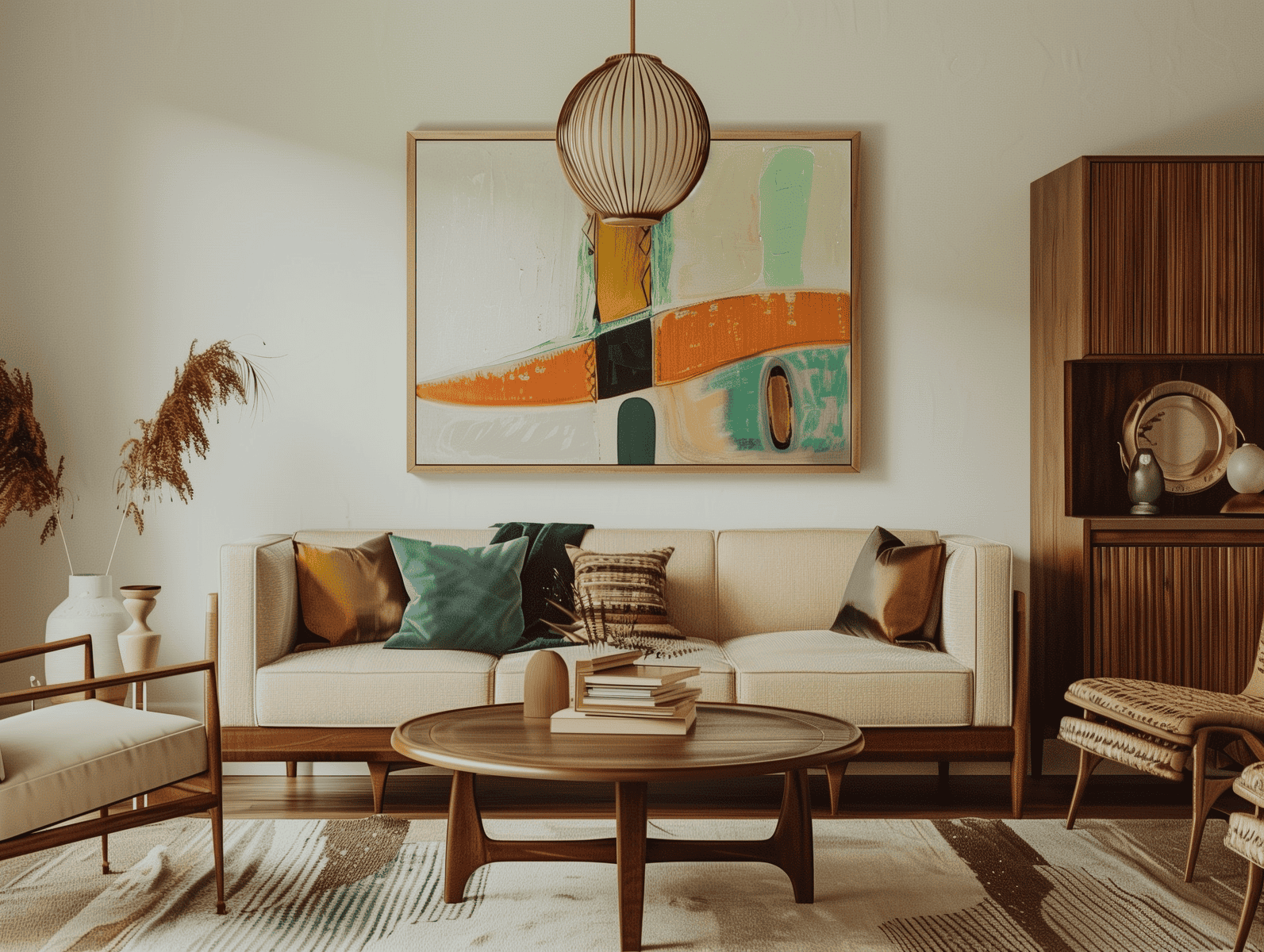
Look at the leggy sideboards and credenzas of the era. They were raised off the floor to create a sense of lightness, but their tops were at a functional height. They balanced the low sofas. If your sofa is super low, you need taller elements elsewhere. A tall bookshelf. A floor lamp with a high arc. A piece of art hung slightly higher than you think. It’s about counterweight. Don’t let everything sink to the floor. Lift the eye back up. Otherwise, you’re just decorating a bunker.
The Ceiling Height Misconception
People assume mid-century modern means flat, low ceilings. This is partly true for some tract housing, where efficiency ruled. But the iconic MCM homes—the ones we drool over on Pinterest—often featured dramatic vaulted ceilings or exposed beams that drew the eye upward. The mistake happens when we try to force a "mid-century" aesthetic into a box with eight-foot ceilings by cluttering the upper space.
In many quick-built homes from the 40s to the 70s, charm came at the cost of balance. When modern updates ignore that context, things get worse. If you have lower ceilings, you cannot use bulky overhead lighting. You can’t hang massive chandeliers. You need to emphasize the horizontal. But you also need to avoid the "cave effect." How? By keeping the walls clean and using vertical lines sparingly but strategically.
A common error is installing recessed lighting everywhere. It flattens the space. Instead, use sconces. Use floor lamps. Keep the light sources at eye level or below. This creates a cozy, intimate atmosphere that mimics the human scale of the original designs. If you do have high ceilings, don’t leave them bare. Expose the structure if you can. Let the beams be the art. The proportion of the void above you matters just as much as the furniture below you. It’s about volume, not just square footage.
Open Plan Chaos: Defining Space Without Walls
The open floor plan is the hallmark of mid-century living. It was revolutionary. It connected the kitchen to the living room, the indoors to the outdoors. But here’s what most people get wrong in 2026: they think "open" means "empty." They remove walls and then panic because the space feels like a gymnasium. So they shove furniture against the walls, leaving a dead zone in the middle. Or they cluster everything in one corner, leaving the rest echoing.
True mid-century openness was about zoning. Architects used changes in floor material, ceiling height, or built-in cabinetry to define spaces without closing them off. A step down into the living room. A brick fireplace that acted as a divider. These were subtle cues that told you, "This is the dining area," and "This is the lounge." Without those cues, your brain doesn’t know how to process the space. It feels chaotic.
To fix this, stop pushing furniture against the walls. Float your seating arrangements. Use rugs to anchor distinct zones. A large rug under the conversation area creates a room within a room. Use a console table behind the sofa to mark the boundary between living and dining. It’s about creating invisible walls. You want the eye to travel freely, but you also want the body to feel contained and safe. It’s a delicate dance. Too much openness feels exposed; too much clutter feels cramped. Find the middle ground.
Material Honesty: Texture Over Trend
Mid-century modern is famous for its materials. Teak. Walnut. Brass. Wool. But the trendiness of these materials has led to a proportional error in texture. We see rooms that are so smooth and polished they feel sterile. Everything is sleek. Everything is hard. This misses the point of the era’s warmth. The originals mixed rough with smooth. They balanced the coldness of glass and steel with the warmth of wood and the softness of textiles.
In 2026, we have access to incredible synthetic materials that mimic wood and stone. But they often lack the depth and variation of the real thing. And when you use them exclusively, the room loses its soul. Proportion isn’t just about size; it’s about visual weight. A heavy wooden cabinet balances a light, airy curtain. A rough-hewn stone fireplace balances a smooth plaster wall. If everything is the same texture, the eye gets bored. It slides off the surfaces.
Don’t be afraid of imperfection. The mid-century ethos celebrated the natural grain of wood, the irregularity of stone. When you introduce these organic elements, you add visual complexity. This complexity slows down the viewer. It makes the space feel richer. So, if you have a lot of clean lines, add a shag rug. If you have a lot of wood, add some metal. If you have a lot of hard surfaces, add velvet. It’s about balancing the sensory load. Make sure no single material dominates the conversation.
Color and Visual Weight: The Neutral Fallacy
We tend to think of mid-century modern as neutral. Beige. Gray. White. And sure, those colors were used. But they were rarely the whole story. The style was defined by pops of color. Mustard yellow. Avocado green. Burnt orange. Teal. These weren’t just accents; they were structural elements. They guided the eye. They created focal points. The mistake today is either going full monochrome beige (which looks like a hotel lobby) or going full retro kitsch (which looks like a theme park).
Color has weight. Dark colors feel heavier and closer. Light colors feel lighter and further away. You can use this to adjust the proportions of a room. If a room feels too long and narrow, paint the far wall a darker, warmer color. It will visually shorten the space. If a ceiling feels too low, paint it a light, cool color to push it up. This is basic color theory, but it’s often ignored in favor of "safe" neutrals.
In 2026, we’re seeing a return to bolder palettes, which is great. But use them intentionally. Don’t just paint a wall orange because it’s trendy. Ask yourself: What am I trying to highlight? Where do I want the eye to go? A bright chair in a corner can pull attention to a neglected nook. A dark accent wall can ground a floating bed. Think of color as a tool for spatial manipulation. It’s not just decoration; it’s architecture. Use it to correct the imbalances in your space.
So, where does this leave us? It leaves us with a simple truth: Mid-century modern isn’t a checklist of furniture pieces. It’s a philosophy of balance. It’s about understanding how humans interact with space. It’s about rhythm, weight, and flow. When you stop trying to copy a photo and start listening to your room, things change. The anxiety fades. The space starts to breathe.
Look at your home today. Really look at it. Are the windows overwhelming the walls? Is the furniture disappearing? Does the open plan feel chaotic? These aren’t failures of taste. They’re failures of proportion. And they’re fixable. You don’t need to knock down walls or buy a new house. You might just need to rearrange a rug. Add a lamp. Hang a curtain. Break up a expanse of glass.
Design is personal. It’s about how you live. The mid-century masters knew this. They designed for life, not for magazines. So should we. Let’s stop chasing the perfect "look" and start creating spaces that feel right. Spaces that hold us gently. That’s the real magic of mid-century modern. It’s not in the objects. It’s in the balance. And that’s something anyone can achieve, regardless of budget. Just pay attention to the proportions. The rest will follow.