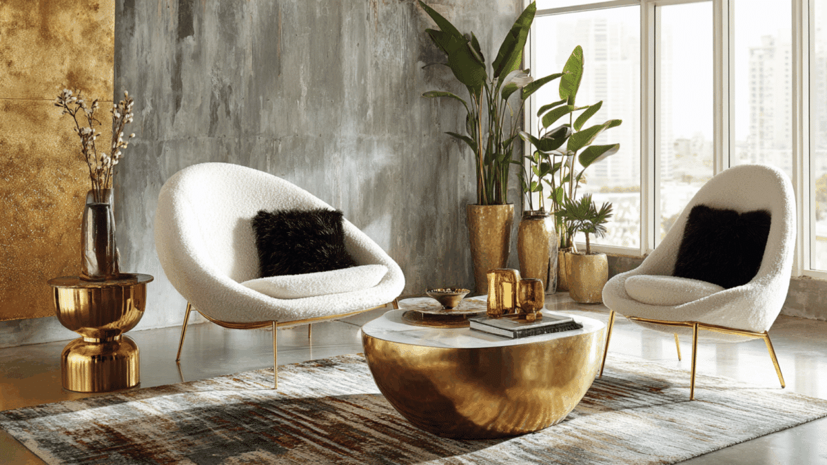
Remember when every luxury home looked like a sterile art gallery? You know the vibe. Cold white walls. Sharp lines. Not a smudge of personality in sight. It was safe, sure. But it was also kinda soulless. We spent years hiding behind "greige" because we were terrified of making a mistake. We wanted our homes to look expensive, so we stripped them of anything that felt too human. Too messy. Too real.
But something shifted. Maybe it was the pandemic forcing us to actually live in these spaces instead of just showing them off. Or maybe we just got tired of feeling like guests in our own lives. Either way, the tide has turned. In 2026, neutrality isn’t about blending into the background anymore. It’s about bringing the foreground forward. It’s about warmth. Texture. And yes, even a little bit of imperfection. The new neutrals aren’t empty vessels waiting for you to fill them. They’re rich, complex, and deeply comforting. They have soul. And honestly? It’s about time.
The Death of Flat Beige and the Rise of Character
Let’s be honest. Beige had a good run. For a long time, it was the go-to for anyone who wanted to play it safe. It was the color of resale value. The color of "no one will hate this." But in its overuse, it erased individuality. It became static. Boring. A flat coat of paint that sucked the life out of a room rather than enhancing it. As noted by industry observers, the death of beige in modern interiors marks a major shift away from that stiff, static minimalism. We are moving toward soulful design where tone and emotion bring life back into calm spaces.
Today’s homeowners aren’t looking for perfection. They want spaces that feel alive. Layered. Personal. This is why we are seeing a massive move away from uniform color schemes. The new approach embraces tones that have character. Think less "builder’s grade tan" and more "sun-baked clay" or "weathered stone." These colors have history. They have depth. When you walk into a room painted in these new neutrals, you don’t just see a color. You feel a mood. It might be sunlight-y cheer or nature-inspired calm, but it’s never flat. Designers are finally realizing that a neutral palette doesn’t have to mean a neutral personality.
This shift is also about longevity, but not in the boring sense. It’s about creating a foundation that can grow with you. Maria Lindgren and Adele Lonergan, founders of Covet Noir, point out that today’s pared-back palettes speak to a growing desire for emotional clarity at home. Acting as a timeless foundation rather than a fleeting trend, these colors allow the rest of the room to breathe. They provide a backdrop that feels stable and grounded. Instead of chasing the next big bold color trend, people are investing in hues that offer peace. It’s a smart move. Trends fade. But a room that feels like a hug? That lasts forever.
Warmth Over Cool: The 2026 Color Shift
For years, we were obsessed with cool tones. Remember "Millennial Gray"? It was everywhere. Cool grays, crisp whites, icy blues. They looked sleek in photos, but let’s be real—they felt cold to live in. Especially in the winter. As that era comes to an end, interiors are being reimagined with neutrals rooted in warmth and comfort. We are shifting from cool gray and bright white to a more versatile palette. The result? Spaces that feel relaxed, lived-in, and way less staged. It’s a huge relief, honestly. No more worrying about scuff marks on pristine white floors.
The new neutrals of 2026 are complex. They aren’t just one note. They shift with the light. A wall that looks like soft mushroom in the morning might glow with hints of terracotta by sunset. This complexity is key. It keeps the eye interested without overwhelming the senses. Designers are embracing tones that bring real character to a room. Whether it’s earthy ochres, deep taupes, or warm putties, these colors connect us to the natural world. They remind us of soil, sand, and stone. There’s a primal comfort in that. It grounds us.
This warmth isn’t just about paint colors, either. It’s about the overall temperature of the space. Luxury hotels are leading the charge here. Recent standout neutral designs in high-end hospitality show how soothing stylish beige interiors can be when done right. They aren’t using flat beige. They are using layers of warm, inviting tones that make you want to sink into a chair and stay awhile. It’s proof that neutral doesn’t mean boring. It means inviting. And in a world that feels increasingly chaotic, having a home that feels like a warm embrace is pretty much the ultimate luxury.
Texture Is the New Color
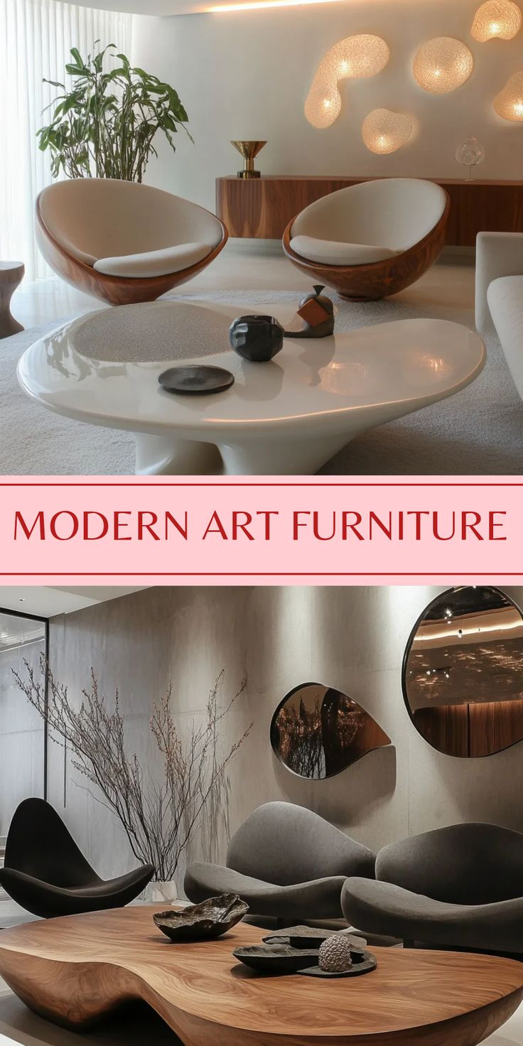
If you take away bold colors, what do you have left? Texture. Lots of it. In fact, texture has become the primary way designers add interest to neutral spaces. Without the distraction of bright hues, every surface matters. The weave of a linen sofa. The grain of an oak table. The roughness of a plaster wall. These details become the stars of the show. This is why the new neutrals are so effective. They provide a quiet backdrop that lets texture shine. It’s a sensory experience, not just a visual one.
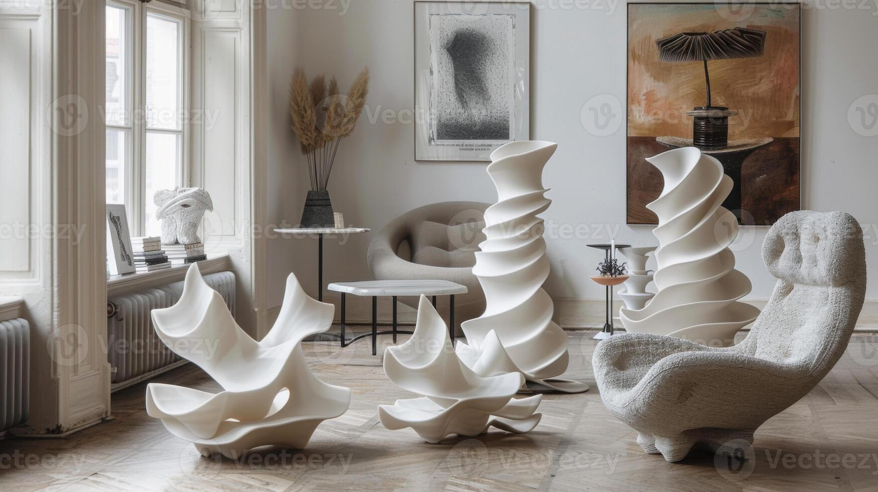
Take a recent London penthouse project by Róisín Lafferty and Artemest, for example. This interior abandons crisp minimalism in favor of warm, earthy tones. But it’s not just the colors that make it work. It’s the materials. Rough-hewn wood sits alongside smooth ceramics. Plush rugs contrast with raw stone floors. The interplay of these textures creates a richness that flat paint never could. It makes the space feel curated and thoughtful. Like every item has a story. That’s the soul we’ve been missing. It’s in the tactile details.
This focus on texture also makes spaces feel more personal. When you rely on color alone, rooms can feel generic. But when you layer textures, you create depth. You create shadows and highlights that change throughout the day. It keeps the space dynamic. Alive. Homeowners are seeking spaces that feel layered and personal, and texture is the easiest way to achieve that. It allows for imperfection, too. A wrinkled linen curtain has more charm than a perfectly pressed one. A hand-thrown vase has more soul than a factory-made one. Embracing these quirks is part of the new luxury aesthetic. It’s imperfectly perfect.
Emotional Clarity and Calm
Why are we so drawn to these new neutrals? It’s not just aesthetics. It’s psychology. We are craving calm. After years of noise and chaos, our homes have become our sanctuaries. We need them to be places of rest. Of recovery. The new neutral palettes support this need. They reduce visual clutter. They lower our heart rates. According to experts, these pared-back palettes speak to a growing desire for calm and emotional clarity at home. It’s about creating a space where your mind can settle. Where you can just be.
This doesn’t mean the spaces are empty or sterile. Far from it. They are full of intention. Every object is chosen for how it makes you feel, not just how it looks. A chunky knit throw isn’t just decor. It’s comfort. A wooden bowl isn’t just storage. It’s a connection to nature. These small touches add up to create an atmosphere of well-being. It’s a holistic approach to design. One that considers the emotional impact of every element. And frankly, it’s refreshing. We are done with designing for Instagram. We are designing for life.
The emotional resonance of these spaces is also tied to their authenticity. They feel real. Grounded. There’s no pretense. No trying too hard to impress. This authenticity is deeply comforting. It allows us to drop our guard. To relax. To be ourselves. And isn’t that what home should be? A place where you can truly exhale. The new neutrals facilitate this. They create a container for our lives that feels supportive rather than demanding. It’s a subtle shift, but a powerful one. It changes how we interact with our spaces. And how we feel within them.
Layering Tones for Depth
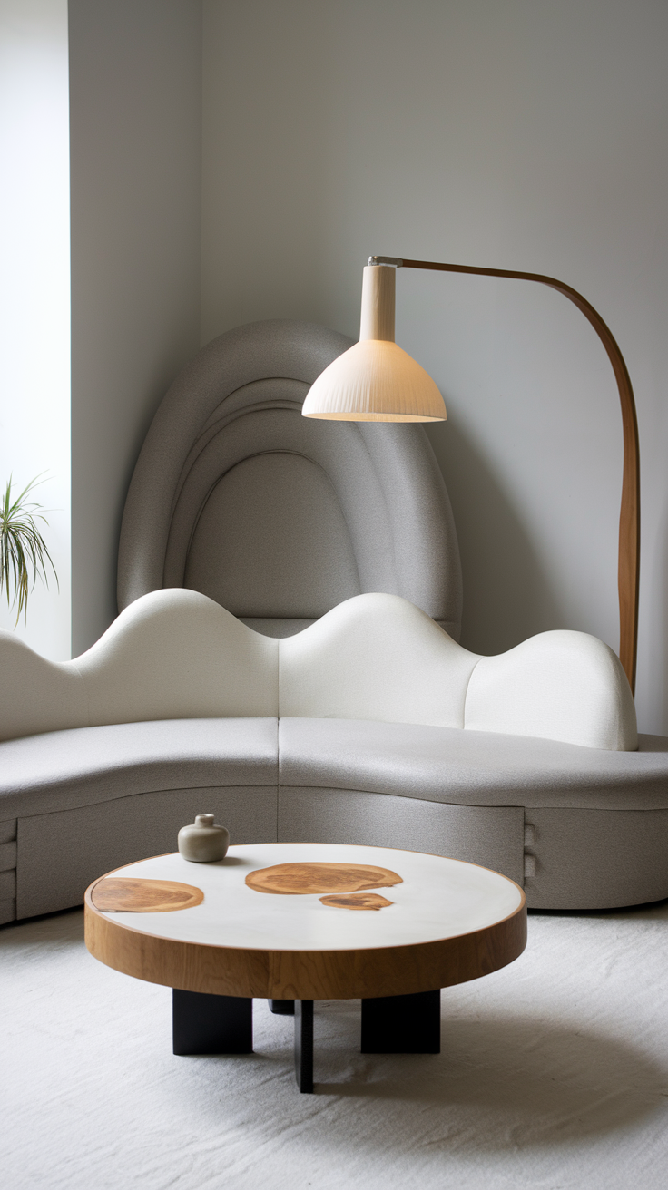
One of the biggest mistakes people make with neutrals is thinking they all look the same. They don’t. The magic lies in the layering. Mixing different shades of warm neutrals creates a sophisticated, nuanced look. Think of it like dressing in monochrome. You wouldn’t wear the exact same shade of black from head to toe. You’d mix charcoal, slate, and jet. The same principle applies to interiors. Layering cream, taupe, camel, and chocolate creates visual interest without breaking the serene vibe. It adds dimension.
This layering technique is crucial for avoiding the "flat" look of old-school beige. By varying the tones, you create a rhythm in the room. Lighter colors bounce light around, making spaces feel airy. Darker tones anchor the room, adding weight and seriousness. Mid-tones bridge the gap, creating harmony. It’s a balancing act. But when done right, it’s incredibly effective. Designers are mastering this art. They are showing us how to use tone-on-tone combinations to create spaces that feel both cohesive and dynamic. It’s subtle. But it works.
Practical tip? Start with a base. Maybe a warm white or a soft greige for the walls. Then build up from there. Add a slightly darker rug. A lighter sofa. Pillows in varying shades of the same family. Don’t be afraid to mix warm and cool undertones, either. A hint of cool gray in a mostly warm room can add sophistication. Just keep the overall temperature balanced. The goal is harmony, not monotony. Experiment with different combinations. See what feels right for your space. There are no strict rules. Just guidelines. Trust your eye. And your gut.
So how do you actually do this? How do you bring soul back into your own luxury interior? Start by letting go of perfection. Embrace the wabi-sabi aesthetic. Find beauty in the imperfect. Choose materials that age well. Wood that patinas. Leather that softens. Stone that wears. These materials tell a story over time. They record your life. And that’s what makes a home special. It’s not about keeping things pristine. It’s about letting them live.
Next, focus on lighting. Lighting can make or break a neutral palette. Warm, dimmable lights enhance the cozy vibes of these new neutrals. Avoid harsh, overhead lighting. Use lamps. Candles. Natural light. Let the shadows play. Shadows add depth. Mystery. They make a room feel intimate. Inviting. Test your paint colors at different times of day. See how they change. Choose the ones that make you feel good. Not just the ones that look good in a swatch book.
Finally, add personal touches. Art. Books. Objects from your travels. These items break up the neutrality. They add pops of personality. They make the space yours. Don’t worry about matching. Mix eras. Styles. Textures. The contrast is what makes it interesting. A modern chair next to an antique table. A abstract painting above a traditional sofa. These juxtapositions create tension. Energy. Life. And that’s the goal. To create a space that feels alive. Soulful. Yours. It’s not about following trends. It’s about creating a home that supports your life. And reflects who you are.
In the end, the move beyond beige is really a move toward authenticity. It’s about rejecting the safe, sterile options of the past in favor of something richer. Warmer. More human. The new neutrals of 2026 aren’t just colors. They’re a mindset. A way of living. They invite us to slow down. To appreciate the simple things. To find luxury in comfort. In calm. In connection. And isn’t that what we all really want? A home that feels like home. Not a showroom. Not a magazine spread. But a true sanctuary. With soul.