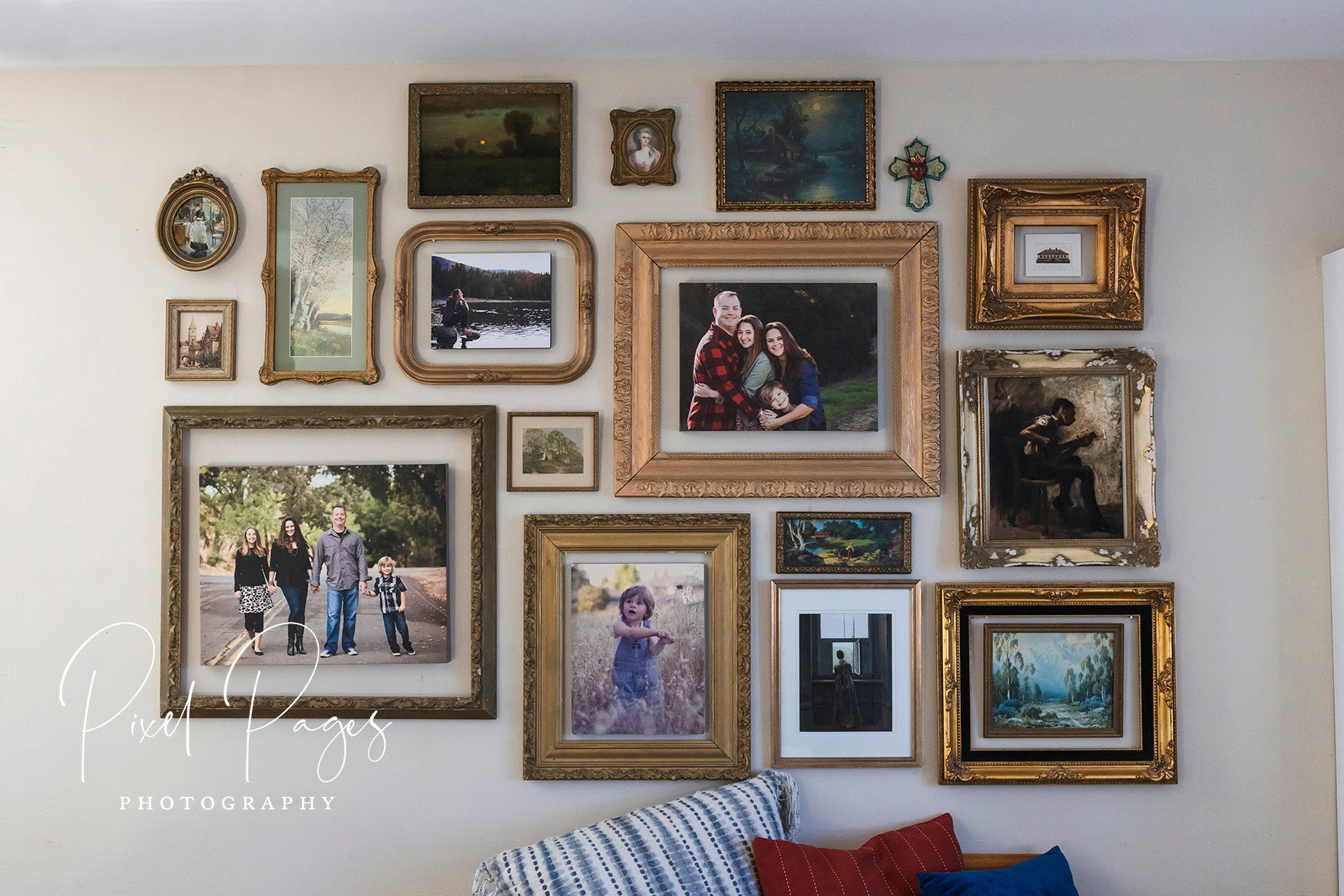
We have all been there. You walk into a room that is perfectly beige, impeccably clean, and utterly soulless. It feels like a hotel lobby where no one is allowed to touch anything. Neutrals are safe. They are timeless. But let’s be honest, they can also be a bit boring if you don’t know how to wake them up. The trick isn’t to paint the walls neon pink or throw out your comfortable sofa. It is about finding that sweet spot between calm and drama.
In 2026, the trend has shifted away from stark minimalism toward something warmer and more personal. People want their homes to feel lived-in and loved. This means taking that neutral base—which acts as a quiet canvas—and adding layers of personality through bold patterns and items made by human hands. It is not about clutter. It is about intention. When you mix a soft, sandy wall color with a vibrant, geometric rug or a rough-hewn ceramic vase, the room suddenly breathes. It tells a story. And isn’t that what a home should do?
The Power of the Neutral Base
Think of neutral colors not as "nothing," but as "everything’s friend." A palette of whites, creams, grays, and taupes creates instant unity. It allows the eye to rest. According to recent design insights from sources like Homes & Gardens, decorating with neutrals is less about picking a single shade and more about understanding light and texture. A well-curated neutral palette creates a serene backdrop that never goes out of fashion. This is crucial because trends come and go, but a good foundation lasts.
However, a neutral base only works if it has depth. If every surface is flat and smooth, the room will feel sterile. The secret lies in layering different tones of the same color family. Imagine a living room with off-white walls, a slightly darker cream sofa, and a taupe wool throw. These subtle shifts create a sense of warmth and sophistication. Lorddecor notes that these soft color palettes are key to creating a timeless look. By keeping the large elements—like walls and major furniture pieces—neutral, you give yourself the freedom to experiment elsewhere without fear of overwhelming the space.
This approach also makes changing your decor easier and cheaper. You do not need to repaint every time you want a new vibe. Instead, you can swap out smaller items. The neutral base acts as an anchor. It keeps the room grounded even when you introduce louder elements later on. It is the silence between the notes in a song. Without it, the music would just be noise. So, embrace the beige. Embrace the gray. Just make sure you are mixing textures so it feels rich, not flat.
Introducing Bold Patterns with Confidence
Now for the fun part. Once your canvas is ready, it is time to add some spice. Bold patterns can feel intimidating. Many people worry that a large print will make a small room look smaller or that clashing designs will create visual chaos. But here is the thing: pattern is energy. It draws the eye and creates focal points. Orangemoon Interiors suggests using bold patterns in accent pieces while keeping larger items neutral. This is the golden rule. Let the pattern sing, but do not let it scream over everything else.
Start small if you are nervous. Throw pillows are the easiest entry point. A single pillow with a vibrant ikat or a striking black-and-white graphic can change the entire mood of a sofa. Rugs are another powerful tool. A large area rug with a bold design defines the space and adds warmth underfoot. Curtains or drapes with a strong pattern can frame a window beautifully, acting almost like artwork. The key is balance. If you have a busy rug, keep the pillows simpler. If the curtains are loud, let the walls stay quiet.
Metaform Design emphasizes that you should use bold shades to create focal points without overwhelming the room. This means choosing one or two areas to highlight. Maybe it is an accent chair upholstered in a wild leopard print. Maybe it is a statement wall with a dramatic wallpaper. By limiting where the pattern lives, you control the energy of the room. It becomes a deliberate choice rather than an accident. And remember, patterns do not have to match perfectly. In fact, mixing scales—like a large floral with a small stripe—often looks more sophisticated and curated.
The Warmth of Handcrafted Accents
Patterns bring energy, but handcrafted accents bring soul. In a world mass-produced by machines, objects made by hand carry a special weight. They have imperfections. They have history. When you place a hand-thrown pottery bowl on a sleek, modern table, the contrast is magical. Palmerstown House highlights the importance of combining calming neutral colors with bold accent textures. Handcrafted items are all about texture. They invite you to reach out and touch them.
Think about a woven basket from a local artisan. Or a macramé wall hanging. Or a wooden tray with visible grain and knots. These items break up the smoothness of a neutral room. They add organic warmth that factory-made items often lack. Best Living Furniture points out that transformative designs blend textures and tones to elevate a space from mundane to magnificent. A rough linen cushion next to a smooth leather chair creates a tactile experience that feels luxurious and inviting.
Handcrafted accents also support a slower, more mindful way of living. Each piece has a story. Maybe you bought it at a market while traveling. Maybe it was made by a neighbor. These stories become part of your home’s narrative. They make the space feel unique to you. No one else will have the exact same combination of items. This personalization is what turns a house into a home. It shows that you care about the details. And in a neutral room, these details shine brighter because there is no visual competition.
Creating Visual Continuity Through Repetition
One of the biggest mistakes people make when adding bold elements is treating them as isolated incidents. You put a blue pillow here, a blue vase there, and a blue painting somewhere else, but they do not talk to each other. The result can feel scattered. Walls n Wonders explains that accent colors work best when repeated subtly throughout a room. This creates visual continuity. It guides the eye around the space in a gentle loop.
Let us say you choose emerald green as your bold accent. Do not just stop at one item. Use it in a cushion, then pick it up in a small detail of a rug, and maybe again in a piece of artwork. The repetition does not need to be exact. It can be varied in scale and material. A velvet green pillow, a glossy green ceramic, and a matte green plant pot all contribute to the theme without looking matchy-matchy. This controlled repetition prevents accents from feeling excessive or random.
This technique also helps tie together different patterns and textures. If you have a geometric rug and a floral curtain, a common color thread can unite them. It creates a cohesive look even when the styles differ. Think of it like a melody that repeats in a song. It gives the listener something familiar to hold onto. In design, this familiarity creates a sense of order and calm, even amidst the boldness. It is a subtle trick, but it makes a huge difference in how polished a room feels.
Balancing Calm and Drama
The ultimate goal is balance. You want a room that feels dynamic but not chaotic. Serene but not sleepy. Basic Home Design describes this as pairing neutral bases with bold accent colors for timeless yet dynamic designs. It is a dance between yin and yang. Too much neutral, and the room falls asleep. Too much bold, and the room gives you a headache. Finding the middle ground is an art form.
Consider the mood and functionality of the room, as suggested by Lilly Ashley Design. A bedroom might need more calm, so keep the bold patterns softer and the handcrafted accents gentle. A living room or dining area can handle more drama. Here, you might use a larger scale pattern or a bolder color. Lighting also plays a huge role. Natural light changes how colors and textures appear throughout the day. A bold pattern might look intense at noon but soft and shadowy in the evening. Test your choices at different times.
Do not be afraid to edit. Step back and look at the room. Does your eye know where to rest? Is there a clear focal point? If everything feels loud, remove one item. If it feels flat, add a textured object. Balance is not a static state. It is something you adjust over time. Live with the changes. See how they feel. Sometimes, less really is more. Other times, one more layer of texture is exactly what the space needs. Trust your instincts. They are usually right.
So, how do you actually start? It can feel overwhelming to look at a blank, beige room and know where to begin. Start with inspiration. Look at images of rooms you love. Notice what draws your eye. Is it a color? A texture? A specific object? HGTV offers many ideas for adding color to neutral rooms, showing that even a small splash can energize a scheme. Pick one element you love and build from there.
Next, assess what you already have. Do you have a rug with a hint of color? A piece of art you have been ignoring? Start with those. Build your palette around existing items to save money and reduce waste. Then, identify the gaps. Do you need more texture? More pattern? More height? Go shopping with a purpose. Look for handcrafted items at local markets or online artisan platforms. Look for patterns that speak to you, not just what is trendy.
Finally, arrange and rearrange. Design is not a one-and-done task. Move things around. Swap pillows between rooms. Layer rugs. Hang art at different heights. Play with the space until it feels right. Remember, there are no strict rules, only guidelines. The best rooms are those that reflect the people who live in them. They are comfortable, interesting, and full of life. So take a deep breath, pick up that bold cushion, and start transforming your space. It is easier than you think.
Transforming a neutral room is not about erasing the calm. It is about enhancing it with moments of joy and surprise. By using bold patterns sparingly and intentionally, and by bringing in the warmth of handcrafted accents, you create a space that is both stylish and deeply personal. It is a home that welcomes you. A home that feels alive.
In 2026, we are moving away from perfection and toward authenticity. We want homes that feel real. So do not worry about getting it exactly right. Worry about getting it right for you. Mix the old with the new. The smooth with the rough. The quiet with the loud. Let your home be a reflection of your journey. And enjoy the process. After all, living in a beautiful space is one of life’s simple pleasures.