Have you ever looked at a beautifully sleek mobile app and realized you had to squint just to read the button text. You are definitely not alone. For years, designers have trapped themselves in a frustrating myth: the idea that making a user interface accessible means stripping it of all personality and turning it into something sterile, muted, and boring.
But let’s be honest about the reality. Accessibility isn’t a restrictive constraint that kills your creativity; it is a fundamental design skill. In 2026, creating a color scheme that passes every modern contrast audit while remaining vibrant and beautiful is entirely possible. It just requires changing how we see light and dark on a screen.
The Big Myth About Contrast Ratios
Many people think that if you care about strict Web Content Accessibility Guidelines (WCAG) compliance, you have to throw out your brand identity. That is totally wrong. Most contrast failures in modern web design don’t actually happen because a designer picked a bold color. They happen because of a poor understanding of how background colors interact with foreground text.
When you dive into tools like ColorBox or PaletteChecker, you quickly see that vibrant colors can easily pass the standard 4.5:1 ratio for normal text or the tougher 7:1 ratio for AAA compliance. The trick isn’t abandoning your favorite electric blue or deep emerald; it is about building a system where those hues have the right brightness levels to stand out.
Understanding Lightness Over Pure Color
To build a flawless UI palette, we have to look past the actual color family—what designers call "hue"—and focus entirely on perceived lightness. Think about designing a dark mode for a complex dashboard. If you just grab a random dark gray and throw your brand’s primary purple on top, it will likely fail.
Instead, modern workflows emphasize creating an expanded ramp of tones, usually spanning from 10 to 900. By establishing fixed steps of lightness, you can guarantee that a "600" weight text will always be readable against a "100" weight background, regardless of whether the color is red, green, or blue.
Designing with Colorblindness in Mind
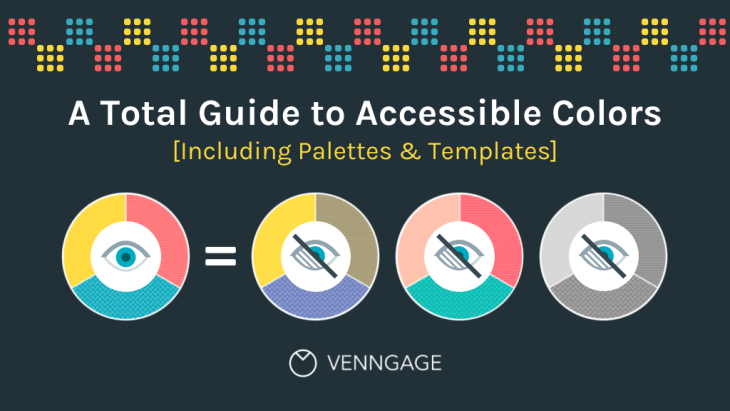
Did you know that a significant chunk of your audience sees the world differently. Designing your digital products with a "colorblind by default" mindset ensures nobody gets left behind. If you rely solely on green to mean "success" and red to mean "error," you are creating barriers for users with protanopia or deuteranopia.
- Never rely on color alone: Always pair color changes with icons, clear text labels, or distinct patterns.
- Use simulators early: Drop your wireframes into tools like RGBlind during the early brainstorming phase.
- Check the greyscale: If your design doesn’t make sense in pure black and white, the layout’s visual hierarchy needs fixing.
Leveraging Modern Math and Generators
Thankfully, we do not have to guess our way through this math anymore. The digital ecosystem in 2026 gives us incredible automated tools. Platforms like accessibility.build allow you to generate WCAG-aware color systems and test real UI states—like buttons, focus rings, alerts, and form fields—in real-time before you write a single line of code.
These smart generators help you map out your core brand colors and automatically suggest compliant neutral shades for text and backgrounds. This workflow saves engineering teams hours of fixing bugs later during compliance audits, keeping the product cycle moving fast.
Testing Your Interface in the Real World
An interface shouldn’t just look great on a high-end designer monitor in a dimly lit studio. It needs to work on a cracked smartphone screen under direct sunlight while someone is rushing to catch a bus. That is where real-world context matters most.
Try testing your color palettes across various hardware setups and lighting environments. Take note of how interactive states, like hover and keyboard focus indicators, stand out. If your focus ring blends too closely into the card background, a keyboard navigator will lose their place instantly.
When you build a digital product that everyone can use easily, you aren’t just checking a legal box. You are opening your doors to a massive audience that traditional design trends often ignore. Inclusive palettes create a smoother, less tiring viewing experience for every single user.
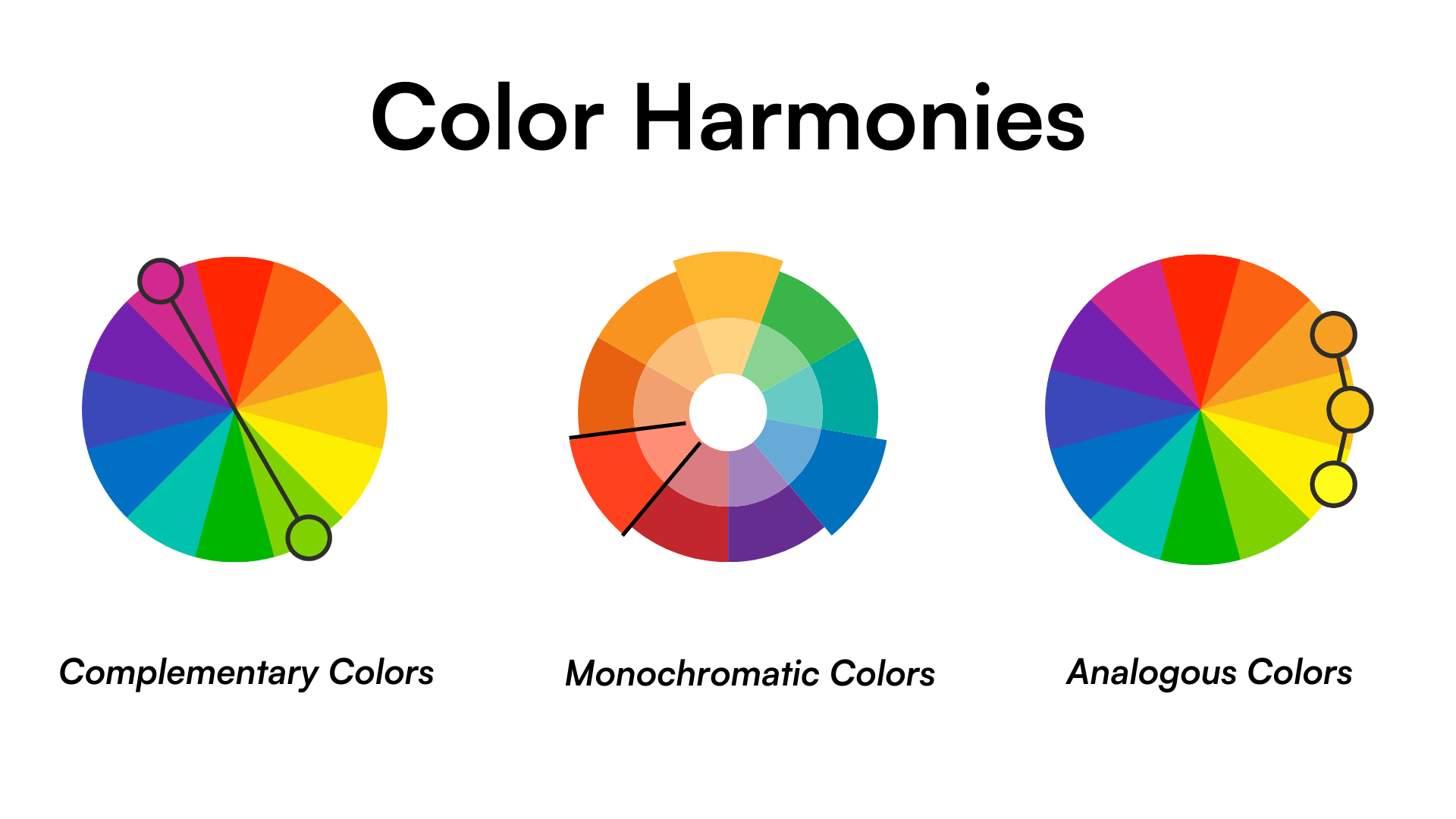
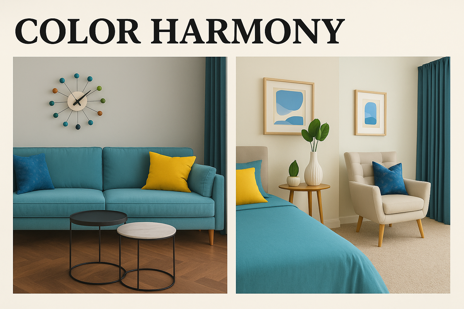
At the end of the day, accessible design is simply good design. By blending the science of contrast ratios with the art of color harmony, you build interfaces that feel incredibly intuitive. Beautiful, accessible, and highly usable—that is the standard we should all aim for.