Have you ever walked into a room and instantly felt your shoulders drop? Or maybe you’ve stepped into a space that felt strangely cramped, even though the layout was perfectly fine. It’s easy to blame the furniture or the lighting, but more often than not, the real culprit is hiding right on your walls.
Color is a massive deal in interior design. It isn’t just about matching your throw pillows to your rugs; it actually changes your brain chemistry and how you perceive physical space. Neuroscience and home design have been teaming up lately to show that where you put a color matters just as much as the shade you pick.
Why Where You Paint Matters More Than What You Paint
Most people choose a color palette they love and just start slathering it everywhere. But color placement acts like a visual trick for your mind. If you paint a small room entirely in a dark navy, it might feel like a cozy cave—or a tiny closet.
But what if you only painted the back wall? Suddenly, your eyes are drawn backward, making the room look much deeper than it actually is. It’s all about how our eyes track light and shade.
Shifting Your Mood from the Ground Up
Let’s talk about how these choices affect your feelings. Bright and warm tones like soft yellows or gentle terracotta are amazing for spots where people hang out, like kitchens or dining areas. They naturally make us feel talkative and energized.
On the flip side, cool shades like sage green or a soft misty blue are the champions of relaxation. If you place these calming tones directly opposite your bed, it’s the first thing you see when you wake up, setting a peaceful tone for the whole day.
Making Tight Spaces Breathe
Living in a compact apartment can sometimes feel a bit claustrophobic. Luckily, color psychology is a secret weapon for making small homes feel way more comfortable. If you’re dealing with a low ceiling, try painting it a lighter shade than your walls.
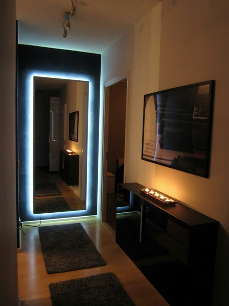
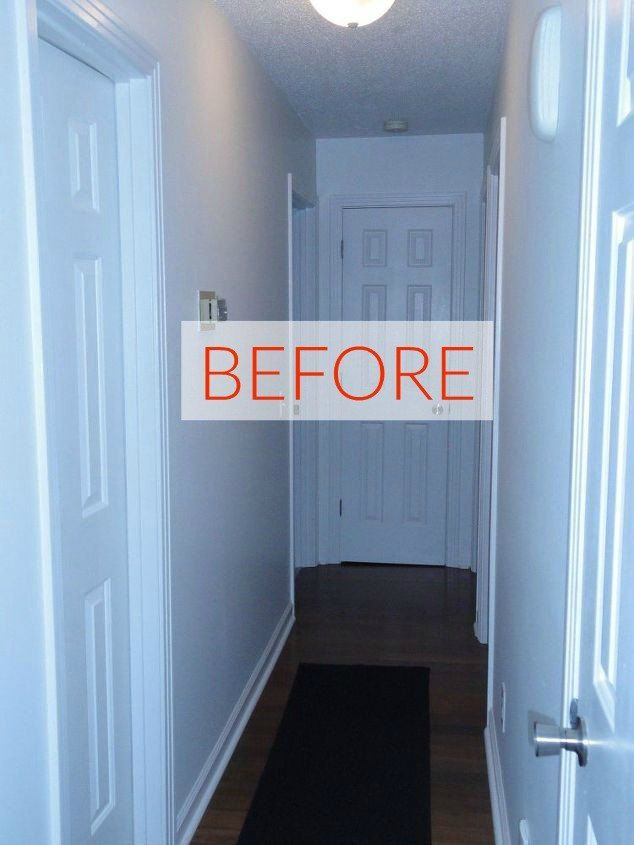
This simple trick tricks your brain into thinking the ceiling is higher up. Want to make a narrow hallway feel wider? Paint the side walls a crisp, light neutral and use a slightly darker hue on the far end wall to bring it forward.
The Power of the Accent Wall Myth
We have all heard of the classic accent wall, but people often get it wrong by picking the wrong wall to highlight. You don’t want to just pick a random side wall because it feels safe.
Instead, look for the natural focal point of the room. Maybe it’s the wall behind your TV, or the space where your bed headboard rests. Placing a rich tone there anchors the whole room and gives your eyes a satisfying place to land.
Creating Harmony and Connection Between Rooms
Your home should feel like a cohesive story, not a bunch of random ideas thrown together. You can use an analogous setup—which just means choosing colors that sit next to each other on the color wheel—to create a smooth flow from the living room to the hallway.
Maybe your living room features a deep forest green, and as you walk into the next area, that shifts into a soft olive. It feels natural and keeps your brain from feeling overwhelmed by sudden visual jumps.
Ready to try this out? Start small before you commit to buying gallons of paint. Grab some large poster boards, paint them with your top choices, and tape them to different walls throughout the week.
Watch how the daylight shifts the color from morning to night. Notice how a bold shade on a north-facing wall looks completely different than it does on a south-facing one. It’s a fun, zero-risk way to see how your body responds to the visual changes.
At the end of the day, your home should be a reflection of who you are and how you want to live. By understanding the basics of color placement, you gain the power to turn a chaotic space into a peaceful haven or a dull room into an energizing workspace.
Take a good look around your living space today. Is it telling the story you want it to tell? With a little bit of strategy and a fresh bottle of paint, you can easily reshape your environment to support your happiness and well-being.