You’ve spent hours picking out the perfect frames. You found that one print that speaks to your soul. You even bought the fancy level. Yet, when you step back to admire your handiwork, something feels… wrong. It’s not terrible, exactly. But it’s not right either. It looks a bit chaotic. Maybe a little lopsided. Or just kind of "meh."
It is frustrating, isn’t it? You followed the instructions. You measured twice. So why does it look like a hot mess?
The truth is, most people focus on the wrong things. They worry about the art itself or the color of the frame. But the real culprit is usually invisible. It’s about negative space. It’s about the tiny gaps between objects. In 2026, interior design trends have shifted towards more intentional, curated looks, yet the fundamental physics of visual balance haven’t changed. A single inch of uneven spacing can throw off the whole vibe. Let’s dig into why this happens and how you can fix it without losing your mind.
The Invisible Grid and Why Your Eyes Hate Chaos
Our brains are wired to find patterns. When we look at a wall, we aren’t just seeing pictures; we are scanning for order. If that order is missing, our eyes get tired. They dart around trying to find a focal point or a rhythm, and when they can’t, we feel uneasy. This is why random placement often fails. It lacks rhyme or reason.
Think of an invisible grid overlaying your wall. Professional designers use this concept constantly. Even if the arrangement looks organic or eclectic, there is usually a underlying structure holding it together. Maybe it’s a central axis line. Maybe it’s a consistent margin around the edges. Without this skeleton, your art pieces float aimlessly. They don’t talk to each other. They just exist in the same space, awkwardly ignoring one another.
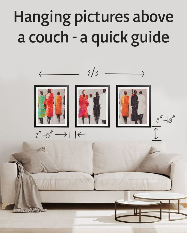
This is especially true for three-frame arrangements, which are deceptively tricky. You might think hanging three items in a row is simple. But if the center frame is slightly higher, or the gap on the left is two inches while the right is three, the balance collapses. It’s subtle, but your brain notices immediately. It creates a sense of tension rather than calm.
Spacing Secrets: The Two-Inch Rule and Beyond
Let’s talk numbers. One of the most common mistakes is inconsistent spacing. Designers often recommend keeping a consistent gap between frames. The gold standard? Usually between two to three inches. This creates enough breathing room for each piece to stand out, but keeps them connected as a group.
However, consistency is key. If you have a large landscape photo next to a small portrait, the visual weight is different. You might need to adjust the spacing slightly to compensate, but the perceived distance should feel equal. A tape measure is your best friend here. Don’t guess. Eye-balling it rarely works because our perspective shifts depending on where we stand in the room.
Also, consider the wall size. In smaller rooms or tight alcoves, you might want to tighten the spacing to make the collection feel more cohesive and substantial. In large, open-plan living areas, wider spacing can help the art breathe and prevent it from looking cluttered. Remember, dark colors recede, making a wall feel further away, while light colors project. This optical trick can help if your wall space feels awkward or poorly placed.
Alignment Anxiety: Center Lines vs. Bottom Edges
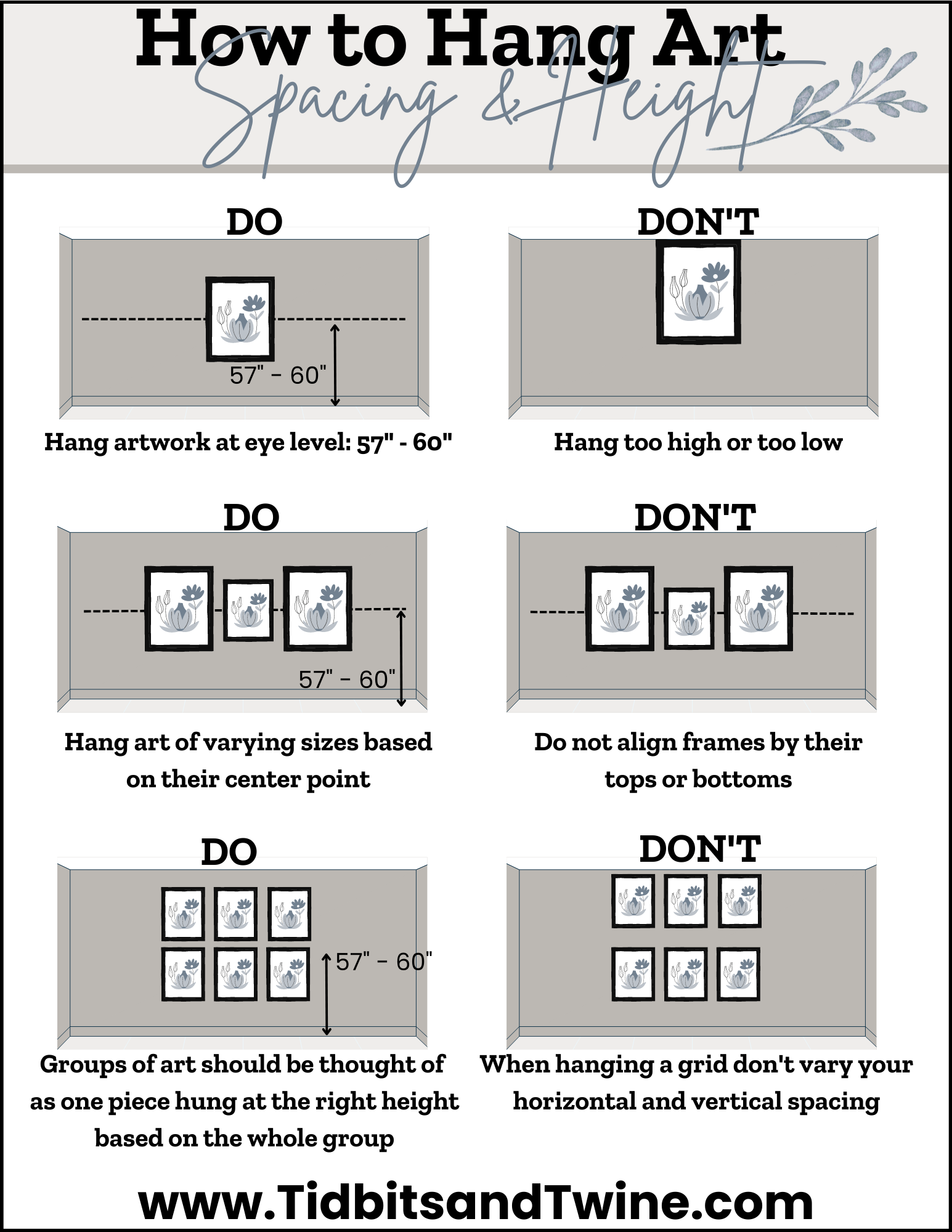
How do you line them up? This is where many people go wrong. Do you align the tops? The bottoms? The centers? The answer depends on the shapes of your frames. If you have a mix of sizes and orientations (some vertical, some horizontal), aligning the centers is usually the safest bet. It creates a harmonious flow that guides the eye across the middle of the arrangement.
Aligning the bottom edges can work, but it often makes the top of the arrangement look jagged and uneven. This can feel heavy at the bottom and light at the top, which is visually unsettling. Conversely, aligning the tops can make the arrangement feel like it’s "hanging" too high, leaving dead space below.
For a triptych or a simple row of three, ensure the center lines match perfectly. Even a half-inch deviation can disrupt the visual balance. Use a laser level if you have one. If not, a good old-fashioned string line stretched across the wall can act as a guide. Mark your center points with pencil before you hammer in any nails. It saves time and prevents unnecessary holes.
Scale and Proportion: Don’t Let Art Float in Void
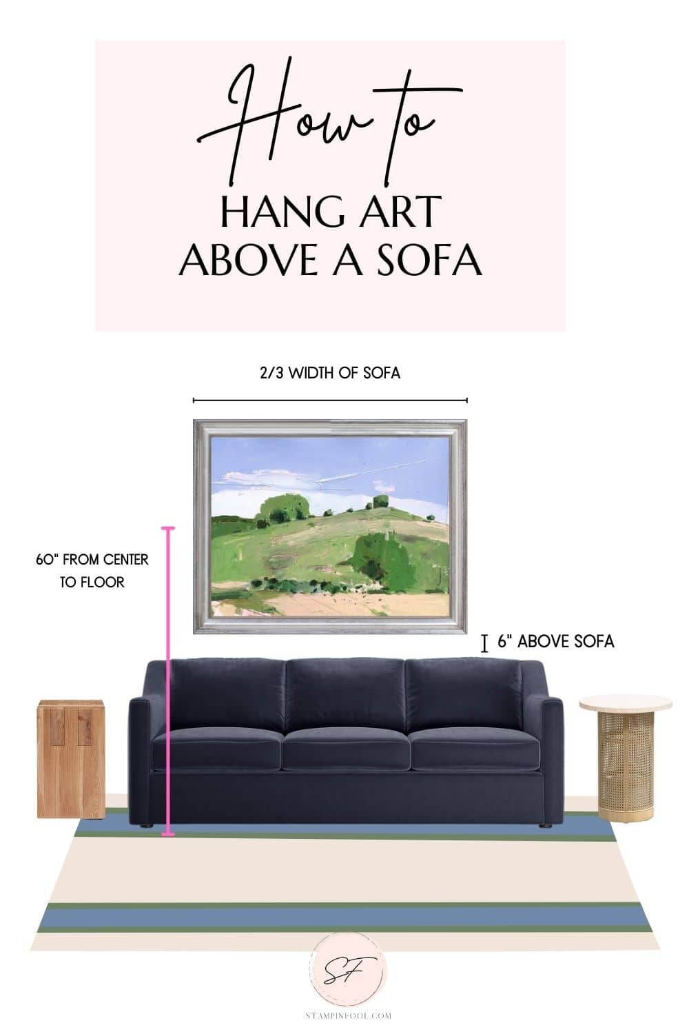
Size matters. Not just the size of the art, but its relationship to the furniture below it. A common error in 2026 homes is hanging art too high. We tend to hang things at eye level, which is great for museums, but terrible for living rooms. If your art is above a sofa, the bottom of the frame should be about six to eight inches above the back of the couch. This connects the art to the furniture, grounding the space.
If the art is too small for the wall, it looks lonely. It floats in a void. In this case, you don’t necessarily need bigger art. You can create a larger "visual unit" by grouping smaller pieces together. Think of them as a single block. This adds weight and presence to the wall.
On the flip side, if the art is too large, it can overwhelm the room. It feels aggressive. If you’re stuck with a massive piece, try balancing it with other elements. A floor lamp on one side, a plant on the other. This distributes the visual weight and makes the large piece feel intentional rather than dominating.
The Mix-Up: Variety is the Spice of Life (But Keep It Curated)
Monotony is boring. A gallery wall where every frame is the same size, same color, and same style can feel sterile. It lacks personality. Designers warn against these shortcuts. Instead, aim for variety. Mix different frame finishes—wood, metal, black, white. Mix mat widths. Incorporate different types of art, like prints, photographs, and maybe even some 3D objects like masks or wall vases.
But here’s the catch: variety needs curation. It can’t be random chaos. There needs to be a thread connecting everything. Maybe it’s a color palette. Maybe it’s a theme, like travel or nature. Or maybe it’s the style of the artwork itself. This common thread ties the diverse elements together, making the arrangement feel collected over time rather than bought in a single shopping spree.
Incorporating texture helps too. A flat print next to a textured canvas adds depth. It catches the light differently. This dynamic interplay keeps the eye engaged. It invites viewers to look closer and discover details. Just remember, more variety means you need to be more careful with spacing and alignment to keep it from looking messy.
Before you pick up a hammer, plan. Seriously. Lay your arrangement out on the floor first. Move pieces around until you find a composition you love. Take a photo of it. This gives you a reference map when you’re up on the ladder.
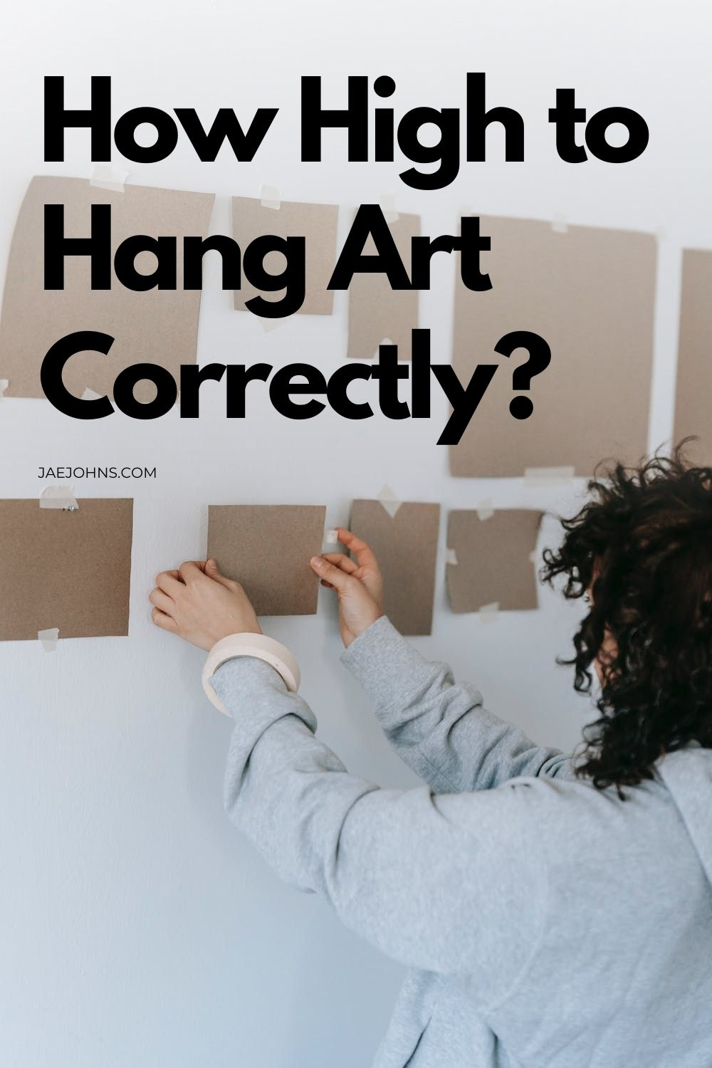
You can also use kraft paper or newspaper. Trace your frames onto the paper, cut them out, and tape them to the wall. This allows you to live with the arrangement for a few days. You can see how it looks at different times of day, with different lighting. It helps you spot issues with scale and positioning before you commit to permanent holes.
Proper planning saves time and stress. It prevents costly mistakes, like realizing too late that your arrangement is crooked or off-center. Measure your available wall space carefully. Consider architectural details like windows, doors, or sloping ceilings. These features can interrupt the flow, so you may need to adjust your layout to work with them, not against them. In 2026, smart apps can even help you visualize this, but the paper method remains unbeatable for tactile feedback.
So, take a breath. Look at your wall again. Is it the spacing? The alignment? The scale? Identify the issue. Then, apply these fixes. Start small. Adjust one piece. Step back. See how it feels. Creating a beautiful wall arrangement isn’t about perfection. It’s about intention. It’s about creating a space that feels like you. And honestly, that’s worth the extra effort.