You know that feeling when you walk into a room and something just feels… wrong? You can’t quite put your finger on it. The colors are nice. The bed is comfy. But there’s a subtle tension in the air. Often, the culprit is staring you right in the face, or rather, hovering awkwardly above your head. It’s the art. Specifically, how it’s hung.
We’ve all been there. You spend hours picking out the perfect print, maybe even framing it yourself, only to step back and realize it looks like it’s trying to escape through the ceiling. In 2026, with so many of us treating our bedrooms as true sanctuaries for rest and recharge, getting this right matters more than ever. It’s not just about aesthetics; it’s about how the space makes you feel. Let’s fix those blunders, shall we?
The Sky-High Syndrome
Let’s address the elephant in the room immediately. Or rather, the elephant on the wall. The number one mistake people make when hanging art is placing it way too high. It’s practically universal. Why do we do this? Maybe we’re afraid of hitting our heads. Maybe we think higher looks more "grand." But in a bedroom, grand isn’t the goal. Cozy is.
When art floats near the ceiling, it disconnects from the furniture below. It creates a visual gap that makes the room feel disjointed. Imagine lying in bed, looking up, and seeing a picture frame stranded in no-man’s-land. It doesn’t anchor the space. Instead, it makes the ceiling feel lower and the room smaller. It’s a tricky illusion, but a real one.
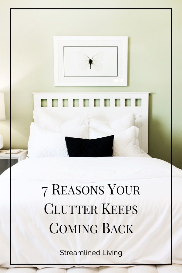
The fix is simpler than you’d think. Aim for eye level. But wait—whose eye level? When you’re standing? Sure, that’s the standard museum rule (57 to 60 inches from the floor to the center of the piece). But in a bedroom, you spend most of your time sitting or lying down. Try hanging the center of the artwork about 50 to 55 inches from the floor. Or, if it’s above the headboard, keep the bottom of the frame just 6 to 8 inches above the top of the mattress. This connects the art to the bed, creating a unified, grounded look.
The Headboard Hover Gap
Speaking of the headboard, let’s talk about that awkward space between your bed and your wall decor. A common blunder is leaving too much distance here. If you have a large statement piece or a gallery wall above your bed, hanging it a foot or more above the headboard creates what designers call a "floating effect." It looks accidental. Like you couldn’t decide where it should go, so you just guessed.
This gap breaks the visual flow. The bed and the art should feel like they belong together, like partners in a dance. When they’re separated by a vast expanse of empty wall, the eye gets lost. It disrupts the calm vibe you’re trying to cultivate. In 2026, the trend is toward intentional, connected spaces. We want rooms that hug us, not ones that ignore us.
To fix this, measure carefully. As mentioned, 6 to 8 inches is the sweet spot for most standard headboards. If you have a particularly tall or upholstered headboard, you might go up to 10 inches, but rarely more. Use painter’s tape to mock up the position before you drive any nails. Step back. Sit on the bed. Does it feel connected? Does it feel like the art is resting gently above you, rather than looming? That’s the goal.
Scale and Proportion Nightmares
Size matters. Not in a vanity way, but in a visual balance way. One of the quickest ways to make a bedroom look amateurish is to hang a tiny piece of art on a huge wall, or conversely, to cram a massive canvas into a cramped space. Both extremes throw off the room’s equilibrium. A small print above a king-sized bed looks lonely. It gets swallowed by the scale of the furniture.
On the flip side, an oversized piece can feel oppressive. In a bedroom, you want relaxation, not intimidation. If the art is too big, it dominates the room. It shouts instead of whispers. This is especially true in smaller bedrooms, where every inch counts. A piece that’s too large can make the walls feel like they’re closing in. It’s a subtle psychological effect, but it impacts how rested you feel.
So, how do you get the scale right? A good rule of thumb is that the artwork (or group of artworks) should span about two-thirds to three-quarters of the width of the furniture below it. For a queen bed, that’s roughly 40 to 45 inches of total width. For a king, aim for 50 to 60 inches. If you’re doing a gallery wall, treat the entire arrangement as one unit. Keep the overall shape within those proportions. It creates harmony. It feels purposeful.
The Gallery Wall Chaos
Gallery walls are fun. They’re personal. They tell a story. But they’re also a minefield of potential blunders. The biggest issue? Lack of cohesion. Throwing together random frames, random sizes, and random spacing without a plan leads to visual noise. In a bedroom, noise is the enemy. You want serenity. A chaotic wall creates subconscious stress. It’s hard to unwind when your eyes are darting around trying to make sense of the clutter.
Another common mistake is inconsistent spacing. Some gaps are wide, others are narrow. It looks messy. Even if you’re going for an eclectic vibe, there needs to be an underlying order. Otherwise, it just looks like you gave up halfway through. And don’t forget the frames. Mixing too many styles can work, but only if there’s a unifying element, like all black frames or all white mats. Without that thread, it falls apart.
Start with a plan. Lay everything out on the floor first. Arrange the pieces until you find a balance that pleases you. Keep the spacing consistent—usually 2 to 3 inches between frames. Stick to a loose theme, whether it’s color, subject matter, or frame style. This creates a curated look rather than a collected junk drawer look. Remember, less is often more in a sleep space. You don’t need twenty pieces to make a statement. Sometimes, three well-chosen prints are enough.
Lighting and Glare Oversights
We often forget that art doesn’t exist in a vacuum. It interacts with light. A major blunder is ignoring how natural and artificial light hits your walls. Hanging a glossy print directly opposite a window? Hello, glare. You won’t see the art; you’ll see a reflection of your own tired face. It defeats the purpose. Similarly, placing art in a dark corner without any dedicated lighting makes it disappear. It becomes wallpaper.
In 2026, smart lighting is everywhere, yet many still overlook its role in highlighting decor. A beautiful piece of art deserves to be seen. But harsh overhead lights can create shadows or wash out colors. It’s about finding the right balance. You want the art to be visible, but not spotlighted like an interrogation room. Soft, warm light is key in a bedroom.
Consider adding picture lights or adjustable wall sconces. These provide gentle illumination that enhances the art without disrupting the sleep environment. If that’s not in the budget, simply reposition the art. Move it away from direct sunlight. Test it at different times of day. See how the light changes. Adjust accordingly. It’s a small tweak that makes a huge difference in how professional and polished the room feels.
Finally, let’s talk about mood. A bedroom is for rest. Yet, so many people hang art that is energetic, chaotic, or even unsettling. Bright neon colors. Aggressive abstract shapes. Busy cityscapes. While these might work in a living room or office, they can sabotage your sleep hygiene. Your brain processes visual information even when you’re trying to wind down. Cluttered or intense imagery can keep your mind active when it should be slowing down.
This isn’t to say you need boring beige landscapes. Far from it. But choose art that resonates with calm. Soft textures. Soothing colors. Nature scenes. Personal memories that bring joy, not stress. The emotional weight of the art matters. If a piece makes you feel anxious or excited, save it for another room. The bedroom should be a retreat.
Take a moment to really look at your current wall decor. How does it make you feel? Relaxed? Or stimulated? Be honest. If it’s the latter, it might be time for a swap. Rotate in something softer. Something that breathes. This is your sanctuary. Every element, including the art, should support that function. It’s not just about looking good; it’s about feeling good. And that’s the ultimate goal.
Getting your bedroom art right doesn’t require a degree in design. It just requires a bit of attention to detail. Lower the height. Mind the gap. Check the scale. Plan the layout. Respect the light. Honor the vibe. These small adjustments transform a room from merely decorated to truly inviting. So, grab a hammer (and some painter’s tape) and give those walls the love they deserve. Your future well-rested self will thank you.