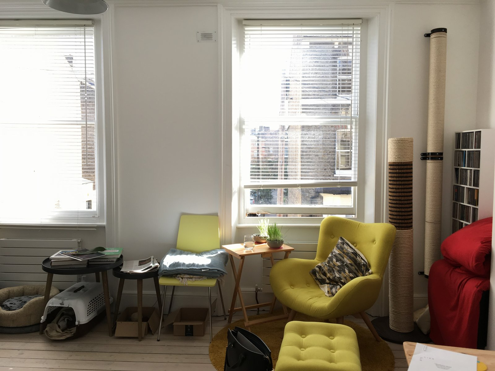
We’ve all got that one spot. You know the one. It’s usually tucked behind a door, squeezed between two pieces of furniture, or sitting awkwardly at the end of a hallway. For months, maybe even years, it collects dust, stray mail, or that pile of clothes you swear you’ll fold later. It feels like an afterthought. A visual glitch in your otherwise nice home. But what if that dead space could actually be the most interesting part of the room?
It doesn’t take a full renovation to fix it. You don’t need to knock down walls or buy expensive new furniture. In fact, the secret lies in looking at what you already have. By mastering the art of the vignette—a small, curated grouping of objects—you can turn those cluttered, forgotten nooks into intentional moments of beauty. It’s about shifting your perspective from "storage problem" to "display opportunity." And honestly? It’s easier than you think.
Understanding the Power of the Vignette
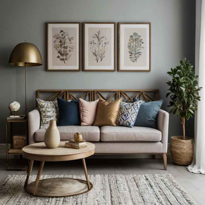
So, what exactly is a vignette? In interior design terms, it’s a small arrangement of decorative items that work together to tell a story or create a mood. Think of it as a mini still-life painting in three dimensions. According to recent insights from restoredstyle.com, these intentional displays serve as visual anchors. They reflect your personal style while adding depth and character to every room. Instead of seeing a corner as empty or messy, you start seeing it as a canvas.
The beauty of a vignette is its flexibility. You can create them on a coffee table, a bookshelf, a windowsill, or yes, that awkward floor corner. The key is intentionality. Clutter happens when things are placed without thought. A vignette happens when things are placed with purpose. It transforms a generic area into something memorable. As noted by coohom.com, building mini "story corners" with photo frames, souvenirs, and stacks of themed books can make dull spaces feel personal and alive.
Why does this matter in 2026? Because our homes are becoming multi-purpose hubs. We work, rest, and play in the same squares footage. We need spaces that calm us down, not ramp up our anxiety. A well-styled corner acts as a visual pause button. It gives the eye a place to rest. When you walk into a room and see a thoughtful arrangement instead of a pile of junk, your brain registers order and care. It’s a small change with a big psychological payoff.
The Golden Rules of Composition
Before you start grabbing things off your shelves, there are a few basic rules to keep in mind. Designers often talk about the "rule of three," and for good reason. Grouping items in odd numbers—three, five, or seven—is visually more appealing than even numbers. It creates a sense of balance without being too symmetrical or rigid. If you’re styling a corner, try starting with three main objects. It’s manageable and almost always looks right.
Height variation is another critical element. If everything is the same height, the eye gets bored. You want to create a triangle shape with your items. Start with the tallest object, perhaps a vase or a stack of books, then add a medium-height item, and finish with something low and wide. This guides the viewer’s eye up and down, creating movement. Foter.com suggests including items of similar tone or style but varying heights, shapes, and sizes to keep the look cohesive yet dynamic.
Don’t forget about negative space. This is the empty space around your objects. It’s just as important as the objects themselves. Over-styling is a common mistake. When you cram too many things together, it looks cluttered again, defeating the whole purpose. Embrace the breathability. Let each item have its own moment to shine. If you feel like something is missing, try taking something away instead of adding more. Less is often more, especially in tight corners.
Choosing Your Anchor Piece
Every great vignette needs an anchor. This is the star of the show, the item that draws the eye first. It sets the tone for the rest of the arrangement. An anchor piece can be anything: a large framed print leaning against the wall, a sculptural lamp, a tall indoor plant, or even a vintage suitcase. The goal is to pick something with presence. Something that says, "I belong here."
Once you have your anchor, build around it. If your anchor is a tall plant, you might add a smaller potted succulent at its base and a stack of gardening books nearby. If your anchor is a piece of art, you could place a small sculpture in front of it and a candle to the side. The anchor provides stability. Without it, the vignette can feel floating or disjointed. It grounds the arrangement in the space.
In 2026, we’re seeing a trend towards organic anchors. Natural materials like wood, stone, and ceramic are huge. They bring warmth and texture into a room. A rough-hewn wooden bowl or a smooth river stone can serve as a perfect anchor because they connect the indoors with the outdoors. These elements feel timeless and calming. Plus, they’re easy to find. You don’t need to spend a fortune. Sometimes the best anchor is something you found on a walk or inherited from a relative.
Layering Textures and Materials
Texture is what makes a vignette feel rich and inviting. If everything is smooth and shiny, it can feel cold and sterile. If everything is rough and matte, it might feel heavy. The magic happens when you mix them. Combine hard and soft, rough and smooth, glossy and matte. This contrast creates visual interest and invites people to look closer. It adds a tactile quality that makes the space feel lived-in and comfortable.
For example, pair a sleek metal tray with a chunky knit coaster. Place a glass vase next to a woven basket. Lean a linen-bound book against a ceramic figurine. These combinations create a dialogue between the objects. They highlight each other’s unique qualities. Southernhomeandhospitality.com highlights how kitchen counters can stay stylish and functional by mixing materials, a principle that applies perfectly to corner vignettes too.
Color plays a role here as well, but keep it simple. Stick to a limited palette. Two or three colors max. This helps tie the different textures together. If you have a lot of pattern or texture, keep the colors neutral. If your colors are bold, keep the textures simple. This balance prevents the vignette from looking chaotic. Remember, you’re trying to create a sense of harmony, not a circus act. The goal is for the eye to glide over the arrangement, not get stuck on any one jarring element.
Incorporating Personal Stories
A vignette isn’t just about looking good; it’s about feeling good. The most successful arrangements are those that mean something to you. They tell your story. Maybe it’s a souvenir from a trip to Japan, a photo of your grandparents, or a rock you picked up on your favorite hiking trail. These items add soul to your home. They transform a generic decor setup into a personal sanctuary.
Coohom.com mentions transforming generic areas into "memory-packed vignettes." This is key. Don’t just buy stuff to fill space. Look at what you already own. What items make you smile? What objects have a history? Displaying these things makes your home feel authentic. It shows who you are without you having to say a word. Guests will often ask about these items, leading to conversations and connections.
However, be selective. Just because an item has sentimental value doesn’t mean it needs to be in the vignette. Curate your memories. Choose the top three or four items that really speak to you. Rotate them seasonally if you like. This keeps the display fresh and allows you to enjoy different parts of your collection throughout the year. It’s a way of keeping your past present in your daily life, but in a controlled, beautiful way.
Let’s be real: life happens. Dust settles. Trends change. A vignette isn’t a set-it-and-forget-it project. It requires a little bit of maintenance to keep it looking fresh. Make it a habit to wipe down the surfaces and objects once a week. It takes two minutes and makes a huge difference. A dusty vignette looks neglected, no matter how well-styled it is. Keep a microfiber cloth handy nearby so it’s easy to do.
Also, don’t be afraid to edit. If a vignette starts to feel stale, swap out one or two items. You don’t need to redo the whole thing. Maybe replace the candles with fresh flowers. Or switch out a book for a small box. Small changes can have a big impact. This flexibility is one of the best things about vignettes. They allow you to experiment with your decor without committing to a major overhaul.
Finally, consider the function of the corner. If it’s a high-traffic area, make sure the items are sturdy and won’t easily get knocked over. If it’s a quiet reading nook, you might include softer, more delicate items. Function should always inform form. A beautiful vignette that gets in the way or breaks easily isn’t serving its purpose. Keep it practical. Keep it safe. And most importantly, keep it enjoyable for you.
Transforming cluttered corners into stylish vignettes is less about design rules and more about mindfulness. It’s about paying attention to the details of your environment and choosing to bring order and beauty into them. By using simple accessories, respecting negative space, and infusing personal meaning, you can turn any awkward nook into a highlight of your home. It’s a small effort with a lasting reward. So go ahead. Look at that messy corner. See it differently. And start styling.