There’s a specific kind of magic that happens when you walk into a home where the kitchen doesn’t feel like a separate room. It feels like the pulse of the house. You know the vibe. Someone is chopping vegetables at the island, someone else is reading on the sofa ten feet away, and yet, nobody feels interrupted. They feel connected. In 2026, this isn’t just a trend anymore; it’s pretty much the standard for how we want to live. We crave that visibility. We want to be part of the action, even when we’re just boiling water for pasta.
But let’s be real for a second. Taking down walls is the easy part. The hard part? Making sure the space doesn’t feel like a chaotic warehouse or a sterile showroom. It’s about flow. It’s about knowing exactly where to put the fridge so it doesn’t block the view of the TV, or choosing flooring that ties the cooking zone to the lounging zone without looking mismatched. If you’ve ever stood in your own kitchen feeling like you’re on a stage while everyone else watches from the audience, you know what I mean. We’re fixing that today.
This guide is for anyone who wants their home to feel bigger, brighter, and way more social. Whether you’re renovating a cramped 19th-century farmhouse or tweaking a modern apartment layout, the principles stay the same. It’s not about following rigid rules. It’s about creating a space that works for your life. So, grab a coffee (or wine, no judgment here) and let’s dive into how to make your kitchen and living room dance together perfectly.
Visual Continuity: The Invisible Thread
The first thing your eye notices isn’t the cabinet hardware or the fancy faucet. It’s the overall feel. Does the space look like one room, or two rooms that got smashed together? To get that seamless look, you need visual continuity. This is just a fancy way of saying you should carry similar elements from the kitchen into the living area. Think of it like an invisible thread stitching the zones together.
Start with your color palette. You don’t have to paint everything white (please don’t, unless you love cleaning). But you do need harmony. If your kitchen cabinets are a warm oak, maybe introduce that same wood tone in your living room coffee table or shelving units. If your kitchen backsplash has hints of sage green, throw a few sage pillows on the sofa. It’s subtle, but it works. According to recent design insights from sources like House Beautiful, using a cohesive color palette is one of the most effective ways to unify disjointed spaces. It tricks the brain into seeing one large, intentional area instead of fragmented boxes.
Materials matter too. If you have sleek quartz countertops in the kitchen, consider a similar stone or composite material for a side table or fireplace surround in the living area. It creates a rhythm. Thierry Lemaire, a designer known for his work in Normandy farmhouses, nailed this by keeping the exposed beams and rustic wood tones consistent across both zones. The result? An intimate refuge that feels grounded. You don’t need to match everything exactly. Just echo the vibes. Repetition creates comfort. And honestly, who doesn’t want their home to feel comforting?
Zoning Without Walls: Defining Spaces Softly
Okay, so we’ve got the visuals linked up. But how do you stop the kitchen from bleeding into the living room in a messy way? You need zones. But since we aren’t using walls, we have to get creative. This is where furniture and layout become your best friends. The goal is to define areas without blocking sightlines. You want to know what’s happening, not hide it.
The kitchen island is the classic divider, and for good reason. It acts as a physical barrier for spills and prep messes, but it’s low enough to keep the conversation going. But don’t just slap an island in there and call it a day. Think about orientation. As noted in recent guides from Accent Villa, incorporating furniture pieces that face both toward and away from the kitchen can help direct traffic and attention. For example, place bar stools on the kitchen side for eating, but maybe a slim console table on the living room side to hold lamps or decor. This creates a "back" to the kitchen zone, giving the living area its own identity.
Rugs are another secret weapon. A large area rug under the sofa and coffee table instantly says, "This is the lounge zone." It anchors the furniture and adds texture. Meanwhile, the kitchen floor stays bare (because, well, crumbs). This contrast in texture helps the brain switch modes when you walk from one area to the other. You can also use lighting to zone. Pendant lights over the island create a focused pool of light for cooking, while softer, ambient floor lamps in the living area signal relaxation. It’s all about layers. Layer your light, layer your textures, and the zones will define themselves naturally.
The Flow Factor: Traffic Patterns and Function
Let’s talk about movement. Or as designers call it, "flow." Bad flow is when you bump into someone trying to get to the fridge while they’re trying to sit down. Good flow is when you can glide through the space without thinking about it. In an open concept, this is critical because there are no doors to stop you. You need clear pathways.
The golden rule here is the work triangle, but expanded. In a traditional kitchen, you have the sink, stove, and fridge. In an open plan, you have to add the living room entry points and dining areas to that mental map. Make sure there’s at least 36 to 48 inches of clearance around your island. This allows people to walk behind you while you’re cooking without feeling claustrophobic. Necabinet’s 2025 design guide emphasizes maximizing this flow to keep the space functional and inviting. If you’re constantly dodging people, you won’t enjoy the openness. You’ll just feel exposed.
Think about where the main traffic lines are. Do people walk through the kitchen to get to the backyard? If so, keep that path clear of obstacles. Don’t put the dishwasher right in that walkway, or you’ll have a bottleneck every time you unload dishes. Instead, push the heavy appliance zones to the sides or back walls. Keep the center open. Also, consider the "landing zones." Where do groceries go when you walk in? Where do keys drop? Creating small, dedicated spots for these everyday actions prevents clutter from spreading into the living area. A cluttered kitchen kills the vibe of an open plan faster than anything else. Keep the surfaces clear, and the flow stays smooth.
Lighting the Way: Layers and Ambiance
Lighting can make or break an open space. If you rely on one big ceiling light, your home will feel like a hospital waiting room. Nobody wants that. You need layers. And I mean lots of them. The key is to treat the kitchen and living room as one canvas, but paint with different brushes.
Start with ambient lighting. This is your base layer. Recessed cans or track lighting can provide general illumination across the whole open area. Keep the color temperature consistent—usually around 2700K to 3000K for a warm, inviting glow. Mixing cool white in the kitchen and warm yellow in the living room creates a weird disconnect. Keep it uniform. Then, add task lighting. Under-cabinet lights in the kitchen are non-negotiable. They light up your workspace without glaring into the living area. Pendant lights over the island add height and drama, drawing the eye up and making the ceiling feel higher.
Finally, the mood layer. This is where the living room shines. Floor lamps, table lamps, and even dimmable sconces add warmth and intimacy. In 2026, smart lighting systems make this easier than ever. You can set scenes. "Cooking Mode" might brighten the kitchen tasks lights, while "Movie Night" dims everything except a soft glow behind the TV. The Spruce highlights how ceiling accents and cohesive lighting enhance flow. Don’t forget to highlight architectural features. If you have those beautiful exposed beams mentioned in Elle Decor’s features, uplight them. It adds depth and makes the space feel curated, not just assembled. Light is the easiest way to change the mood of a room instantly. Use it wisely.
Taming the Chaos: Storage and Clutter Control
Here’s the ugly truth about open kitchens: there’s nowhere to hide. In a closed kitchen, you can shut the door on a messy sink. In an open plan, that mess is staring at you while you try to relax on the couch. So, storage isn’t just about convenience; it’s about sanity. You need serious, strategic storage to keep the visual noise down.
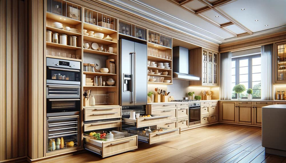
First, prioritize closed storage for the ugly stuff. Dishwashers, trash cans, and pantry overflow should be behind doors. Flat-panel cabinets with no handles (push-to-open mechanisms) are huge right now because they look like walls, not furniture. They recede into the background. Save the open shelving for the pretty stuff. Cookbooks, nice ceramics, plants. But be careful. As Accent Villa suggests, open shelving can act as a divider, but it also displays every crumb. Limit it to one or two sections max. The rest should be hidden.
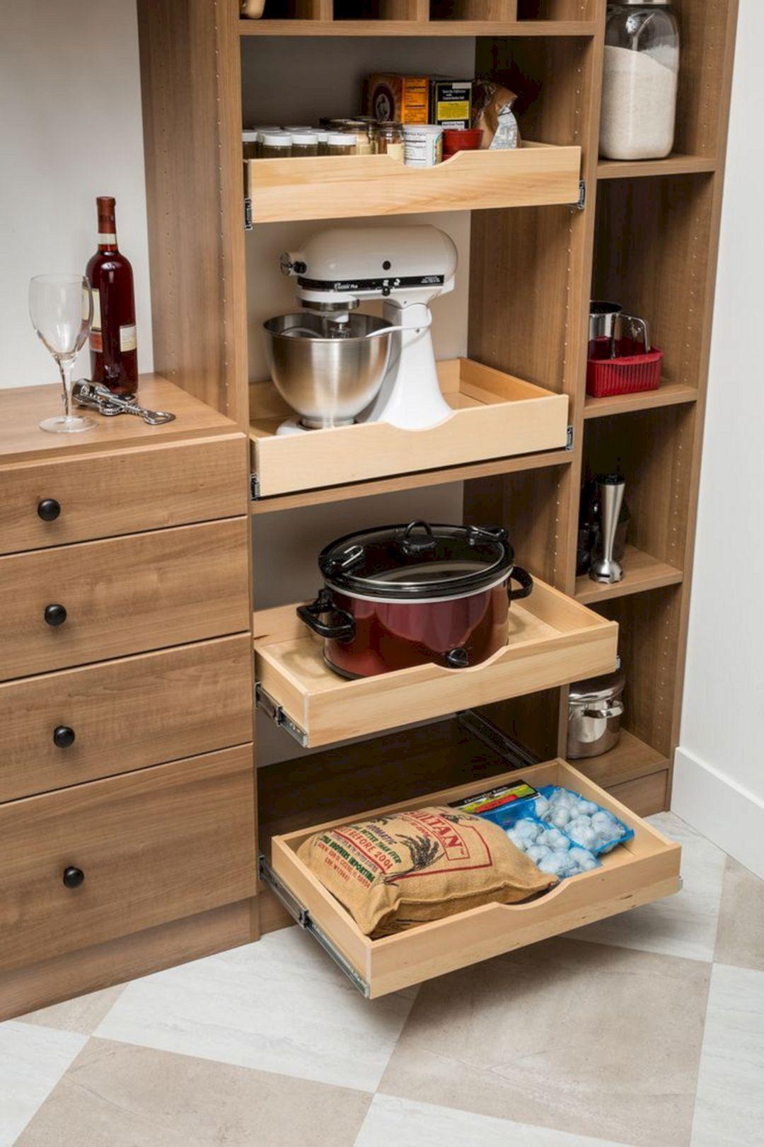
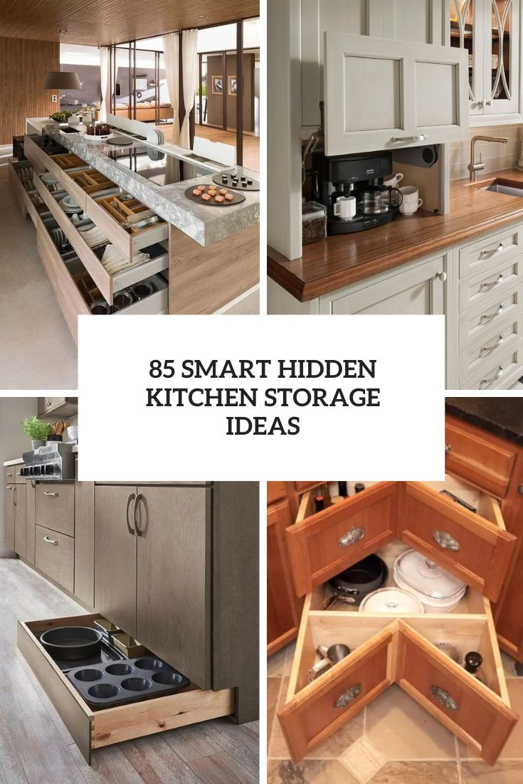
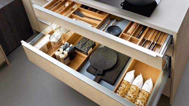
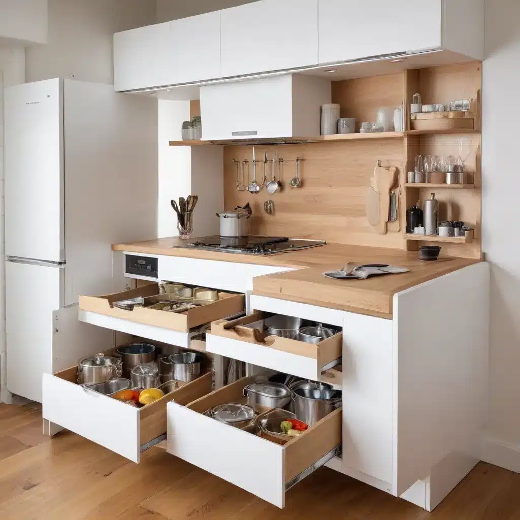
Integrated appliances are your best friend here. Panel-ready fridges and dishwashers that match your cabinetry blend in seamlessly. They don’t scream "APPLIANCE." They whisper "furniture." Also, think about vertical space. Tall cabinets that go all the way to the ceiling draw the eye up and offer massive storage capacity without taking up more floor space. This keeps the footprint small and the flow open. And please, have a plan for small appliances. Toasters, blenders, coffee makers—they clutter counters fast. Dedicate a cabinet with outlets inside (an appliance garage) so you can unplug and hide them when not in use. A clear counter is a happy counter. And a happy counter means a relaxing living room.
At the end of the day, a perfectly designed space means nothing if it doesn’t feel like you. Open concepts can sometimes feel a bit cold or generic if you stick too strictly to the rules. This is where personality comes in. It’s the difference between a showroom and a home. You need to inject life into the space.
Start with art. Large-scale artwork can bridge the gap between kitchen and living areas. Hang a big piece on the wall that’s visible from both zones. It creates a focal point that unites the room. Mix eras and styles. If your kitchen is modern and sleek, soften it with a vintage rug in the living area or some antique wooden stools at the island. Thierry Lemaire’s use of low wooden stools and built-in benches in his Normandy project shows how mixing textures and ages adds warmth. It invites people to linger.
Don’t forget the sensory details. Scent, sound, touch. A bowl of fresh lemons on the counter smells amazing. A soft throw blanket on the sofa invites you to curl up. Play music that fills the whole space, not just one corner. These little things make the space feel lived-in and loved. Homedecorbliss notes that personal details complete the open-concept look. It’s about balance. Balance function with comfort. Style with soul. Add plants. Real ones. They bring life and color, and they soften the hard edges of cabinets and tiles. A fiddle leaf fig in the corner or herbs on the windowsill can change the whole energy. Make it messy sometimes. Leave a book on the table. Let it be real.
So, there you have it. Designing an open kitchen that flows into your living space isn’t about perfection. It’s about connection. It’s about creating a backdrop for your life that supports how you actually live. Start with the visual thread. Zone with furniture, not walls. Keep the traffic moving. Layer your light. Hide the clutter. And then, fill it with your stuff. Your memories. Your mess. Your joy.
It might take some trial and error. You might move the sofa three times before it feels right. That’s okay. Design is a process, not a one-time event. Listen to how you use the space. Adjust as you go. The best homes are the ones that evolve with you. So go ahead. Knock down that wall if you need to. Or just rearrange the rugs. Either way, make it flow. Make it yours. And enjoy the view.