You know that feeling when you walk into a room and just… exhale? The tension in your shoulders drops. Your breathing slows. It’s not magic, though it might feel like it. It’s color. But here’s the thing most people get wrong: they pick paint based on what’s trending on social media or what looks good in a showroom under bright, sterile lights. They don’t pick it for how it makes them feel.
And honestly? That’s why so many of us end up repainting two years later. We chose "Agreeable Gray" because everyone said it was safe, but our living room feels cold and impersonal. Or we went with a bold navy because it looked dramatic online, but now our bedroom feels like a cave that drains our energy. In 2026, we’re moving past trends. We’re talking about neuro-aesthetics—how our brains react to our environment. This isn’t just about decor. It’s about designing a home that supports your mental health.
Let’s be real. Standing in front of that wall of paint chips is overwhelming. There are thousands of whites alone. It’s enough to make you want to just leave the walls bare. But it doesn’t have to be hard. If you follow a clear, step-by-step process that prioritizes your emotional response over exterior opinions, you’ll find colors that stick. Colors that feel like home. Here is exactly how to do it, without the headache.
Start With Your Feelings, Not the Fan Deck
Before you even look at a single swatch, you need to do some internal homework. Most people skip this. They jump straight to "I want blue." But why? Do you want blue because it calms you? Or because you saw it in a magazine? There’s a big difference. Grab a notebook. Seriously, put down the phone for a minute. Think about the primary function of the room you’re painting. Is it a place for high-energy creativity? A sanctuary for sleep? A spot for lively dinner parties?
Now, list three emotions you want to feel in that space. For a bedroom, maybe it’s "safe," "soft," and "restful." For a home office, it might be "focused," "clear," and "energized." This is your emotional brief. It acts as a filter. If a color doesn’t support those feelings, it’s out. No matter how pretty it is. Research in environmental psychology continues to show in 2026 that our surroundings directly impact cortisol levels. A chaotic color scheme in a relaxation zone keeps your brain on high alert. You’re fighting your own biology. Don’t do that to yourself.
Once you have your emotion words, translate them into color families. This is where basic color theory helps, but keep it simple. Warm colors (reds, oranges, yellows) tend to stimulate and energize. They’re great for social spaces but can be too much for a bedroom if they’re too bright. Cool colors (blues, greens, purples) generally calm and soothe. Neutrals aren’t just "beige" anymore; they’re complex mixes that can feel either warm and cozy or cool and crisp depending on their undertones. Match your emotion words to these families. "Safe" and "soft" might point you toward warm, earthy neutrals or muted greens. "Focused" might lean toward cool, crisp grays or deep blues.
Audit Your Light and Fixed Elements
Here’s where most DIY painters mess up. They pick a color in the store, love it, paint the wall, and then hate it once it’s dry. Why? Lighting. Light changes everything. A color that looks creamy and warm in the north-facing light of a showroom might look pink and sickly in your south-facing living room at noon. You have to work with the light you have, not the light you wish you had.
Start by identifying your fixed elements. These are the things you aren’t changing. Hardwood floors, kitchen cabinets, countertops, tile, even large pieces of furniture like a sofa or rug. Look at the undertones in these items. Does your oak floor have orange/yellow undertones? Then a cool, blue-gray paint will clash, making the floor look muddy and the wall look icy. You need to harmonize with these existing tones. If your fixtures are warm, lean toward warm paints. If they’re cool, go cool. It’s about creating a cohesive backdrop, not a battle between the wall and the floor.
Next, map your natural light. Stand in the room at different times of day. Morning light is often cooler and bluer. Afternoon light is warmer and golden. North-facing rooms get consistent, cool, indirect light all day, which can make colors look darker and flatter. South-facing rooms get intense, warm light that can wash out subtle colors. East and west rooms have shifting light that changes dramatically from morning to evening. You need a paint that works in all these conditions, or at least the ones when you use the room most. If you work from home in a north-facing office, you might need a warmer white to counteract the gloom. If your bedroom gets blazing afternoon sun, a soft, muted tone might prevent glare and overheating visually.
The Art of Sampling (Do It Right)
Okay, you have your emotion brief. You’ve audited your light and fixed elements. Now, finally, you can look at paint chips. But don’t buy gallons yet. And please, don’t just hold a tiny chip against the wall. Those chips are misleading. They’re too small to see the true effect, and they’re printed on paper, which absorbs light differently than painted drywall. In 2026, the standard advice from pros is still the same: sample big, sample smart.
Buy peel-and-stick samples or small pots of your top 3-4 choices. Brands now offer large, reusable swatches that you can stick on the wall, which is a game changer. If you’re using traditional sample pots, paint at least a 2×2 foot square on the wall. Better yet, paint on a large piece of white poster board so you can move it around the room. This lets you see how the color interacts with different corners and lighting conditions without committing to a permanent patch.
Watch the color for at least 24 to 48 hours. Check it in the morning, midday, and evening. Turn on your artificial lights at night. Does the color shift? Does it turn green under your LED bulbs? (This is common with certain grays and beiges.) Does it feel calming when you’re tired in the evening? Does it feel energizing when you’re starting your day? Trust your gut reaction. If a color makes you feel anxious or uneasy, even if it’s "the right choice" theoretically, drop it. Your emotional response is the ultimate data point. This step takes time—usually a week or two—but it saves you from the regret of repainting later. As noted in recent guides, rushing this phase is the number one cause of color dissatisfaction.
Understand Undertones and Context
Undertones are the secret sauce. They’re the hidden colors beneath the main hue. A white isn’t just white. It has undertones of yellow, pink, blue, green, or gray. A gray isn’t just gray. It can lean purple, blue, or green. Identifying these is tricky but crucial. If you mix clashing undertones, the whole room feels "off," even if you can’t pinpoint why. It creates visual vibration that tires the eyes and the mind.
To find the undertone, compare your swatch to a true white piece of paper. Hold them side by side. Does the paint look yellowish? Pinkish? Bluish? That’s your undertone. Now, look at your fixed elements again. Do their undertones match? If your countertop has subtle green veining, a paint with pink undertones will make both look dirty. A paint with green or neutral undertones will make the countertop pop and the walls feel clean. It’s about harmony.
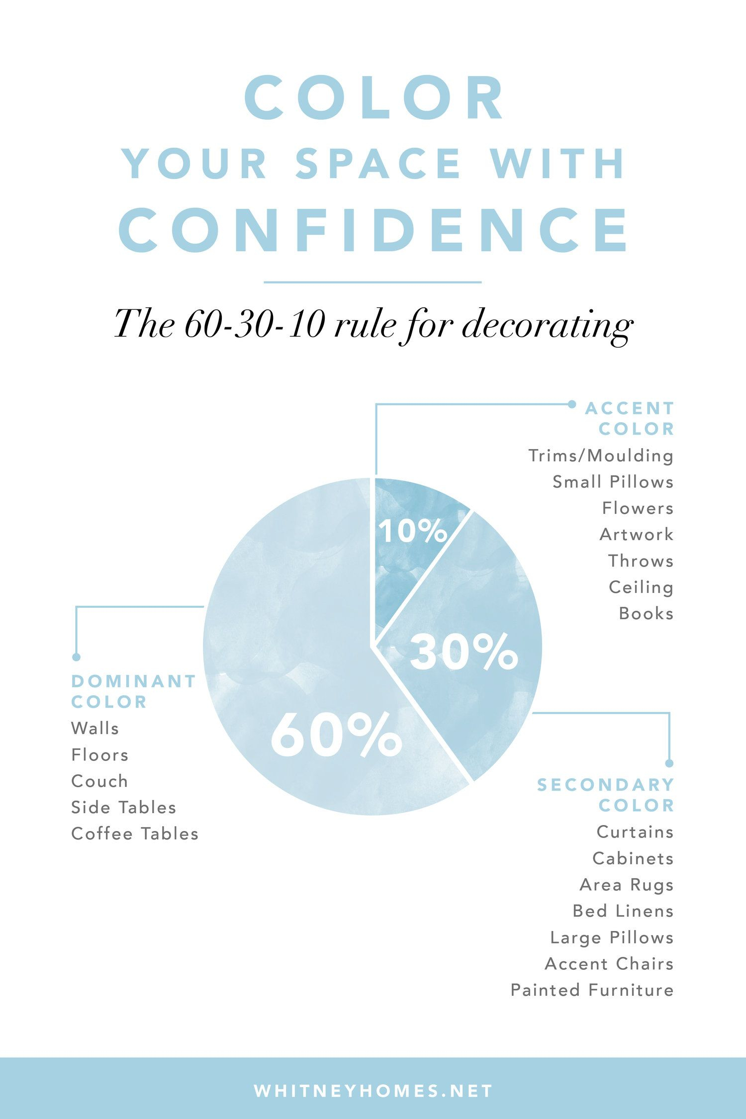
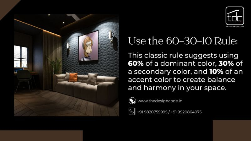
Also, consider the flow of your home. If you have an open floor plan, you can’t pick colors in isolation. The living room color needs to converse with the kitchen color. They don’t have to be the same, but they need to belong to the same family or share a common undertone. A popular method in 2026 is the 60-30-10 rule applied across spaces: 60% dominant neutral, 30% secondary color, and 10% accent. This creates a rhythm that guides the eye smoothly from room to room, reducing visual chaos. A chaotic visual field increases cognitive load. You want your home to feel restful, not like a puzzle your brain has to solve every time you walk through it.
Test the Sheen and Finish
People obsess over color and ignore sheen. Big mistake. The finish affects both the look and the mood of the room. Glossy surfaces reflect more light, making colors appear brighter and more intense. They also highlight imperfections in walls. Matte finishes absorb light, making colors look softer, deeper, and more velvety. They hide wall flaws but can be harder to clean.
For mood enhancement, think about the texture of the light. In a bedroom, you want soft, diffused light. A matte or eggshell finish on the walls helps create that cocoon-like, gentle atmosphere. It reduces glare and softens the edges of the room. In a kitchen or bathroom, where energy is higher and cleanliness is key, a satin or semi-gloss might be better. It reflects light, making the space feel brighter and more awake. But be careful. Too much gloss in a small room can feel clinical and cold.
There’s also a tactile element. Matte finishes feel more organic and grounded. They invite touch. Glossy finishes feel sleek and modern but can feel distant. Consider how you want to interact with the space. Do you want to curl up and sink in? Go matte. Do you want to feel sharp and ready? Go with a slight sheen. Also, newer paint technologies in 2026 offer "washable mattes" that combine the soft look of flat paint with the durability of satin. Ask your paint supplier about these hybrid options. They’re worth the extra few dollars per gallon because they let you prioritize mood without sacrificing practicality.
This is the hardest part for type-A personalities. You want to be done. You want to check the box. But don’t. Once you’ve narrowed it down to one or two finalists, live with them for a few days. Keep the large samples on the wall. Move them around. Sit in the room with them. Notice how you feel. Do you find yourself avoiding that corner? Does the color make your skin look washed out in the mirror nearby? These are valid concerns.
Pay attention to your body. Do you feel tense when you look at the darker option? Do you feel sleepy in the afternoon with the lighter one? Your body knows before your brain does. This is somatic marking. We often ignore these subtle signals because we’re focused on logic ("It matches the rug!"). But if the color doesn’t support your well-being, it’s not the right color. Period.
If you’re still torn, ask a friend whose taste you trust, but only after you’ve formed your own opinion. Don’t let them override your gut. Their mood needs are different from yours. Maybe they love high-energy reds, but you need calm blues. This is your sanctuary. It should reflect your nervous system, not theirs. If you’re still stuck after all this, it’s okay to hire a professional color consultant for an hour. In 2026, virtual consultations are affordable and quick. They can spot undertone clashes you might miss. But usually, if you’ve followed these steps, you’ll have clarity. The right color will feel obvious. It will feel like a relief.
Choosing paint colors that enhance your mood isn’t about following rules. It’s about listening. Listening to your light, your space, and most importantly, yourself. It takes a bit of patience. It requires you to slow down in a world that pushes for fast decisions. But the payoff is huge. You’re not just painting walls. You’re curating your daily experience. You’re building a backdrop for your life that supports, calms, and inspires you.
So take a breath. Put down the fan deck for a moment. Think about how you want to feel. Then, let that feeling guide your hand. The perfect color is out there. It’s not the one on the cover of the catalog. It’s the one that makes you sigh with happiness when you walk through the door. And that’s worth waiting for.