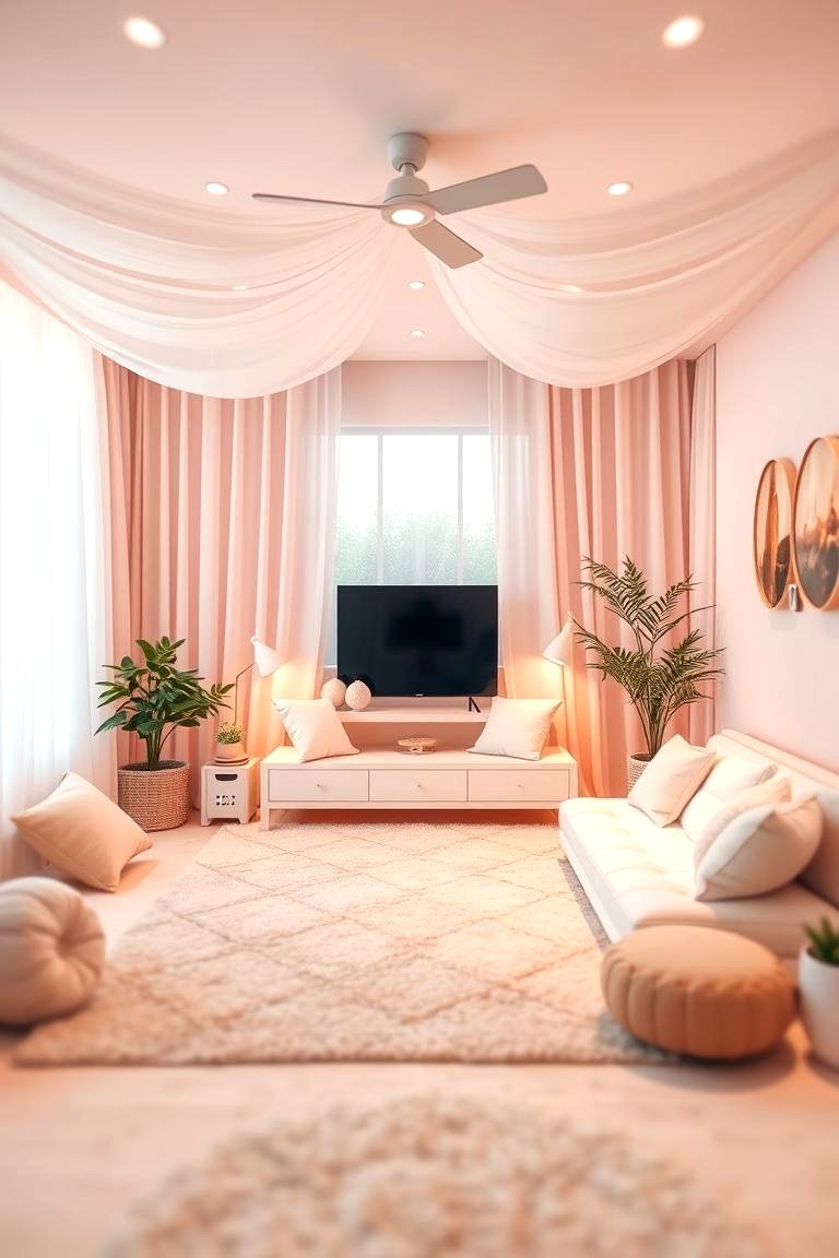
The afternoon sun cuts diagonally across the hardwood floor, casting long, lazy shadows over a room that breathes. There are no jarring neon flashes here, no aggressive geometric contrasts demanding your immediate attention. Instead, the walls wear a quiet coat of muted sage, the sofa is upholstered in unbleached Belgian linen, and a ceramic vase holds dried pampas grass that sways imperceptibly with the draft from an open window. You exhale, your shoulders dropping two inches. This is not the sterile, clinical minimalism of a corporate showroom, nor is it the sugary, nursery-room aesthetic that gave pastels a bad name for decades. This is quiet elegance—a deliberate, tactile retreat designed to shield the nervous system from the relentless static of the outside world.
For years, interior design swung violently between stark industrial grays and chaotic maximalist experiments. Yet as we navigate through 2026, our relationship with domestic space has matured into something deeply therapeutic. We are demanding homes that act as psychological shock absorbers. The modern application of pastel tones has evolved lightyears beyond the chalky pinks and baby blues of mid-century children’s bedrooms. Today’s palette draws directly from the earth: limestone, chalk, withered eucalyptus, clouded sea glass, and sun-bleached terracotta. By stripping away the synthetic brightness and embracing desaturated, mineral-based pigments, designers and homeowners alike are crafting living spaces that feel simultaneously airy and grounded.
Achieving this level of subdued sophistication, however, requires a precise understanding of color theory, material interaction, and light dynamics. Throwing a few pastel pillows onto a gray leather couch will not cut it; doing so often creates a jarring visual dissonance rather than a unified sanctuary. Transforming a room into a haven of quiet elegance requires treating color not as an arbitrary surface coating, but as an atmospheric medium. We must examine how natural light dances across desaturated hues, how raw textures counteract the inherent coolness of light pigments, and how to construct a living space that feels curated by nature rather than manufactured by a trend forecast.
The Chemistry of Calm: Decoding Mineral and Earth-Based Pastels
The secret to moving past the "Easter egg" trap of pastel design lies in understanding the undertones of the pigments you select. Traditional pastels are typically created by taking a saturated primary or secondary color and adding pure white until it reaches high lightness and low saturation. The result is often chalky, flat, and aggressively youthful. In contrast, natural pastels—the kind favored in contemporary 2026 interior architecture—are formulated by introducing gray, brown, or raw umber undertones into the color base. This grounds the hue, giving it weight, complexity, and a profound sense of maturity.
Consider sage green, arguably the cornerstone of the modern botanical pastel palette. A synthetic mint green reflects light aggressively and evokes commercial chewing gum. A natural sage, however, contains a heavy dose of grey and yellow-brown. When applied to living room walls, it mimics the dusty, waxy exterior of a live sage leaf, absorbing harsh rays and casting a soft, diffuse glow throughout the room. Similarly, blush pink shifts from a juvenile bubblegum shade into a sophisticated, clay-like terracotta or faded rose when blended with earthy beige undertones. This earthy desaturation allows the color to act almost as a neutral, harmonizing effortlessly with warm woods, blackened steel, and natural stone.
Light is the ultimate arbiter of how these tones behave within your specific four walls. A powder-blue living room facing north will absorb cold, bluish daylight, potentially turning the space into an icy cave unless balanced with warm amber lighting and tactile wools. Conversely, a south-facing room drenched in golden afternoon sun will elevate warm pastels like buttery cream, muted peach, and soft oat, making them feel luminous and expansive. Mapping your home’s orientation before selecting paint swatches is not merely a design recommendation; it is a structural necessity for achieving authentic visual harmony.
Crafting Depth Through Monochromatic Layering and Tactile Contrast
One of the most common missteps in soft-color interior design is falling into the trap of visual flatness. When walls, furniture, and textiles all share a similar high-lightness value without adequate variation in texture or shade, a room quickly loses its soul, feeling washed out and unmemorable. To cultivate quiet elegance, you must rely on monochromatic layering and aggressive tactile contrast. If your walls are a pale, chalky limestone, your sofa cannot simply be a smooth, flat fabric of the exact same light value. It needs to introduce weight through texture—think heavy loop boucle, coarse raw linen, or tumbled leather.
Textile selection becomes your primary tool for adding architectural muscle to a delicate color palette. Introduce heavy, floor-to-ceiling drapery in unrefined cotton-linen blends that pool slightly on the floor, adding verticality and softness. Layer wool and jute rugs to ground the floating feeling that pale colors can sometimes induce. When the eye encounters rough-hewn oak furniture, brushed brass hardware, and hand-thrown ceramic objects against a backdrop of muted seafoam walls, the space transcends mere decoration. It becomes a rich, sensory landscape where materials speak louder than loud pigments.
Furthermore, integrating natural wood finishes acts as an essential anchor for pastel schemes. Skip heavy, dark mahogany or glossy red-toned cherry woods, which fight against the airy disposition of pastels. Instead, lean into white oak, ash, walnut with blonde graining, or cerused timber. These medium-light wood tones bridge the gap between organic rawness and sophisticated refinement. A low-profile white oak coffee table resting on a cream-and-sage patterned wool rug establishes an immediate focal point that stabilizes the surrounding pastel architecture.
A Field-Tested Methodology for Curating Your Pastel Sanctuary
Transforming a chaotic, brightly colored or aggressively stark living room into a serene pastel haven requires a systematic, phased approach. Rushing the process often results in buying mismatched decor pieces that fail to cohere. Follow this step-by-step framework to ensure a deliberate, highly polished outcome.
- Step 1 (Light & Orientation Audit): Spend 48 hours observing how natural sunlight moves through your living room. Note which corners remain perpetually shaded and which are flooded with direct glare, as this dictates whether you need warm-undertoned pastels (peach, oat, warm blush) or cool-undertoned pastels (sage, slate blue, mist gray).
- Step 2 (Base Palette Selection): Choose one primary pastel hue for your largest surfaces (walls or large-scale upholstery) and two secondary supporting tones. Limit your palette to ensure the room maintains its cohesive, calming envelope rather than feeling like a confectionary shop.
- Step 3 (Material & Texture Mapping): Before purchasing any colored items, determine your texture profile. Balance smooth surfaces (plaster walls, glass tabletops) with heavy tactile elements (boucle upholstery, rattan, brushed metals, raw-edge stone).
- Step 4 (The Principle of Restraint in Decor): Clear out 50 percent of your current decorative accessories. In a quiet, elegant space, negative space is a luxury. Select a few statement objects—such as a large ceramic vessel, an abstract landscape painting with muted tones, or a single statement branch in a glass vase.
- Step 5 (Layered Illumination Design): Eliminate harsh overhead ceiling lights. Install dimmable, warm-spectrum LED lighting (around 2400K to 2700K) distributed across multiple levels: floor lamps, wall sconces, and low-profile table lamps that cast a golden glow against your pastel walls.
Navigating the Trapdoors: Common Pitfalls and Practitioner Workarounds
Even experienced designers occasionally stumble when working with delicate color profiles. Because pastels have such high light-reflectance values, small errors in lighting, scale, or color pairing become glaringly obvious. Recognizing these common pitfalls saves you from costly repaint jobs and frustrating furniture returns.
- Pitfall 1 (The Nursery Effect): Using high-saturation, blue-based pastels paired with crisp white trim creates an unintended children’s bedroom aesthetic.
- Workaround: Immediately ground the room by replacing bright white baseboards and crown molding with a warm, creamy off-white or a muddy taupe. Introduce matte black or dark bronze hardware to add instant sophistication.
- Pitfall 2 (Visual Monotony): Selecting furniture and walls in matching pastel shades without introducing pattern or deep neutrals.
- Workaround: Use the "rule of thirds"—two-thirds soft pastels and one-third grounding neutrals (such as charcoal, raw umber, or deep espresso wood) to anchor the eye and prevent visual fatigue.
- Pitfall 3 (Sterile Lighting Choices): Installing cool-toned LED bulbs (above 3500K) which turn sophisticated sage and blush walls into clinical hospital corridors.
- Workaround: Strictly mandate warm, low-Kelvin incandescent or high-CRI (Color Rendering Index) warm LED bulbs that emphasize the yellow and red undertones of your mineral paints.
- Pitfall 4 (Over-Accessorizing with Knick-Knacks): Filling every shelf with colorful trinkets that break the serene, meditative mood of the room.
- Workaround: Adopt a minimalist curation strategy. Group items in odd numbers, and store away 70% of decorative items, rotating them seasonally to keep surfaces clean and breathable.
- Pitfall 5 (Ignoring Scale and Silhouette): Placing delicate, spindly pastel furniture into a large room with high ceilings, making the furniture look lost and insignificant.
- Workaround: Ensure your foundational pastel furniture pieces feature substantial, architectural silhouettes (such as deep-seated modular sofas or heavy oak armchairs) even if their color is light and airy.
The Psychological Architecture of Quiet Interiors
The resurgence of natural pastels in modern interior design is not merely a fleeting aesthetic trend; it is a profound psychological response to cognitive overload. Environmental psychologists have long studied how color wavelengths affect human cortisol levels, heart rates, and cognitive processing. Highly saturated, vibrant colors—such as primary reds and electric yellows—stimulate the sympathetic nervous system, preparing the body for action. While appropriate for collaborative workspaces or high-energy kitchens, this constant stimulation in a living room—the primary space for decompression—prevents the nervous system from fully resetting.
Natural pastels, by virtue of their high luminance and low chroma, mimic the colors found in nature during twilight or early dawn. These are biological cues that signal safety, rest, and tranquility to the human brain. When you walk into a room bathed in desaturated sage and warm limestone, your visual cortex expends significantly less energy processing visual data. This reduction in cognitive load translates directly into physical relaxation: breathing slows, muscle tension dissipates, and mental clarity is restored.
Furthermore, this design philosophy aligns seamlessly with the broader shift toward sustainable, enduring living. Because natural pastels are deeply tied to organic pigments found in the earth, they do not suffer from the aggressive dating of neon trends or hyper-specific maximalist fads. A living room designed around the quiet elegance of stone, clay, and muted botanical tones is inherently timeless. It ages gracefully, requiring minor, intuitive updates rather than total overhauls as years pass, establishing a sanctuary that honors both your mental well-being and the longevity of your home.
Frameworks for Longevity: Maintaining Your Serene Living Environment
Creating a serene pastel living room is an achievement; maintaining its pristine, tranquil energy requires a conscious operational framework. High-lightness surfaces, by definition, reveal dust, wear, and everyday life more readily than dark, heavily patterned environments. However, rather than viewing maintenance as a burden, incorporate the upkeep of your space into a calming domestic ritual that reinforces the room’s peaceful purpose.
- Integrate Washable, Natural Textiles: Select slipcovered sofas and cushion covers crafted from pre-washed linen or heavy cotton canvas. This ensures that accidental spills or daily wear do not trigger panic, as high-quality natural fabrics can be easily laundered or professionally cleaned without degrading.
- Establish a Weekly Curation Ritual: Dedicate ten minutes each week to returning items to their designated places, fluffing down feather-filled cushions, and clearing off coffee table surfaces. Treat this not as a chore, but as a physical decluttering of your immediate environment.
- Protect Surfaces with Organic Finishes: Treat raw wood coffee tables and side tables with natural beeswax or matte penetrating oils rather than shiny polyurethane. This preserves the tactile, organic feel of the timber while providing robust protection against water rings and daily use.
- Embrace Patina as Elegance: Allow natural leather, unlacquered brass, and terracotta to age gracefully. In a quiet, elegant interior, slight signs of life and usage do not ruin the aesthetic; they enhance the narrative of a home that is genuinely lived in and loved.
The pursuit of quiet elegance is ultimately an act of reclaiming your interior life from the noise of the modern world. By stripping away visual clutter, embracing the grounded maturity of natural pastel tones, and anchoring your design in raw, tactile materials, you construct more than just a stylish room. You build a physical boundary between the frantic velocity of daily existence and the sacred sanctuary of home.
As you look around your living space, consider where the friction still lies. Is a wall too bright, a texture too synthetic, or a corner too crowded? Trust your instincts, lean into the soothing restraint of the natural spectrum, and allow your home to become what it was always meant to be: a quiet place to land.