Ever walked into a room and just felt… off? Maybe the walls were a nice shade of beige, but under the evening lights, they turned a sickly yellow. Or perhaps you loved a bold blue in the store, but now it makes your bedroom feel like a cave. It’s frustrating. We’ve all been there. You pick colors you think will look amazing, but once they’re on the walls, the whole vibe is wrong. It’s not just about picking pretty hues. It’s about how light dances with those hues. And honestly? Most of us get it backward. We pick paint first, then worry about lamps later. That’s a recipe for disaster.
Light and color are best friends. They can’t be separated. If you ignore one, the other suffers. In 2026, we’re seeing a huge shift away from sterile, all-white interiors toward spaces that feel alive and warm. People want homes that hug them back. But achieving that warmth isn’t accidental. It takes a bit of know-how. You don’t need a degree in design. You just need to understand the basics of how light changes color and how to make those two elements work together. Let’s dive in.
Understanding the Dance Between Light and Pigment
First things first. Light is not static. It changes throughout the day. Morning light is cool and crisp. Afternoon light is warm and golden. Evening light? Well, that depends on your bulbs. This matters because paint doesn’t have a fixed color. It reflects whatever light hits it. A gray paint might look sleek and modern at noon but turn muddy and purple by dusk if you aren’t careful. This is why testing is non-negotiable. You can’t trust the swatch in the hardware store. Those fluorescent lights lie. They strip out warmth and make everything look flat.
So, what’s the fix? Paint large samples on different walls. North-facing walls get less direct sun, so colors look cooler there. South-facing walls get blasted with light, making colors appear brighter and warmer. If you put a cool blue on a north wall, it might feel icy. Put that same blue on a south wall, and it might look vibrant and fresh. See the difference? It’s all about context. Also, consider the time of day you use the room most. If you’re only in your living room at night, test your paints at night. Don’t just look at them at 10 AM when you’re rushing to work. That’s a common mistake.
Another thing to remember is the Color Rendering Index, or CRI, of your light bulbs. This sounds technical, but it’s simple. CRI measures how accurately a light source shows colors compared to natural sunlight. Sunlight has a CRI of 100. Old-school incandescent bulbs were around 95-100. Many cheap LEDs today hover around 80. That means colors look washed out or slightly wrong. For a harmonious home, aim for bulbs with a CRI of 90 or higher. It makes a huge difference. Your red rug will actually look red, not orange-ish. Your green plants will look lush, not dull. It’s a small detail that adds up to a big impact.
Choosing a Whole-House Palette That Flows
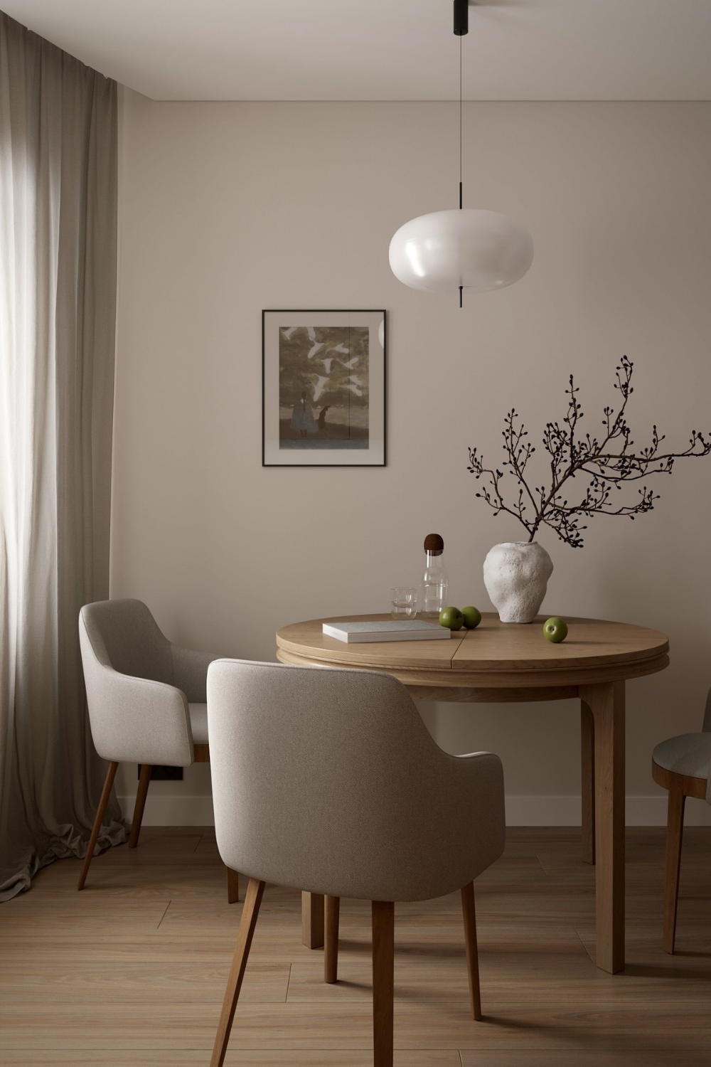
One of the biggest challenges people face is making their whole house feel connected. You don’t want each room to feel like a separate universe. That creates visual chaos. Instead, think of your home as a story. Each room is a chapter, but they’re all part of the same book. Start by picking a neutral base. This doesn’t mean boring white. It could be a warm greige, a soft taupe, or even a pale, airy blue. This base color should appear in most rooms, maybe as wall paint, trim, or large furniture pieces. It acts as the glue holding everything together.
From there, introduce accent colors. These can change from room to room to reflect the mood you want. A kitchen might need energizing yellows or greens. A bedroom might call for calming lavenders or deep blues. But here’s the trick: keep the undertones consistent. If your base neutral has warm, yellow undertones, stick with warm accents. If it’s cool and gray, go with cool accents. Mixing warm and cool undertones haphazardly is what makes a space feel disjointed. It’s subtle, but our eyes pick up on it immediately. We might not know why a room feels "off," but our brains notice the clash.
Look at the flow between rooms, too. If you have an open floor plan, this is critical. Stand in one room and look into the next. Do the colors fight each other? Or do they transition smoothly? You don’t need every wall to be the same color. In fact, that’s pretty dull. But you do need a thread. Maybe you use the same trim color everywhere. Or maybe you repeat a specific accent shade in pillows or art across different spaces. This repetition creates rhythm. It guides the eye and makes the house feel intentional. In 2026, designers are moving away from rigid rules and toward intuitive flow. Trust your gut, but check the connections.
Harnessing Natural Light for Mood and Depth
Natural light is the best light. It’s free, it’s healthy, and it makes colors sing. But you have to work with what you’ve got. You can’t change which way your windows face. So, how do you maximize what nature gives you? Start by keeping windows clean. It sounds obvious, but dirty glass cuts down on light significantly. Then, look at your window treatments. Heavy drapes block light. Sheer curtains diffuse it. If you have a dark room, skip the heavy fabrics. Let the light pour in. If you have too much harsh afternoon sun, use shades that can be adjusted. Control is key.
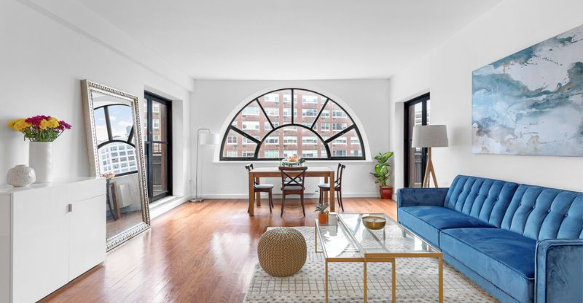
Mirrors are your secret weapon. They bounce light around and make spaces feel larger. Place a mirror opposite a window to reflect the outdoors and double the natural light. It’s a classic trick because it works. But be mindful of what the mirror reflects. You don’t want it bouncing back a cluttered corner. Aim it at something nice, like a plant or a piece of art. This not only brightens the room but adds depth. It creates a sense of expansion. In smaller homes, this is invaluable. It tricks the eye into seeing more space than there actually is.
Also, consider the exterior view. What’s outside your window affects the light coming in. Green trees cast a greenish tint. Brick buildings might cast a warm, reddish glow. Be aware of this. If you have a lot of green foliage outside, a yellow-based paint might turn neon. A cooler gray might balance it out. It’s all about compensation. You’re balancing the indoor colors with the outdoor light quality. This is where observing your space at different times really pays off. Watch how the shadows move. Notice when the room feels brightest. Use that knowledge to place your furniture and art. Put your reading chair where the morning light hits. Put your TV where glare won’t be an issue. Simple adjustments make a huge difference in daily comfort.
Artificial Lighting: Layering for Warmth and Function
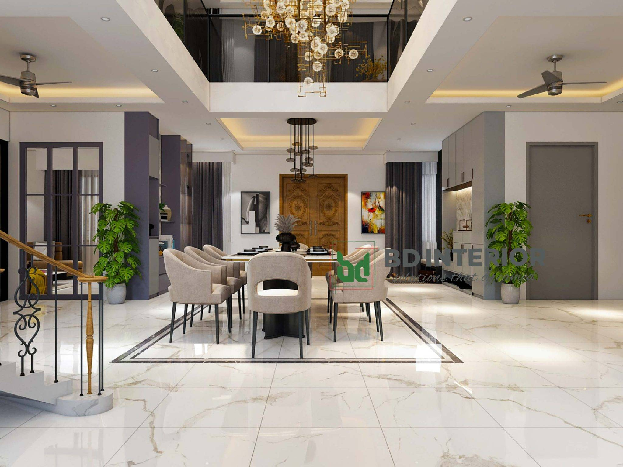
Once the sun goes down, artificial light takes over. And boy, do we mess this up. One ceiling fixture in the center of the room is not enough. It creates harsh shadows and makes the room feel flat. You need layers. Think of lighting in three categories: ambient, task, and accent. Ambient light is the general glow. Task light is for specific activities, like reading or cooking. Accent light highlights features, like art or architectural details. A harmonious home uses all three. It creates depth and interest. It makes the room feel cozy and inviting, not like a dentist’s office.
Let’s talk color temperature. This is measured in Kelvins (K). Lower numbers (2700K-3000K) are warm and yellow. Higher numbers (4000K-5000K) are cool and blue. For living spaces, stick to 2700K-3000K. It’s relaxing and flattering. Cool light is better for garages or utility rooms, where you need alertness. But in your bedroom or living room, cool light can feel sterile and cold. It disrupts your circadian rhythm, too. In the evening, you want to wind down. Warm light signals to your brain that it’s time to rest. So, swap out those cool bulbs. Your sleep quality might improve.
Dimmers are another game-changer. They allow you to adjust the intensity of light based on the time of day and your activity. Bright light for cleaning or working. Soft light for dinner or movie night. It’s versatile. And don’t forget about lamp placement. Floor lamps and table lamps bring light down to eye level. This creates a more intimate atmosphere than overhead lights. It draws you in. It makes the space feel human-scaled. In 2026, smart lighting systems are making this easier. You can program scenes. "Movie Mode" dims the lights. "Dinner Party" brightens them slightly. Technology is helping us create better ambiance with less effort. Use it.
Color Psychology and Room-Specific Strategies
Colors affect how we feel. This isn’t woo-woo; it’s science. Blue lowers heart rate. Red raises it. Yellow stimulates creativity. Green is restful. When choosing colors, think about the function of the room. What do you do there? How do you want to feel? For bedrooms, calm is key. Blues, greens, and soft neutrals work well. Avoid bright oranges or reds. They’re too energizing for sleep. For kitchens, you might want something more lively. Yellows and warm whites can make the space feel cheerful and welcoming. It encourages cooking and gathering.
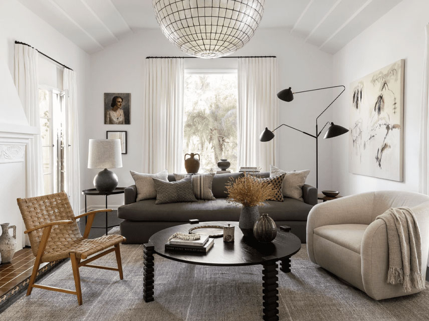
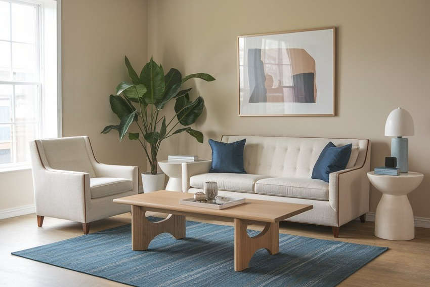
Living rooms are social hubs. They need to be flexible. Neutral walls with colorful accessories are a safe bet. You can change the mood with pillows and throws. If you love bold colors, use them on an accent wall or in large furniture pieces. But keep the rest of the room balanced. Too much bold color can be overwhelming. It causes visual fatigue. You want to relax in your living room, not feel like you’re in a circus tent. Balance is the goal. Harmony comes from contrast, but controlled contrast.
Home offices are tricky. You need focus, but you don’t want stress. Green is great for concentration. It’s easy on the eyes. Blue is good for logical tasks. Avoid too much white, which can cause glare on screens. And definitely avoid dull grays, which can feel depressing. Add some personality with art or a rug. Make it a space you enjoy being in. If you hate your office, you’ll procrastinate. Color can motivate. It sets the tone. Think about what inspires you. For some, it’s a deep navy. For others, it’s a crisp white with pops of coral. There’s no right answer, only what works for you. Listen to your instincts. They’re usually right.
Color isn’t just about paint. It’s about texture, too. A matte black wall feels very different from a glossy black one. Matte absorbs light. It feels soft and velvety. Gloss reflects light. It feels hard and modern. Mixing textures adds richness. It prevents a room from looking flat. Think about rugs, curtains, upholstery, and wood finishes. A smooth leather sofa paired with a chunky knit throw creates interest. A sleek marble countertop paired with rough-hewn wood cabinets adds warmth. These contrasts make a space feel curated and thoughtful.
Sheen matters for paint, too. High-gloss paint is durable and easy to clean, so it’s great for trim and doors. But it highlights imperfections. If your walls aren’t perfectly smooth, gloss will show every bump. Matte or eggshell finishes hide flaws better. They’re more forgiving. They also create a softer look. For bedrooms and living rooms, eggshell is usually a good choice. For kitchens and bathrooms, satin or semi-gloss holds up better against moisture and grease. Choose wisely. It’s not just about looks; it’s about practicality. A beautiful paint job that chips in a month is not harmonious. It’s annoying.
Don’t forget metals and hardware. Brass, chrome, nickel, black matte—they all interact with light and color. Warm metals like brass and copper pair well with warm colors. Cool metals like chrome and nickel pair well with cool colors. But mixing metals is trendy in 2026. Just keep it intentional. Don’t mix five different finishes. Pick two or three and repeat them. Consistency creates cohesion. A brass faucet in the kitchen should match the brass handles on the cabinets. Small details tie the whole look together. It’s the polish that makes a house feel like a home. Pay attention to these touches. They elevate the design from good to great.
Creating a harmonious home isn’t about following strict rules. It’s about understanding how light and color interact. It’s about listening to your space and your needs. Test your paints. Layer your lights. Choose colors that support your lifestyle. Mix textures for depth. And remember, it’s okay to make mistakes. You can always repaint. You can always swap a bulb. Design is a process, not a perfect destination. Take your time. Observe. Adjust. Enjoy the journey. Your home should be a sanctuary. Make it feel like you.