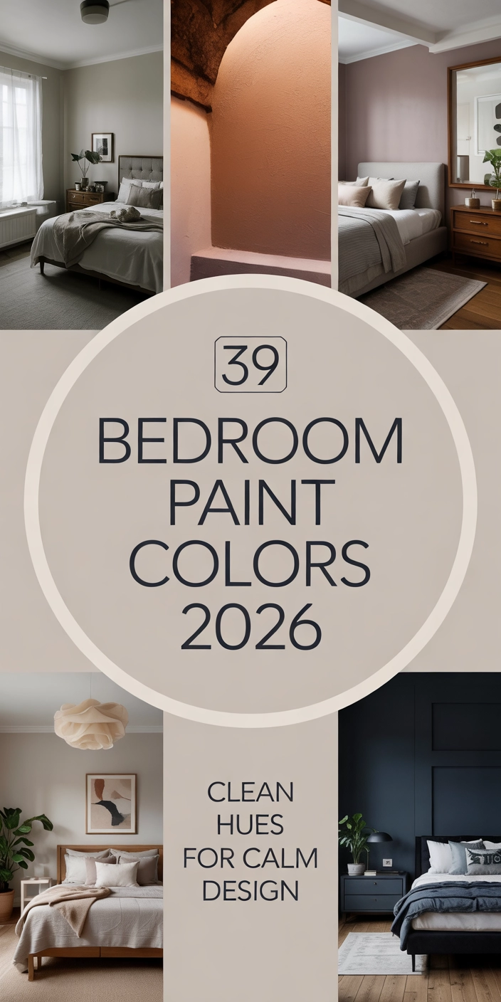
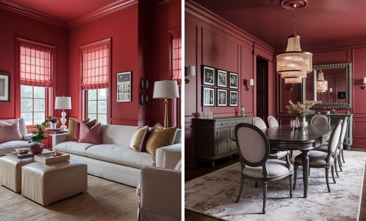
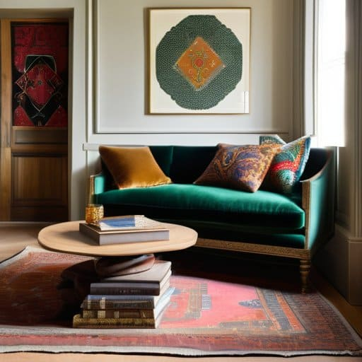
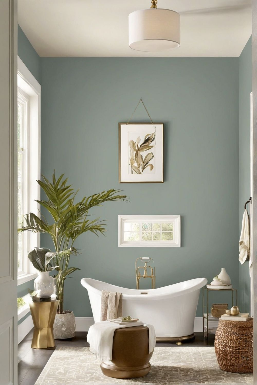
Imagine waking up to a silent alarm, rolling over, and instantly exposing your retinas to a backlit pane of glass glowing at six hundred nits. By the time your feet hit the floor, you have already digested three geopolitical crises, a dozen algorithmic video snippets, and an interface optimized entirely in high-saturation electric blues and neon greens. This visual onslaught is not an exception; it is the baseline of modern living. We spend our waking hours trapped in a synthetic luminosity that treats the human eye like a high-bandwidth data pipeline.
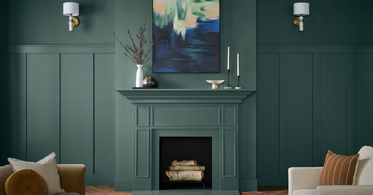
Yet, step away from the screen and walk into physical spaces or examine the aesthetic choices defining contemporary branding and interior design. Something has fundamentally snapped. We are turning our backs on the hyper-vibrant digital brights that dominated the past decade. Instead, our eyes are seeking refuge in ochres, burnt siennas, muddy olives, raw umbers, and chalky clay whites. This is not a fleeting seasonal preference or a random swing of the aesthetic pendulum. It is a biological survival mechanism disguised as a design trend—a desperate, hardwired reach for gravity in an era that feels entirely unmoored.
For years, the commercial world chased a specific flavor of digital perfection. Clean, sterile white backgrounds, slick gradients, and neon accents dominated both Silicon Valley interfaces and high-end residential architecture. This was the aesthetic of the frictionless future—a world where everything looked lightweight, frictionless, and easily wipeable. But perfection breeds suspicion. When every brand interface looks like a polished slab of glass, the human brain stops processing it as trustworthy and starts reading it as artificial. We have reached a saturation point of digital polish, and the resulting exhaustion has triggered a massive psychological correction toward material authenticity, texture, and visual weight.
The Neurobiology of Visual Exhaustion and Screen Fatigue
To understand why burnt umber and slate gray suddenly feel like a cooling glass of water on a scorching day, we have to look at how our neural circuitry processes light and color. The human visual system evolved over hundreds of thousands of years under open skies, surrounded by the spectrum of the natural world: the dull browns of soil, the muted greens of foliage, and the weathered grays of stone. These hues share a common denominator: they have low reflectance and high absorption. They do not demand aggressive processing from our rods and cones.
When we submerge ourselves in high-saturation digital color schemes, we force our nervous systems into a perpetual state of hyper-arousal. The blue-heavy light emitted by displays mimics midday sun, signaling the pineal gland to suppress melatonin production and keeping cortisol levels artificially elevated. Over time, this constant electrochemical bombardment leads to what environmental psychologists call directed attention fatigue. We lose our capacity to focus, our irritability spikes, and our tolerance for artificial stimuli plummets.
Grounded color palettes act as an immediate pharmacological antidote to this state. Earth tones and muted neutrals mirror the spectral distribution found in natural environments, which triggers an involuntary physiological down-regulation. Heart rates slow, blood pressure stabilizes, and the brain shifts from task-focused directed attention to effortless fascination—a state known in environmental psychology as attention restoration theory. When we surround ourselves with colors derived from physical matter rather than pixel matrices, our nervous system finally receives the evolutionary cue that it is safe to lower its guard.
The Cultural Awakening Toward Material Authenticity and Tactility
This aesthetic pivot extends far beyond simple color theory; it is deeply intertwined with a broader cultural disillusionment regarding the digital economy. For the better part of two decades, society outsourced large swathes of human experience to the cloud. We traded physical albums for streaming queues, tactile books for backlit tablets, and local community spaces for algorithmically curated social feeds. The promise was convenience. The hidden cost was a pervasive sense of dissociation—a feeling that nothing we touched was quite real.
As the lines between physical reality and digital simulation blurred further through synthetic media and automated workflows, the human desire for tangible truth intensified. People began searching for materials that bear the marks of time, labor, and origin. This is why interior designers and product creators are leaning heavily into unsealed woods, raw travertine, lime-washed walls, and textiles woven from heavy, unbleached fibers. Color cannot be separated from this material context. An earth tone only works because we instinctively associate it with a physical substance—clay, soil, bark, or stone.
When brands adopt grounded palettes today, they are communicating far more than modern sophistication. They are signaling honesty. By abandoning pure white backgrounds and replacing them with warm, grounding neutrals, companies drop the digital facade and establish an unspoken pact of trust with the consumer. In a marketplace drowning in deepfakes and automated content, tangible color is a radical declaration of presence. It says: we are real, we take up physical space, and we are not going anywhere.
Methodical Implementation of Grounded Color Systems in Design
Translating this psychological shift into physical spaces or digital branding requires deliberate strategy rather than an accidental wash of brown paint. A poorly executed earth-tone palette can easily slip from feeling cozy and grounded to looking dreary, heavy, or dated. Achieving the right balance demands careful attention to undertones, tonal layering, and spatial light dynamics.
- Step 1 (Audit Environmental Lighting): Before selecting any grounded color, analyze how natural light interacts with the space or screen interface. Warm earth tones with yellow or red undertones (like terracotta and raw sienna) can feel suffocating in rooms with weak, north-facing light, whereas cool-leaning neutrals (like stone grays and muted olives) risk feeling sterile if paired with harsh, unfiltered afternoon glare.
- Step 2 (Establish a Tonal Anchor): Choose a foundational dark neutral to ground the composition. This replaces the traditional use of pure black or stark white. Look to deep charcoal, blackened olive, or rich espresso brown to provide visual weight and structure without the harsh contrast of a digital layout.
- Step 3 (Layer Organic Textures): Color does not exist in a vacuum. To make grounded palettes resonate, pair matte finishes with tactile variation. Combine chalky lime-wash walls with brushed brass, coarse linen, and unsealed grain wood to create depth that a flat coat of paint can never achieve.
- Step 4 (Introduce Desaturated Secondary Accents): Avoid the trap of making every element monotone. Activate neglected secondary palettes by integrating muted, organic accents like moss green, dusty rust, or faded indigo. These hues inject emotional energy into a space without shattering the calming baseline.
- Step 5 (Test Across Mediums): If applying this shift to a brand identity or digital product, test the palette rigorously across different screen calibrations and viewing conditions. Ensure that low-saturation neutrals maintain enough contrast to meet accessibility standards while retaining their warm, analog feel.
Navigating the Traps: Common Pitfalls and Practitioner Workarounds
Even experienced designers frequently miscalculate when shifting away from high-contrast minimalism into the nuanced territory of grounded palettes. The margin for error is narrow because these colors rely entirely on subtle relationships of light and undertone rather than loud, attention-grabbing saturation.
- Pitfall 1 (The Muddy Trap): Mixing warm and cool earth tones indiscriminately results in spaces or designs that look dirty rather than sophisticated. Workaround: Stick to a unified color temperature family. If your base neutrals lean warm (red/yellow undertones), ensure your supporting accents share that thermal lineage unless you are intentionally creating contrast with a deliberate, cool-toned exception.
- Pitfall 2 (Sensory Deprivation): Overcorrecting away from bright colors can lead to spaces that feel overly somber, monotone, or depressing. Workaround: Introduce controlled moments of high visual interest through artisanal objects, organic irregularities, or lighting design rather than relying on neon color pops.
- Pitfall 3 (Ignoring Scale and Spatial Volume): Applying deep, light-absorbing earth tones to small, windowless rooms can make them feel claustrophobic and cave-like. Workaround: Reserve heavy, saturated earth tones for architectural focal points or furniture pieces, wrapping the primary envelope in lighter, highly reflective natural chalks and warm ivories.
- Pitfall 4 (Digital Translation Failure): Selecting a grounded hex code that looks stunning on a calibrated design monitor but appears dull, gray, or sickly on standard consumer displays. Workaround: Always test your digital color selections on physical proofing materials and across multiple uncalibrated mobile screens before finalizing asset production.
- Pitfall 5 (Trend Chasing Without Substance): Treating earth tones as a temporary aesthetic costume rather than an alignment with core brand values or personal well-being. Workaround: Ground your color decisions in the functional purpose of the space or the authentic ethos of the organization, ensuring the aesthetic is supported by material honesty.
The Economic and Environmental Imperative of Sustainable Aesthetics
The migration toward grounded color palettes is also quietly revolutionizing manufacturing, supply chains, and architecture. For decades, the pursuit of hyper-bright, consistent digital and industrial colors relied heavily on synthetic petrochemical dyes, toxic mordants, and energy-intensive bleaching processes. Achieving pure white paper, textiles, or plastics requires aggressive chemical processing that leaves a heavy ecological footprint.
Conversely, earthy and grounded aesthetics align naturally with sustainable material sourcing. Many true earth tones can be achieved using mineral pigments, clay washes, and plant-based dyes that require minimal chemical transformation. This creates a powerful feedback loop between aesthetics and ethics. When consumers see a room painted in raw umber or a product packaged in unbleached, fiber-rich paperboard, their psychological attraction to the color is reinforced by a subconscious recognition of environmental stewardship.
This convergence of beauty and sustainability points toward a larger economic shift. As consumers become increasingly skeptical of greenwashing, visual cues of sustainability must be backed by genuine material choices. The companies and designers who master this balance are not just following an aesthetic trend; they are future-proofing their work against a culture that demands honesty, longevity, and ecological responsibility in every facet of design.
Actionable Frameworks for Integrating Grounded Palettes Into Daily Life
You do not need a complete architectural overhaul or a corporate rebranding campaign to benefit from the psychological restoration offered by grounded color palettes. Bringing this shift into your immediate environment can be achieved through small, deliberate interventions that reduce visual noise and foster a sense of calm.
- Audit Your Personal Screen Environment: Change your digital operating system wallpapers and app background settings away from hyper-saturated neon themes. Opt for muted, organic photography or custom gradients built from warm stone and muted forest tones to reduce daily ocular fatigue.
- Introduce Living Textures: Replace synthetic decor items with natural materials that develop a patina over time. Think terracotta pots, unpolished stone trays, and untreated wood cutting boards that introduce genuine tactile variety into your living spaces.
- Rethink Small Textile Investments: Swap out bright, synthetic throw pillows, blankets, or table runners for pieces made from raw linen, wool, or heavy cotton dyed in earthy hues like clay, sand, and moss. These textiles absorb ambient light differently, softening the overall acoustic and visual atmosphere of a room.
- Simplify Your Visual Horizon: Clear out unnecessary clutter and reduce the number of high-contrast visual focal points in your primary workspaces. Allow walls and surfaces to breathe by adopting tonal, layered neutrals that encourage mental clarity and focus.
We are living through a profound cultural recalibration. The relentless acceleration of the digital age forced us into an unsustainable relationship with light, color, and attention. By recognizing our deep-seated biological need for grounded color palettes, we are doing much more than updating our homes and brand identities; we are reclaiming our equilibrium.
This return to earth tones, raw materials, and visual calm is a testament to human resilience. It proves that no matter how far we push into virtual spaces and automated efficiency, our bodies remember where we came from. We will always seek out the tactile, the honest, and the real. As we look toward the future of design, the most successful spaces and brands will be those that honor this fundamental truth—offering not just a feast for the eyes, but a true sanctuary for the human nervous system.