Step inside a five-by-eight-foot city apartment bathroom at 7:00 AM, and you immediately feel the squeeze. The walls seem to inch closer with every movement, trapping the steam, the echoes, and your morning grogginess in a box of limited square footage. Most homeowners instinctively react to this spatial restriction by slapping a coat of stark, high-gloss white paint on the drywall, hoping light will bounce around and magically expand the room. Instead, they end up with a sterile, interrogation-room aesthetic that feels harsh, uninviting, and ironically just as small as before.
Color is never a passive backdrop; it is an active psychological agent that dictates how the human brain registers physical boundaries. When interior designers tackle ultra-compact footprints, they do not just look at a paint deck to pick pretty shades. They manipulate chromatic wavelengths, optical weight, and psychological temperature to rewrite the geometry of a room. By understanding how the human eye interprets pigment, shadow, and saturation, you can completely dismantle the physical limits of a tiny bathroom without tearing down a single wall or losing an inch of floor space.
The evolution of the small-space bathroom has shifted dramatically over the years. Once treated purely as utilitarian, back-of-house utility boxes, compact powder rooms and en-suites have evolved into personal wellness capsules where people kickstart their mornings and wind down their nervous systems at night. Yet, urban densification and modern architectural trends mean that footprints are shrinking while expectations for luxury are climbing. This design tension has forced professionals to rely heavily on environmental psychology—the study of how human beings react to built environments—to trick the visual cortex into perceiving infinity where physical walls clearly exist.
Decoding Spatial Expansion Through Chromatic Wavelengths and Optical Physics
To understand why certain hues make a room expand while others cause it to collapse, you have to look at how light travels and how our eyes receive it. Warm colors—reds, oranges, and deep yellows—possess longer physical wavelengths. Because of this property, the human eye processes warm pigments as advancing elements. They demand immediate visual attention, leaping off the wall plane and pressing inward toward the center of the room. In a compact bathroom, an unregulated warm red or terracotta palette acts like a physical closing fist, shrinking the perceived volume and height of the space.
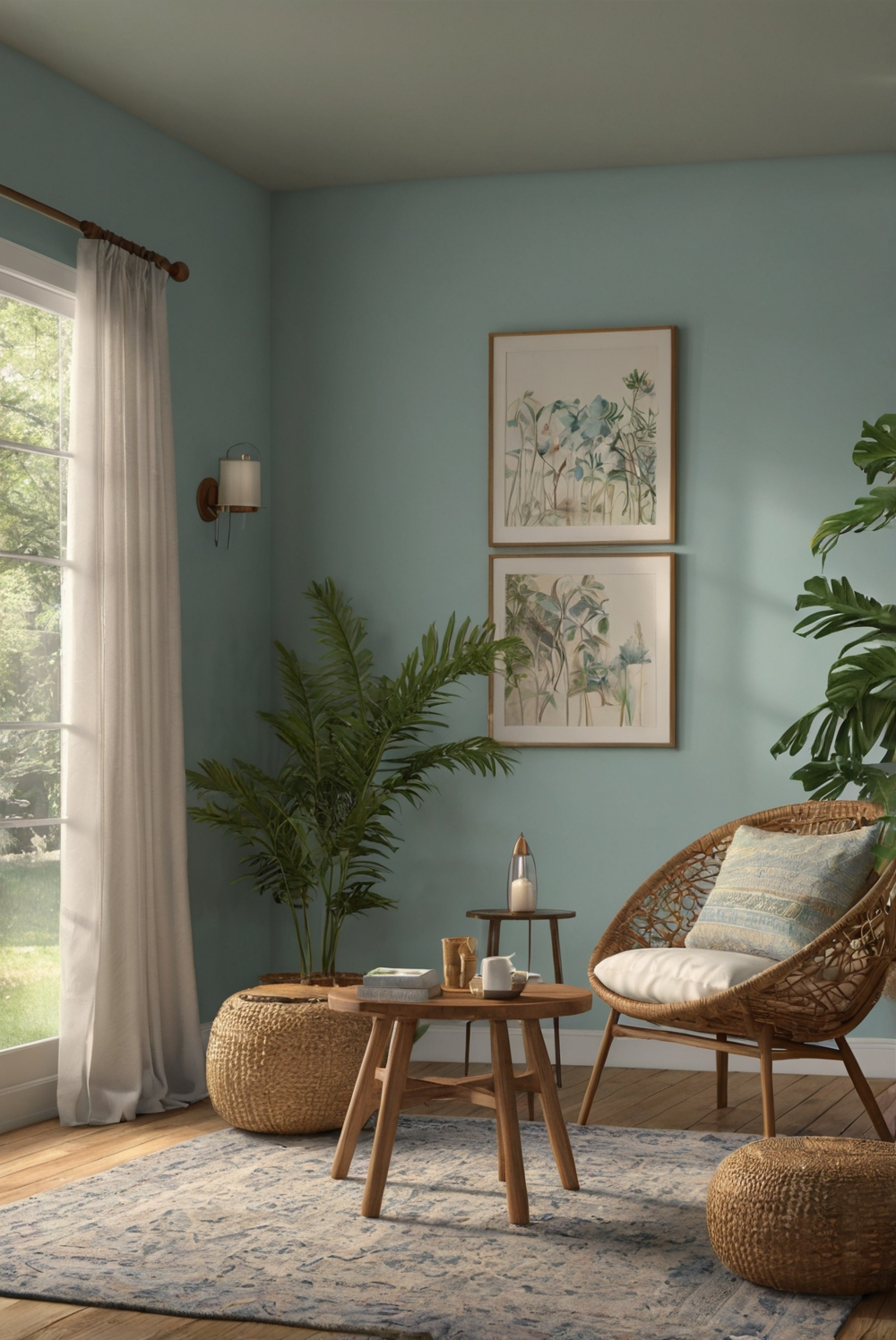
Conversely, cool colors like soft cerulean, muted sage, and aquatic blue-greens possess shorter, tighter wavelengths. These hues recede away from the observer. When applied to the envelope of a small bathroom, cool tones trick the brain into pushing the boundaries outward, making the perimeter walls feel as though they are melting away into the horizon. This optical illusion is compounded by light reflectance value (LRV). LRV measures the percentage of light a paint color reflects back into a room on a scale from zero (absolute black) to one hundred (pure reflective white). While high LRV whites are often the default choice, they can sometimes create harsh glare and expose every surface imperfection in a cramped space.
Professional designers instead leverage mid-to-high LRV desaturated tones that soften shadows while maximizing light bounce. A light gray-green with an LRV of 70, for instance, does not just bounce illumination; it cools the visual temperature of the room, creating an atmospheric haze reminiscent of an open morning landscape. This perceptual trickery bypasses logic. Even though your tape measure confirms the room is only twenty-five square feet, your nervous system processes the environment as an expansive, breathable sanctuary.
The Power of Monochromatic Drenching and Soft-Contrast Strategies
One of the most transformative techniques deployed by elite designers in tight quarters is monochromatic color drenching—sometimes referred to as color-wrapping. Historically, homeowners relied on the "rule of thirds" in small bathrooms, painting the wainscoting white, the upper walls a pastel color, and the trim a contrasting shade. This chops up a small room into jarring horizontal slices, drawing the eye to the finite boundaries of the space and emphasizing its cramped proportions.
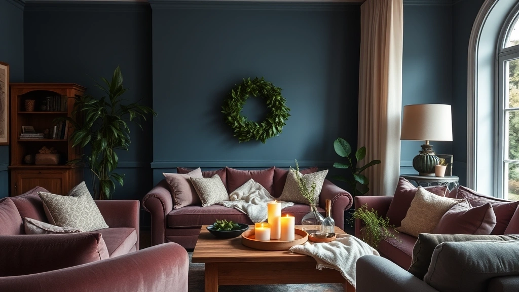
Color drenching completely upends this convention by coating every single surface—walls, baseboards, door frames, ceiling, and even the radiator—in the exact same hue and finish. By eliminating contrasting cut lines, the room loses its visual corners. When the eye cannot find a distinct transition point where the wall meets the ceiling, it stops measuring the room’s dimensions. The entire space blurs into a cohesive, atmospheric cloud. This strategy is particularly potent with moody, desaturated mid-tones. Contrary to the outdated myth that small rooms must always be painted white, enveloping a tiny powder room in a deep, cocooning olive green or slate blue creates an infinity effect. The dark walls recede into shadow, blurring the perimeter and making the room feel endlessly deep rather than tightly boxed.
Balancing this approach requires careful attention to finish sheen. To prevent a color-drenched room from feeling flat or suffocating, designers play with texture and gloss levels while maintaining absolute color unity. Using a flat or matte finish on the ceiling allows it to absorb overhead light and drift upward, while an eggshell or satin finish on the walls provides a subtle, velvety sheen that diffuses light softly across the space without creating harsh, pinpoint glare.
Implementing Designer-Approved Color Strategies for Maximum Spatial Impact
Transforming a compact bathroom requires a disciplined, step-by-step methodology that balances psychological intent with technical execution. Rushing into a hardware store and picking a paint chip under fluorescent lighting is the fastest way to ruin a small-space design.
- Step 1 (Audit the Light and Shadow Mapping): Track how natural and artificial light moves through your compact bathroom across twenty-four hours. Note which walls fall into permanent shadow and which catch direct glare, as this determines whether you need a cool recessive tone or a warm balancing hue.
- Step 2 (Select Your Baseline LRV Threshold): Choose a color palette with a Light Reflectance Value between 60 and 80 if you want an open, airy feeling, or drop to 20 to 35 if you are committing to an immersive, moody infinity-box effect. Never mix high-contrast extremes in a micro-room.
- Step 3 (Execute Total Surface Drenching): Apply your chosen color across the walls, baseboards, doors, and ceiling using uniform finishes. Eliminate visual stutter by matching your vanity or hardware framing to the surrounding chromatic envelope whenever possible.
- Step 4 (Introduce Strategic Chromatic Anchors): Prevent the space from feeling washed out by integrating organic, grounding accents. Incorporate warm natural wood tones, brushed brass fixtures, or tactile stone textures to add depth and tactile richness without breaking the visual flow.
- Step 5 (Calibrate Artificial Lighting Temperatures): Pair your color scheme with high-CRI (Color Rendering Index) LED lighting set between 2700K and 3000K. This warm-neutral illumination ensures your carefully chosen color psychology reads accurately and flatters both the space and human skin tones.
Navigating Common Pitfalls and Professional Workarounds in Small-Space Color
Even experienced renovators frequently stumble when trying to manipulate spatial perception through paint and finish choices. Recognizing these common traps can save you from a costly repaint and an underwhelming room.
- Pitfall 1 ( Relying on Stark White to Create Space): Slap-dash white paint often feels clinical, cold, and blindingly harsh under modern LED vanity fixtures. Practitioner Workaround: Shift away from pure titanium whites toward complex off-whites infused with green, ochre, or gray undertones—such as chalky alabaster or pale bone—which diffuse light with organic warmth.
- Pitfall 2 (Chopping Up Vertical Lines with Accent Walls): Painting just the back wall a contrasting bold color cuts the room in half, visually shortening the distance between you and the focal point. Practitioner Workaround: If you want an accent, use texture rather than color—such as vertical fluted wood paneling or slim vertical tiles—monochromatically drenched in the wall color to draw the eye upward toward the ceiling.
- Pitfall 3 (Ignoring the Ceiling Plane): Leaving the ceiling stark white in a dark or colored small bathroom creates a harsh "hat" effect that presses down on anyone standing inside. Practitioner Workaround: Always extend your wall color onto the ceiling, or tint the ceiling paint to twenty-five percent strength of your wall hue to maintain a seamless upward gradient.
- Pitfall 4 (Misjudging Finish Sheen in Wet Environments): Using flat matte paint directly inside a shower stall or high-moisture zone leads to premature degradation and water staining. Practitioner Workaround: Utilize moisture-resistant, scrubbable matte or satin formulations specifically rated for high-humidity architectural zones, ensuring performance without sacrificing the soft, velvety aesthetic.
- Pitfall 5 (Disregarding Fixture and Hardware Undertones): Pairing a cool, receding blue wall with harsh, yellow-toned polished brass can create visual dissonance that subconsciously clutters the room. Practitioner Workaround: Audit your metal finishes to match the undertone temperature of your wall color—pairing cool grays with brushed nickel or chrome, and earthy greens with living brass or bronze.
The Intersection of Wellbeing, Sensory Design, and Long-Term Spatial Value
The modern bathroom has transcended its origins as a purely utilitarian chamber. In contemporary interior architecture, it functions as a decompression lock between the chaotic outside world and the private sanctuary of the home. When square footage is restricted, the emotional burden of clutter and confinement multiplies. Color psychology acts as a non-verbal therapist in these tight spaces, directly regulating autonomic nervous system responses through visual cues.
Soft aquatic blues and mineral greens lower cortisol levels, mimicking the psychological restorative benefits of being near natural bodies of water. Earthy clay tones and warm taupes wrap the user in a sense of physical safety and grounding, transforming a mundane morning hygiene routine into an intentional ritual of self-care. Furthermore, mastering the chromatic illusions of small spaces yields substantial economic and architectural dividends. Instead of undertaking expensive structural renovations to steal square footage from adjacent closets or bedrooms, homeowners can achieve a dramatic expansion of perceived volume simply through strategic color placement and lighting design.
This sustainable approach respects the original architecture of the home while maximizing functional and emotional utility. As urban living spaces continue to compact, the mastery of color psychology transitions from an elite designer secret to an essential toolkit for modern spatial design.
Strategic Recommendations for Executing Your Compact Bathroom Transformation
Translating psychological principles into a finished room requires a clear framework of execution. Keep these core takeaways at the forefront of your design process to ensure your compact bathroom achieves an endless, harmonious feel.
- Prioritize Flow Over Contrast: Eliminate visual speed bumps by maintaining a continuous color story across walls, trim, and ceilings.
- Leverage Desaturation: Choose muted, complex pigments over hyper-saturated primary colors to prevent optical claustrophobia and visual fatigue.
- Manage Light Quality: Combine your color palette with warm, high-CRI lighting to eliminate harsh shadows and enhance spatial depth.
- Embrace Tactile Variety: Introduce natural materials and subtle textures to add sensory richness without disrupting the chromatic continuity of the room.
- Test in Situ: Always paint large sample boards and observe them in your specific bathroom across all lighting conditions before committing to a full-room application.
The transformation of a compact bathroom is ultimately an exercise in psychological architecture. By stepping away from outdated design dogmas—such as the blind reliance on stark white paint to fake square footage—you open up an entire spectrum of spatial possibilities. Color is a profound tool that speaks directly to the human subconscious, shaping our moods, altering our perception of physical boundaries, and turning tight corners into infinite escapes.
As you stand on the threshold of your own small-space redesign, remember that limitations are merely invitations for more creative problem-solving. By respecting chromatic wavelengths, embracing monochromatic drenching, and honoring the emotional weight of tone and texture, you can craft a compact bathroom that feels not like a compromise, but like a boundless, personal masterpiece.