You step out of the shower, reach for a towel, and suddenly the walls feel like they are inching inward. It is not your imagination, nor is it merely a byproduct of living in a modest home. Even a bathroom with respectable square footage can feel claustrophobic, heavy, and oppressive. More often than not, the culprit isn’t the physical layout, the plumbing stack, or the size of the room itself. It is the color scheme.
Color dictates how light behaves within a confined architectural box. When shades are deployed without an understanding of light reflectance values (LRV) and optical physics, they trap illumination rather than bouncing it around. You end up with a space that swallows natural light, highlights awkward corners, and makes every square inch feel compressed.
Fixing a cramped-feeling bathroom requires more than just slapping a coat of stark white paint on the drywall and hoping for the best. Achieving an expansive, breathable atmosphere takes a calculated approach to undertones, contrast ratios, and surface finishes. Let’s examine why your current color strategy is failing you and how professional interior designers manipulate color theory to turn tight spaces into luminous retreats.
For decades, standard architectural advice dictated that small rooms required pure white to maximize reflected light. This often resulted in sterile, clinical environments that lacked character, resembling hospital wards rather than personal sanctuaries. Homeowners rebelled, turning to moody jewel tones, charcoal grays, and rich, saturated earth tones popularized by design platforms and shelter magazines.
The trouble began when these rich palettes were transposed directly from sprawling, light-drenched Pinterest boards into windowless powder rooms or tight apartment en-suites. A deep navy blue that looks breathtaking in a room with twelve-foot ceilings and floor-to-ceiling windows behaves entirely differently in a five-by-eight-foot box illuminated by a single overhead LED fixture. The color absorbs ambient light instead of reflecting it, creating hard shadow lines that visually shrink the perimeter.
Furthermore, the mistake is rarely just about the hue on the walls. It is about the relationship between the wall color, the flooring material, the vanity finish, and the hardware. When all these elements compete in a high-contrast battleground, the eye is forced to process too many visual stops at once. The room fractures into tiny pieces, erasing any sense of continuous flow and leaving you feeling trapped inside a physical puzzle box.
The Science of Light Reflectance and Why Your Walls Are Stealing Your Space
To understand why a room feels cramped, you have to look at how light interacts with paint surfaces. Every paint color possesses a specific Light Reflectance Value, a metric measured on a scale from zero percent (absolute black, which absorbs all light) to one hundred percent (pure white, which reflects all light). If your bathroom feels suffocatingly small, chances are your walls are coated in a color with an LRV below forty, meaning it absorbs the majority of the light hitting it.
Beyond raw LRV, undertones play a massive psychological trick on the human brain. Cool colors—such as icy blues, mint greens, and crisp grays—naturally recede in our field of vision. When light hits a cool, high-LRV wall, the photons scatter in a way that tricks the optic nerve into perceiving the boundary as being further away than it actually is. Conversely, warm colors with strong yellow, red, or brown undertones advance toward the viewer, creating an enveloping, intimate atmosphere that translates to "cramped" in tight quarters.
Specular reflection—the mirror-like reflection of light from a surface—is another missing piece of the puzzle. Flat and matte paints absorb light diffusely, which can make walls look velvety and rich in a large bedroom, but in a small bathroom, they act like a sponge. Satin, eggshell, and semi-gloss sheens bounce light back into the room, effectively multiplying the available illumination. If your walls are draped in a dark, matte finish, you have effectively installed a visual ceiling that presses down on anyone standing inside.
Breaking Down the Visual Triggers That Shrink Your Bathroom
Beyond paint chemistry, several systemic design errors work in tandem with poor color choices to exacerbate the feeling of spatial compression. One of the most common culprits is high-contrast wainscoting or wainscot paneling that cuts the wall horizontally in half. When a dark color sits below a stark white chair rail, or vice versa, it creates a sharp horizon line that draws the eye sideways and stops it dead in its tracks. This horizontal slicing breaks up the vertical continuity of the room, making standard eight-foot ceilings feel agonizingly low.
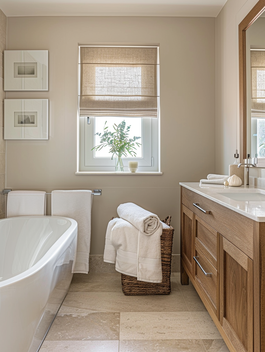
Another major offender is the lack of tonal harmony between fixed architectural elements and moveable decor. Consider a bathroom with beige travertine floor tiles, stark bright-white porcelain fixtures, and muddy taupe walls. These conflicting undertones fight for dominance. The yellow-beige of the floor clashes with the cool undertones of the walls, creating a visual discord that makes the room feel cluttered and unsettled, even when it is completely clean.
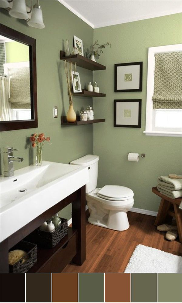
Countertops and vanities also contribute significantly to this optical illusion. A heavy, dark wood vanity placed against a medium-toned wall creates a massive visual anchor. Your eyes immediately lock onto that dark block of mass, ignoring the rest of the room and registering the footprint as severely restricted. Designers know that if an object has visual weight, it consumes perceived space, regardless of its actual physical dimensions.
How to Audit and Reset Your Bathroom Color Strategy
Transforming a cramped room requires a methodical, step-by-step approach to stripping away visual noise and recalibrating your palette. You cannot simply guess a new color swatch; you must analyze the room’s natural light exposure, fix tonal imbalances, and create an uninterrupted continuum of sightlines.
- Step 1 (Analyze Light Exposure and LRV): Observe how natural light enters your bathroom throughout the day. If the room faces north, the light will be cool and blue, requiring a warm-neutral with an LRV above seventy to prevent the space from feeling icy and harsh. If it faces south, embrace clean neutrals or soft, cool-leaning pastels that temper the intense glare without shrinking the room.
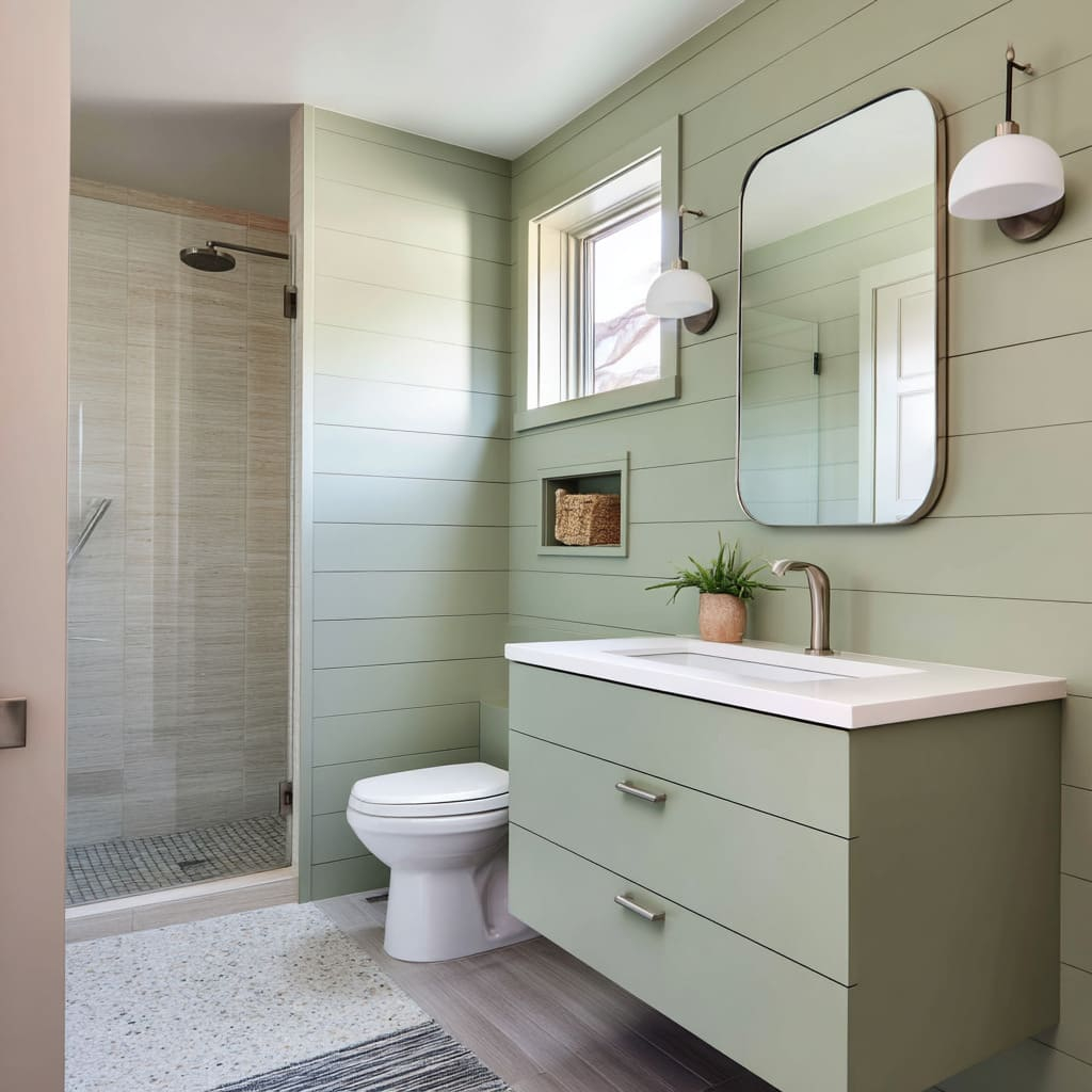
- Step 2 (Establish a Monochromatic Base): Select a primary wall color and match your large surfaces—such as tiles, cabinetry, and wall panels—as closely as possible to that same hue. By minimizing contrast between vertical and horizontal planes, you eliminate hard visual borders, tricking the eye into seeing an expansive, continuous space.
- Step 3 (Upgrade Your Paint Sheen): Transition away from light-absorbing matte finishes. Opt for a moisture-resistant satin or soft eggshell sheen on the walls. These finishes offer a subtle, diffused reflection that bounces light around the perimeter, brightening dark corners without creating harsh glare.
- Step 4 (Calibrate Fixture and Hardware Undertones): Audit all fixed elements in the room. If your tiles lean warm (pinkish beige or golden taupe), ensure your wall paint and fixtures share those warm undertones. Eliminate conflicting yellow-whites and blue-whites so the room reads as a unified, cohesive whole rather than a patchwork of mismatched materials.
- Step 5 (Introduce Strategic Vertical Lines): If your ceilings feel low, use vertical elements—such as floor-to-ceiling tile stacks, vertical wood slat paneling painted the exact same color as the walls, or tall, slender mirrors—to draw the eye upward, instantly restoring a sense of vertical volume.
Navigating Advanced Design Traps and Practitioner Workarounds
Even when homeowners follow basic color guidelines, subtle execution errors can sabotage the final result. Understanding these advanced pitfalls ensures your renovation achieves the bright, airy sanctuary you are aiming for.
- Pitfall 1 (The All-White Trap): Slathering every surface in pure, optic white can backfire in windowless bathrooms, resulting in gray, shadowy corners because there is not enough natural light to bounce off the walls. Workaround: Choose an off-white with a soft, creamy, or warm greige undertone that has enough pigment to catch available artificial light and radiate warmth instead of looking sterile.
- Pitfall 2 (Ignoring the Fifth Wall): Leaving the ceiling painted in a stark, disconnected white while the walls feature a saturated color creates a heavy lid effect, making the room feel like a box. Workaround: Extend your wall color up onto the ceiling using a flat sheen, or tint the ceiling paint to twenty-five percent strength of your wall color to blur the boundaries overhead.
- Pitfall 3 (Overusing Accent Walls): Painting the wall directly across from the entry door a dark, bold accent color halts the line of sight immediately upon entering, making the room feel shallow. Workaround: Keep the focal accent wall on a side plane that is not directly in your line of sight when you open the door, allowing the back wall to recede.
- Pitfall 4 (Mismatched Grout Lines): Using dark, high-contrast grout with light-colored small-format tiles creates a aggressive grid pattern that breaks the room down into thousands of tiny squares, destroying visual continuity. Workaround: Match your grout color precisely to your tile to create a seamless, monolithic surface that expands the floor or shower enclosure.
- Pitfall 5 (Heavy Window Treatments): Hanging dark, opaque, or heavily patterned roman shades and curtains over a bathroom window blocks precious natural light and introduces visual bulk. Workaround: Install sheer linen panels or crisp white top-down, bottom-up cellular shades that maximize privacy while letting diffused daylight flood the space.
The Broader Impact of Color Psychology on Daily Well-Being
The bathroom is the first place you visit in the morning to wake up and center yourself, and the last place you inhabit at night to decompress before sleep. The environment you construct here has a direct, measurable impact on your psychological state. A cramped, visually chaotic color scheme triggers mild, subconscious sensory overload, raising cortisol levels before you have even had your morning coffee.
Conversely, a carefully curated color palette that optimizes light and spatial perception promotes a sense of calm and mental clarity. By utilizing soft, high-LRV neutrals, monochromatic transitions, and balanced undertones, you transform a purely functional utility space into a restorative wellness spa. This design evolution honors the architecture of the home while maximizing square footage through the clever manipulation of human optics.
Furthermore, investing time and thought into your bathroom’s color strategy yields significant long-term value. Bathrooms that feel larger, brighter, and more open command higher perceived value in real estate markets. Buyers routinely penalize dark, claustrophobic bathrooms, viewing them as renovation liabilities, whereas an airy, light-filled bath signals quality, meticulous care, and thoughtful design.
Key Takeaways for Crafting an Expansive Bathroom Palette
Creating an open, breathable bathroom environment comes down to a few fundamental rules that every homeowner should keep in mind during their next refresh or remodel.
- Prioritize high Light Reflectance Value (LRV) paints to ensure your walls bounce light rather than absorbing it.
- Match your large surfaces—walls, tiles, and vanities—in a monochromatic or low-contrast palette to eliminate visual stops.
- Select paint sheens like satin or eggshell to introduce subtle specular reflection that brightens dark corners.
- Pay strict attention to undertones, ensuring your warm or cool elements harmonize rather than clashing.
- Utilize vertical lines, such as floor-to-ceiling tile or mirrors, to draw the eye upward and restore a sense of vertical volume.
A cramped bathroom color scheme is not a permanent sentence dictated by your floor plan. It is simply an optical miscalculation, one that can be systematically corrected with the right mix of light physics, tonal harmony, and disciplined design choices.
By shifting your perspective away from rigid design rules and toward how light actually moves through your space, you unlock the ability to reshape your environment entirely. Take a critical look at your bathroom today, evaluate your LRVs and undertones, and begin stripping away the visual clutter. Your newly expanded sanctuary awaits.