The midday sun hits the venetian plaster wall of a newly renovated penthouse, and instead of bouncing off a flat, sterile sheet of bright white acrylic paint, the light shatters. It catches microscopic mineral inconsistencies, subtle variations in iron oxide, and the muted, dusty undertones of a real, earth-bound substance. For over a decade, contemporary interior design marched under the banner of hyper-clean minimalism—a world dominated by mass-produced brilliant whites, stark factory grays, and synthetic coatings that prioritized uniformity above all else. But rooms began to feel clinical, cold, and entirely divorced from the human sensory experience.
People grew tired of living inside digital-ready rendering boxes. They wanted spaces that breathed, aged, and carried the weight of history without sacrificing the architectural clarity of modern design. This realization sparked a quiet rebellion within the architecture and design communities. Instead of abandoning minimalism, creators did something unexpected: they dragged centuries-old chemical compounds, ancient earth minerals, and organic dyes straight into ultra-contemporary floor plans. The resulting aesthetic trades the cold perfection of the 2010s for a grounded, tactile atmosphere where the stark lines of contemporary architecture finally meet the soulful, living skin of history.
This marriage of old-world materiality and modern reductive design is redefining high-end spaces. Historic pigments—substances born from volcanic ash, ground animal shells, crushed minerals, and fermented plants—possess a complex refraction index that synthetic dyes can never replicate. When applied to clean, unadorned drywall, monolithic concrete slabs, or custom floating cabinetry, these ancient colors do not just coat a surface; they animate it. They react to ambient humidity, shift dramatically as daylight transitions into evening shadows, and offer a visual depth that turns minimalist restraint from a sterile prison into a sanctuary of sensory calm.
The Chemistry of Contrast: Why Ancient Minerals Complete Reductive Spaces
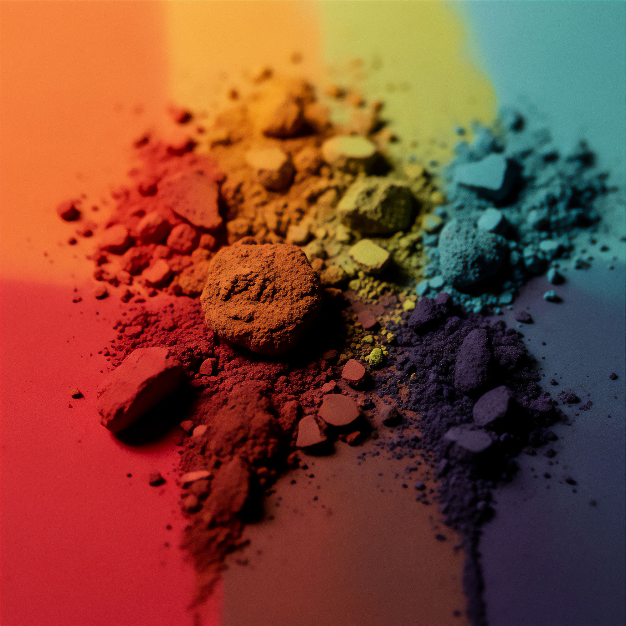
To understand why historic pigments work so brilliantly within a minimalist framework, one must examine how color actually behaves under the laws of light and physics. Modern synthetic paints are engineered for opacity and color consistency. Titanium dioxide mixed with petroleum-derived colorants creates a uniform film that reflects light evenly across every square millimeter. While efficient, this uniformity flattens a room, stripping it of the micro-shadows and subtle tonal shifts that human eyes evolved to find comforting. In contrast, authentic historic pigments—such as raw sienna, lapis lazuli, vine black, and genuine verdigris—are chemically irregular. Their particle sizes vary wildly, meaning they scatter light in unpredictable directions.
When these irregular particles are applied to minimalist architectural interventions—like a cantilevered staircase, a handleless kitchen island, or a floor-to-ceiling glass wall—they provide a vital counterbalance. Minimalist design relies on clean geometry, negative space, and the absence of clutter to create mental peace. However, when paired with synthetic minimalism, this approach often drifts into sterility. Historic pigments inject organic chaos into geometric order. A wall rendered in a natural iron-rich yellow ochre does not fight the sharp corners of a modern room; rather, it softens them, giving the eye a rich, organic anchor to rest upon without introducing a single decorative object or piece of clutter.
Furthermore, authentic pigments possess an aging property that modern paints actively try to prevent. Natural mineral and organic colors slowly interact with ultraviolet light, atmospheric carbon, and the alkaline binders of lime or casein plasters. They patina. In a 2026 interior, this slow evolution is considered a feature, not a flaw. A minimalist home featuring historic pigments is never truly finished on installation day; it matures alongside its inhabitants. This dynamic relationship rescues minimalism from its historical trap of being a frozen, untouchable museum exhibit and turns it into a living, breathing habitat that tells an authentic visual story.
Sourcing, Sustainability, and the Shift Away from Petrochemical Finishes
The resurgence of historic coloring agents is driven by an industry-wide reckoning with sustainability and indoor environmental quality. For years, the design world accepted high volatile organic compound (VOC) emissions and petroleum-based acrylic binders as the unavoidable price of clean lines and washable surfaces. Today, interior architects are auditing their supply chains with the same rigor as high-end fashion houses and farm-to-table restaurants. Traditional mineral paints, distempers, and lime washes are entirely free of synthetic plastic resins. They rely on breathable, natural binders like slaked lime, potassium silicate, or animal-free casein alternatives that allow walls to regulate indoor humidity naturally.
Sourcing these pigments requires a return to artisanal trade routes and specialized quarries. Genuine ultramarine, once more expensive than gold because it was derived solely from lapis lazuli mined in the remote mountains of Badakhshan, is now synthesized in laboratories using its exact historic molecular structure, alongside ethically quarried mineral deposits from the Mediterranean and European riverbeds. Designers are specifying pigments categorized by their geological origin rather than a Pantone catalog number. Earth colors come from specific clay deposits in France and Cyprus; carbon blacks are made by charring specific grapevines or peach stones; and reds are pulled from ancient iron-rich red iron oxide strata.
This shift has profound implications for indoor wellness. Synthetic coatings trap moisture behind impermeable plastic films, often leading to hidden mold growth and degraded indoor air quality. Historic mineral finishes, when paired with breathable substrates, create a vapor-permeable skin that allows walls to breathe. In high-end residential design, this technical performance is just as prized as the visual aesthetic. Clients are willing to invest in labor-intensive lime plastering techniques and authentic pigment mixing because they recognize that true luxury in the current era means living in an environment that is chemically inert, ecologically restorative, and rich with genuine tactile history.
The Masterclass in Application: Bringing Pigments into Clean Architectural Shells
Applying historic pigments to modern minimalist spaces requires a delicate balancing act. You cannot simply brush a 17th-century madder lake paint over standard drywall and expect architectural harmony. The substrate, the application technique, and the light exposure must all work in unison to honor both the ancient material and the contemporary frame. The following methodology outlines how top-tier designers successfully integrate these elements into high-end residential and commercial projects without falling into the trap of pastiche or theatrical historicism.
- Step 1 (Substrate Preparation): Strip away standard gypsum board finishes where possible and specify lime plaster or clay skim coats. These porous, high-pH substrates allow mineral pigments to form a chemical bond through carbonation rather than merely sitting on top as a plastic film.
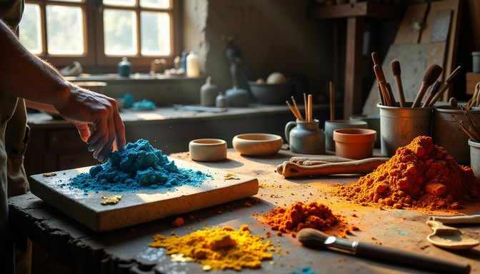
- Step 2 (Pigment Selection and Milling): Select a restricted, cohesive palette of three to four historic pigments maximum to preserve minimalist discipline. Hand-mill the raw mineral powders into natural binders like potassium silicate or traditional slaked lime to ensure authentic particle dispersion and light refraction.
- Step 3 (Layering and Application Technique): Apply the paint using traditional multi-layer brush techniques, such as fresco-secco or multi-directional stippling. Avoid uniform roller applications, as the goal is to create a subtle clouding effect that catches natural light without looking distressed or artificially rustic.
- Step 4 (Architectural Lighting Integration): Position linear LED wash lighting and large architectural windows at acute angles to the painted surfaces. Because historic pigments scatter light dynamically, raking light will expose the rich mineral depth and tactile micro-texture of the finish.
- Step 5 (Sealing and Curing): Allow the natural finish to cure slowly over several weeks under controlled humidity conditions. Seal high-traffic or moisture-prone zones using breathable, non-yellowing natural beeswax or potassium soap treatments instead of impermeable acrylic topcoats.
Navigating the Traps: Common Mistakes and Practitioner Workarounds
Working with authentic historic pigments and minimalist architecture is fraught with technical hazards. Because these materials behave differently than off-the-shelf latex paints, minor miscalculations in formulation or lighting can completely derail a project. Professionals who fail to respect the chemistry and physical properties of natural minerals often find themselves facing uneven curing, drastic color shifts, or client dissatisfaction when a wall looks dramatically different in the evening than it did during morning briefings. Understanding these pitfalls before the first brushstroke is applied separates successful executions from expensive failures.
- Pitfall 1 (Ignoring Substrate Alkalinity): Using acid-sensitive organic pigments on fresh, highly alkaline lime plaster can cause the color to bleach or fade prematurely. Workaround: Always test small sample boards using the exact substrate and allow a 28-day curing cycle to verify chemical stability before committing to full-room application.
- Pitfall 2 (Overloading the Minimalist Palette): Trying to use too many historic colors in a single open-plan space creates visual chaos that destroys minimalist spatial flow. Workaround: Restrict historic pigments to focal architectural planes—such as a single chimney breast or entry hallway—while keeping transitional circulation zones neutral.
- Pitfall 3 (Relying on Artificial Lighting Specs): Choosing pigment shades under standard fluorescent showroom lighting rather than the actual home’s specific daylight conditions. Workaround: Build large scale-one sample boards and move them around the room at different times of day to observe how iron oxides and natural earths shift under changing sun angles.
- Pitfall 4 (Using Non-Breathable Sealers): Applying modern polyurethane or acrylic clear coats to protect natural mineral washes, which traps moisture and ruins the matte, powdery light-absorption quality. Workaround: Opt for traditional soap finishes, breathable silicate sealers, or leave the lime matrix unsealed if placed in low-impact zones.
- Pitfall 5 (Expecting Industrial Consistency): Panicking when hand-mixed mineral batches show subtle tonal variations from wall to wall. Workaround: Educate clients that natural variation is the ultimate proof of authenticity, and feather batch transitions in natural room corners to blend variances naturally.
The Broader Cultural Shift: Permanence Versus Fast-Design Obsolescence
The convergence of historic pigments and modern minimalism is symptomatic of a much larger cultural fatigue with disposable, trend-driven interior design. For years, social media algorithms accelerated the trend cycle, pushing fast-furniture, cheap laminates, and hyper-saturated accent walls that lasted barely eighteen months before feeling dated. Minimalist architecture was frequently weaponized as an empty backdrop for endless consumer churn. By introducing high-maintenance, historically resonant materials into these clean spaces, designers are forcing a radical shift back toward permanence, craftsmanship, and material honesty.
This approach reflects a growing economic and philosophical valuation of slowness. Historic pigments cannot be manufactured overnight in automated mega-factories; they require mining, grinding, and blending processes that respect historical precedent. When a client commissions a room finished in authentic lead-free flake white, real cinnabar alternatives, or rich umbers sourced from specific European quarries, they are buying into a narrative that extends far beyond current calendar trends. This material choice signals an intellectual rejection of cheap mimicry in favor of deep-rooted cultural continuity.
Furthermore, this aesthetic represents a sophisticated synthesis of opposing design philosophies. Minimalism traditionally looks forward, obsessed with future-forward technology, reduction, and machine-made precision. History looks backward, honoring ancestral craft, organic imperfection, and the tactile marks of human labor. By forcing these two forces to coexist, contemporary designers have created a new architectural language. It is a style that acknowledges our digital, hyper-connected reality while offering a physical environment that grounds us in the ancient, unalterable physics of the earth beneath our feet.
Strategic Frameworks for Specifying Historic Finishes in Contemporary Architecture
Successfully implementing this aesthetic requires a structured, strategic framework that aligns client expectations, architectural detailing, and artisan capabilities. Interior architects cannot simply treat historic pigments as another color selection in a design deck; they must manage the entire ecological system of the room. The following strategic framework outlines the essential pillars required to execute a museum-grade historic-minimalist interior without compromising modern lifestyle functionality.
- Pillar 1 (Material Authenticity Audit): Conduct a thorough review of all specified building materials to ensure that modern synthetics do not choke the breathability of natural mineral wall finishes. Every layer—from primer to final glaze—must be chemically compatible.
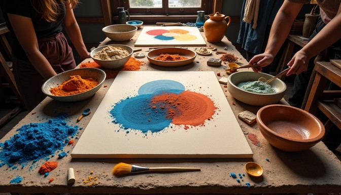
- Pillar 2 (Artisanal Collaboration): Partner directly with specialized plasterers and decorative painters who understand the specific rheology and application quirks of silicate paints, casein distempers, and hot-applied lime washes. Standard painting contractors rarely possess the requisite tactile skill set.
- Pillar 3 (Spatial Zoning by Light Quality): Map the natural daylight trajectory of the floor plan and assign specific historic pigments to zones based on how their mineral undertones react to morning versus evening sun. Warm iron oxides belong in east-facing morning rooms; cooler earth tones excel in glare-heavy south-facing spaces.
- Pillar 4 (Tactile Contrast Management): Balance the soft, powdery, light-absorbing qualities of historic pigment walls against hard, reflective modern elements like unlacquered brass, blackened steel, floating glass, and smooth concrete floors.
- Pillar 5 (Long-Term Maintenance Protocol): Provide the client with a clear, chemical-free maintenance guide that details how to clean, touch up, and care for natural mineral finishes without resorting to harsh modern cleaning solvents or abrasive scrubbing.
The marriage of historic pigments and modern minimalism is far more than a passing stylistic whim. It is a necessary correction—a design movement that rescues contemporary minimalism from its own cold, synthetic tendencies by infusing it with the rich, sensory memory of the earth. When a minimalist room is painted with real minerals and ancient organic compounds, it stops being a mere stage set for online documentation and becomes a living, protective shelter that engages every human sense.
As we move deeper into an increasingly digital and automated world, the craving for physical authenticity will only intensify. Homes are no longer expected to be just efficient containers for living; they must act as counter-environments that restore our connection to tangible reality. By embracing the irregularities, the deep light refraction, and the slow-aging beauty of historic pigments within clean architectural envelopes, designers have charted a timeless path forward. It proves that the most exciting design frontier of the current era is not found by inventing something entirely new, but by looking backward with profound respect and reimagining our oldest materials for a modern world.