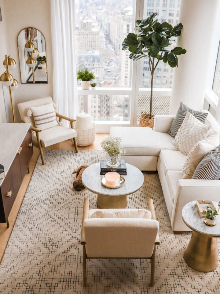
We live in a loud world. Notifications ping, traffic honks, and screens glow with urgent reds and blues. It’s exhausting. When you finally walk through your front door, what do you want to feel? If you’re like most people I’ve talked to lately, the answer isn’t "excited." It’s "relieved." You want to exhale. You want the noise to stop.
That’s where color comes in. Not just any color, but the quiet ones. The neutrals. For years, people thought neutral meant boring. Beige was the punchline. Gray was cold. But something shifted. In 2026, we’re seeing a massive return to palettes that don’t shout. They whisper. They hold space for you to just be. This isn’t about following a trend. It’s about building a home that feels like a deep breath. Let’s talk about how to get there.
Why Neutrals Are More Than Just "Safe" Choices
There’s a misconception that picking neutral colors is the coward’s way out of design. Like you couldn’t decide, so you picked white. That’s not it at all. Choosing a neutral palette is actually a bold act of intentionality. It says, "I value peace over spectacle." And scientifically, it makes sense. Our brains process high-saturation colors as stimuli. They demand attention. Neutrals, on the other hand, allow our nervous systems to downshift.
Think about the last time you stayed in a really nice hotel. Chances are, the room wasn’t painted neon green. It was probably a mix of creams, taupes, and soft grays. Why? Because those spaces are designed for rest. They are designed to make you forget the outside world. When you bring that same energy into your home, you’re creating a biological cue for relaxation. It’s not just aesthetic; it’s physiological.
In recent years, designers have moved away from the stark, clinical whites of the early 2010s. We now understand that "neutral" doesn’t mean "empty." It means "flexible." A room painted in a warm, sandy beige can feel completely different depending on the light, the texture of the rug, and the wood tone of the furniture. It’s a living canvas. It adapts to your mood. That versatility is why these palettes are timeless. They don’t date themselves because they aren’t trying to be the center of attention. They are the support system for your life.
The New Wave of Warm Whites and Creams
Let’s start with the foundation: white. But not the white that looks like a hospital corridor. We’re talking about warm whites. These are shades that have tiny hints of yellow, red, or brown underneath. In 2026, the obsession with "pure" white has largely faded in residential spaces. People want walls that glow, not glare. Think of colors like "Swiss Coffee," "Alabaster," or "White Dove." These names sound soft, and the colors are too.
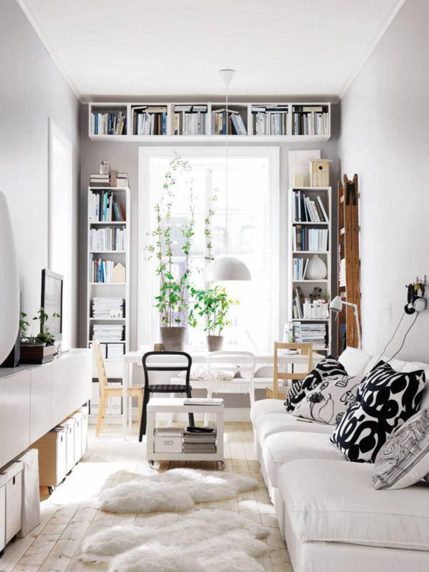
Warm whites work because they reflect light in a gentle way. Cold whites can feel sharp, especially in the evening when artificial light hits them. Warm whites absorb some of that harshness. They make a small room feel bigger without making it feel sterile. I’ve seen this work wonders in apartments with limited natural light. A coat of warm white paint can make a dark hallway feel inviting rather than dungeon-like.
But here’s the trick: you have to test them. White is the chameleon of the paint world. It changes based on what’s next to it. If you put a warm white next to a cool gray floor, it might look pink. If you put it next to oak floors, it might look crisp. Always paint a large swatch on the wall. Watch it in the morning light. Watch it at night. Don’t rush this part. Getting the right white is half the battle. Once you do, though, it becomes the perfect backdrop for everything else. It lets your furniture breathe.
Layering Beige, Taupe, and Greige for Depth
If white is the skeleton, then beige and its cousins are the muscle. This is where many people get stuck. They pick one shade of beige and paint the whole house. Then they complain it looks flat. The secret to a sophisticated neutral home is layering. You need variation. You need contrast, even within the same color family. This is where "greige" (a mix of gray and beige) and taupe come into play.
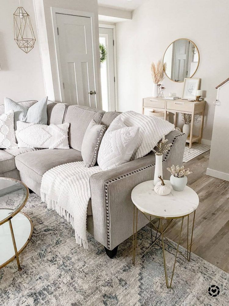
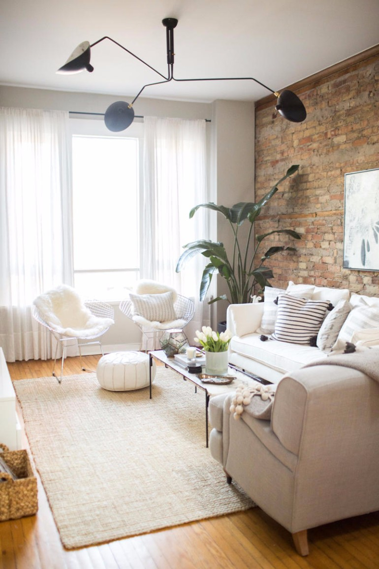
Imagine a living room. The walls are a light, airy greige. The sofa is a deeper, warmer taupe. The throw pillows are a sandy beige. The rug is a natural jute with hints of cream. See what happened there? We used four different "neutrals," but together they created a rich, textured look. It’s not boring because the eye has places to travel. It moves from the light wall to the dark sofa to the textured rug.
This layering technique also helps with the "cozy" factor. In the past, minimalism often felt cold because it lacked these subtle shifts in tone. Today’s minimalist elegance is all about warmth. By mixing undertones, you add complexity. A room with only one color feels static. A room with layered neutrals feels dynamic, even if it’s quiet. It’s like listening to a chord instead of a single note. The harmony is what makes it pleasing. Don’t be afraid to mix warm and cool neutrals, too. A cool gray chair can look stunning against a warm beige wall if the textures are right.
The Critical Role of Texture and Material
Here’s the thing about neutrals: since you aren’t relying on bright colors to create interest, you must rely on texture. If you have a beige sofa, beige walls, and a beige carpet, all made of smooth fabric, you will have a blob. It will look unfinished. Texture is the spice of the neutral kitchen. It’s what keeps the eye engaged.
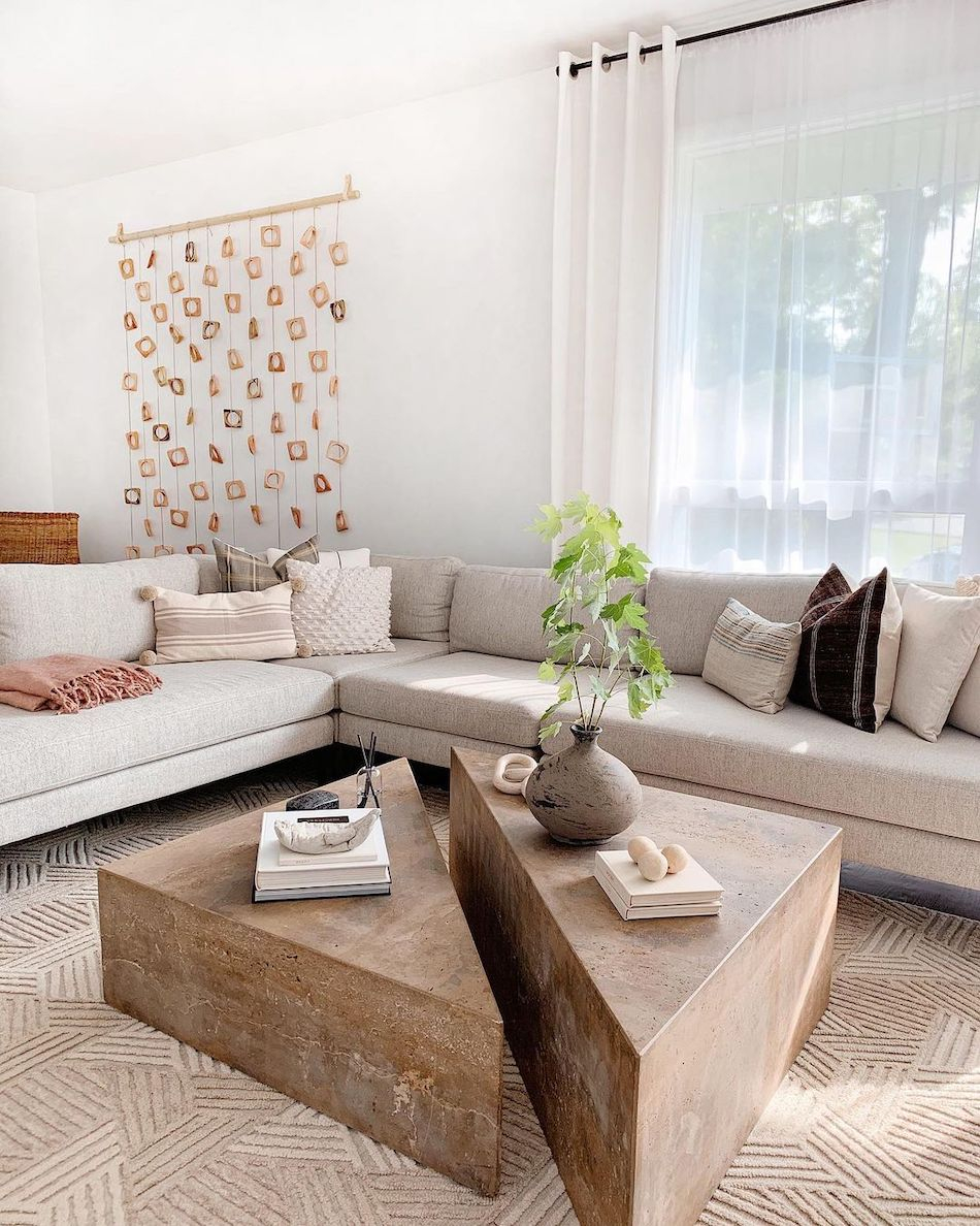
Think about natural materials. Wood, stone, linen, wool, leather, rattan. These materials have inherent variations. A piece of oak wood has grain. A linen cushion has slubs. A wool rug has pile. These physical differences catch the light differently. They create shadows and highlights. This adds depth to the room without adding visual clutter. In 2026, there’s a huge focus on "organic modern" styles, which is basically a fancy way of saying "neutrals with lots of natural texture."
Let’s get practical. If your walls are smooth drywall, add a chunky knit throw. If your floors are sleek tile, add a shaggy rug. If your furniture is streamlined and modern, add a rough-hewn wooden coffee table. Contrast is key. Soft vs. hard. Rough vs. smooth. Matte vs. slight sheen. This interplay makes a neutral room feel luxurious. It feels curated, not accidental. People often ask me why their neutral room feels "cheap." Usually, it’s because everything is too matchy-matchy and lacks textural variety. Break up the smoothness. Add some grit.
Bringing Life In with Organic Accents
Even the best neutral palette can feel a bit dead if it’s just paint and fabric. You need life. This is where plants and organic accents come in. Green is technically a color, but in interior design, it acts like a neutral. It goes with everything. A fiddle leaf fig in the corner or a trailing pothos on a shelf breaks up the monotony of beige and white. It adds a pop of vitality.
But it’s not just about plants. It’s about objects that feel handmade. A ceramic vase with an imperfect glaze. A woven basket from a local market. A piece of driftwood. These items bring a sense of history and humanity to the space. They remind us that humans made them, or nature formed them. In a world of mass-produced plastic, these organic touches ground us. They connect our indoor spaces to the outdoors.
This approach also aligns with the sustainable design trends dominating 2026. People are buying less, but buying better. They’re choosing pieces that last. A neutral palette is perfect for this because it doesn’t clash with new additions. If you buy a beautiful handmade bowl today, it fits. If you find a vintage chair next year, it fits. The neutral background allows your collection of meaningful objects to shine. It turns your home into a gallery of your life, rather than a showroom of a catalog.
Practical Tips for Starting Your Neutral Journey
So, how do you actually do this? It can feel overwhelming. Here is my advice: start small. Don’t repaint your entire house tomorrow. Start with one room. The bedroom is a great place to begin because it’s your sanctuary. Pick one main neutral color for the walls. Then, look at your bedding. Can you layer different shades of white and cream? Add a wooden nightstand. Put a plant on it. See how it feels.
Lighting is another huge factor. Neutral colors look terrible under bad lighting. Avoid cool, blue-toned LED bulbs. They make warm whites look gray and dirty. Stick to warm white bulbs (around 2700K to 3000K). Use lamps to create pools of light. This creates ambiance. It makes the neutrals feel cozy rather than flat. Dimmers are your best friend. Being able to lower the lights in the evening signals to your body that it’s time to wind down.
Finally, give it time. Living with neutrals is a practice. You might feel like it’s too plain at first. That’s normal. We’re conditioned to expect stimulation. Resist the urge to buy a bright red pillow just to "spice it up." Instead, add a textured black-and-white print. Or a metallic accent in brass or bronze. Keep it subdued. Let your eyes adjust. You’ll find that after a few weeks, the calm starts to seep into your bones. You’ll sleep better. You’ll feel less anxious. That’s the power of the palette.
At the end of the day, our homes are more than just boxes we live in. They are the containers for our emotions. They shape how we feel when we wake up and how we unwind when we go to sleep. Choosing a timeless neutral palette isn’t about being trendy. It’s about creating a environment that supports your well-being. It’s about stripping away the unnecessary noise so you can hear yourself think.
In 2026, as life continues to move at a breakneck pace, the value of a calm home only increases. These palettes offer a refuge. They are forgiving. They are enduring. They don’t demand anything from you except to exist within them. Whether you prefer the crispness of warm whites, the warmth of layered beiges, or the earthiness of organic textures, there is a neutral path for you.
So take a look around your space. What feels loud? What feels chaotic? Maybe it’s time to soften the edges. Maybe it’s time to let some light in. You don’t need a complete renovation. You just need a little intention. Start with one wall. One cushion. One plant. Build your sanctuary piece by piece. Your mind will thank you.