Step into high-end residential projects across urban capitals today, and you will notice a striking shift. The era of the hyper-curated showroom—where every surface looks like it was staged by a corporate merchant with zero personal imprint—is officially over. Homeowners are pouring thousands into custom joinery, vintage velvet sofas, and artisanal plaster walls, only to watch their spaces fall flat. The culprit is almost never the structural foundation or the anchor furniture. It is the styling layer. The finishing touches. The accessories.
Walk through any newly renovated penthouse or suburban family home, and you will spot the same subtle styling infractions repeating themselves across different zip codes. It is the tragic case of the orphan objects: lonely objects scattered across massive coffee tables without any contextual grounding. It is the tyranny of the corporate box-store generic decor bundle—instantaneously recognizable items ordered en masse that strip a room of architectural integrity. Even as material palettes shift toward earthy warmth and micro-luxe detailing in 2026, these micro-errors continue to betray the potential of otherwise stunning spaces.
Professional designers spend years training their eyes to catch these micro-disruptions in visual harmony. Scale, proportion, narrative weight, and tactile contrast are the silent languages of interior curation. When a space feels slightly off—like it is missing its soul or struggling to breathe—it almost always boils down to how objects are gathered, scaled, and placed. Understanding these recurring missteps allows us to dismantle the showroom effect and build interiors that feel lived-in, deeply personal, and structurally sound.
Why the Catalog Look Fails Real Homes
The modern design landscape suffers from an identity crisis driven by rapid inspiration consumption. Scroll through any digital feed, and you are fed meticulously lit vignettes that look exceptional in a two-dimensional photograph but fail entirely under the brutal, shifting light of everyday life. This algorithmic homogenization has led homeowners to populate their shelves and coffee tables with catalog-perfect replicas of trends that were dead six months ago. When you buy an entire shelf-styling kit from a fast-decor retailer, you are importing someone else’s generic narrative into your private sanctuary.
Interior design in 2026 demands authenticity, leaning hard into the "Micro-Luxe Detail" movement. This design philosophy prizes two to three genuinely unique, handmade, or vintage elements per room over dozens of mass-produced plastic or stamped-metal knick-knacks. Yet, many people still cling to the comfort of the matching set. They buy matching sculptural bowls, matching lantern sets, and matching artificial botanicals. The human eye reads symmetry in mass quantities as clinical and uninviting. It communicates a fear of making independent aesthetic choices.
Furthermore, scale distortion remains an epidemic across living rooms and entryways. Homeowners consistently underestimate the physical mass required to anchor an open-concept space. They scatter dozens of tiny, weightless trinkets across vast oak surfaces, creating visual clutter rather than focal gravity. A collection of ten small, disconnected objects carries the visual weight of a spilled box of matches. Professional designers operate on the principle of editing: grouping items into heavy, purposeful clusters that command respect and establish a clear spatial rhythm.
The Anatomy of Coffee Table and Surface Clutter
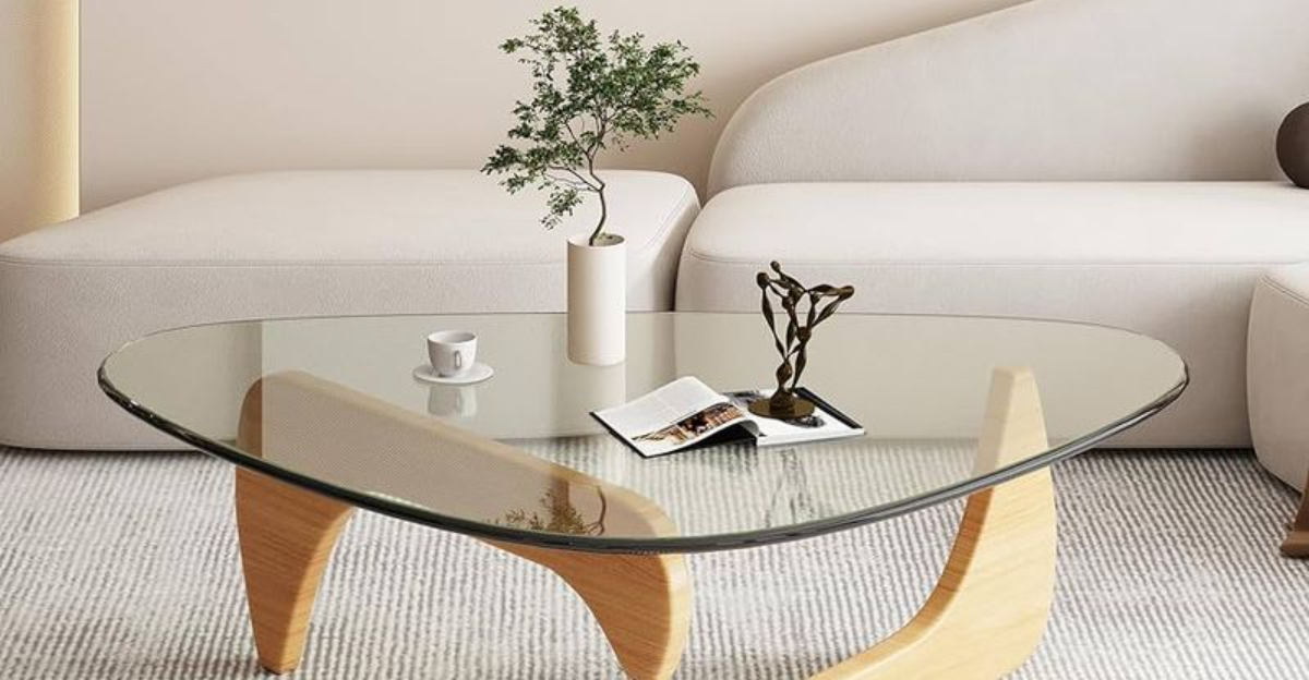
Surface styling is where most interior schemes quietly unravel. The coffee table is often the central battleground of the living room, designed to be both a functional landing pad for morning coffee and a high-impact styling canvas. The most common mistake? Treating the coffee table like a museum vitrine where nothing can be touched, or conversely, letting it become a chaotic drop zone for remote controls, mail, and charging cords. Designers look at a surface and immediately assess its negative space. If a coffee table is packed edge-to-edge with objects, the eye has nowhere to rest.
Another critical surface error is the absence of verticality. When every object on a console or bookshelf sits at the exact same low-slung height, the surface looks flat and monotonous. Professionals manipulate three-dimensional volume by mixing tall, slender elements—like an alabaster urn or a branching botanical stem in a heavy ceramic vessel—with low horizontal anchors, such as oversized art books or heavy stone trays. The tray itself is a powerful tool, yet it is frequently abused. Placing a tiny tray on a massive table creates an awkward island effect; the tray must anchor a substantial portion of the surface footprint to make logical sense.
Materiality also plays a make-or-break role in surface arrangements. A coffee table styled entirely in glossy ceramics, glass, and polished brass feels cold and slippery. It lacks textural friction. Designers intentionally introduce tactile tension by pairing smooth, reflective surfaces with rough, matte, and organic elements—a raw-edge burlwood bowl, a chunk of unpolished travertine, or a hand-woven rush coaster. This interplay prevents the room from feeling like a sterile staging ground and grounds the accessories in the physical world.
Masterclass in Strategic Accessory Editing
Transforming a cluttered, uninspired room into a masterclass of interior styling requires a deliberate, step-by-step methodology. You must strip the space down to its architectural skeleton before adding a single decorative element back in.
- Step 1 (The Complete Clear-Out): Remove every single accessory, book, and decorative object from the room and place them in the center of the floor. Do not edit while looking at the shelves; start with a completely blank canvas to reset your spatial perspective.
- Step 2 (The Architectural Audit): Evaluate the room’s permanent features—window placements, lighting fixtures, wood tones, and wall finishes. Identify the natural focal points where your eye should be drawn upon entering the space.
- Step 3 (Curate by Narrative Weight): Sort your objects into three categories: high-value artisan or vintage pieces, meaningful personal artifacts, and generic filler. Ruthlessly pack away or donate the generic filler items that lack a clear visual or emotional story.
- Step 4 (Establish the Anchors): Place your largest, heaviest items first. Position oversized art books, substantial ceramic vessels, or heavy stone sculptures to anchor the layout before introducing any medium-sized decor.
- Step 5 (Layer and Refine): Add medium and small-scale items using the rule of three, mixing organic textures and heights. Step back five paces, squint your eyes, and check for visual balance—removing one item if the composition feels congested.
Navigating Styling Pitfalls and Practitioner Workarounds
Even with the best intentions, certain design habits are deeply ingrained. Recognizing these traps is the first step toward curing them. Here is how professional designers diagnose and correct the most persistent accessory mistakes in contemporary homes.
- Pitfall 1 (The Island Tray Syndrome): Using a small, decorative tray that floats awkwardly in the middle of a massive coffee table, looking like a raft in the ocean. Practitioner Workaround: Scale your tray so it occupies roughly one-third to one-half of the table’s surface area, or eliminate the tray entirely and use a large, low book stack to ground your objects.
- Pitfall 2 (Orphan Object Syndrome): Scattering dozens of tiny, unrelated trinkets across shelves and tables without any compositional grouping. Practitioner Workaround: Cluster items in odd-numbered groups (threes and fives) and anchor them on a shared tactile base like a wooden board or linen runner.
- Pitfall 3 (Artificial Botanical Traps): Using stiff, shiny, plastic faux plants or dying grocery store flowers that scream neglect. Practitioner Workaround: Invest in high-end silk botanicals with natural wire-adjustable stems, or stick exclusively to dried elements like bleached pampas, eucalyptus, and sculptural branches that require zero water and look intentional.
- Pitfall 4 (The Matchy-Matchy Trap): Buying pre-packaged decor sets where every pillow, vase, and candleholder is made from the exact same factory run. Practitioner Workaround: Mix eras, finishes, and origins. Pair a sleek mid-century brass object with a rough-hewn, primitive clay vessel sourced from a local artisan.
- Pitfall 5 (Ignoring Negative Space): Filling every square inch of open shelving because empty space feels uncomfortable. Practitioner Workaround: Embrace negative space as a design material; leave at least forty percent of every shelf entirely empty to let the surrounding architectural lines breathe.
The Broader Philosophy of Timeless Home Curation
Looking at interior design through a macro lens reveals that accessory mistakes are rarely about taste; they are about patience. In our rush to finish a room and make it "Instagram-ready," we rush the acquisition process. A truly compelling home is built over years, not weekend shopping sprees. It collects the dust of lived experiences, travels, and quiet moments. When you buy accessories that tell a genuine story—a hand-thrown ceramic mug purchased on a trip to the coast, an inherited brass candlestick from a grandparent, a vintage book found in a dusty antiquarian shop—the room stops looking like a catalog page and starts reflecting an authentic human life.
This patience directly aligns with sustainable design practices gaining momentum in 2026. The throwaway decor culture—driven by fast-shipping trends that cycle out every three months—is being replaced by conscious curation. Homeowners are investing in durable, timeless materials like cast bronze, solid hardwoods, unlacquered brass, and natural stone. These materials do not just survive trends; they age gracefully, developing patinas that record the passage of time. When you select accessories with an eye toward longevity, you stop chasing fleeting aesthetic ghosts.
Furthermore, scale and proportion act as the silent backbone of architectural dignity. No matter how expensive your sofa or how rare your rug, a room will feel amateurish if the accessories do not converse with the architecture. Tall ceilings demand vertical accessory gestures; sprawling floor plans require substantial objects with physical gravity. Aligning your decorative layers with the scale of the room creates a profound sense of calm. The space stops fighting itself and finally achieves that elusive, effortless harmony seen in the portfolios of master designers.
Practical Frameworks for Lasting Interior Harmony
To ensure your home remains timeless and immune to recurring stylistic blunders, adopt a disciplined framework for every room update. Start by evaluating the lighting conditions of your space. Accessories reflect light differently depending on whether your room faces north, south, east, or west. A glossy ceramic vase that looks sophisticated in a sun-drenched southern exposure can look harsh and glaring in a dim northern room. Match your material choices to the natural light quality—opting for matte finishes and warm woods in darker spaces, and allowing cooler tones and reflective surfaces to play with bright, direct sunlight.
Establish a rotation schedule for your accessories. You do not need to keep every item out on display 365 days a year. Professional stylists often store seasonal or supplementary pieces, rotating them in and out to keep rooms feeling fresh and responsive to the changing light outside. This practice not only prevents surface fatigue and clutter accumulation but also deepens your appreciation for the items you own. When a cherished ceramic bowl returns to the living room shelf after a six-month hiatus, it feels brand new.
Finally, remember that your home is a sanctuary, not a static art installation. While adhering to rules of proportion and avoiding mass-market decor sets will instantly elevate your interior, the ultimate test of a well-accessorized room is how it feels when you walk through the door at the end of a long day. If the space invites you to sit, read, breathe, and unwind without demanding constant readjustment, your accessory strategy has succeeded.
The journey toward a beautifully edited home is an ongoing exercise in mindfulness and restraint. By stepping back from the relentless pressure of fast trends and mass-market styling kits, you reclaim the creative agency of your own living space. Every object you choose to place on a surface should earn its keep through narrative weight, tactile richness, or functional necessity.
As we navigate the design landscape, the homes that endure are those rooted in authenticity and thoughtful proportion. Embrace the power of negative space, honor the physical scale of your architecture, and let your accessories tell a story that is uniquely, beautifully yours. The showroom era is over—welcome home.