You know that feeling. You’re standing in the hardware store, holding a tiny square of cardboard that looks like the perfect creamy white. It’s warm, inviting, and exactly what you imagined for your living room. You buy three gallons. You paint the wall. And then… disaster. Suddenly, that "creamy" white looks like dirty dishwater next to your oak floors. Or maybe it turns a sickly pink when the sun hits it at 4 PM.
It’s not your fault. It’s the undertone. And in an open plan home, where the kitchen bleeds into the dining area and flows right into the lounge, getting this wrong isn’t just a small mistake. It’s a house-wide headache. The colors have to talk to each other across the entire space. If they’re arguing, the whole vibe feels off. But don’t panic. You don’t need a degree in color theory to fix this. You just need to know how to look closer.
Why That Tiny Chip is Lying to You
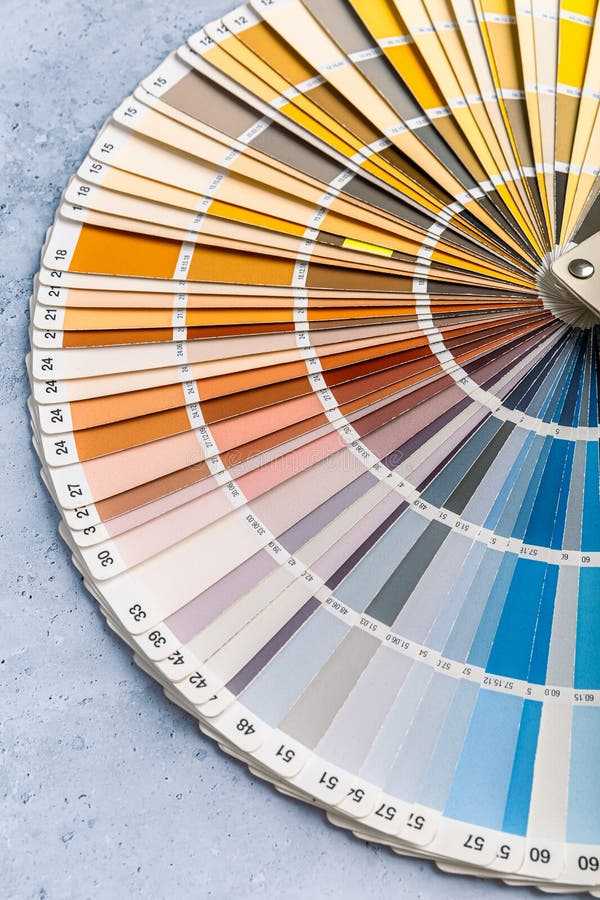
Let’s be honest. Paint chips are basically liars. They are small, printed on glossy paper, and usually viewed under the harsh, flat fluorescence of a store aisle. None of that matches your actual life. In 2026, we have apps and AI tools that promise to show you exactly how a color will look in your room. They’re okay for narrowing down choices, sure. But they often miss the subtle, shifting nature of undertones. An app might tell you a gray is neutral, but it won’t tell you that your specific north-facing window makes it look like a bruised plum by dinner time.
Undertones are the shy cousins of the main color. The main color is what you see first—blue, beige, gray. The undertone is the secret ingredient hiding underneath. A gray can have blue, green, purple, or even brown undertones. A beige can lean pink, yellow, or orange. When you’re dealing with an open plan scheme, these subtle hues become massive players. Because there are no walls to stop the eye, the undertone in your kitchen cabinets needs to harmonize with the undertone in your hallway paint. If one is cool (blue-based) and the other is warm (yellow-based), they clash. It creates a visual vibration that makes your eyes tired.
Think of it like music. If your flooring is playing a warm cello note, and your wall paint is screeching a cool violin note, it’s noise. Not harmony. The goal isn’t to match everything perfectly—that’s boring. The goal is to make sure they belong in the same song. You have to see the undertone in the context of your actual room, with your actual furniture, at different times of the day. That tiny chip in your hand? It’s silent. You need to make the color sing before you commit.
The White Paper Trick and Other Cheap Hacks
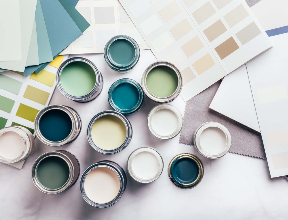
You don’t need to spend a fortune on sample pots to start figuring this out. In fact, some of the best tests cost almost nothing. Try the white paper trick. Take a pure white sheet of printer paper—standard office stuff—and hold it up against your paint chip or your existing wall. Then, take a piece of warm-toned paper, like a manila folder or even a slice of bread (okay, maybe not bread, but you get the idea). Hold that up too.
When you compare the paint color to the pure white, you’ll instantly see if it’s warm or cool. If the paint looks yellowish next to the bright white, it has warm undertones. If it looks bluish or grayish, it’s cool. It’s a simple contrast hack that strips away the confusion. You can do this with your fixed elements too. Hold that white paper next to your floorboards. Are they orange-yellow? Or are they ash-gray? Knowing this baseline helps you pick a paint that complements rather than fights.
Another great low-stakes test is using fabric swatches. Do you have a throw pillow, a rug, or a curtain you love? Bring those items into the equation. Lay your paint chip directly on top of the fabric. Does the color pop in a good way, or does it make the fabric look dull? If you have warm wood furniture, pull a chair close to your test patch on the wall. As noted by experts at Headwaters Painting, ignoring the relationship between your paint and your furnishings is a classic mistake. A cool gray wall might make your beautiful walnut table look muddy. Seeing them together, side-by-side, reveals the truth faster than any digital simulator.
Lighting is the Great Revealer
Here’s the thing about light: it changes everything. And I mean everything. A color that looks crisp and clean at noon can look completely different at 8 PM. This is why the "10-Minute Paint Test" suggested by architecture pros is so vital. You need to watch your color shift. Natural light brings out the truest version of the color, but artificial light can warp it. LED bulbs, especially, come in different temperatures. A "daylight" bulb (5000K) will make cool undertones pop, while a "soft white" bulb (2700K) will enhance warm tones.
In an open plan space, you likely have multiple light sources. Maybe the kitchen has bright recessed lighting, but the living area relies on floor lamps. This creates zones of different color temperatures. You have to test your paint samples in all of them. Put a sample patch near the window. Put another one in the darkest corner. Put one near the kitchen island. Watch them throughout the day. Does that "greige" turn green in the afternoon shadow? Does the white look pink under the dining room chandelier?
Don’t just look once. Look at dawn. Look at dusk. Look at night with the lights on. This is where most people fail. They pick a color on a sunny Saturday morning and assume it’s done. But you live in your home at night too. If your relaxing evening movie-watching time is ruined by walls that look strangely purple, you’ve failed the test. Take photos with your phone at different times. Sometimes seeing it on a screen helps you spot the shift more clearly than your naked eye, which adapts too quickly.
Scale Matters: The Big Wall Reality
What looks delicate on a two-inch chip can feel overwhelming on a ten-foot wall. This is the scale problem. When you stare at a small sample, your brain focuses on the hue. When you cover a whole wall, your brain processes the mass of color. The undertone becomes louder. A subtle green undertone in a gray might be barely noticeable on a chip, but on four walls, it can feel like you’re living inside a seafoam box.
To combat this, stop painting tiny squares. They aren’t enough. In 2026, many painters recommend buying large peel-and-stick samples or painting onto big poster boards (at least 2×2 feet). Move these boards around the room. Lean one against the wall near the trim. Lean another one next to the sofa. This lets you see how the color interacts with the scale of your furniture and architectural details. It also helps you see the color in relation to the ceiling and floor, which frame the space.
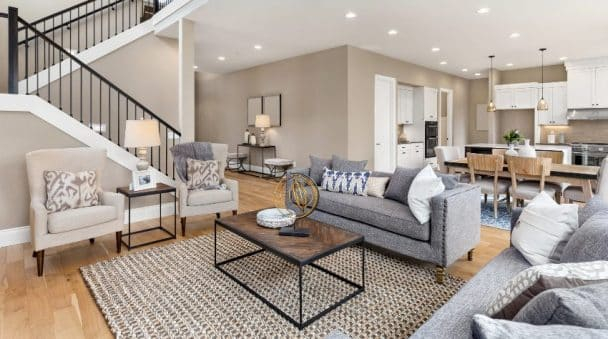
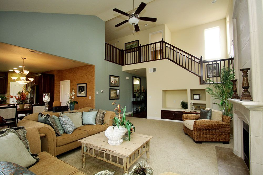
Also, consider the flow. In an open plan, you aren’t just looking at one wall. You’re seeing three or four walls from a single vantage point. Stand in the center of the room. Spin around. Do the colors on opposite walls feel connected? If you’re using different shades for different zones (like a darker accent wall in the dining area), ensure the undertones are consistent. If the living room beige has a pink undertone and the dining room beige has a yellow undertone, the transition will feel jarring, like stepping into a different house. Keep the undertone family the same, even if the darkness or lightness changes.
The Fixed Element Anchor
You can change your paint. You can change your rugs. You can even change your sofa. But you probably aren’t changing your floors, your kitchen countertops, or your brick fireplace anytime soon. These are your anchors. They are the non-negotiables. Your paint choice must bow to them. This is where identifying the undertone of your fixed elements is crucial.
Look at your flooring. Is it a warm honey oak? A cool gray laminate? A reddish cherry? Whatever it is, that’s your base note. If you have warm floors, you generally want warm or neutral wall colors. Putting a stark, cool blue-gray on top of warm orange-toned wood can create a visual disconnect that feels cold and unwelcoming. Conversely, if you have cool gray tiles in the kitchen, a warm, buttery yellow wall might look dated or clashing.
Use the "connection" method. Find a color in your stone countertop or tile backsplash that you love. Maybe it’s a faint speck of taupe or a vein of charcoal. Pull a paint color that matches that specific subtle hue. This ties the new paint to the existing permanent features. It creates a cohesive look that feels intentional. As Welsh Design Studio points out, understanding undertones ensures your color works beautifully with these finishes. Don’t fight the stone. Work with it. Let the stone dictate the direction, and let the paint support it.
Before you buy the five gallons, live with the sample for at least 48 hours. This is the hardest part because we want instant gratification. We want to paint it now. But patience saves money. Leave those big poster boards or test patches up for two full days. Eat breakfast looking at them. Cook dinner with them in your peripheral vision. Sit on the couch and read a book while staring at that patch.
Ask yourself: Do I feel calm looking at this? Or does it feel anxious? Does it make my skin tone look washed out? (Yes, wall colors affect how you look in selfies and video calls). Does it make the room feel bigger or smaller? Trust your gut. If something feels slightly "off," it probably is. It might be the undertone clashing with a piece of art you forgot about, or reflecting weirdly off a shiny appliance.
If you’re still unsure, try the black and white photo test. Take a picture of your room with the samples up, and turn it into black and white on your phone. This removes the distraction of the hue and lets you see the value (lightness/darkness) and contrast. If the sample disappears into the wall or creates a harsh, jagged contrast with the trim, it’s not the right fit. This simple trick strips away the emotion of color and leaves you with the structural reality of the shade. It’s a final sanity check before you dip the brush.
Choosing paint for an open plan home doesn’t have to be a gamble. By slowing down, testing in real light, respecting your fixed elements, and looking for those hidden undertones, you can avoid the regret. It’s about connection. It’s about making sure every surface in your home is having a polite, pleasant conversation with the next. So grab some poster board, steal a sheet of printer paper, and watch the light change. Your walls will thank you. And honestly, so will your wallet. No more repainting because the gray turned green. Just get it right the first time. It’s worth the extra few days of waiting.