You walk into a room, and something just… isn’t quite right. It’s neutral, sure, but it feels flat. Lifeless, even. You picked all the "safe" colors – the greys, the creams, the whites – hoping for a serene and timeless look. But instead, you’re left with a space that feels more meh than magnificent. Ever been there? We’ve all done it, haven’t we.
It’s a common tale, this quest for a calm, sophisticated interior that somehow veers into "boring" territory. Neutrals are the backbone of countless beautiful designs, offering a versatile and tranquil foundation. Yet, the line between understated elegance and utterly uninspired is surprisingly thin. In 2026, with so much visual noise around us, the desire for peaceful, neutral environments is stronger than ever. But how do we ensure these spaces possess a genuine spark, a palpable warmth, a personality that truly resonates, rather than just existing? Let’s peel back the layers and uncover the secrets to making your neutral palette sing.
Deciphering Neutrals Beyond the Basic Beige
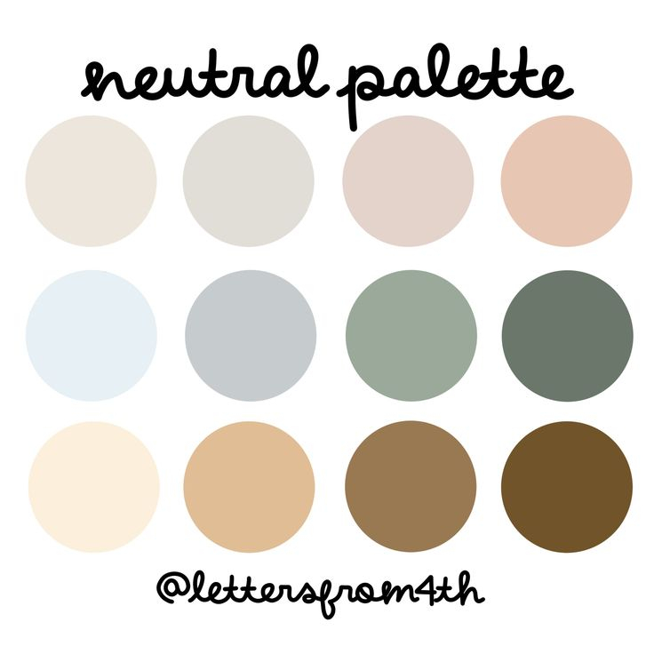
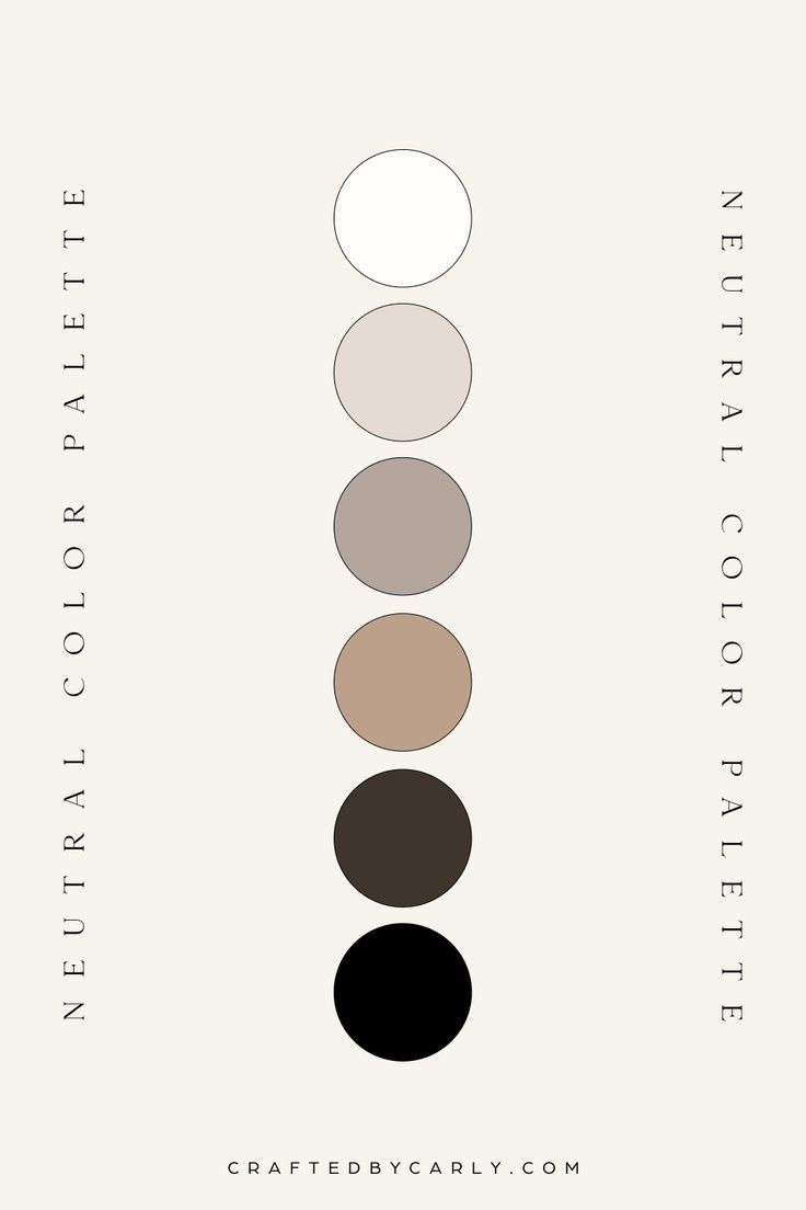
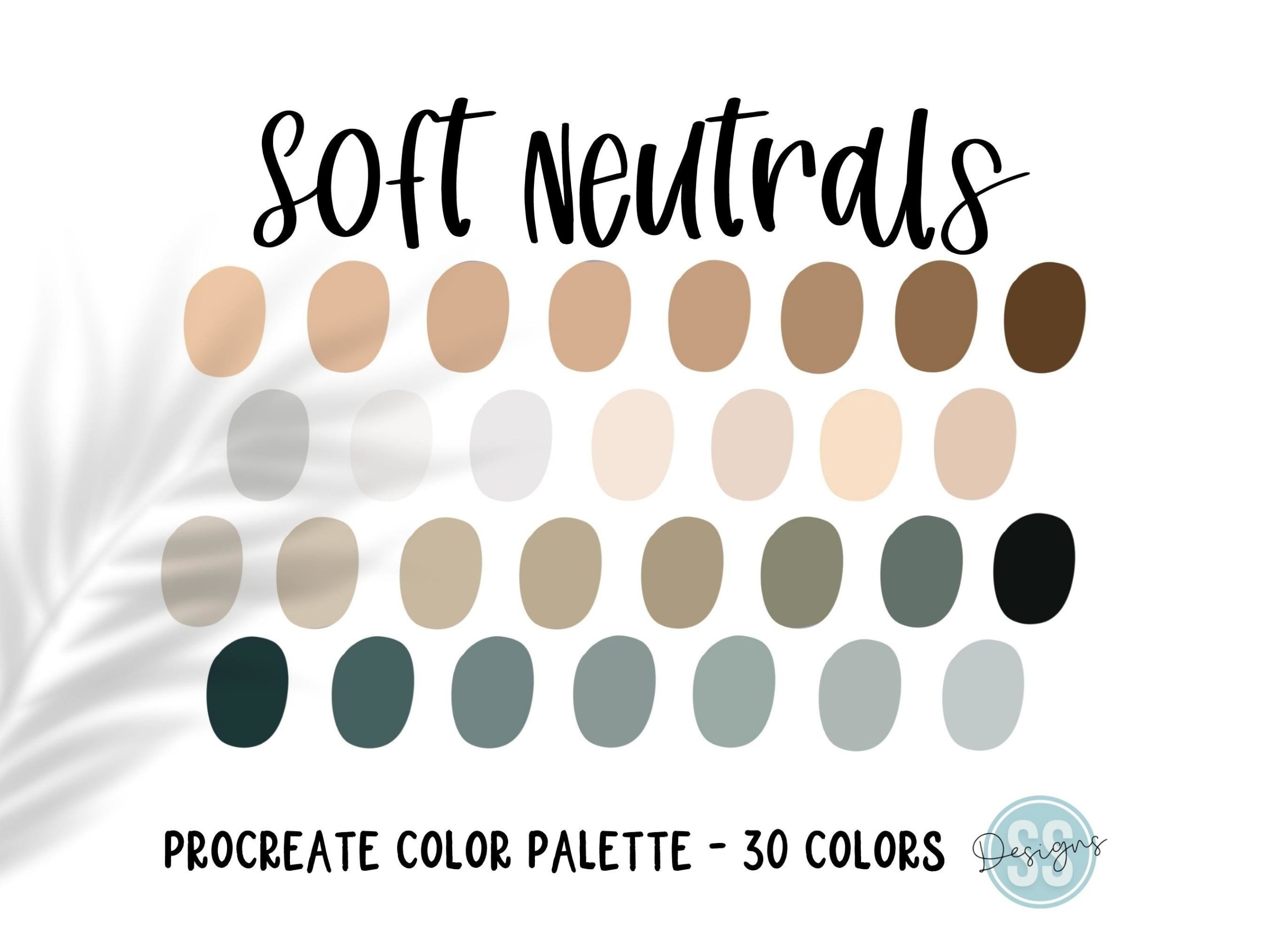
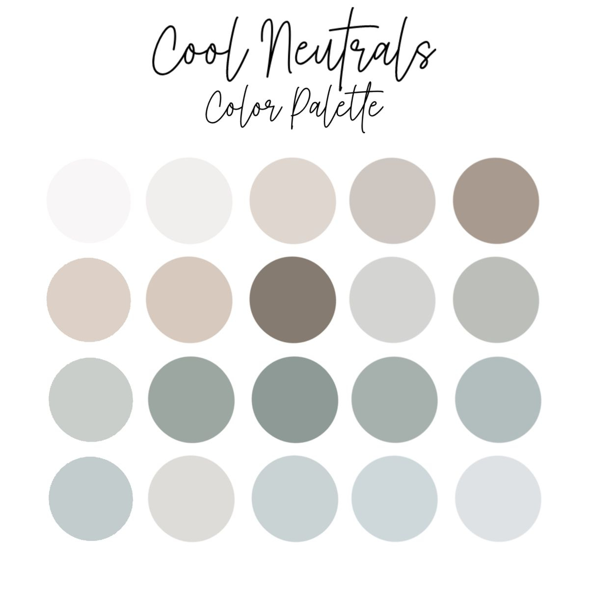
The first, and perhaps most frequent, misstep many folks make is narrowing their definition of "neutral." It’s not just about beige or gray anymore. Oh, no. The world of neutrals is a vast, rich tapestry that includes everything from the softest off-whites and creamy ivories to deep charcoals, comforting taupes, and even muted greens or blues that act as incredibly sophisticated, softened neutrals when properly employed. These foundational hues aren’t meant to shout; they’re designed to support, to offer a calm backdrop. A typical blunder is simply picking a "gray" paint without considering its depth. Is it a cozy gray with a hint of brown, or a cool, crisp one that leans toward blue? This basic distinction sets the entire mood for your area.
The Potent Magic of Texture and Layering
When your color scheme is deliberately subdued, texture doesn’t just become important, it becomes utterly paramount. It’s the invisible hand that shapes how light dances across surfaces, generating depth, visual interest, and a certain tactile allure. Think about it: a room swathed in various shades of cream could be utterly bland, or it could be a symphony of sensory delight. We’re talking about chunky knit throws, smooth silk pillows, rough-hewn linen draperies, earthy woven baskets, plush velvet cushions, even the grain of distressed wood furniture or the cool touch of polished stone. Layering these diverse textures is your secret weapon against flatness. A perfectly neutral sofa, for instance, can be utterly transformed with the simple addition of a fluffy sheepskin throw and a couple of linen pillows. This is where a room truly gains its inviting feel and luxurious richness.
Mastering Undertones and Infusing Warmth
Every single neutral shade, believe it or not, carries an undertone – a subtle hint of yellow, pink, blue, green, or even purple. Overlooking these can result in jarring clashes or, worse, a space that feels cold, sterile, and unwelcoming. Warm undertones, like those with yellow, red, or orange notes, naturally make a room feel cozy, inviting, and embracing. Conversely, cool undertones – blues, greens, or purples – tend to create a crisp, serene, and sometimes more formal atmosphere. While deliberately mixing warm and cool undertones can be a mark of truly sophisticated design, accidental mixing often feels just plain "off." The trick is to identify a dominant undertone and either stick with it throughout your design or introduce a very carefully chosen opposing one for a purposeful, compelling contrast. This might be a subtle adjustment, but it’s an incredibly powerful way to inject authentic personality.
Introducing Strategic Bursts of Color
Let’s be super clear: choosing a neutral palette doesn’t mean you’re condemned to a life devoid of color. Far from it. What it does mean is that color is used as an accent, a carefully placed punctuation mark that draws the eye and sparks joy. Imagine a single, vibrant piece of artwork commanding attention on a cream wall, a pair of richly colored throw pillows on a gray sofa, a striking ceramic vase on a minimalist shelf, or even a stack of bright, inviting books. The key words here are "strategic" and "pops." A small amount of saturated color feels far more impactful and special against a serene, neutral backdrop than if the entire room were awash in bold hues. Think of it like the perfect accessory that completes a stylish outfit – it’s not the whole ensemble, but it makes all the difference.
Lighting: The Unsung Hero of Neutral Spaces
Ah, lighting. It’s often an afterthought, isn’t it? But in a neutral scheme, lighting is nothing short of transformative. First, consider natural light. How does the sunlight stream into your room throughout the day? Does it make your neutral walls glow, or does it somehow make them appear dull and lifeless? Then, there’s artificial lighting, which needs to be layered like a pro: ambient light for general illumination, task lighting for functional areas, and accent lighting for mood and highlighting special features. What’s more, the temperature of your light bulbs – warm versus cool whites – can dramatically alter how your neutrals are perceived. A warm white bulb can soften a cool gray, making it feel more approachable, while a cooler bulb might make a cream wall appear crisper and more modern. And let’s not forget that in 2026, advanced smart lighting systems offer incredible control, allowing you to fine-tune warmth and brightness to suit any moment or mood.
Bringing the outside in isn’t just a trend; it’s a timeless design principle that injects an organic, lively touch into any space. Think about incorporating lush houseplants, raw wood furniture, rough-hewn stone accents, and natural fibers like jute or sisal. These elements inherently possess their own unique textures and subtle color variations that profoundly enrich a neutral scheme, preventing it from feeling sterile. And contrast, my friends, isn’t solely about color. It’s about the interplay of light and dark, hard and soft, smooth and rough. Envision a rich, dark wood coffee table resting on a plush, light-colored rug, or a sleek, modern metal lamp positioned next to a chunky knit throw. This dynamic interplay isn’t just visually engaging; it prevents monotony, giving the eye compelling points to rest and explore.
So, you see, your neutral space doesn’t have to be a snooze-fest. It’s not about avoiding color; it’s about mastering the art of subtlety, depth, and intentionality. By understanding the true spectrum of neutrals, embracing texture, playing with undertones, strategically placing color, harnessing the power of light, and incorporating natural elements, you can transform any bland canvas into a vibrant, inviting, and deeply personal haven. It’s about making thoughtful choises, creating a narrative, and letting your space breathe with a quiet confidence. Go on, give your neutrals that much-needed spark. You’ve got this.