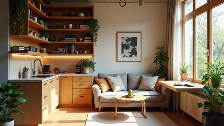
You know that feeling. You walk into a friend’s place. It’s roughly the same square footage as yours. Maybe even smaller. But it feels… breezy. Light. Open. You take a deep breath without realizing it. Then you go home. And suddenly, your own walls feel like they’re closing in. The air feels thick. You trip over the coffee table for the third time that week.
It’s frustrating, isn’t it? You’ve tried decluttering. You’ve bought those cute storage bins. You’ve even painted the walls white, like every blog post told you to. But something is still off. The problem usually isn’t the size of the box you’re living in. It’s how you’re filling it.
Most of us don’t realize that layout is a silent thief. It steals space before we even unpack our boxes. In 2026, with urban living spaces getting tighter and tighter, understanding these hidden traps is more important than ever. It’s not about having more room. It’s about respecting the room you have. Let’s look at the mistakes we keep making, often without noticing, and how to gently nudge our spaces back into balance.
The Furniture Scale Trap
We’ve all been there. You see a sofa online. It looks perfect. Sleek, modern, inviting. You buy it. When it arrives, it eats the entire living room. This is the most common error: ignoring scale. In a small apartment, every piece of furniture needs to earn its keep. Not just functionally, but visually. Oversized furniture creates visual weight. It makes the ceiling feel lower and the walls feel closer.
Think about proportion. A massive sectional in a 400-square-foot studio is like wearing a winter coat in July. It just doesn’t fit the environment. Instead, opt for pieces with legs. Furniture that sits on the floor blocks sightlines. Furniture raised on legs lets light and eye travel underneath. This creates an illusion of more floor space. It’s a simple trick, but it works wonders.
Also, consider the depth of your seating. Deep sofas are cozy, sure. But in a tight layout, they push other furniture against the walls, creating a "dance floor" effect where you can only walk around the perimeter. Try shallower seats. Or armless chairs. They take up less visual real estate. You might be surprized by how much more room you suddenly have just by swapping out one bulky chair for two slender ones.
Blocking the Natural Flow
Have you ever walked into a room and immediately felt stuck? Like you had to detour around an obstacle to get to the window? That’s poor flow. And it’s a major cramped-maker. Good layout is about movement. It’s about creating clear, intuitive paths from one zone to another. When you block these paths, the brain registers the space as chaotic and small.
In many small apartments, people push all their furniture against the walls. It seems logical, right? Clear the center. But this often creates a dead zone in the middle that feels unused and awkward, while the edges feel cluttered. Sometimes, pulling a sofa just a few inches away from the wall—or floating it in the room to define a space—can open up the perimeter. It creates breathing room.
Check your main walkways. You should be able to walk through your primary paths without turning sideways or brushing against furniture. If you’re constantly navigating an obstacle course, your layout is fighting you. Move things around. Create a direct line from the door to the kitchen. From the bed to the bathroom. Smooth flow makes a space feel larger because your body relaxes. Tension shrinks rooms. Ease expands them.
The Lighting Blind Spot
Lighting is often an afterthought. We rely on the single overhead fixture the landlord installed. Usually, it’s right in the center of the room. And usually, it’s terrible. Harsh, shadow-casting, unflattering light. Poor lighting doesn’t just make a room dark; it makes it feel flat and confined. Shadows create corners. Corners feel like boundaries. Boundaries feel like limits.
Layering is key. You need ambient light, task light, and accent light. Ambient light fills the room. Task light helps you read or cook. Accent light highlights art or plants. When you light the corners of a room, you push the walls back visually. Dark corners shrink a space. Lit corners expand it. It’s a psychological trick that architects have used for decades.
In 2026, smart bulbs and affordable LED strips make this easier than ever. You don’t need to rewire anything. Plug-in sconces can add height and draw the eye up. Floor lamps can soften hard edges. Avoid using only one source of light. It creates a "spotlight" effect that makes everything outside the beam feel nonexistent. By illuminating the entire volume of the room, you claim all the space. You tell your brain: "This whole area is usable." And suddenly, it feels bigger.
Visual Clutter and Noise
Clutter isn’t just stuff on the floor. It’s visual noise. It’s patterns clashing. It’s too many colors. It’s busy artwork. In a small space, your eyes need a place to rest. If every surface is competing for attention, the brain gets overwhelmed. And when the brain is overwhelmed, it perceives the space as chaotic and small. It’s a survival mechanism. We feel safer in open, predictable environments.
This doesn’t mean you need to live in a sterile white box. It means you need cohesion. Choose a palette. Stick to it. If you love color, use it in accents, not on every wall. Large, solid-colored rugs anchor a space better than small, busy ones. They define zones without adding visual static.
Reflective surfaces are your friend here. Mirrors don’t just double the view; they bounce light and break up solid walls. But be careful. One large mirror is better than ten small ones. Ten small mirrors create fragmentation. One large mirror creates continuity. Same with glass. A glass coffee table disappears. A wooden one stays solid. Use transparency to reduce visual weight. Let the eye travel through objects, not stop at them. It’s about curating what you see, not just what you own.
Ignoring Vertical Space
We tend to live horizontally. We spread out. But in a small apartment, horizontal space is premium. Vertical space is often wasted. Empty walls above eye level are missed opportunities. When you ignore the vertical, you force everything onto the floor. And the floor gets crowded fast.
Think up. Tall bookshelves draw the eye upward, making ceilings feel higher. Hanging plants add life without taking up square footage. Wall-mounted desks free up floor space for movement. Even art placement matters. Hanging art slightly higher than standard gallery height can lift the perceived ceiling line. It’s subtle, but it works.
Storage is another big one. Floor-standing cabinets eat up footprint. Floating shelves give you storage without the bulk. They feel lighter. Airier. In 2026, modular vertical storage systems are huge. They allow you to customize height and depth. Use them. Don’t let your stuff sprawl. Let it climb. When you utilize the full height of your room, you increase your usable volume without adding a single square foot. It’s like adding a secret floor to your apartment.
We’re told to buy multi-functional furniture. Sofa beds. Ottoman storage. Drop-leaf tables. These are great tools. But they can become traps if used incorrectly. The mistake isn’t buying them. It’s relying on them to do too much. A sofa bed that is always a bed is just a bed. A table that is always folded down is just a wall decoration.
The error is lack of intentionality. If a piece of furniture has two functions, but you only use one, it’s poorly designed for your life. Worse, multi-functional pieces are often bulkier than their single-purpose counterparts. A sofa bed is thicker than a sofa. An ottoman with storage is heavier than a stool. If you don’t need the second function, you’re paying for it in space.
Be honest about your habits. Do you really host sleepovers twice a year? Maybe a guest mattress under the bed is better than a heavy sleeper sofa. Do you work from home daily? Then a proper desk is worth the space, not a flimsy lap tray. Intentional choices beat generic solutions. Tailor your layout to how you actually live, not how you think you should live. When every piece serves a clear, frequent purpose, the space feels efficient. And efficiency feels spacious.
So, where does this leave us? Your apartment doesn’t have to feel like a shoebox. It doesn’t have to feel awkward or cramped. The fixes aren’t about knocking down walls or spending a fortune. They’re about seeing your space differently. It’s about respecting flow, scale, and light. It’s about clearing the visual noise and letting the room breathe.
Start small. Move one piece of furniture today. See how the light changes. Notice how your body moves through the space. Does it feel easier? Lighter? That’s the goal. It’s not about perfection. It’s about comfort. It’s about coming home and feeling like you can expand, not contract.
You have the power to change how your home feels. It’s already there. You just need to uncover it. Look at your layout with fresh eyes. Question the norms. Break the rules if you need to. After all, it’s your space. Make it work for you, not against you. And remember, sometimes the smallest shift makes the biggest difference.