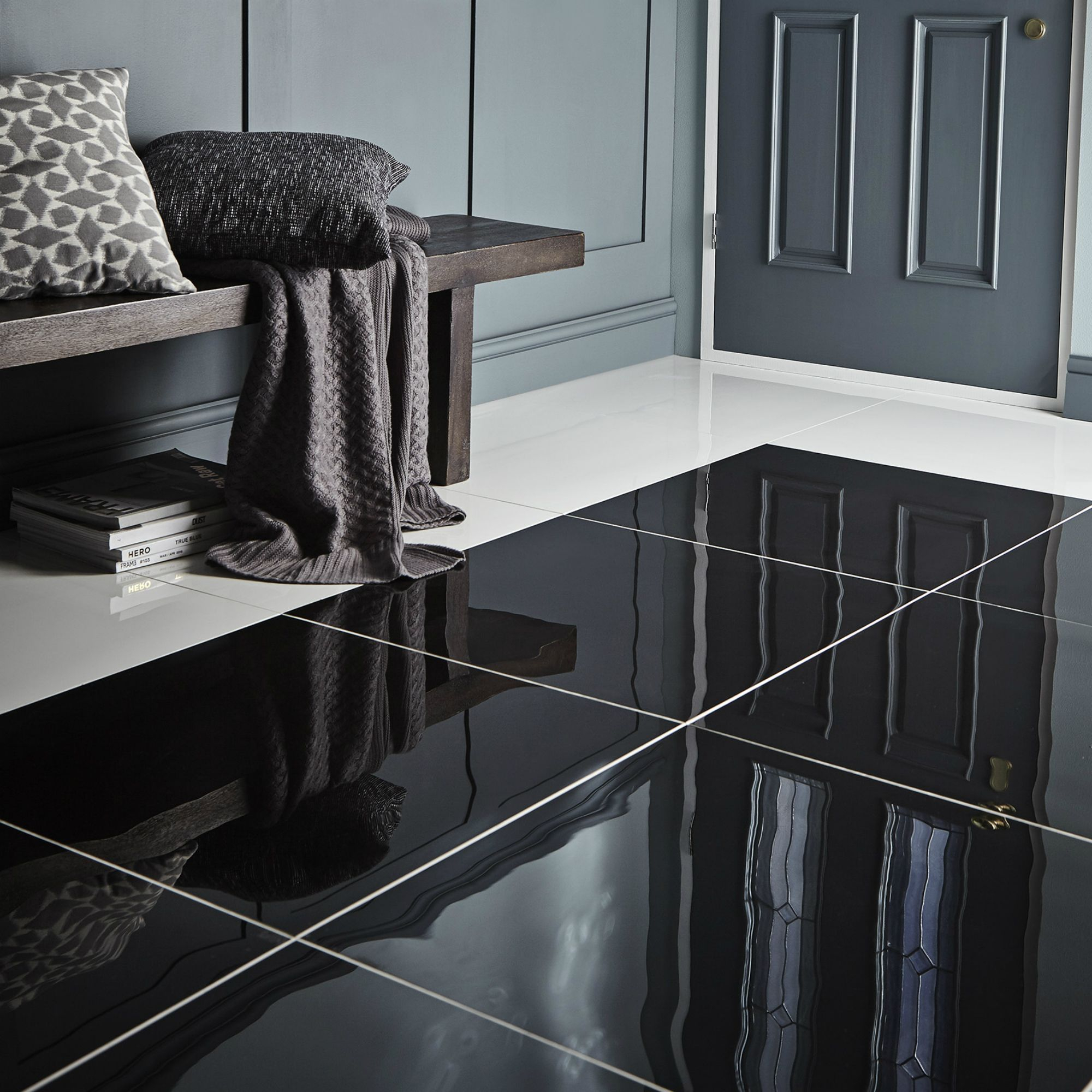
Ever walked into a tiny powder room and felt like the walls were closing in? It’s a common frustration. We all want that spa-like serenity, but when you’re dealing with forty square feet or less, it can feel like an impossible dream. You might think the answer is to paint everything white and hope for the best. But there’s a bolder, more sophisticated secret that designers have been using for decades. It’s not about hiding the size. It’s about playing with perception.
The magic lies in contrast. Specifically, the crisp, graphic punch of black and white tiles. This isn’t just a trend; it’s a visual tool. When used correctly, this monochrome duo doesn’t just look chic. It actually manipulates how our eyes scan the room, creating depth and dimension where there was none before. It turns a cramped closet-sized space into a intentional, stylish retreat. Let’s dive into how you can pull this off without making your bathroom feel like a chessboard.
The Psychology of Contrast and Space
Why does black and white work so well in tight quarters? It comes down to how our brains process visual information. High contrast creates definition. When you pair stark white with deep black, you create clear lines that guide the eye. In a small space, blurry boundaries can make a room feel cluttered and undefined. Sharp lines, on the other hand, give the eye a place to rest and a path to follow.
Think of it like framing a picture. The black acts as a frame, while the white provides the negative space. This separation prevents the room from feeling like a single, overwhelming blob of color. According to recent design insights from sources like Courtney’s World, minimalist monochrome tiles create a sleek look that makes small spaces appear larger by adding depth without overwhelming the senses. It’s about balance. Too much black feels heavy. Too much white feels sterile. Together, they breathe.
This approach also taps into a sense of order. Clutter makes spaces feel smaller. A structured tile pattern suggests organization and calm. Even if your counter is messy, the underlying structure of the floor or walls feels solid and expansive. It’s a psychological trick that works every time. You aren’t just decorating; you’re curating an experience of space.
Choosing the Right Tile Size and Format
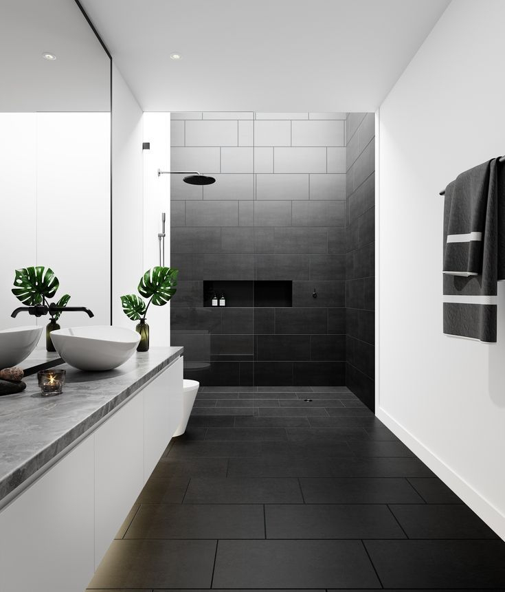
One of the biggest mistakes people make in small bathrooms is choosing tiny tiles. It seems logical—small space, small tiles, right? Wrong. Dozens of grout lines create visual noise. That grid pattern chops up the floor and walls, making the room feel busy and confined. In 2026, the trend is firmly toward large-format tiles. Think 12×24 inches or even larger slabs.
Large tiles mean fewer grout lines. Fewer grout lines mean a smoother, more continuous surface. This continuity tricks the eye into seeing one long, unbroken plane rather than a bunch of little squares. Metro Bath and Tile notes that large-format tiles are key to making small bathrooms look bigger because they enhance the sense of openness. If you love the look of classic subway tiles, go for an oversized version. A 4×16 or even a 3×12 tile laid in a stacked bond can elongate the walls beautifully.
Don’t be afraid of scale. A large black hexagonal tile on the floor can anchor the room, while white rectangular tiles on the wall draw the eye upward. The key is consistency. Stick to one or two sizes max. Mixing too many formats creates chaos. Keep it simple. Let the size of the tile do the heavy lifting in expanding the visual footprint of the room.
Strategic Pattern Placement for Depth
Where you put the tiles matters just as much as the tiles themselves. You don’t need to tile every inch in a complex pattern. In fact, simplicity is your friend here. One of the most effective techniques is the "feature wall." Choose one wall—usually the one behind the vanity or in the shower—and make it the star.
Pairing classic white subway tiles with bold black grout is a timeless move that lifewithhana.com highlights for its ability to make compact spaces feel sophisticated and visually larger. The black grout lines create a grid that adds texture without adding color bulk. It’s subtle but powerful. Alternatively, try a vertical stack bond. Laying rectangular tiles vertically draws the eye up toward the ceiling, making the room feel taller. Height is often more important than width in creating a sense of airiness.
For the floor, consider a diagonal layout. Turning your square tiles 45 degrees creates dynamic lines that lead the eye into the corners of the room. This expands the perceived boundaries of the floor plan. It’s a classic installer trick that costs nothing extra in materials but pays huge dividends in perceived space. Just ensure your installer is precise; diagonal cuts require skill to look clean.
The Power of Grout Color
Grout is often an afterthought, but in a black and white scheme, it’s a primary design element. It can either blend in or stand out. For a seamless, expansive look, match your grout to your tile. White tile with white grout disappears, creating a wall of pure brightness. This reflects light and pushes the boundaries out. It’s the safest bet for making a room feel huge.
But if you want drama, go high-contrast. Black grout on white tile creates a graphic, modern look. It defines each tile, adding rhythm and structure. This works best with larger tiles, as mentioned earlier. If you use small mosaic tiles with black grout, it will look like a mesh net, which can feel claustrophobic. Use contrast wisely.
There’s also a middle ground. Grey grout. It softens the starkness of black and white, offering a vintage or industrial vibe. It’s less harsh than pure black but still provides definition. In 2026, we’re seeing a rise in epoxy grouts that come in nuanced shades. These are durable and stain-resistant, perfect for bathrooms. Choose a grout color that supports your goal: blending for space, contrasting for style.
Lighting and Reflection Synergy
Tiles don’t work in a vacuum. They interact with light. Glossy finishes are your best friend in a small bathroom. A high-gloss white tile reflects ambient light, bouncing it around the room. This eliminates dark corners and shadows, which are the enemies of spaciousness. Matte black tiles, while trendy, absorb light. Use them sparingly, perhaps as an accent strip or on the floor where direct light hits less.
Consider your lighting fixtures too. Layered lighting is crucial. Overhead lights alone cast harsh shadows. Add sconces at eye level near the mirror. This illuminates the face and the wall behind, pushing the wall back visually. If you have a window, keep it unobstructed. Natural light is the ultimate space-expander.
GlowHomey suggests that light-reflecting colors and clever patterns can make tiny spaces feel significantly larger. Combine your glossy white tiles with warm LED bulbs (around 3000K) to avoid the clinical hospital feel. The warmth softens the black and white contrast, making the space feel inviting rather than just big. It’s about comfort as much as dimensions.
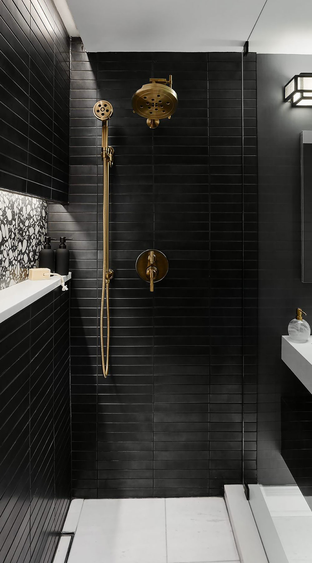
The final piece of the puzzle is what goes on the tiles. Your fixtures should complement the monochrome palette, not fight it. Chrome or polished nickel fixtures shine against black and white, adding another layer of reflection. Matte black fixtures can blend seamlessly with black tiles, creating a cohesive, streamlined look. Avoid brass or gold unless you’re very careful; they can clash with the cool crispness of black and white if not balanced properly.
Glass is essential. A frameless glass shower door, as noted by Andrea and Mike, keeps sight lines open. A bulky framed door cuts the room in half visually. Frameless glass disappears, allowing the eye to travel through the entire space. It’s one of the most impactful changes you can make. Similarly, choose a vanity with legs or a floating design. Seeing the floor continue underneath the vanity makes the floor area seem larger.
Keep accessories minimal. A black and white bathroom is graphic and bold. Adding colorful towels or rugs can break the spell. Stick to whites, blacks, or greys for textiles. Use plants for a touch of life. A single green fern in a white pot adds organic softness without clutter. Remember, every item in the room competes for visual attention. Less is more.
Making a small bathroom feel larger isn’t about magic. It’s about intention. By leveraging the high-contrast power of black and white tiles, choosing large formats, and paying attention to grout and light, you can transform a cramped space into a serene sanctuary. It’s timeless, it’s elegant, and it works. So next time you’re staring at those tiny walls, don’t just paint them white. Give them some definition. Give them some depth. You might just find that the space you thought was too small was waiting for the right perspective all along.