Ever stood in a shoebox-sized bedroom staring at four blank walls, wondering if painting one of them jet black is a genius move or a total disaster? It’s a question that keeps interior designers up at night and homeowners awake with regret. We’ve all heard the old rule: "keep it light to make it look big." But then you scroll through Instagram and see these moody, dramatic little nooks that look incredibly chic. So, which is it? Do you play it safe with a whisper of beige, or do you go loud with a shout of emerald green?
The truth is, there isn’t one single answer that fits every cramped apartment or cozy cottage. It depends on so much more than just square footage. It’s about how the light hits the floorboards at 4 PM. It’s about the vibe you want when you walk in the door. Are you trying to create a sanctuary that feels like a hug, or a dynamic space that sparks creativity? Let’s dig into the messy, beautiful reality of color in small spaces. Because honestly, a tiny room doesn’t have to feel tiny. It can feel intentional. And that starts with picking the right hue for that one special wall.
The Psychology of Space and Color
When we talk about small rooms, we’re usually talking about fighting a feeling of confinement. Our brains are wired to interpret certain visual cues as "open" or "closed." Light colors reflect light, bouncing it around the room and tricking the eye into seeing more depth. That’s why soft whites, pale blues, and light grays have been the go-to recommendations for decades. They recede. They don’t demand attention. They let the furniture breathe. If your primary goal is to make a 10×10 foot office feel like a 12×12 foot office, subtle is your friend. It creates a seamless flow that blurs the boundaries of where the wall ends and the ceiling begins.
But here’s the thing: safe doesn’t always mean satisfying. Sometimes, a room that is all light and airy can feel a bit… sterile. Like a hospital waiting room. That’s where the psychology of bold colors comes in. Darker, richer tones like charcoal, navy, or deep forest green actually absorb light. This might sound counterintuitive for a small space, but it creates what designers call "visual depth." Instead of the walls pushing out, they seem to pull back into shadow. It creates a cocoon effect. A study from homesandgardens.com highlights that considering the mood you want to evoke is crucial before picking a shade. If you want drama and elegance, a bold color can make a small space feel luxurious rather than just small. It’s about shifting the focus from the size of the box to the quality of the experience inside it.
So, it’s not really about making the room look bigger. It’s about making the room feel better. A subtle accent wall might expand the perceived space, but a bold one can anchor it. Think of it like jewelry. You wouldn’t wear a giant diamond necklace with a loud patterned shirt. You’d pair it with something simple. In a small room, the accent wall is the jewelry. If the rest of the room is quiet, the wall can be loud. If the room is already busy with books, plants, and art, maybe the wall should stay subtle. It’s a balancing act between expansion and expression.
Lighting: The Make-or-Break Factor
You can pick the perfect shade of teal, but if your room faces north and gets zero direct sunlight, that teal is going to look like muddy gray by noon. Lighting is the invisible ingredient in every paint job. Before you even buy a sample pot, you need to watch your room for a full day. Where does the sun hit? Is it warm, golden afternoon light, or cool, blue morning light? The orientation of the room changes everything. As noted in recent design guides, the type of light—cool or warm—has a massive impact on how a color reads. A bold yellow might look cheerful in a south-facing room but sickly in a north-facing one.
For subtle accent walls, lighting is forgiving. A light gray or a soft blush will look relatively consistent regardless of whether the sun is shining or it’s raining outside. They are chameleons. They adapt. This makes them a low-risk choice for renters or anyone who doesn’t want to stress over the changing seasons. However, because they are so dependent on reflected light, they can sometimes look flat if the room lacks good artificial lighting layers. You’ll need lamps and overhead lights to keep them from looking dull.
Bold colors, on the other hand, are divas. They demand good lighting to show off their true character. In a well-lit room, a deep blue accent wall will shimmer with complexity. In a dark room, it might just look like a black hole. But here’s a pro tip: if you have a small room with poor natural light, don’t be afraid to go dark anyway. Just compensate with artificial light. Use warm-toned bulbs (2700K-3000K) to add coziness. The contrast between the dark wall and the warm glow of a lamp can create an incredibly intimate atmosphere. It turns the lack of natural light into an asset. You’re not hiding the darkness; you’re embracing it. Just make sure you test your samples at night too. What looks great at 2 PM might look totally different at 8 PM.
Bold Choices: Making a Statement Without the Shout
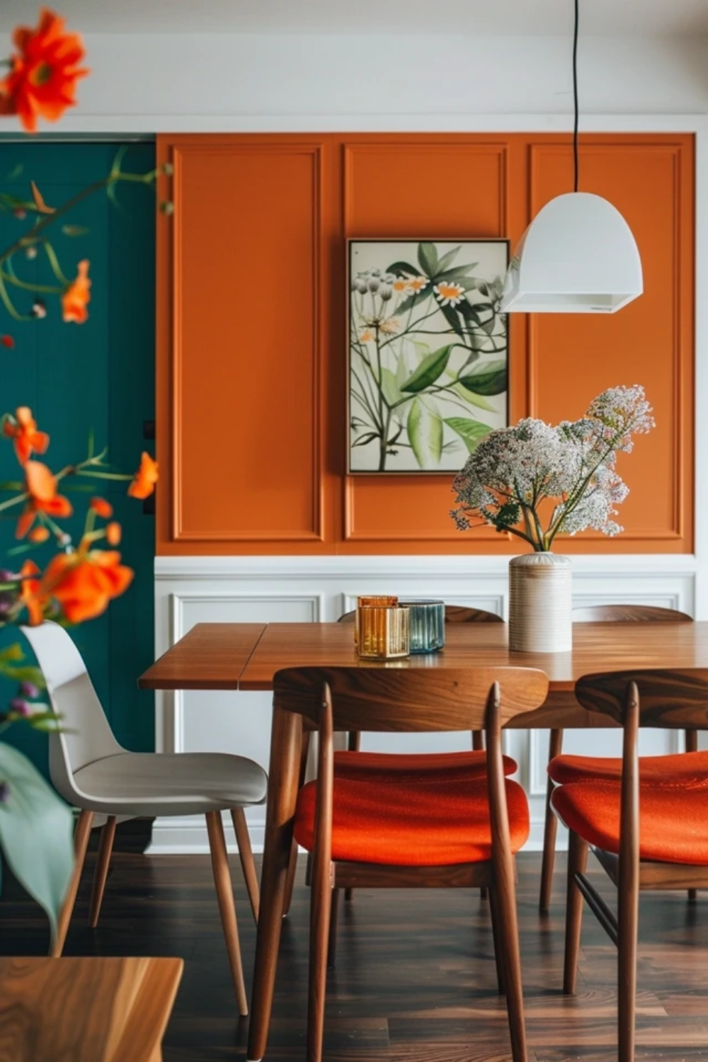
Let’s talk about going bold. There’s a misconception that bold means neon or primary red. It doesn’t. In 2026, "bold" often means saturated, earthy, or moody. Think charcoal, as suggested by roomdsign.com for an elegant look. Think deep olive, terracotta, or midnight blue. These colors add richness and sophistication. They tell a story. When you paint one wall in a small living room a deep navy, you aren’t shrinking the room; you’re creating a focal point. The eye goes straight to that wall, rests there, and ignores the cramped corners. It adds a layer of visual interest that makes the room feel dynamic rather than static.
The key to pulling off a bold accent wall in a tight space is balance. You can’t have a bright red wall, a orange sofa, and a purple rug. It’s too much. The other three walls need to be neutral. White, cream, or a very light gray that complements the bold color. This creates a frame. The bold wall becomes the art piece. Furnishr.com points out that a single darker wall creates depth without overpowering the space. It’s a smart way to introduce personality without overwhelming the senses. Imagine a small home office. Three walls are crisp white. The wall behind your desk is a deep, moody green. Suddenly, you have a zone. A place for focus. The color psychologically separates "work" from "rest," even in a studio apartment.
Also, consider the finish. Glossy paints reflect more light and can make a bold color feel even more intense. Matte finishes absorb light and make the color feel velvety and soft. For a small room, a matte or eggshell finish on a bold accent wall often works better. It reduces glare and makes the color feel more integrated into the architecture. It’s less "look at me" and more "feel me." And remember, you don’t need a whole gallon. Most accent walls in small rooms only need a quart or two. It’s a low-commitment way to experiment. If you hate it, you can paint over it in an afternoon. But chances are, once you see that depth, you won’t want to change it.
Subtle Strategies: The Art of the Whisper
Now, let’s flip the script. Subtle doesn’t mean boring. It means nuanced. It’s about texture, tone, and temperature. A subtle accent wall might be just one shade darker than the other walls. Or it might be the same color but with a different sheen. This approach is all about creating dimension without drawing a hard line. It’s sophisticated. It’s understated. It’s perfect for people who want their space to feel calm and collected. As homedecorbliss.com suggests, strategic splashes of color can create visual depth and make a tiny room feel surprisingly spacious. Subtle colors do this by keeping the eye moving smoothly across the surface.
Think about pale blues, soft sage greens, or warm greiges. These colors connect with nature. They bring the outdoors in, which naturally makes a space feel less confined. A pale blue accent wall in a small bedroom can mimic the sky, creating a sense of openness. A soft sage can bring in the feeling of a garden. These colors are versatile. They work with almost any furniture style, from mid-century modern to farmhouse chic. They also age well. Trends come and go, but a soft, neutral accent wall rarely looks dated. It’s a timeless choice.
Another way to go subtle is through texture rather than just color. Maybe the accent wall isn’t a different color at all, but a different material. Wood slats, shiplap, or even a subtle grasscloth wallpaper can add that necessary depth. Mariafaller.com notes that bold patterns or subtle textures can draw the eye and add dimension. This is a great hack for renters who can’t paint. A textured wallpaper in a neutral tone adds shadow and light play, which breaks up the flatness of a small room. It creates interest without the visual weight of a dark paint color. It’s quiet, but it’s not silent. It whispers, "look closer," and rewards those who do.
Connecting the Dots: Flow and Cohesion
One mistake people make with accent walls is treating the room as an island. But your small bedroom doesn’t exist in a vacuum. It’s connected to the hallway, the bathroom, the living room. The colors need to talk to each other. If your hallway is a stark white and your bedroom accent wall is a jarring electric purple, the transition will feel abrupt and disjointed. It can actually make both spaces feel smaller because the eye stumbles at the threshold. Homesandgardens.com emphasizes taking into account the colors in adjoining rooms to ensure flow. This is critical in small homes where you can often see multiple rooms at once.
To create flow, try pulling a secondary color from the accent wall into the adjacent spaces. If your living room has a deep teal accent wall, maybe the throw pillows in the connecting dining nook have hints of teal. Or maybe the trim in the hallway is painted a very light version of that teal. This creates a visual thread that ties the home together. It makes the whole house feel larger because the eye travels smoothly from one space to the next. It’s like a melody that repeats in different keys.
Matching trim to wall colors is another secret weapon. Thepaintstore.com highlights that matching trim creates visual continuity. Usually, we paint trim white to contrast with walls. But in a small room, that white line cuts the wall off. It defines the boundary. If you paint the trim the same color as the walls (or a very close match), the boundary disappears. The wall seems to wrap around the room endlessly. This is especially effective with subtle accent walls. If you have a light gray accent wall, painting the trim the same light gray makes the room feel airier and more expansive. It removes the visual clutter of contrasting lines. It’s a simple tweak with a huge payoff.
Okay, so you’ve decided on a direction. Bold or subtle. Now, how do you actually do it without messing up? First, measure twice. Buy once. Well, buy sample pots first. Never, ever skip the sample step. Paint a large swatch (at least 2×2 feet) on the wall you plan to accent. Watch it for three days. Morning, noon, and night. See how it changes. See how it makes you feel. If it makes you anxious, it’s the wrong color. If it makes you smile, keep it.
Second, prepare the wall properly. Small rooms show imperfections more easily because the eye is closer to the walls. Fill any holes. Sand down bumps. Use a good primer, especially if you’re going from light to dark or dark to light. A good primer saves you coats of paint and ensures the true color shines through. For bold colors, you might need two or three coats to get full coverage. Don’t rush it. Let each coat dry completely. Rushing leads to streaks, and streaks look cheap.
Third, think about the furniture placement. Your accent wall should ideally be the wall you see when you enter the room, or the wall behind the main piece of furniture (like the bed or the sofa). Don’t put an accent wall behind a door that’s usually open. It’s wasted effort. Also, keep the decor on that wall minimal. If the wall is bold, let it be the star. A single large piece of art or a simple mirror works better than a gallery wall of ten small frames. Clutter competes with color. In a small space, less is always more. And finally, don’t forget the ceiling. If you’re going bold on the walls, keep the ceiling light. If you’re going subtle, you can experiment with a slightly darker ceiling to create a tent-like coziness, but be careful. It can lower the perceived height of the room. Stick to white or off-white for ceilings unless you’re very confident.
At the end of the day, there is no wrong choice, only choices that fit your life. Whether you lean towards the dramatic embrace of a charcoal accent or the airy whisper of a pale blue, the goal is the same: to create a space that feels like yours. Small rooms are intimate. They are personal. They offer a unique opportunity to experiment because the stakes are low and the impact is high. So, grab a brush. Test some colors. Make a mess. And find the hue that makes your small space feel just right.