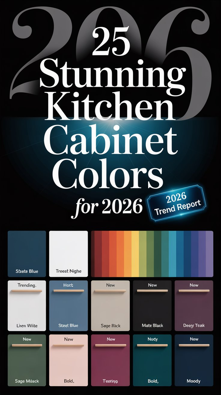
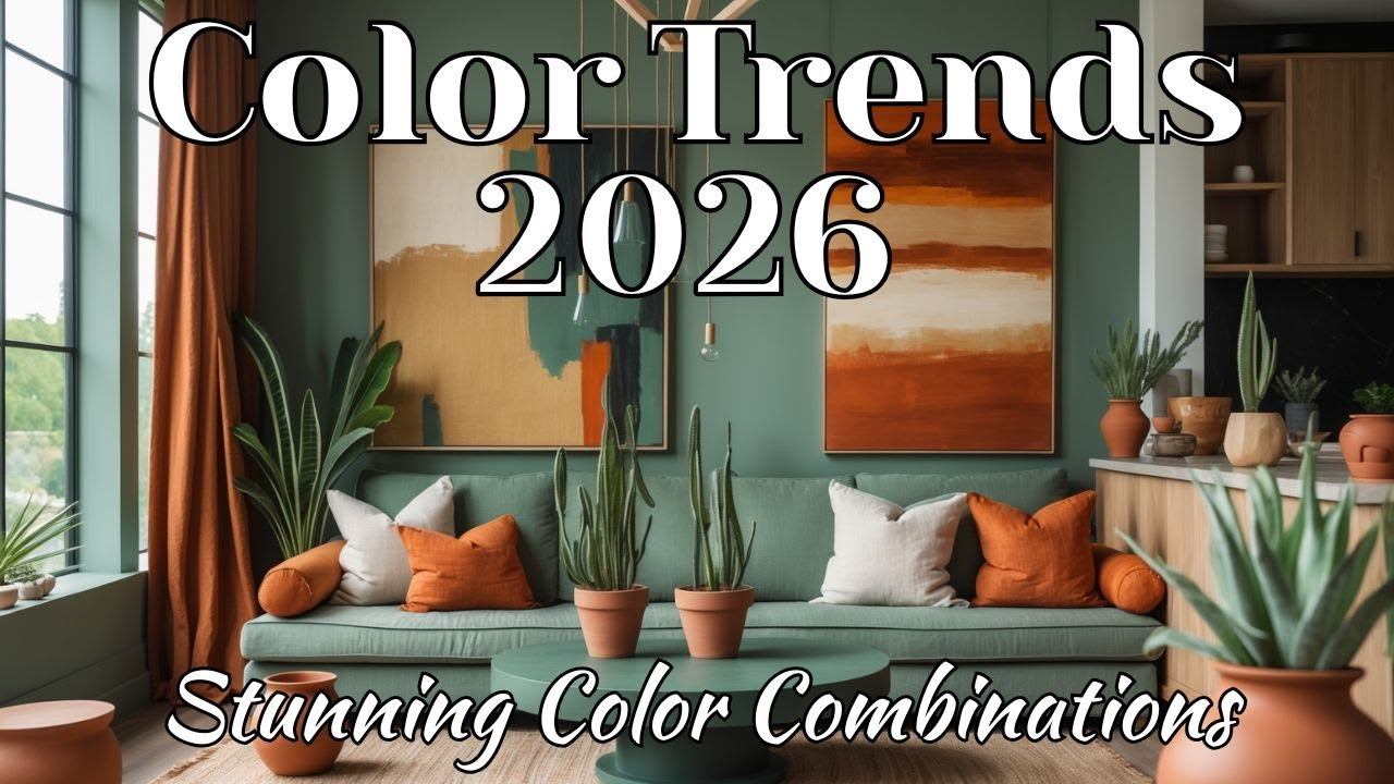
Ever walked into a room and felt your shoulders instantly drop? Or maybe you’ve scrolled past an ad because the neon yellow just felt… aggressive? That’s not an accident. It’s color doing its job. We often think of paint swatches or logo hues as mere decoration, like the sprinkles on a cupcake. But in 2026, we’re realizing that color is actually the flour, the eggs, and the sugar. It’s the structure. It holds everything together.
This year feels different. Maybe it’s because we’re all a bit more tired of the noise. The trends aren’t screaming for attention anymore. They’re whispering. Designers and psychologists are finally on the same page: color isn’t just about what looks good on Instagram for five seconds. It’s about how you feel when you wake up, how you focus at work, and whether you trust a brand enough to buy from them. If you’ve been struggling to pick a shade for your living room or your website, you’re not alone. It’s tricky. But getting it right changes everything.
The Shift From Trend-Chasing to Strategic Wellness
Remember when everyone painted their houses gray? It was safe. It was clean. But it was also kind of cold. In 2026, we’re seeing a massive shift away from those sterile, "Instagram-worthy" moments that age like milk. As noted by recent design forecasts, the focus has moved squarely toward biophilic design. That’s a fancy way of saying we want colors that come from nature. Think moss green, clay red, sky blue. These aren’t just pretty; they support mental wellness.
Why does this matter now more than ever? Because our lives are chaotic. We need our spaces to be anchors. When you choose a palette rooted in the natural world, you’re creating a backdrop that works across life’s inevitable renovations. You aren’t just hopping on a trend bandwagon that will fall off next year. You’re building a foundation. It’s strategic design. It’s about creating environments that help you breathe easier.
This approach also saves you money and stress. Instead of repainting every two years because the "hot color" changed, you’re picking hues that have timeless appeal because they’ve existed for millennia. A stone beige doesn’t go out of style. A leaf green doesn’t become dated. By aligning your choices with nature, you’re opting for longevity over fleeting hype. It’s a smarter, calmer way to live.
Understanding the Emotional Weight of Hues
Colors have feelings. Seriously. Red can make your heart beat faster. Blue can lower your blood pressure. In 2026, understanding this emotional impact is crucial for both homeowners and business owners. Major paint brands and color institutes release annual forecasts, but these aren’t just random picks. They are shaped by culture, shifting lifestyles, and what people are longing for. Right now? We are longing for calm, grounding, and renewal.
Take the rise of earthy tones. These colors add warmth and personality without overwhelming a space. They are especially beautiful in low-light rooms, which is great because not everyone lives in a sun-drenched loft. Using these warm neutrals in bedrooms or reading nooks creates a cocoon effect. It tells your brain it’s time to rest. On the flip side, if you’re trying to energize a home office, you might lean into brighter, clearer tones that mimic daylight.
But it’s not just about one color. It’s about the combination. Consumer behavior is constantly evolving, influenced by emotions and global events. When you look at Spring/Summer 2026 trends, you see a mix of bold hues and surreal tones. These elements shape how people connect with products. If a brand uses a harsh, unnatural purple, it might signal "tech" but also "cold." If they use a soft, organic lavender, it signals "innovation" but also "care." The difference is subtle, but the feeling it leaves is huge.
The Power of Contrast and Structure
Here’s a secret: soft colors need a backbone. If you fill a room with only pale, misty shades, it can start to feel flat. Uninspired. Like a foggy day that never clears. This is where contrast comes in. In 2026, black isn’t just a trend—it’s a tool. It has become essential for giving softness and neutrals a sense of structure. Think of it like the frame around a painting. Without the frame, the art floats away. With it, the art pops.
You don’t need to paint your walls black to get this effect. Actually, please don’t do that unless you really love drama. Instead, use black accents. Door frames. Light fixtures. The legs of a chair. These sharp, dark lines cut through the haze of neutral tones and give the eye a place to rest. It creates depth. It makes the soft colors feel softer by comparison. It’s a classic design trick that feels fresh again because we’ve been so afraid of dark colors for so long.
This principle applies to digital spaces too. Web design in 2026 is moving toward high contrast. Bold text on light backgrounds, or vice versa. It’s not just aesthetic; it’s accessible. It helps people read better. It guides the user’s eye to what matters. Whether you’re designing a bedroom or a landing page, remember that contrast creates clarity. Don’t be afraid to let the dark spots be dark. They’re doing heavy lifting.
Navigating the Digital Color Landscape
We live half our lives on screens now. So, how does color translate from a paint chip to a pixel? It’s complicated. Screens emit light; walls reflect it. A color that looks cozy on your phone might look sickly on your wall. In 2026, creatives are benchmarking against leading institutions like Pantone and WGSN to bridge this gap. The trend is moving toward "cosmic gradients" and digital palettes that feel immersive.
But here’s the catch: digital colors change depending on your device. Your old laptop shows colors differently than your new smartphone. This is why relying solely on screen-based inspiration for physical projects is risky. Always, always get a physical sample. Hold it in the room. Look at it in the morning light. Look at it at night with the lamps on. Colors are chameleons. They shift.
For brands, this means consistency is harder but more important. Your logo needs to look good on a billboard and on a smartwatch. This is why many companies are simplifying their palettes. They’re choosing core colors that are robust enough to handle different mediums. They’re using digital gradients to add flair without compromising recognition. It’s a balancing act between looking modern and being legible.
Practical Steps to Choose Your Palette
So, how do you actually do this? Start with what you already love. Look at your closet. What colors do you reach for when you want to feel confident? Look at your favorite photo from a vacation. What are the dominant hues there? These are clues to your personal color psychology. Don’t start with a trend report. Start with yourself. Then, layer the trends on top.
Next, consider the function of the space or project. Is this a place for high energy? Go for warmer, brighter tones. Is it a place for deep thought? Cool, muted tones might work better. For 2026, interior designers are loving hues that support specific activities. A kitchen might benefit from a cheerful, appetite-stimulating orange tone, while a bathroom might need a spa-like sage green. Context is king.
Finally, test in small doses. You don’t have to commit to a whole wall. Buy a poster. Change your throw pillows. Update your website’s button color. See how it feels. Live with it for a week. Does it annoy you? Does it soothe you? Trust your gut. If a color makes you feel anxious, it’s the wrong color, no matter how trendy it is. Your reaction is the most accurate data point you have.
One big mistake people make is lighting ignorance. You can pick the perfect shade of white, but if your bulbs are warm yellow, that white will look cream. If your bulbs are cool blue, it will look gray. Always check your light temperature. In 2026, with the rise of smart lighting, you can even change the mood of a room by changing the bulb color. Use this to your advantage. Let your walls adapt to the time of day.
Another pitfall is overcrowding. Just because you love teal and terracotta and mustard doesn’t mean they all belong in one room. Pick one dominant color. Pick one secondary color. Use the third as an accent. Rule of thumb: 60% dominant, 30% secondary, 10% accent. This keeps things balanced. It prevents visual chaos. Your eyes need a break. Give them one.
Lastly, don’t ignore the flow. If you have an open-concept home, the colors in your kitchen should talk to the colors in your living room. They don’t have to match, but they should be cousins, not strangers. Use a common undertone to tie them together. If your kitchen has warm wood tones, carry that warmth into the living room with a rug or art. It creates a sense of harmony. It makes the whole house feel intentional.
Getting color right isn’t about following rules perfectly. It’s about listening. Listening to the space, listening to the light, and listening to yourself. In 2026, the best color choices are the ones that make you feel more like you. They ground you. They inspire you. They don’t shout; they support. So take a breath. Look around. What color does your life need right now?