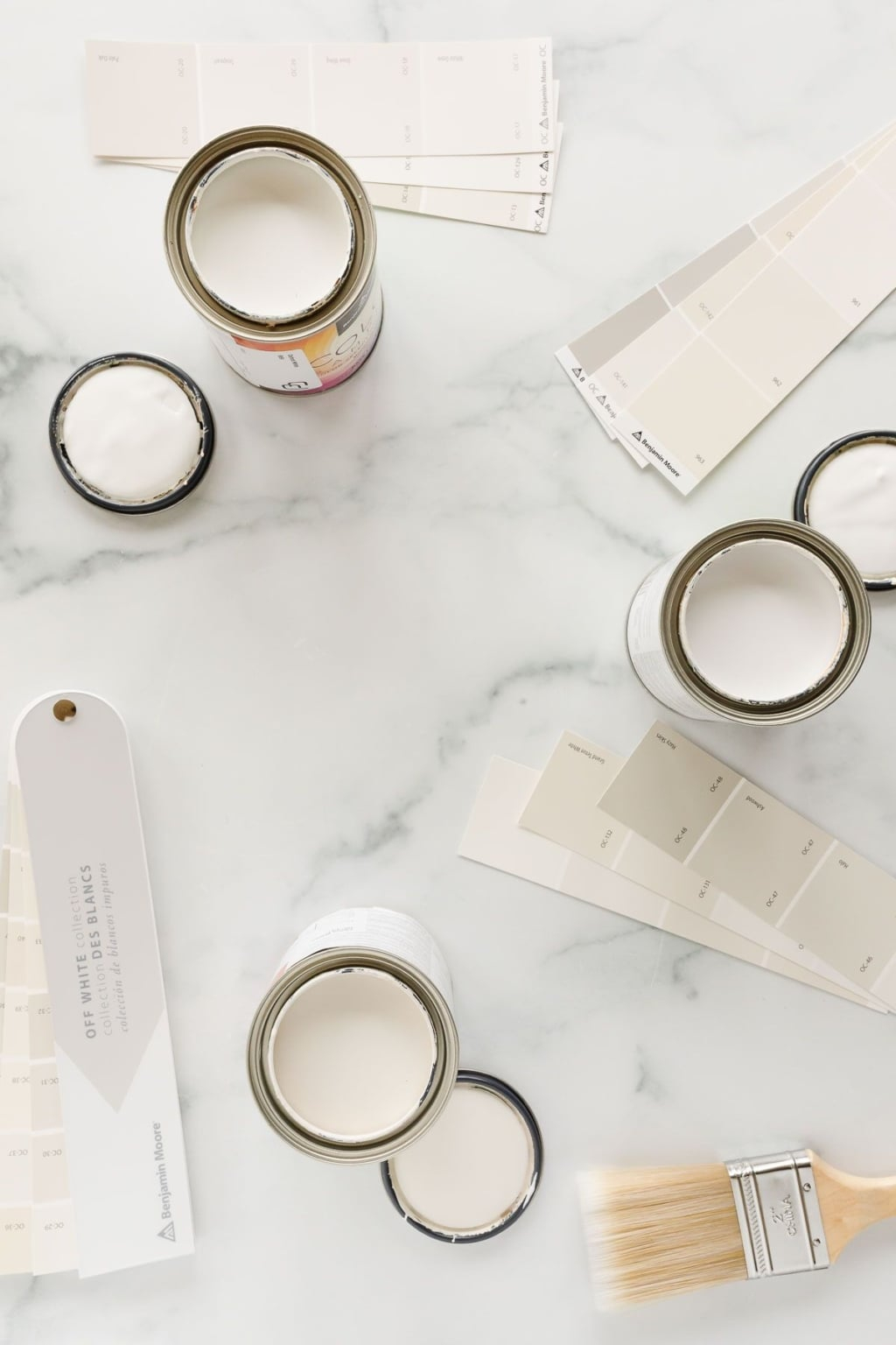
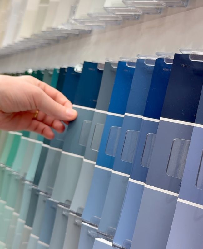
You know that feeling. You’re standing in the paint aisle, holding three different shades of white, and your brain just stops working. They all look the same. Or maybe they look completely different than they did on the tiny card in the store. It’s exhausting. And expensive. One wrong move and you’re stuck living with a wall color that makes your living room feel like a dentist’s office waiting room.
We’ve all been there. In 2026, the trend isn’t about chasing the "color of the year" anymore. Sure, those annual picks are fun for a throw pillow or a vase. But for your walls? You want something that breathes. Something that feels like home, not a magazine spread that’ll be outdated by next Tuesday. The secret isn’t finding the perfect shade. It’s using a system. A checklist, if you will, that designers have used for decades to avoid regret.
Let’s cut through the noise. This isn’t about what’s hot right now. It’s about what lasts. We’re talking about shades that work with your light, your furniture, and your actual life. By the end of this, you’ll have a clear path forward. No more second-guessing. Just confidence.
Understanding Light Is Everything
Before you even look at a color fan deck, you need to look at your windows. Seriously. Light is the invisible ingredient in every paint job. It changes everything. A beautiful warm beige can turn into a sickly yellow if your room gets too much southern exposure. A crisp gray can feel cold and sterile in a north-facing room with no direct sun.
Start by watching your space for a day. Where does the light come from in the morning? What about late afternoon? North-facing rooms get cool, indirect light. They often benefit from warmer undertones to balance the chill. South-facing rooms are flooded with warm, bright light. You can get away with cooler tones there because the sun warms them up naturally. East and west are tricky. Morning light is soft and golden; evening light is intense and orange. You need a shade that can handle both shifts without looking weird.
Don’t trust the bulb in your ceiling either. LED lights have color temperatures, measured in Kelvin. A 3000K bulb casts a warm glow, while a 5000K bulb is stark and blue-ish. If you pick a paint color under store lighting (which is usually harsh and cool), it will look totally different under your cozy home lamps. Always, always test your samples in the actual room, at different times of day. It’s the only way to know the truth.
The Undertone Trap and How to Avoid It
Here is where most people mess up. They see a color they like, but they don’t see what’s hiding underneath. Every color has an undertone. White isn’t just white. It’s got hints of pink, yellow, green, or blue. Gray isn’t neutral. It leans purple, green, or blue. If you mix undertones that clash, your whole room feels "off," even if you can’t pinpoint why.
The trick is to identify the fixed elements in your room first. Do you have oak floors? They usually have orange or yellow undertones. Do you have marble countertops with gray veining? That’s a cool tone. Your wall color needs to harmonize with these permanent features. If you have warm wood floors, a cool gray wall might make the wood look dirty or dated. Instead, try a greige (gray-beige) or a warm white that complements the wood’s warmth.
A simple way to check undertones is the paper test. Hold a pure white piece of printer paper next to your paint sample. The contrast will reveal the hidden hue. If the paint looks yellow next to the paper, it’s a warm white. If it looks blue or gray, it’s cool. This small step saves you from the headache of repainting later. In 2026, designers are leaning heavily into earthy, natural undertones. Think clay, stone, and moss. These colors feel grounded and pair well with almost any furniture style.
Testing Like a Pro (Not an Amateur)
Stop painting huge squares on the wall. It’s messy, hard to cover up, and doesn’t give you the full picture. Instead, use large poster boards or foam core sheets. Paint two coats on each board. Let them dry completely. Then, move them around the room. Prop one against the dark corner. Hold another next to the window. Tape one behind your sofa.
This method lets you see how the color interacts with your furniture and flooring. Does it clash with your rug? Does it disappear in the shadows? You can also see how it looks from different angles. When you paint directly on the wall, you’re stuck with that one spot. With boards, you have flexibility. Plus, if you hate it, you just toss the board. No scraping, no spackling.
Leave the samples up for at least 48 hours. Live with them. Eat dinner with them. Watch TV with them. You’ll notice things you missed at first glance. Maybe the color feels too heavy at night. Maybe it’s perfect in the morning but glaring in the afternoon. This patience is key. Designers never rush this step. They know that light changes, and so does our perception of color. Take your time. It’s worth it.
The 60-30-10 Rule for Balance
Once you have your main wall color, how do you pull the rest of the room together? Enter the 60-30-10 rule. It’s a classic design principle that ensures your space feels balanced, not chaotic. Sixty percent of the room should be your dominant color. This is usually your walls, but it can also include large rugs or sofas. Thirty percent is your secondary color. Think curtains, accent chairs, or bedding. Ten percent is your accent color. This is for pillows, art, vases, and small decor items.
For a timeless look, keep the 60% neutral. Soft whites, warm grays, or muted beiges are perfect here. They create a calm backdrop that lets your personality shine through the other layers. The 30% can introduce some depth. Maybe a navy blue sofa or olive green curtains. The 10% is where you can have fun. A pop of terracotta, mustard, or even black. This structure prevents the room from feeling overwhelming.
In 2026, we’re seeing a shift towards monochromatic schemes within this rule. Instead of contrasting colors, people are using different shades of the same hue. For example, a light sage wall (60%), a deeper sage sofa (30%), and a bright lime green pillow (10%). It’s sophisticated and soothing. It also makes picking colors easier because you’re staying in one family. You don’t have to worry about clashing hues. Just play with light and dark.
Choosing Finishes That Last
Color is only half the battle. The sheen matters just as much. Flat paint looks velvety and hides imperfections, but it’s a nightmare to clean. Glossy paint is durable and easy to wipe down, but it highlights every bump and dent in your drywall. Knowing where to use each finish is crucial for a professional look.
For ceilings, always go flat or matte. You don’t want any shine up there. It draws the eye upward in a bad way. For walls in low-traffic areas like bedrooms and dining rooms, eggshell or satin is ideal. They have a slight glow that reflects light nicely but aren’t so shiny that they show flaws. For high-traffic areas like hallways, kids’ rooms, and kitchens, use satin or semi-gloss. These finishes can handle scrubbing. Trim and doors should always be semi-gloss or high-gloss. It creates a nice contrast with the walls and stands up to hands and feet.
Don’t skimp on quality either. Cheap paint fades faster and doesn’t cover as well. In 2026, many brands are offering low-VOC or zero-VOC options that smell better and are safer for your health. They perform just as well as traditional paints, if not better. Invest in good primer too. It helps the color look true and last longer. A good base means fewer coats and a smoother finish. It’s a small detail that makes a big difference.
Your home shouldn’t feel like a series of disconnected boxes. The colors should flow from one room to the next. This doesn’t mean every room has to be the same color. That’s boring. Instead, think about connections. Use the same trim color throughout the house. It ties everything together visually. Or, pick a palette of three to four related shades and distribute them across your spaces.
For example, you might use a warm white in the living room, a slightly darker beige in the hallway, and a soft gray-blue in the bedroom. These colors share similar undertones, so they feel cohesive. When you walk from one room to another, the transition feels natural, not jarring. Consider the view from one room into another. If you can see the kitchen from the living room, make sure the colors complement each other.
Open floor plans need extra attention. Since there are no walls to separate spaces, color becomes the divider. You can use a darker shade to define a dining area or a lighter shade to open up a living space. Rugs and furniture placement also help, but color is the primary tool. Keep the overall vibe consistent. If your home is cozy and rustic, stick to warm, earthy tones. If it’s modern and sleek, cool grays and crisp whites might work better. Consistency creates calm.
Picking the right paint color doesn’t have to be a gamble. By understanding light, respecting undertones, testing properly, balancing your palette, choosing the right finish, and creating flow, you can create a space that feels intentional and timeless. It’s not about following trends. It’s about knowing what works for you and your home.
So, take a deep breath. Put down the stress. Grab those sample boards. Look at your light. Trust the process. The perfect shade is out there, waiting for you to find it. And when you do, it won’t just look good today. It’ll look good for years to come. That’s the power of getting it right. Now, go make your home feel like you.