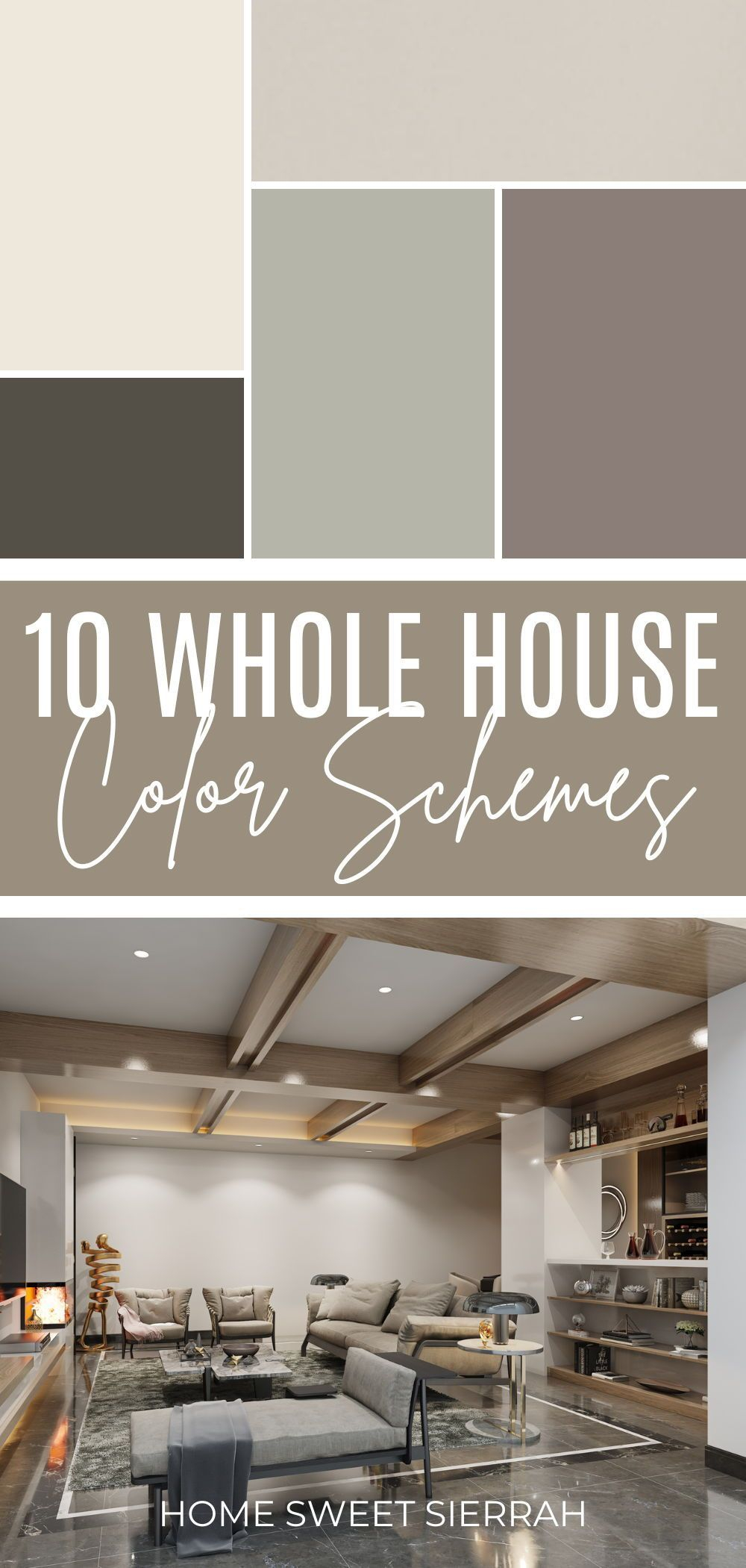
You know that feeling when you walk into a home and it just… works? It’s not flashy. It doesn’t scream for attention. But every room feels like it belongs to the same family. The transition from the kitchen to the living room isn’t jarring. It’s smooth. Like a good conversation. That’s the magic of a masterful whole-house color scheme. And honestly? It’s harder than it looks.
Most people pick paint colors room by room. They fall in love with a moody blue for the bedroom and a bright yellow for the office. Alone, they’re great. Together? It’s chaos. In 2026, we’re moving away from that disjointed approach. We’re done with chasing Instagram trends that age like milk. This year is about something deeper. It’s about creating spaces that feel rooted. Spaces that support your mental wellness and flow naturally from one area to the next. If you’ve ever felt overwhelmed by the sheer number of white shades at the hardware store, you’re not alone. Let’s fix that.
Understanding the 2026 Shift: From Trendy to Timeless
The vibe in 2026 is different. We aren’t looking for the "hot" color of the month. We’re looking for staying power. Designers are calling it "strategic design." It’s a shift toward biophilic principles—basically, bringing the outside in. Think colors derived from nature. Earthy tones. Soft greens. Warm sands. These aren’t just pretty; they calm the nervous system. When you choose a palette based on nature, you’re choosing colors that won’t feel outdated in two years.
Major paint brands like Sherwin-Williams and Benjamin Moore are leaning into this hard. Their 2026 collections focus on warmth and balance. It’s a resurgence of what some call "Warm Minimalism." Imagine the Tuscan era, but lighter. Airier. Without the heavy, dark ochres of the past. Instead, we see foundational hues that act as a quiet backdrop for life. This matters because your home isn’t a showroom. It’s where you live. It gets messy. Kids run through it. Dogs shed. A flexible, nature-based palette handles life’s inevitable renovations and wear-and-tear with grace.
So, how do you start? Stop looking at individual swatches in isolation. Start thinking about the feeling you want when you walk through your front door. Do you want energy? Calm? Coziness? In 2026, the answer is usually "calm." The data shows that homeowners are prioritizing mental wellness in their design choices. By anchoring your home in these enduring, natural tones, you’re building a foundation that lasts. It’s less about what’s "in" and more about what feels right.
The Golden Rule: Establishing Your Core Neutral
Every great whole-house scheme needs a hero. Not a loud, flashy hero. A quiet one. This is your core neutral. It’s the color that will appear in your hallways, your trim, and likely your main living areas. In 2026, the trend is firmly away from stark, cool grays. Those feel clinical now. Instead, we’re embracing warm whites and creams. Think of them as the canvas upon which the rest of your home is painted.
Choosing the right neutral is tricky because lighting changes everything. A cream that looks buttery and soft in the showroom might look pink under your north-facing living room lights. That’s why experts recommend testing large samples. Don’t just rely on the tiny chip. Paint a poster board or a section of the wall. Watch it throughout the day. Does it stay warm? Or does it turn muddy? The goal is a neutral that bridges your rooms. If your kitchen has warm wood cabinets and your bathroom has cool stone tiles, your core neutral needs to play nice with both.
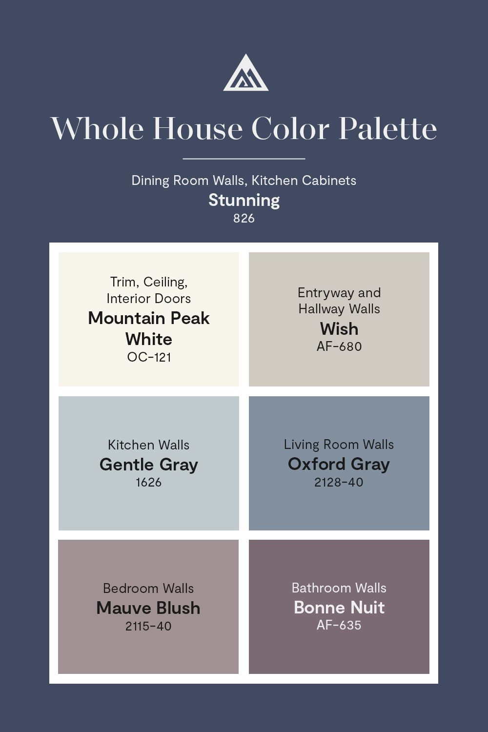
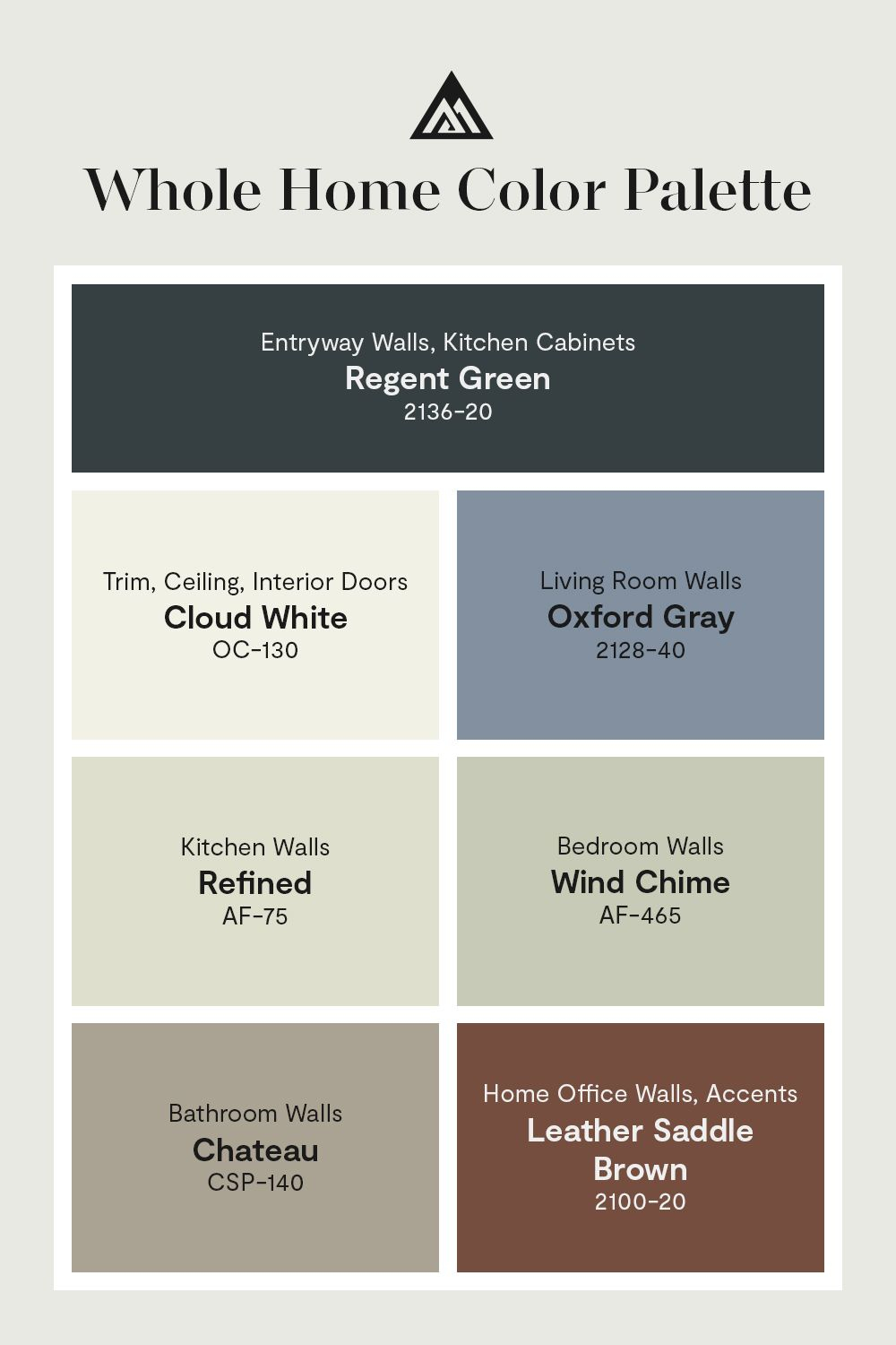
Behr’s 2026 trends highlight this versatility. Their palettes are designed to work together, ensuring that your reading nook and your laundry room feel connected. A good rule of thumb? Pick a neutral with a subtle undertone. Maybe it leans slightly green or beige. This adds depth without adding noise. It allows your furniture and art to pop without competing. Remember, this color will be everywhere. You’ll see it every time you walk down the hall. Make sure you love it. Really love it.
Creating Flow with the 60-30-10 Rule
Once you have your core neutral, you need a strategy for the other rooms. Enter the 60-30-10 rule. It’s a classic interior design principle that still holds up perfectly in 2026. Here’s how it breaks down: 60% of your space is your dominant color (usually that core neutral). 30% is your secondary color. And 10% is your accent. This formula creates balance. It prevents any single room from feeling overwhelming or chaotic.
For a whole-house scheme, think of the 30% as the bridge between rooms. Maybe your living room uses a soft sage green as the secondary color. Then, in the adjacent dining room, you use that same sage green as an accent (the 10%) against a different secondary color, like a warm terracotta. See what happened there? The sage green ties the two spaces together. It creates a visual thread that pulls you through the house. This is how you achieve flow. It’s not about painting every wall the same color. It’s about repetition.
This approach also makes decision-making easier. Instead of picking five completely different colors for five rooms, you’re working with a limited palette. You might have three main colors and two accents for the entire house. This constraint is actually freeing. It stops you from over-complicating things. Plus, it ensures that if you leave a door open, the view from one room to the next looks intentional. It looks pro. Because it is.
Navigating Light and Architecture
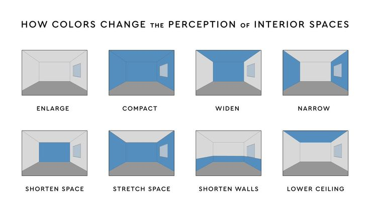
Here’s the thing about paint: it’s not static. It changes. A color that looks amazing in a south-facing room with tons of natural light will look totally different in a windowless powder room. In 2026, designers are paying extra attention to this interplay between light and pigment. You can’t just pick a color because it’s trending. You have to pick it because it works with your specific architecture.
Start by mapping your home’s light. Which rooms get morning sun? Which get harsh afternoon glare? North-facing rooms tend to cast a cooler, bluer light. If you put a cool gray in there, it’ll feel icy. You’d want to counteract that with a warm undertone. South-facing rooms get warm, golden light. They can handle cooler colors without feeling sterile. East and west-facing rooms change dramatically throughout the day. These are the trickiest. Test your samples at different times. Morning. Noon. Night. With lamps on and off.
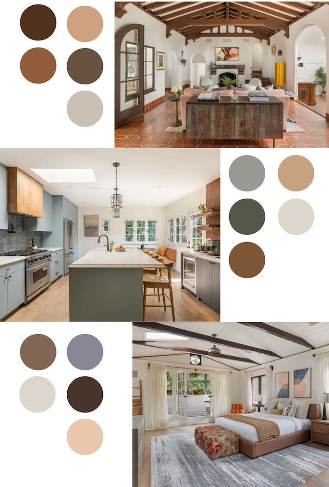
Also, consider your fixed elements. Do you have oak floors? Brick fireplaces? Granite countertops? These things don’t change easily. Your paint colors need to harmonize with them. If you have red-toned brick, a green with red undertones (like a muted olive) will look cohesive. A blue with purple undertones might clash. It’s about respect for the existing structure. Don’t fight your home. Work with it. This is part of that "strategic design" mindset. It’s about long-term harmony, not quick fixes.
Room-by-Room Psychology and Function
Colors affect mood. We know this. But in 2026, we’re getting more specific about it. We’re using color psychology to support our daily lives. Your bedroom shouldn’t feel like your office. Your kitchen shouldn’t feel like your bathroom. Each space has a function, and the color should support that function. This doesn’t mean you need a rainbow of different hues. It means adjusting saturation and tone within your established palette.
For bedrooms, think restorative. Soft, muted tones work best. Blues, greens, and warm neutrals lower heart rates and promote sleep. Avoid high-energy colors like bright reds or oranges here. You want a retreat. A cave. In contrast, kitchens and dining areas benefit from slightly more energy. Warm whites, soft yellows, or earthy terracottas can stimulate appetite and conversation. These are social spaces. They should feel inviting and alive.
What about home offices? With remote work still a huge part of life in 2026, this space matters. You need focus. Greens are great for concentration. They’re easy on the eyes. But avoid anything too dark or depressing. You want clarity. And don’t forget the small spaces. Laundry rooms, mudrooms, powder rooms. These are often overlooked. But a splash of character here can make chores feel less like chores. BEHR’s 2026 palette suggests using these smaller rooms to experiment with bolder accents since the surface area is small. It’s low risk, high reward.
Even with a plan, things can go wrong. The most common mistake? Ignoring the transitions. Hallways are the arteries of your home. If they’re painted a jarring color, the whole flow breaks. Keep hallways neutral. Let them be the pause button between the vibrant living room and the serene bedroom. Another big error? Forgetting about the ceiling. In 2026, we’re seeing a move away from stark white ceilings. Painting the ceiling a slightly lighter shade of the wall color can make a room feel cozier and more enveloping. It removes that harsh line where the wall meets the sky.
Also, watch out for "trend fatigue." Just because a color is named "Color of the Year" doesn’t mean you need to paint your whole house in it. Use trend colors as accents. Pillows. Rugs. A single accent wall. If you commit fully to a trendy color, you’re stuck with it until you repaint. And let’s be honest, painting is a hassle. By keeping your major surfaces timeless, you can update the look of your home just by swapping out textiles. It’s smarter. It’s cheaper.
Finally, don’t rush. Paint is permanent-ish. Take your time. Live with the samples. Ask yourself: Does this feel like me? Does it feel like my home? If the answer is no, keep looking. There’s no prize for finishing first. The goal is a home that feels connected, lived-in, and full of warmth. As one designer put it, choose colors with intention. Think less about what’s hot on social media and more about what feels right when you walk through your door. That’s the secret.
Mastering a whole-house color scheme isn’t about being perfect. It’s about being intentional. In 2026, the best homes aren’t the ones with the wildest colors. They’re the ones that feel like a deep breath. They’re the ones that flow. By anchoring your space in warm, nature-inspired neutrals, using the 60-30-10 rule, and respecting your light and architecture, you can create a home that stands the test of time. It’s not just about paint. It’s about creating a backdrop for your life. And that’s worth getting right. So take a breath. Look at your walls. And start building something that truly feels like home.