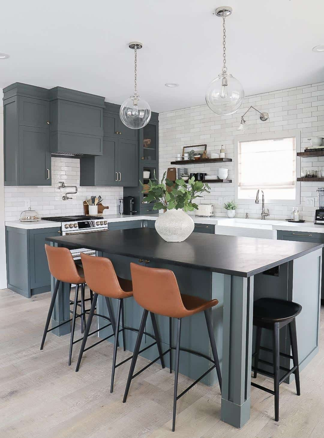
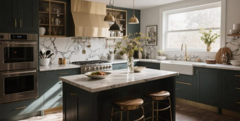
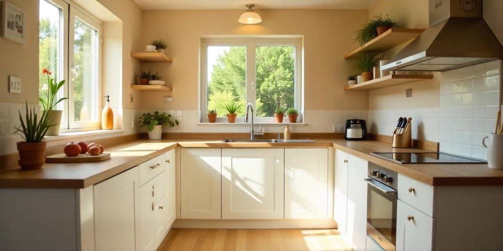
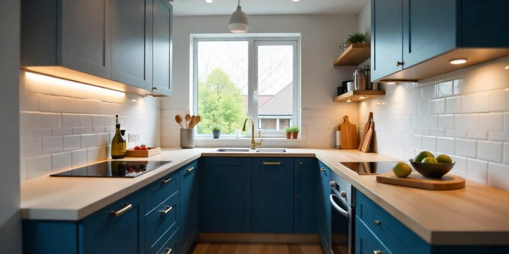
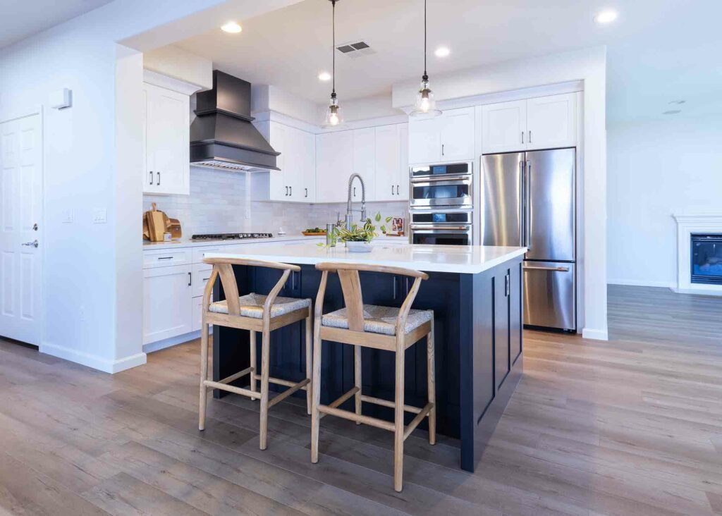
Ever walked into a tiny kitchen and felt like the walls were closing in? It’s a common feeling. You love to cook, but the space just feels… cramped. Cluttered. Dark. But what if I told you there’s a simple trick that designers have been using for years, and it’s getting even more popular in 2026? It’s not about knocking down walls or buying expensive custom cabinets. It’s about what sits right under your hands when you’re chopping veggies.
Light colored countertops.
Sounds too simple, right? Like, can a slab of stone or quartz really change how big a room feels? The answer is a resounding yes. In fact, recent design guides from top home experts highlight that white, cream, and pale gray surfaces don’t just look nice—they actively trick your eye into seeing more space. They bounce light around. They recede visually. And in a year where maximizing every square foot is key, this is the upgrade that gives you the most bang for your buck.
Let’s dive into why this works, which materials are trending right now, and how you can pull it off without making your kitchen look like a sterile hospital room. Because let’s be honest, nobody wants to cook in a clinic. We want warmth. We want style. And we want to feel like we have room to breathe.
The Science of Sight: Why Light Colors Open Up Spaces
It’s not magic, though it feels like it. It’s physics. Or at least, the way our brains process light and color. Dark colors absorb light. Think about wearing a black shirt on a sunny day. It gets hot, right? That’s because it’s soaking up all that energy. In a small kitchen, dark countertops do the same thing. They swallow the available light, making shadows deeper and corners feel tighter.
Light colors, on the other hand, reflect. When you install a white or soft beige countertop, it acts like a giant reflector board. It catches natural light from windows and bounces it back into the room. It also amplifies artificial light from your overhead fixtures. This increased brightness reduces contrast. And when there’s less contrast between surfaces, the boundaries of the room seem to blur. Your eye doesn’t stop abruptly at the edge of a dark counter. It glides over a light one, creating an illusion of continuity.
This is why experts at places like Homes and Gardens point out that white worktops enhance light to create a sense of space. It’s about visual weight. A heavy, dark slab feels solid and immovable. It anchors the eye. A light slab feels airy. It seems to float. In a small footprint—say, 15 to 25 square feet of counter space, which is typical for compact apartments—this reduction in visual weight is crucial. It makes the whole area feel less cluttered, even if you have the same amount of stuff on the counter.
But it’s not just about pure white. The trend in 2026 is moving towards nuanced lights. Think creamy off-whites, pale grays with warm undertones, and even soft pastels. These shades still reflect light, but they add character. They prevent that cold, clinical vibe. As noted in recent updates from OPPEIN, colors like cream and pale gray visually recede, creating that open, airy impression without sacrificing warmth. It’s a delicate balance, but when you get it right, the transformation is immediate.
Choosing the Right Shade: Beyond Just "White
So, you’re convinced. Light is better. But which light? This is where people get stuck. They think "light" means "bright white." And sure, bright white is a classic choice. It’s crisp. It’s clean. It reflects the maximum amount of light. But it can also show every crumb, every splash of tomato sauce, and every fingerprint. For some, that’s a nightmare.
That’s why the palette has expanded. In 2026, we’re seeing a huge rise in warm whites and beiges. These tones are forgiving. They hide minor messes better than stark white, but they still offer that expansive quality. Imagine a countertop in a shade like "vanilla custard" or "soft linen." It feels cozy. It pairs beautifully with wood cabinets, which are also having a moment. The contrast isn’t harsh. It’s gentle. And that gentleness helps the eye move smoothly across the space.
Then there’s gray. But not the dark, moody charcoal gray of the 2010s. We’re talking about pale, misty grays. Maybe with a hint of blue or green. These cool tones can make a small kitchen feel fresh and modern. They work particularly well if your kitchen lacks natural light. Cool light colors can mimic the feel of daylight, brightening up a north-facing room. Livingetc suggests leaning towards these light grays and beiges, noting that they consistently make small kitchens look bigger.
And don’t sleep on soft pastels. Yes, really. A very pale pink or a muted sage green can act as a neutral in 2026. These colors add personality without adding visual noise. They’re subtle. From a distance, they read as light neutrals. Up close, they bring joy. If you’re tired of the all-white look but still need that spatial expansion, a pastel quartz might be your perfect match. Just keep it light. The moment you go mid-tone or dark, you lose the reflective benefit.
Here’s a quick breakdown of top choices for 2026:
- Pure White: Maximum reflection, modern, high maintenance.
- Cream/Off-White: Warm, inviting, hides stains better, pairs well with wood.
- Pale Gray: Cool, contemporary, great for low-light spaces.
- Soft Beige: Earthy, calm, versatile, works with almost any cabinet color.
- Muted Pastels: Unique, cheerful, acts as a light neutral with a twist.
Material Matters: Quartz, Marble, and Solid Surface
Color is king, but material is the queen. The texture and finish of your countertop play a huge role in how it interacts with light. In 2026, quartz remains the heavyweight champion for small kitchens. Why? Because it’s non-porous, durable, and comes in endless light colors. You can get quartz that looks like marble, concrete, or solid color. And unlike natural stone, you don’t have to worry about sealing it. For a busy small kitchen, that’s a lifesaver.
Marble is the dreamy option. There’s nothing quite like the veining in a slab of Carrara or Calacatta marble. The white background with those soft gray veins adds depth without adding darkness. It reflects light beautifully. But marble is porous. It stains. It etches. If you’re the type who leaves a lemon slice on the counter overnight, marble might break your heart. However, for many, the aesthetic payoff is worth the extra care. Just know that you’ll need to be vigilant.
Solid surface materials like Corian are making a comeback too. They’re seamless. And that’s a key point. SlabWise highlights that continuous countertop runs without breaks feel larger than segmented surfaces. Fewer seams mean less visual interruption. In a tiny kitchen, every seam is a line that cuts the space. Solid surface can be molded with integrated sinks, creating one smooth, unbroken plane. This continuity tricks the eye into seeing a larger, uninterrupted surface area. It’s sleek. It’s modern. And it’s incredibly practical.
Granite is still around, but you have to be careful. Many granites are busy. They have lots of movement and dark spots. In a small space, that busyness creates visual noise. It makes the room feel chaotic. If you love granite, look for lighter varieties with minimal patterning. White Alaska or Kashmir White are good examples. They offer the natural stone look without the overwhelming complexity. The goal is calm. Visual calm equals perceived space.
Don’t forget about finish. A polished finish will reflect more light than a honed or matte one. Polished quartz or marble will give you that mirror-like quality that bounces light around the room. Honed finishes are trendy and feel softer to the touch, but they absorb a bit more light. In a very dark kitchen, go polished. In a kitchen with plenty of windows, a honed finish might add a nice, diffuse glow without being too glaring.
The Power of Continuity: Seams, Edges, and Flow
We touched on seams earlier, but let’s dig deeper. In a small kitchen, details matter. A lot. When you have limited counter space, every inch is visible. Every edge is noticed. This is why the layout and installation of your light countertop are just as important as the color itself. The goal is to create flow. To make the eye travel without stopping.
First, minimize seams. If your kitchen is L-shaped or U-shaped, try to use the largest slabs possible. Fewer joints mean a cleaner look. If you must have a seam, place it in a less visible spot. Maybe in a corner where two walls meet, rather than right in the center of your main prep area. A skilled installer can make seams nearly invisible, especially with light-colored materials. But why take the risk? Plan your layout to avoid them if you can.
Next, consider the edge profile. Thick, bulky edges can make a countertop look heavy. In 2026, the trend is towards simpler, thinner profiles. A straight edge or a slight eased edge keeps the look lightweight. It emphasizes the horizontal line, which helps stretch the visual width of the kitchen. Avoid ornate ogee edges unless you’re going for a very specific traditional look. Even then, keep it subtle. The simpler the edge, the less it draws attention to itself, allowing the light color to do its work.
Integration is another big factor. An integrated sink—where the sink is made from the same material as the countertop—is a game changer for small spaces. It eliminates the rim of a drop-in sink, which creates a visual break. With an undermount or integrated sink, the counter flows right into the basin. It’s smooth. It’s easy to wipe down. And it looks incredibly spacious. Granite Countertop Solutions notes that this clean, modern look helps visually expand the space.
Also, think about the backsplash. If you have a light countertop, carrying that same material up the wall as a full-height backsplash can amplify the effect. It removes the horizontal line where the counter meets the wall. Suddenly, your eye doesn’t stop at the counter edge. It travels up the wall, making the ceiling feel higher and the room feel larger. It’s a bold move, but in a small kitchen, it’s often the best move. Just ensure the material is suitable for wet areas, or seal it properly.
Coordinating Cabinets and Walls for Maximum Impact
A light countertop doesn’t work in isolation. It’s part of a system. To truly maximize the space-expanding effect, you need to think about how it interacts with your cabinets and walls. The worst thing you can do in a small kitchen is create too much contrast. High contrast creates visual boundaries. And boundaries make a space feel smaller.
Ideally, you want a monochromatic or low-contrast scheme. If you have white countertops, consider white or very light gray cabinets. This creates a seamless look. The eye doesn’t jump from dark to light. It glides. Highland Cabinetry warns against mixing too many finishes. Using multiple cabinet colors, countertop materials, and hardware finishes adds visual complexity. And complexity equals clutter, visually speaking. Keep it simple.
If white-on-white feels too boring, add texture instead of color. Use shaker cabinets with a subtle grain. Or choose a countertop with a faint veining pattern. The variation in texture adds interest without breaking the light flow. You can also introduce warmth through hardware. Brass or gold handles on white cabinets with a white counter look stunning. They add a touch of elegance without shrinking the space.
Wall color matters too. Paint your walls a light shade that complements the countertop. If your counter is warm beige, go for a warm off-white on the walls. If it’s cool gray, pick a crisp white or a pale blue-gray. The goal is harmony. When the walls, cabinets, and counters all sing in the same key, the room feels unified. And a unified room feels bigger.
Don’t forget the floor. A light floor continues the theme. If you have dark floors, it anchors the space, which can be good, but it also defines the boundaries clearly. Light flooring, like pale wood or light tile, keeps the airiness going from top to bottom. If you can’t change the floor, use a light rug to break up the darkness. It’s a small tweak, but it helps tie the whole look together.
Here are some coordination tips:
- Keep it low contrast: Match cabinet and wall tones to the countertop.
- Limit finishes: Stick to one or two metal finishes for hardware and fixtures.
- Add texture, not color: Use grain, veining, or matte vs. gloss to add interest.
- Consider the floor: Light floors enhance the spacious feel; dark floors define boundaries.
- Use mirrors or glass: Reflective surfaces elsewhere in the room boost the light effect.
Let’s look at some real scenarios. Imagine a galley kitchen in a city apartment. It’s narrow. Dark cabinets. Dark laminate counters. It feels like a tunnel. Now, swap those counters for a bright white quartz. Install under-cabinet lighting to hit that white surface. Suddenly, the tunnel opens up. The light bounces off the counter and illuminates the opposite wall. The space feels twice as wide. This is the power of reflection in action.
Or consider a studio apartment with an open-plan kitchen. The kitchen is just a small corner of the living room. A heavy granite counter makes it look like a bulky obstacle. Replacing it with a light, solid-surface counter with an integrated sink makes it recede. It becomes part of the background rather than a focal point. This helps the living area feel larger too, because the kitchen doesn’t dominate the view.
But there are pitfalls. One big mistake is choosing a light counter with a busy pattern. Remember, visual noise is the enemy. A white counter with bold black veining might look dramatic in a showroom, but in a tiny kitchen, those black lines chop up the space. They draw the eye to the pattern, not the expanse. Stick to subtle patterns or solid colors.
Another mistake is ignoring lighting. A light counter needs light to work. If your kitchen is dark, a white counter won’t magically fix it. You need to add light sources. Under-cabinet LEDs are essential. They wash the counter with light, maximizing its reflective potential. Overhead pendant lights help too. Layer your lighting. Don’t rely on a single ceiling fixture.
Also, beware of the "sterile" trap. All-white everything can feel cold. To avoid this, add warmth through accessories. Wooden cutting boards. A bowl of fresh fruit. A colorful rug. Plants. These elements bring life to the space without compromising the spatial benefits of the light counter. In 2026, the trend is towards "warm minimalism." Clean lines, light colors, but with touches of nature and texture.
Finally, don’t forget maintenance. Light counters show dirt. Accept it. Embrace it. Keep a microfiber cloth handy. Wipe down after cooking. It’s a small habit that keeps the space looking fresh and open. A dirty light counter looks worse than a dirty dark one because the contrast is so visible. But the trade-off is worth it for the sense of space you gain.
So, as you plan your 2026 kitchen refresh, remember this: light countertops are more than just a surface. They’re a tool. A tool to manipulate light, perception, and mood. They can turn a cramped, stressful box into a bright, inviting hub. Whether you choose crisp white, warm cream, or misty gray, the key is to keep it light, keep it simple, and let the light do the work.
Your small kitchen doesn’t have to feel small. With the right countertop, it can feel like the heart of your home. Spacious. Airy. Yours. And isn’t that what we all want? A place to cook, to gather, to breathe. Start with the counter. The rest will follow.