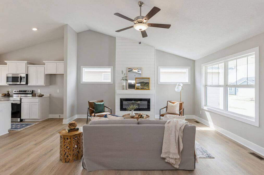
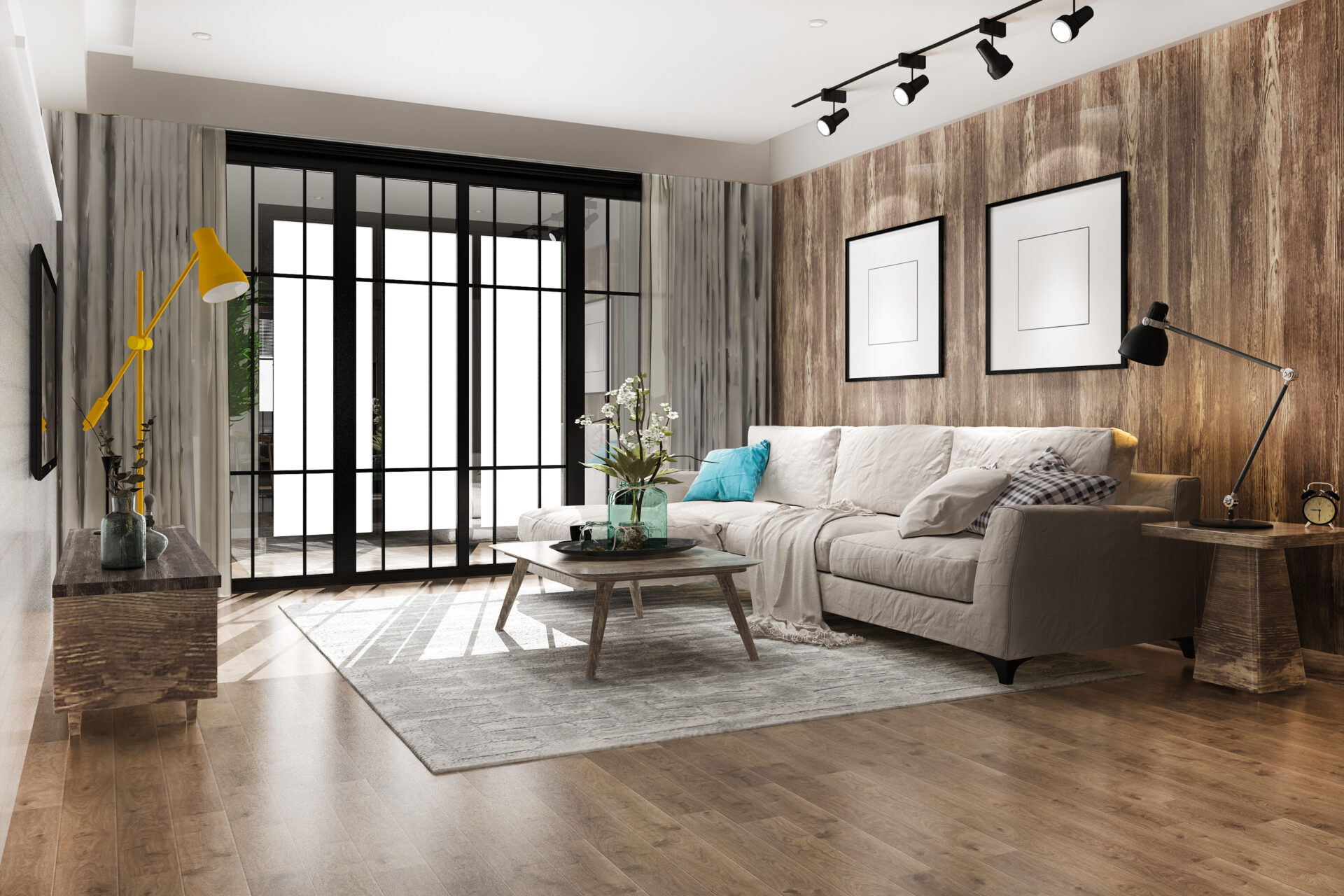
We all love the breezy, sun-drenched feel of an open home. But let’s be totally honest for a second. Standing in the middle of a massive, wall-free space with a handful of paint swatches can feel completely terrifying. Where does the living room actually end and the kitchen begin?
Without architectural boundaries, picking a wall color isn’t just about finding a pretty shade anymore. It is about creating a visual map that keeps your home from looking like a chaotic, mismatched mess. Luckily, design trends in 2026 are shifting toward warm minimalism and grounded, earthy tones that make this puzzle a whole lot easier to solve.
1. Start with Your Unifying Anchor Hue
Every great open space needs a primary color that acts as the connective tissue for the whole area. Think of this as your backdrop shade. It will usually cover about 60% of your total wall space, flowing effortlessly through the main hallways, large living areas, and shared corridors.
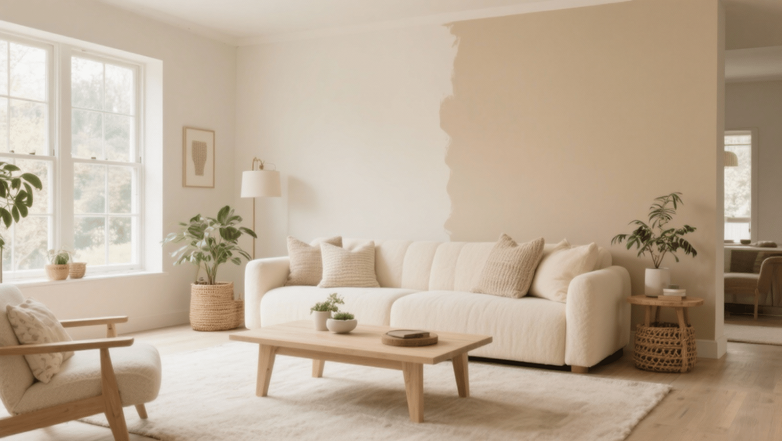
Instead of the cold, sterile grays that ruled the past decade, 2026 is all about warm neutrals with soft, creamy undertones. Think sandy beiges, gentle mushrooms, or pale terracotta blends. This main hue keeps the entire floor plan feeling grounded and spacious while giving your eyes a peaceful place to rest as you look across the room.
2. Master the Rules of the 60-30-10 Zone System
Once you have your main anchor hue selected, it is time to divide and conquer using a simple decorator secret. The 60-30-10 rule is a total lifesaver for open layouts. You use your anchor color for 60% of the space. Then, you choose a secondary color to fill up 30% of the view—this is usually your kitchen cabinetry, a large accent wall, or heavy built-in shelving.
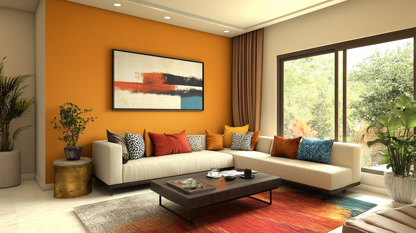
The final 10% is where you get to have some real fun with accent colors. This could be a bold pop of forest green or burnt amber on your kitchen island, throw pillows, or a favorite art piece. This simple formula ensures your zones feel distinct without fighting for attention.
3. Look to Your Fixed Elements for Color Clues
Before you buy gallons of paint, take a good, hard look at the things you cannot easily change. Your hardwood floors, kitchen countertops, backsplash tiles, and heavy appliances are the true bosses of your color scheme. If your kitchen features dark brown cabinets or warm quartz counters, a cool-toned blue paint on the opposite living room wall might feel incredibly jarring.
Instead, look for the subtle undertones hidden inside your fixed materials. A white marble counter with gold veining practically begs for a warm, buttery cream wall paint. Let these pricey finishes guide your brush, and the whole room will instantly look like a high-end designer put it together.
4. Create Invisible Bridges with Shared Undertones
You do not have to paint every single wall the exact same color to get a cohesive look. In fact, doing that can make a large home feel a bit boring. The trick to using different colors in an open layout is making sure they share the same DNA—or undertones.
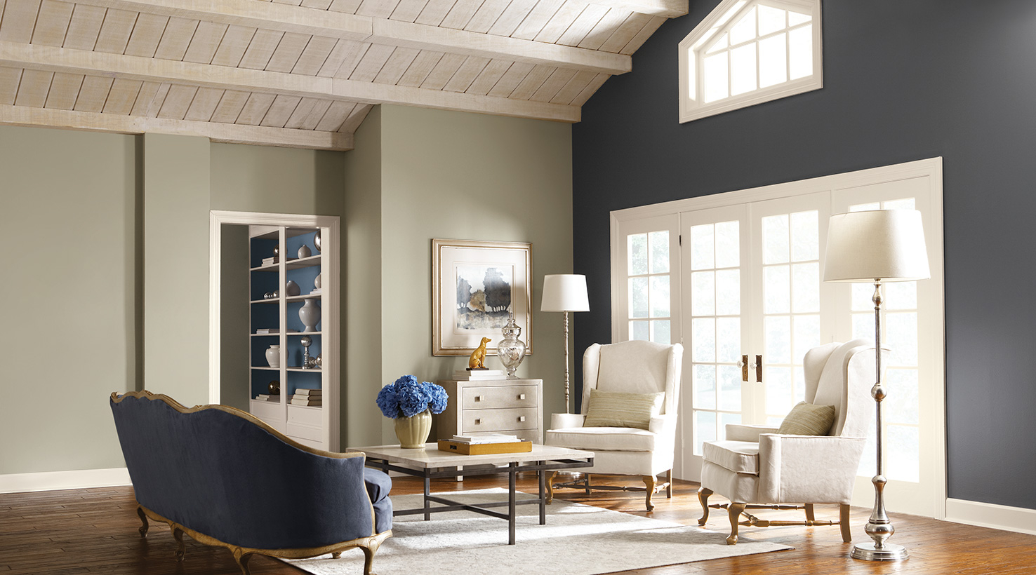
If you want a soft sage green in the dining nook and a cozy beige in the family room, make sure both paints have a warm, yellow base rather than a cool blue one. When colors share a common undertone, your eyes transition smoothly from one functional zone to the next without a weird visual speed bump.
5. Use the Magic of Natural Light and Swatches
Lighting can completely ruin a color scheme if you are not careful. A soft tan that looks amazing in your brightly lit kitchen might turn into a muddy brown in the darker living room corner. Because open floor plans span across multiple exposures, the sun will hit your walls differently throughout the day.
Never pick a paint color under store lighting or from a tiny paper card. Paint large sample boards and move them around your home during the week. Watch how the morning light changes the hue, and how it transforms under your lamps at night. It is a tiny bit of extra effort that saves you from a massive repainting disaster.
6. Define Functional Borders with Furniture and Textures
Sometimes the best way to handle a color shift is to let your decor do the heavy lifting instead of the paint. If you have an unbroken expanse of wall that stretches forty feet, forcing a paint transition in the middle of it almost never works. Keep the wall color uniform and use your furniture to signal a change in purpose.
A deep emerald green couch or a dark oak dining table acts as a brilliant visual marker. You can also layer rich textures like woven rugs, boucle chairs, and wooden ceiling beams to give a specific zone its own unique personality. This strategy lets you enjoy a diverse, cozy home while keeping your walls blissfully simple.
Mapping out an open floor plan color scheme doesn’t require a professional degree. It just takes a little bit of planning and a clear strategy. By focusing on warm, grounded anchor tones, respecting your room’s natural lighting, and letting your fixed features guide your choices, you can easily create a space that feels both unified and full of life.
At the end of the day, your home should feel like a reflection of you. Don’t be afraid to experiment with sample boards and try out different combinations until you find the look that feels just right. What color bridges are you going to build in your own space this year.