Walking into a room filled with bold, energetic color can feel like a breath of fresh air. It wakes you up, lifts your mood, and tells a story about who lives there. But let’s be honest—there is a very thin line between a space that feels beautifully vibrant and one that makes you want to close your eyes and run away.
Have you ever painted a wall a gorgeous shade of teal, only to realize a week later that it feels less like a cozy sanctuary and more like a loud shout. You are definitely not alone. The fear of creating a messy, overwhelming look keeps a lot of us trapped in a world of safe, endless beige. But in 2026, homes are truly becoming personal playgrounds again, and we are moving past the fear of bright paint.
The Golden Rule of Proportions
Achieving balance starts with a classic design trick known as the 60-30-10 guideline. Think of your room as a visual pie chart. You want your dominant neutral or calmer shade to take up about 60% of the space—this is usually your walls or largest rugs. Then, your secondary color, which can be a bit more colorful, fills up 30% of the room through furniture, curtains, or an accent wall.
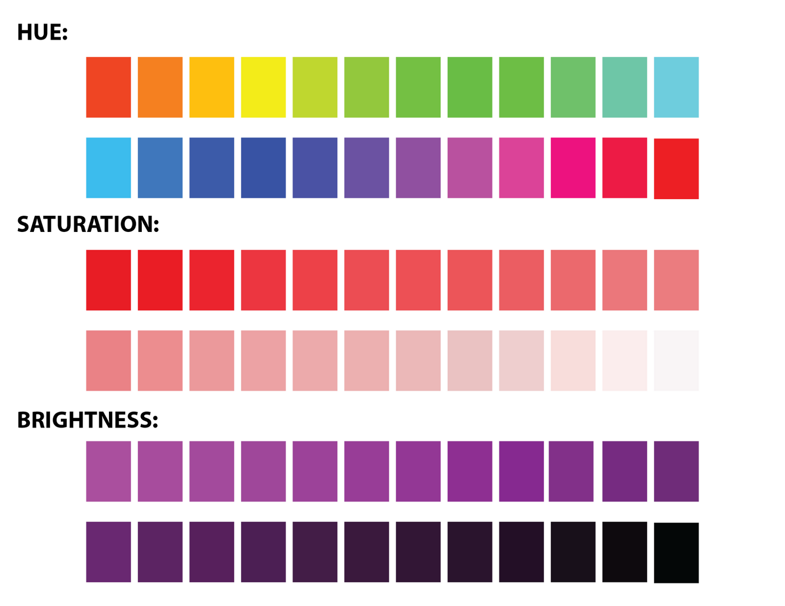
The magic happens in that final 10%. This is where your wildest, most vibrant colors get to shine. By saving intense shades like hot pink, electric blue, or neon yellow for small accents like throw pillows, artwork, or a ceramic vase, you give the eye a fun place to land without overwhelming the senses. It lets you use the colors you love without letting them take over the entire room.
Finding Harmony on the Color Wheel
You don’t need a degree in art to figure out which shades play nice together. One foolproof method is sticking to analogous colors, which are simply neighbors on the color wheel. For example, blending blues, teals, and soft greens creates a natural, ocean-like flow that feels inherently peaceful, even if the shades themselves are quite bright.
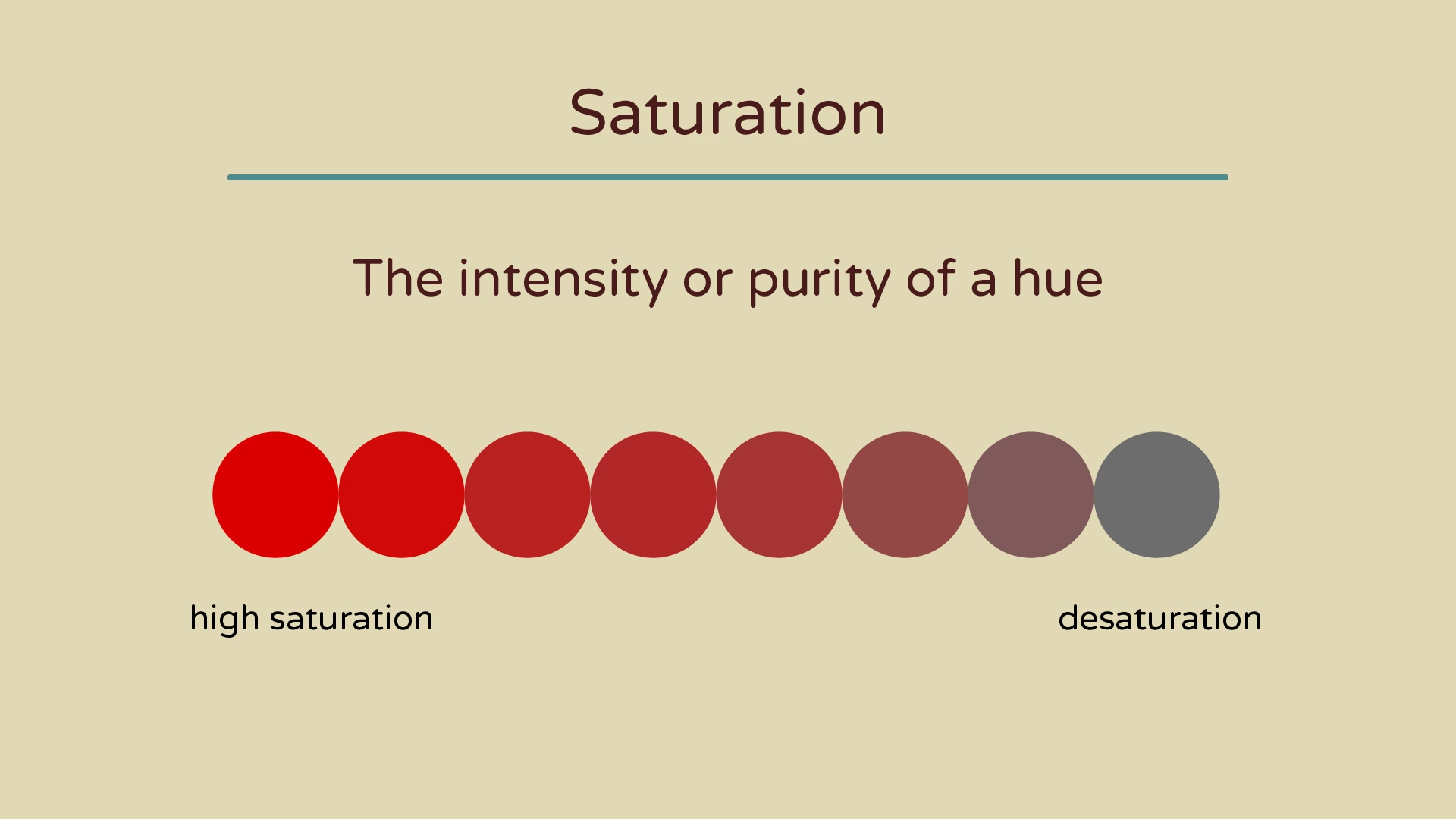
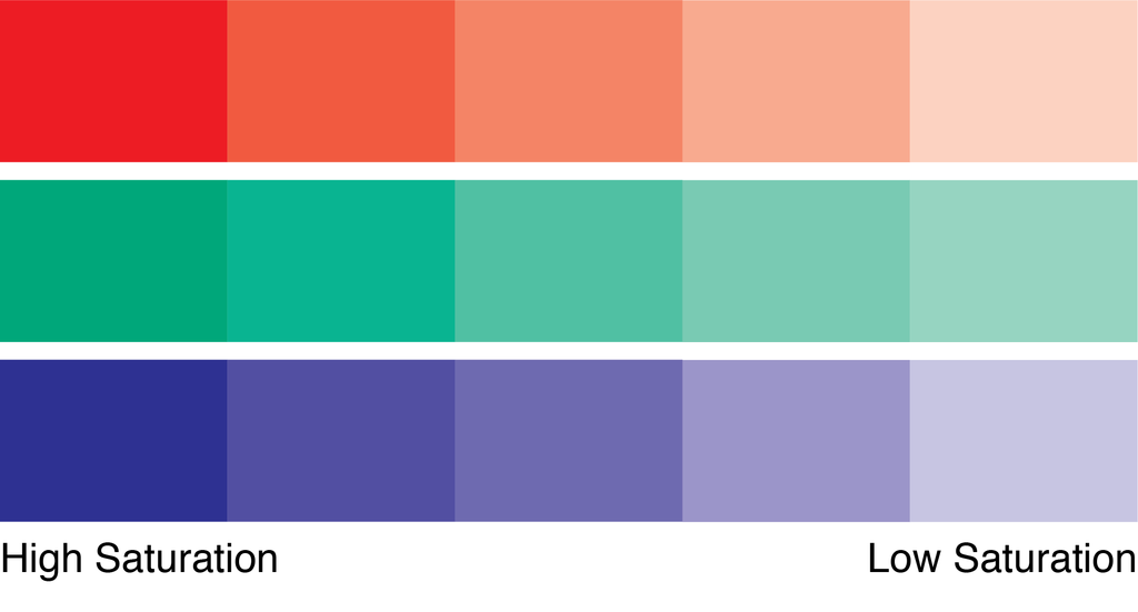
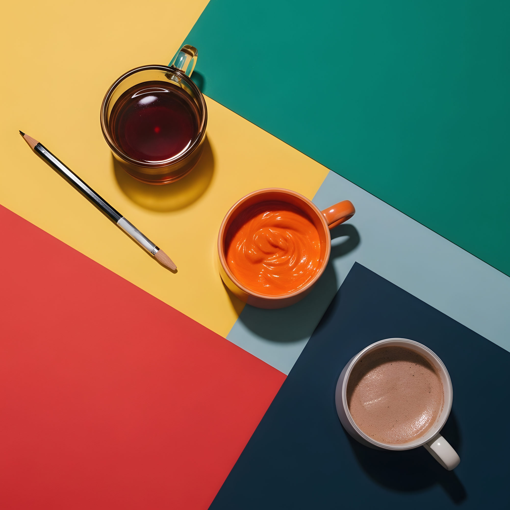
Another path is the complementary route, pairing opposites like orange and blue. The trick to keeping opposites from fighting each other is to alter their intensity. Instead of pairing a bright neon orange with a bright primary blue, try a deep, rich navy wall with a couple of burnt orange velvet chairs. The contrast looks incredibly intentional and stylish, rather than chaotic.
The Power of a Grounding Neutral
When you are playing with high-energy pigments, you need an anchor to tie everything down. This is where neutrals come to the rescue, but they don’t have to be boring. Charcoal grays, rich chocolate browns, and warm tany tones act as a visual palate cleanser, giving your eyes a place to rest between the pops of excitement.
- Black accents: A simple black picture frame or lamp base can instantly sharpen a colorful room and make it look sophisticated.
- Natural wood: Wooden coffee tables or exposed shelves bring an organic warmth that tones down bright synthetic shades.
- Crisp white trim: Painting your baseboards and window frames a clean white creates a frame that neatly contains big blocks of color.
Lighting Changes Everything
A color that looks stunning in the morning sun might look completely different under a lightbulb at night. Natural daylight shows color in its truest form, while artificial lighting can completely shift how a room feels. Warm yellow bulbs will soften cool colors but might make bright oranges look a bit too intense.
Before you commit to a major color swap, always test your choices. Paint large swatches on different walls and watch how they change throughout the day. If a room gets very little natural light, leaning into deep, moody jewel tones often works better than trying to force a bright neon shade to look cheerful in a dark corner.
Texture is Your Secret Weapon
Sometimes, a space feels chaotic not because there are too many colors, but because all the surfaces look exactly the same. Mixing up your textures is a brilliant way to soften the impact of bold shades. A bright red wall can feel harsh, but a bright red chunky knit blanket looks cozy and inviting.
Try blending matte finishes with glossy ones. Velvet sofas, linen curtains, woven baskets, and shiny metallic lamps all absorb and reflect light differently. This variety adds visual layers to the room, making the colors feel integrated into the design rather than just slapped onto the surface.
If you are still feeling a bit nervous about making the jump, remember that you do not have to repaint your whole house this weekend. Decorating is a journey, and starting small is often the smartest way to build your confidence. Begin with a single room that you don’t spend all day in, like a powder room or a small entryway.
"Your home should be a reflection of your personality, not a carbon copy of a minimalist showroom."
Try adding color through items that are easy to swap out if you change your mind. Colorful lampshades, vibrant rugs, and bold art pieces let you experiment with different palettes. Once you get a feel for how those colors interact with your daily life, you can confidently bring them onto your walls and larger furniture.
Ultimately, creating a colorful home that feels peaceful comes down to listening to your gut. There are plenty of design guidelines, but the most important thing is how a space makes you feel when you walk through the door. By balancing your favorite bright hues with quiet neutrals, smart lighting, and rich textures, you can design a joyful, vibrant home that remains a true sanctuary.