Ever stood in front of a blank canvas or a new digital document and felt completely frozen by choices. You want to pick the perfect palette, but your brain starts short-circuiting. You remember those scary-looking charts from school with words like "monochromatic" or "analogous" and suddenly, creating art feels more like a high school chemistry exam.
But here is a little secret: you don’t need a degree in optical physics to make your work look absolutely stunning. In fact, some of the best creators out there couldn’t tell you the exact science behind how light waves hit the human eye. They just know what looks good and how to use it to tell a story. Let’s break down how you can get that same intuition without the headache.
Forget the Physics, Focus on the Mood
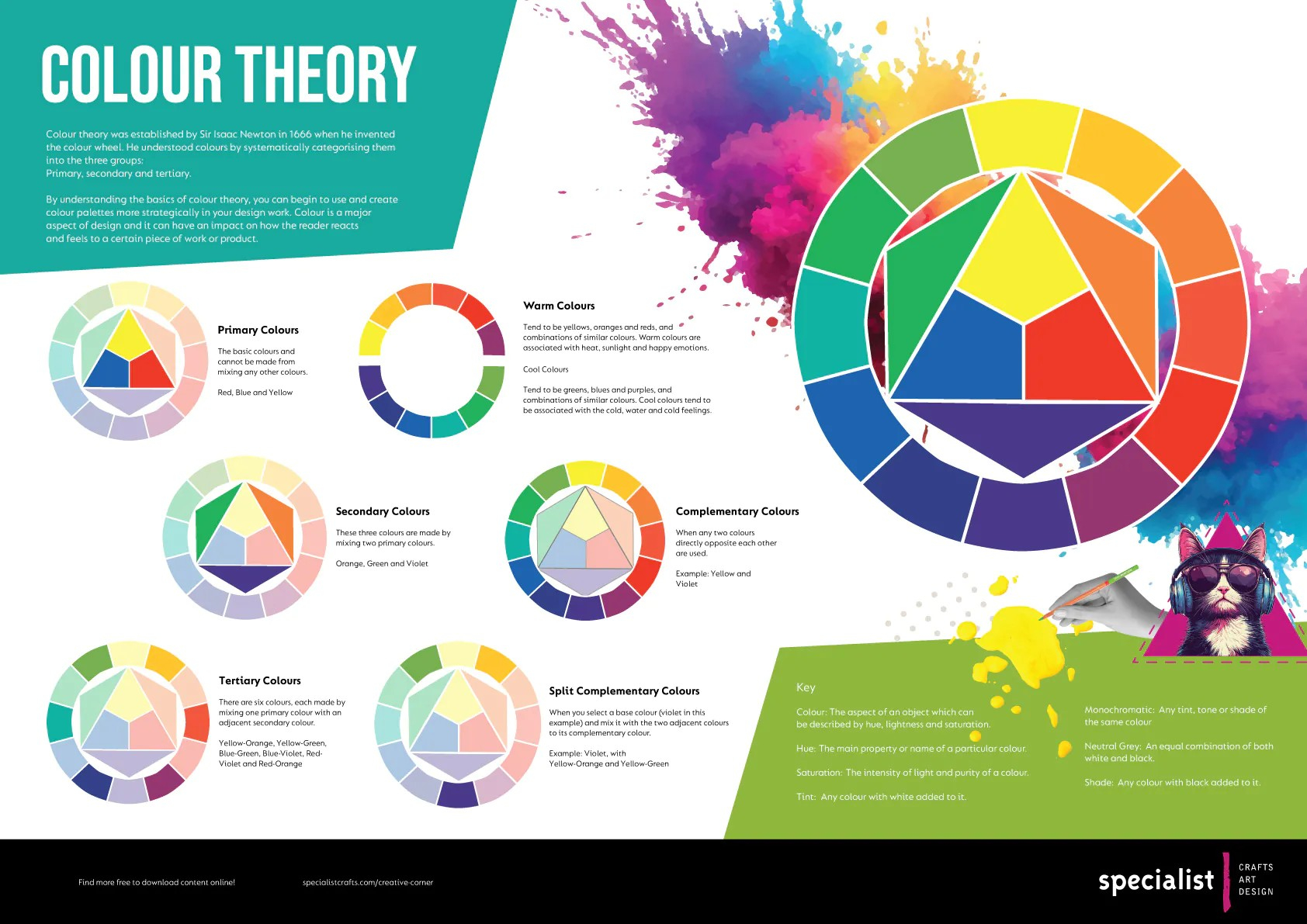
When you look at a painting or a website, your brain doesn’t register wavelengths of light first. It registers a feeling. Colors are basically just emotions in visual form. Warm tones like red, orange, and golden yellow make us feel energized or cozy, while cool tones like blue and green bring a sense of calm or mystery.
Think about your favorite horror movie. The colors are probably dark, cold blues or sickly greens. Now think of a fun summer drink commercial—it is bursting with bright yellows and juicy pinks. Instead of worrying about techical rules, start by asking yourself one simple question: how do I want someone to feel when they look at this.
The Secret Magic of Three Colors
One big mistake people make when starting out is trying to use every single crayon in the box at the same time. This usually ends up looking like a muddy mess. Instead, try limiting your choices. A great trick that top designers use is the 60-30-10 rule, which keeps things balanced and easy on the eyes.
Basically, you pick one dominant color to take up about 60% of your space. This is usually something neutral like a soft beige, gray, or white. Then, you choose a secondary color for 30% of the work to add interest. Finally, you use a tiny 10% splash of a super bright "accent" color to make things pop. It is like putting on a simple outfit and adding a bright red pair of shoes.
Making Friends with the Color Wheel
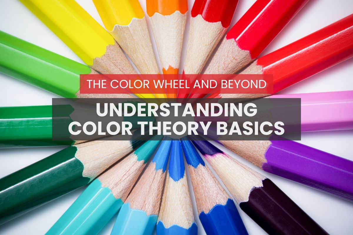
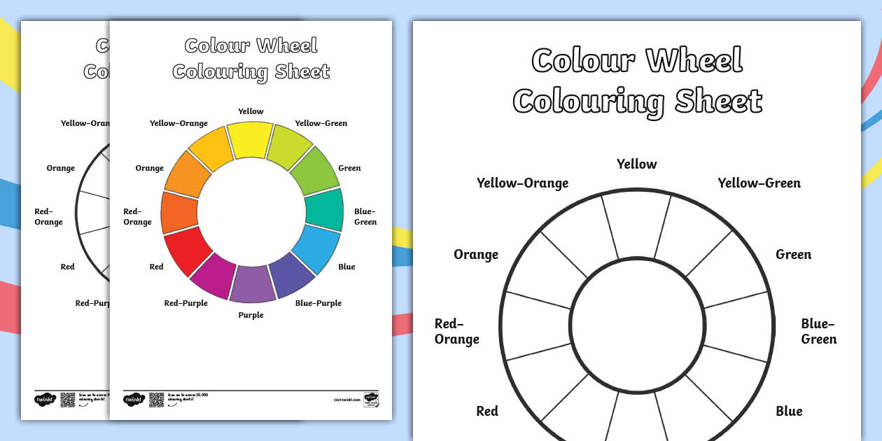
Okay, we can’t completely ignore the color wheel, but we can treat it like a friendly map instead of a math puzzle. You don’t need to memorize all the fancy terms. Just look at how the colors sit next to each other.
Colors that are right next to each other, like blue and green, always look peaceful together because they share the same DNA. Colors that sit directly across from each other, like blue and orange, are rivals. They fight for attention, which makes them super exciting when placed side by side. If your art looks a little boring, just look across the wheel and grab a tiny bit of that opposite color to wake things up.
The Power of Going Light and Dark
Sometimes, the problem isn’t the actual colors you picked, but how light or dark they are. Artists call this value, and it is secretly the most important part of making things look real and three-dimensional. If everything in your drawing has the exact same brightness, it will look flat and boring, even if you used twenty different shades.
An easy way to test this in 2026 is to take a photo of your work on your phone and turn the saturation all the way down to black and white. If your image turns into a giant blob of gray, you need to make your darks darker and your lights lighter. Contrast is what gives your work its punch.
Copying from Nature and Everyday Life
If you are totally stuck and can’t find a palette that works, stop staring at your computer screen and look around your room or go for a walk outside. Nature is the ultimate master of color theory. A simple photo of a mossy rock next to a wild berry can give you a perfect palette of deep greens and rich purples.
You can also steal inspiration from your favorite movies, retro arcade games, or even vintage clothing packaging. Keep a folder on your phone where you screenshot things that catch your eye. You aren’t stealing their art; you are just learning from the combinations they already figured out.
At the end of the day, the only way to truely get better at this is to make a mess. Grab some cheap paints or open up a free digital drawing app and just start mixing things together to see what happens. Notice how a tiny drop of yellow can totally change a boring gray into something alive.
Don’t worry about making a masterpiece every time you sit down. Treat it like a game where there are no wrong answers. The more you play with color without worrying about the strict textbook rules, the faster your creative instincts will grow.
Mastering color doesn’t mean you have to turn into a scientist overnight. It is all about paying attention to how colors interact and how they make you feel. By limiting your palette, focusing on contrast, and gathering inspiration from the real world, you will start making beautiful choices naturally.
So, put away the complicated textbooks and trust your eyes. The more you practice and experiment, the more confident you will become. Go ahead and start mixing.