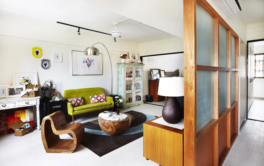
You know that feeling when you walk into a house and it just… breathes? It’s not necessarily huge. In fact, some of the most spacious-feeling homes I’ve visited are modest in size. But they don’t feel cramped. They don’t fight you. You can move through them without doing that awkward sideways shuffle to avoid knocking over a vase. That’s not magic. It’s space planning. And honestly, it’s the single most important thing you can get right before you buy a single throw pillow or paint a wall.
We often think making a home feel bigger means knocking down walls or adding an extension. Sure, that works if you have the budget and the permits. But in 2026, with housing costs still being what they are, most of us are working with the footprint we’ve got. The good news? You can trick your brain. You can manipulate perception. By understanding how people move, how light travels, and how furniture occupies volume, you can unlock a sense of airiness that square footage alone can’t provide. It’s about function meeting flow. It’s about every inch pulling its weight.
Let’s be real for a second. A cluttered, poorly laid out large room feels smaller than a well-planned tiny studio. It’s counterintuitive, but it’s true. When you master the art of layout, you aren’t just arranging objects; you’re choreographing life. You’re deciding where the eye rests, where the feet travel, and where the body relaxes. This guide isn’t about rigid rules. It’s about principles that help you see your space differently. So, grab a tape measure, maybe a cup of coffee, and let’s look at how to make your home feel like it has room to spare.
The Invisible Architecture of Flow
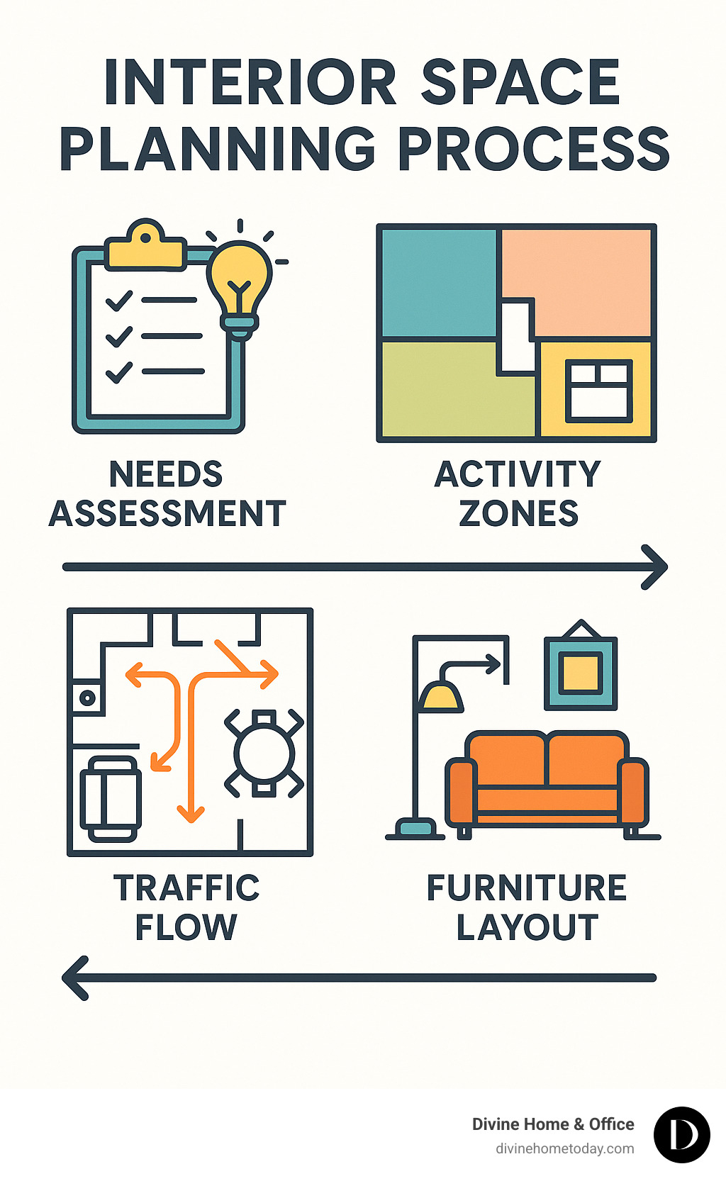
Before you even think about where the sofa goes, you need to understand how you move. This is called circulation, and it’s the invisible skeleton of your home. If you have to squeeze past a coffee table to get to the kitchen, your space planning has failed, no matter how beautiful the table is. The goal is clear pathways. Think of water flowing through a riverbed; it shouldn’t hit rocks. It should glide. In interior design, we aim for main walkways to be at least 36 inches wide. In high-traffic areas, like between a kitchen island and the counter, you want 42 to 48 inches. This allows two people to pass comfortably, or one person to open a dishwasher while another walks by. It sounds specific, but these numbers are the difference between frustration and ease.
Start by mapping out the "desire lines" in your rooms. These are the natural paths you take from door to door, or from the couch to the TV. Are there obstacles in the way? Often, we place furniture based on symmetry or what looks good in a catalog, ignoring how we actually live. Try this: stand in the doorway of a room and watch yourself (or have someone else watch you) walk through it for a day. Where do you hesitate? Where do you bump into things? Those are your pain points. Fixing them doesn’t always mean buying new stuff. Sometimes it just means shifting an existing chair three feet to the left. Clearing these visual and physical blockages instantly makes a room feel larger because your brain isn’t subconsciously calculating how to navigate the obstacle course.
Another huge factor in flow is zoning. Even in an open-plan living area, you need distinct zones for different activities. Eating, lounging, working. If these bleed into each other too much, the space feels chaotic and small. Use rugs, lighting, or the back of a sofa to create subtle boundaries. You don’t need walls. A rug under the dining table defines that space. A floor lamp behind the sofa marks the end of the living zone. This organization helps the eye process the room in chunks rather than one overwhelming blob. When the brain can easily categorize spaces, it perceives them as more orderly and, consequently, more spacious. It’s a simple trick, but it changes everything.
Furniture Scale and the Art of Negative Space
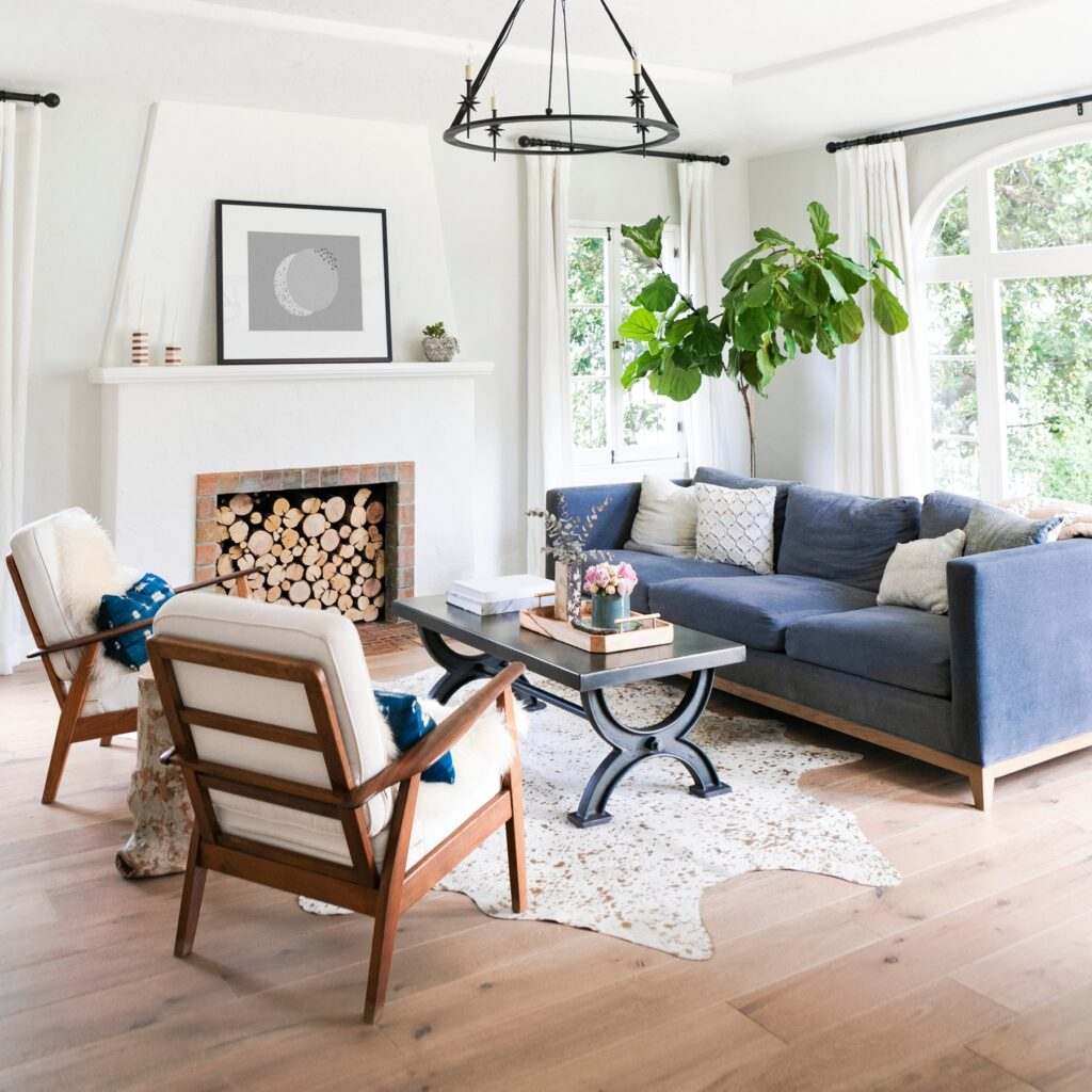
Here is a hard truth: big furniture in a small room doesn’t make the room look bigger. It makes it look crowded. But here’s the twist: tiny furniture in a small room can also make it look cluttered because you end up needing more pieces to fill the void. The secret is scale and proportion. You want pieces that fit the room, not the other way around. Low-profile furniture is your best friend. Sofas with low backs and exposed legs allow light to pass underneath and through them. This visibility of the floor creates a sense of continuity. When you can see the floor extend beneath the sofa, your brain registers that extra square footage. It’s an optical illusion, but it works every time.
Negative space is just as important as the stuff you put in the room. Negative space is the empty area around and between objects. It’s the breathing room. If every wall is covered with art, every corner has a plant, and every surface has a knick-knack, there’s no place for the eye to rest. The room feels busy and tight. Try leaving some walls bare. Leave some corners empty. It feels scary at first, like you’re wasting space, but you’re actually creating value. That emptiness amplifies the importance of the pieces you do have. It lets them shine. In 2026, the trend is definitely moving away from maximalist clutter toward curated simplicity. Not sterile minimalism, but intentional editing. Ask yourself: does this piece earn its place? If not, let it go.
Also, consider the visual weight of your furniture. Dark, heavy, solid blocks of wood or upholstery feel heavier and take up more visual space than lighter, airier pieces. Glass tables, acrylic chairs, or furniture with slender metal legs disappear somewhat, reducing the visual clutter. This doesn’t mean you can’t have a sturdy wooden dining table. But if you do, balance it with chairs that have open backs or lighter materials. Mix and match textures and weights to keep the eye moving. When the eye moves freely, the space feels expansive. When it gets stuck on a heavy, dark mass, the space feels confined. It’s all about balance. Don’t be afraid to mix eras and styles, too. A modern glass table with vintage wooden chairs can create a dynamic tension that keeps the space interesting without feeling heavy.
Lighting Layers and Vertical Expansion
Light is the paintbrush of space planning. A dark room feels small, period. But it’s not just about having one big overhead light. That actually flattens a room and makes it feel like a box. You need layers. Ambient light for general illumination, task light for reading or cooking, and accent light to highlight architecture or art. By spreading light sources around the room at different heights, you push the walls out. Floor lamps draw the eye up. Table lamps create pools of warmth that make corners feel inviting rather than shadowy and closed off. In 2026, smart lighting systems make this easier than ever. You can adjust the color temperature and intensity to match the time of day, keeping the space feeling bright and airy during the day and cozy at night.
Don’t forget the vertical space. Most people focus on the floor plan, but the ceiling height plays a huge role in how spacious a room feels. Draw the eye upward. Hang curtains high—close to the ceiling, not just above the window frame. This tricks the brain into thinking the windows (and the walls) are taller than they are. Use vertical lines in your decor. Tall bookshelves, vertical shiplap, or even striped wallpaper can elongate the walls. Mirrors are the classic trick for a reason. Placing a large mirror opposite a window bounces natural light deep into the room and doubles the visual depth. It’s like adding a virtual window. Just be careful not to overdo it, or you’ll feel like you’re in a funhouse.
Natural light is the gold standard. Keep window treatments sheer or lightweight during the day. Let that sunlight flood in. If you have privacy concerns, consider top-down/bottom-up shades that let light in from the top while keeping the bottom covered. Clean your windows. Seriously. It sounds trivial, but dirty windows block surprising amounts of light and blur the view to the outside. Connecting the indoors with the outdoors expands the perceived boundary of your home. If you can see the garden or the street, your living room feels like it extends into that space. Blurring that line between inside and out is one of the most powerful ways to gain square footage without building anything.
Color Psychology and Visual Continuity
Color is emotional, but it’s also spatial. Light colors reflect light, making walls recede. Dark colors absorb light, making walls feel closer. But it’s not just about painting everything white. That can feel clinical and cold. The key is continuity. Using the same or similar colors for walls, trim, and even ceilings creates a seamless envelope. When there’s no sharp contrast between the wall and the ceiling, the eye doesn’t stop at the corner. It keeps going. This softens the edges of the room and makes it feel less like a box. Monochromatic schemes, where you use different shades of the same color, are incredibly effective for this. They create a soothing, unified backdrop that feels expansive.
Flooring continuity is another major player. If you have different flooring materials in adjacent rooms, it chops up the space. Each change in material acts as a visual speed bump, stopping the eye and defining a hard boundary. If possible, run the same flooring throughout the main living areas. Hardwood, luxury vinyl plank, or large-format tiles work great for this. The uninterrupted flow of the floor plane draws the eye across the entire footprint, making the whole area feel like one large, cohesive space. If you can’t change the flooring, use large area rugs that span across zones to visually link them. Avoid small, scattered rugs that break up the floor into little islands.
Accent walls can be tricky. While they add interest, they can also shrink a room if done incorrectly. Painting one wall a dark color pulls that wall forward, which might be what you want for a cozy bedroom, but not for a small living room you want to feel big. If you want color, try painting the ceiling a slightly lighter shade than the walls, or use a glossy finish on trim to reflect light. Also, consider the sheen of your paint. Higher sheens reflect more light but show imperfections. Eggshell or satin is usually a safe bet for walls, offering a bit of reflection without highlighting every bump. The goal is to keep the surfaces reflecting light evenly, creating a glow that fills the space.
Smart Storage and Hidden Clutter
Clutter is the enemy of space. No matter how good your layout is, if surfaces are covered in mail, keys, and random junk, the room will feel small and stressful. Storage isn’t just about hiding things; it’s about integrating organization into the architecture of your home. Built-ins are fantastic because they utilize dead space, like alcoves or under-stair areas, and they sit flush with the walls, avoiding the bulkiness of standalone cabinets. But if you’re renting or on a budget, think vertically. Floor-to-ceiling shelving units draw the eye up and provide massive storage capacity without taking up more floor space.
Multi-functional furniture is essential in modern space planning. Ottomans with storage inside, beds with drawers underneath, coffee tables that lift up to become desks. These pieces do double duty, reducing the total number of items you need in a room. Fewer items mean more open space. It’s simple math. But be careful not to overstuff these pieces. Just because a bench has storage doesn’t mean you should fill it with things you never use. Edit your belongings regularly. The less you have, the more your home breathes. In 2026, the focus is on sustainable living, which aligns perfectly with owning fewer, higher-quality items that serve multiple purposes.
Visual quiet is important too. Closed storage is your friend for hiding the ugly stuff. Open shelving looks great in magazines, but in real life, it requires constant styling and can look messy quickly. Aim for a mix. Use closed cabinets for everyday clutter and open shelves for a few curated decorative items. This balance keeps the space feeling organized but personal. Also, keep the tops of cabinets and fridges clear. Dust and boxes up there draw the eye up to the ceiling in a bad way, emphasizing the height while highlighting the mess. Keep those upper zones clean and clear to maintain that sense of airiness.
Finally, space planning isn’t just about physics and optics. It’s about how you live. A home that looks perfect but feels uncomfortable is a failure. Think about your daily rituals. Where do you drink your morning coffee? Do you need a nook for that? Where do you drop your bag when you come home? If you don’t have a designated spot, it ends up on the dining chair, creating clutter. Design for your habits, not against them. If you love to read, create a cozy corner with good light and a comfortable chair. If you work from home, ensure your desk setup doesn’t dominate the living room visually. Screen it off or tuck it away when not in use.
Comfort is subjective, but flow is universal. Make sure there’s enough space to move around furniture without feeling restricted. Can you vacuum easily? Can you open all the drawers without hitting something? These practical considerations impact how spacious a home feels. If you’re constantly battling your furniture, the space feels small and hostile. If everything fits and functions smoothly, the space feels generous. It’s about ease. Ease of movement, ease of cleaning, ease of living. When your home supports your life instead of complicating it, it feels bigger because you’re not mentally burdened by the friction of your environment.
Don’t be afraid to experiment. Space planning isn’t a one-and-done deal. As your life changes, your needs change. Maybe you need more workspace now than you did last year. Maybe you’ve acquired a new hobby that requires space. Be willing to move things around. Swap rooms. Change the orientation of the bed. Live with a layout for a few weeks and see how it feels. Trust your gut. If a room feels off, it probably is. Tweak it. Adjust it. The perfect layout is the one that feels effortless to you. It’s the one where you forget about the space and just enjoy living in it. That’s the ultimate goal.
So, where do you start? Pick one room. Just one. Look at it with fresh eyes. Identify the flow. Check the light. Assess the clutter. Move one piece of furniture. See what happens. Small changes compound. You don’t need to redo your whole house overnight. Start with the basics: clear the paths, let the light in, and edit your stuff. You’ll be surprised at how much bigger your home feels just by giving it room to breathe. It’s not about having more space. It’s about making the space you have work harder for you. And honestly, that’s a pretty comforting thought.