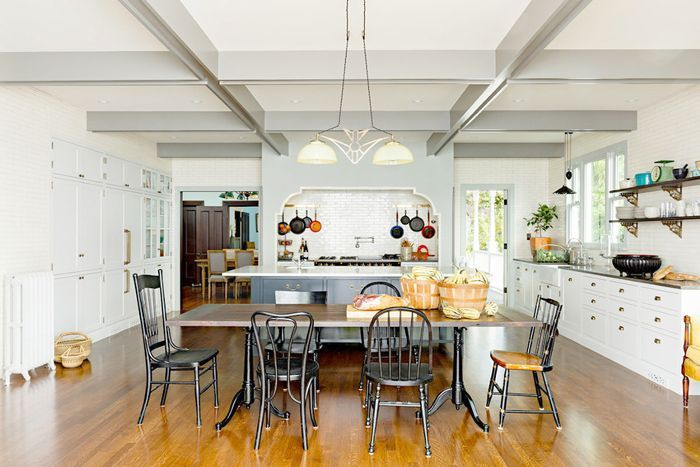
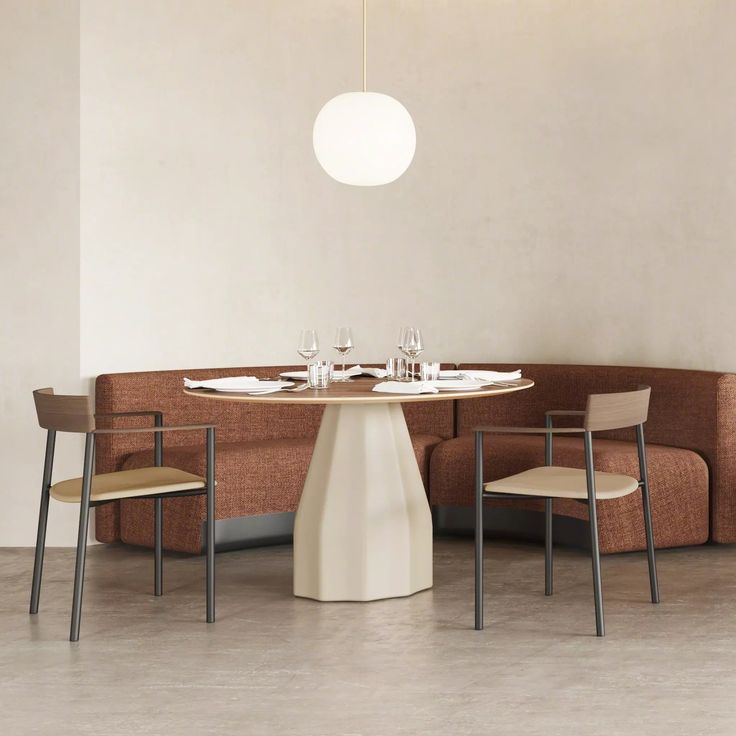
Open floor plans are great. Really great. They let light pour in from every angle and make a small apartment feel like a loft. But there’s a catch. Without walls, things can get messy. Not just clutter-messy, but visually chaotic. You’re trying to read a book, and your partner is vacuuming three feet away. Or you’re hosting dinner, and the living room bleeds into the dining area in a way that feels unstructured. It’s a common problem in 2026, where flexible living spaces are the norm, but privacy and definition are still deeply human needs.
So, how do you fix it without building a wall? You don’t. Walls are permanent. Walls block light. Walls make a space feel smaller. Instead, you look at furniture. Specifically, lounge chairs. Most people think of chairs as places to sit. And sure, they are. But they are also powerful architectural tools. A well-placed chair can act as a period at the end of a sentence. It tells the eye, "This zone ends here. That one begins there." It creates a boundary that you can see through, walk around, and ignore when you want to feel connected. It’s the best of both worlds.
This isn’t about buying expensive dividers or hanging curtains that collect dust. It’s about using what you likely already have, or what fits naturally into your decor, to carve out intention. When you float a pair of armchairs in the middle of a room, you aren’t just adding seating. You’re drawing a line in the sand. A soft, upholstered, comfortable line. Let’s talk about how to do this right, so your home feels organized but never closed off.
The Psychology of Floating Furniture
Why does pushing all your furniture against the wall feel so… empty? It’s because it leaves a giant void in the center of the room. That void doesn’t feel open; it feels unused. When you pull furniture away from the walls, you change the energy. This is called "floating" your furniture, and it’s the first step to creating zones. By pulling a lounge chair or two into the room, you create a pathway around it. This pathway is crucial. It guides traffic. It tells people where to walk without you having to put up a sign.
Think about the feeling of connection. If you have a massive sofa blocking the view from the kitchen to the living room, the cook feels isolated. But if you use two slender lounge chairs angled slightly inward, you create a semi-permeable barrier. Light passes through the gaps. Sound travels. You can still see your kids playing on the rug, but you’ve established a "living area." The chairs act as anchors. They give weight to that specific spot in the floor plan. According to recent design trends in 2026, this approach is favored over heavy sectionals because it maintains sightlines. You keep the airy vibe because the eye can travel under and around the chairs.
It’s also about presence. A floating chair has its own identity. It’s not just an appendage of the wall. It stands on its own. This independence helps define the zone. If you place two chairs facing each other with a small table between them, you’ve created a conversation nook. Even if it’s in the middle of a large studio apartment, that little cluster feels like a separate room. It’s a psychological trick. Our brains recognize clusters as distinct entities. So, by grouping chairs, you’re hacking your brain into seeing separate spaces. It’s subtle, but it works wonders for reducing that chaotic, undefined feeling.
Choosing the Right Silhouette for Visual Flow
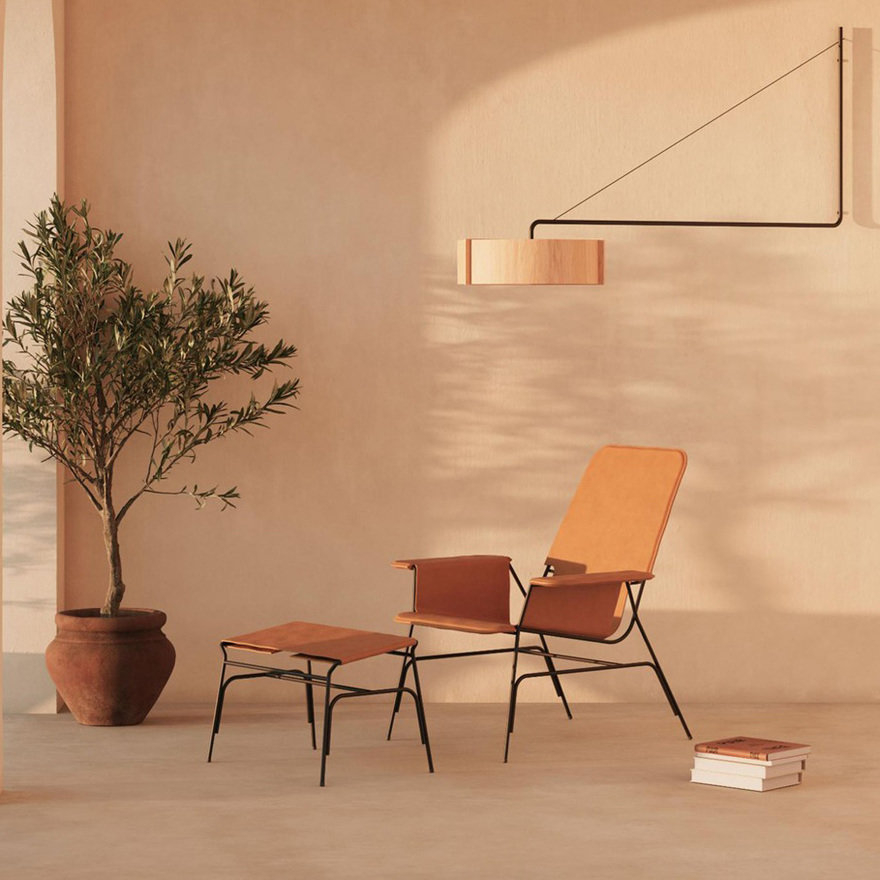
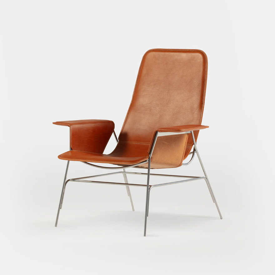
Not all chairs are created equal when it comes to zoning. If you pick a massive, boxy leather recliner, you’ve basically built a brick wall. It blocks light. It blocks views. It stops the airiness dead in its tracks. To keep things connected, you need to think about silhouette. You want chairs that feel light, even if they are substantial. Look for legs. Exposed legs are your best friend here. When you can see the floor continuing underneath the chair, the space feels larger. The eye doesn’t hit a solid block; it glides under the frame. This is a key principle in modern interior design.
Consider the back height too. A low-back chair is less obstructive than a high-wingback. If you want to maintain a view across the room—say, from the entryway to the window—a low profile is essential. It acts as a speed bump for the eye, not a stop sign. However, if you’re trying to create a cozy reading corner away from a TV, a slightly higher back might be okay. It depends on the goal. But generally, in 2026, the trend is toward streamlined, mid-century inspired shapes or sculptural modern pieces that have negative space within their frames. Think cane backs, open arms, or slender metal frames. These materials allow light to filter through.
Color plays a role here as well. A dark, heavy chair will feel more imposing than a light-colored one. If you’re worried about closing off the space, opt for fabrics in neutral tones or translucent materials like acrylic or light wood. You don’t have to match everything, but keeping the visual weight balanced is important. If one side of the room has a heavy sofa, balance it with two lighter lounge chairs on the other side of the zone. This creates equilibrium. It prevents the room from feeling lopsided or crowded on one end. The goal is to create a rhythm. Heavy, light, heavy, light. This rhythm keeps the eye moving and the space feeling dynamic rather than static.
Strategic Placement and Angling Techniques
Where you put the chairs matters just as much as which chairs you pick. The most common mistake is lining them up perfectly parallel to the sofa or the wall. Don’t do that. It looks stiff. It looks like a waiting room. Instead, angle them. A slight turn—maybe 15 to 30 degrees—creates a more inviting and organic boundary. It directs attention inward toward the conversation area, effectively closing off that zone psychologically without physically blocking anything. It’s like a gentle hug for the space.
Another technique is the "bridge" method. Use two chairs to bridge the gap between two different functions. For example, if you have a dining table and a living area, place two lounge chairs between them, perpendicular to the flow of traffic. They act as a gatekeeper. You still walk around them, but they signal that you are crossing from one zone to another. This is particularly effective in long, rectangular rooms. It breaks up the length without chopping the room in half. You maintain the longitudinal flow, but you’ve created a lateral division. It’s a smart way to handle awkward proportions.
Don’t forget the space between the chairs. If you push them too close together, they become a single bulky unit. Give them room to breathe. Leave at least 18 to 24 inches between two adjacent chairs. This gap is vital. It allows light to pass through. It allows you to slip a small side table or a plant in between. That plant becomes part of the divider, adding greenery and life to the boundary. It softens the transition. In open-concept homes, these little gaps are what keep the "airy" feeling alive. They remind you that the separation is an illusion, a helpful guide rather than a rigid rule. And honestly, it just looks more relaxed. Less forced.
Using Rugs and Lighting to Anchor the Zone
Chairs alone can sometimes feel like they’re floating in space, untethered. To make the zone feel real, you need to ground it. This is where rugs come in. A rug acts as a floor-based wall. It defines the perimeter of your zone from below. When you place your lounge chairs on a rug, you are telling the eye, "Everything on this fabric belongs together." It’s a powerful visual cue. Even if the chairs are ten feet away from the sofa, if they share a rug (or a complementary rug), they feel connected. If they are on a different rug, they feel separate. It’s that simple.
Lighting works in tandem with rugs. A floor lamp placed behind or beside a lounge chair creates a vertical element that reinforces the boundary. It draws the eye up and down, marking the edge of the zone. In 2026, lighting is increasingly used as sculpture. A distinctive lamp behind a chair doesn’t just provide light; it acts as a beacon. It says, "This is a place for reading," or "This is a place for quiet." When you combine the horizontal plane of the rug with the vertical plane of the lamp and the furniture, you create a complete three-dimensional zone. It feels intentional. It feels designed.
Be careful with scale. A tiny rug under a large chair will look accidental. Make sure the rug is big enough to accommodate the front legs of all the seating in that zone. This ties the pieces together. Similarly, don’t use a dim, hidden light if you want the zone to feel distinct. The light should be noticeable. It should cast a glow that defines the atmosphere of that specific corner. Warm light for a cozy nook, brighter light for a social area. These subtle cues help people understand how to use the space without you having to tell them. It’s environmental storytelling. And it’s highly effective.
Balancing Transparency and Privacy
The whole point of this exercise is to keep things airy. So, how do you balance the need for separation with the desire for openness? It’s about transparency. You want barriers that you can see through. This is why glass tables, open-shelving units, and yes, open-frame chairs, are so popular. They provide structure without solidity. If you’re using lounge chairs as dividers, consider pairing them with other transparent elements. A glass coffee table between two chairs keeps the view clear. A lucite side table does the same.
But what if you need a bit more privacy? Maybe you want to hide the clutter of a home office from the living room view. You can still use chairs, but layer them. Place a tall, leafy plant behind the lounge chair. The leaves create a soft, organic screen. They move with the air, adding life and motion. They block the view just enough to create mystery, but not enough to feel封闭 (closed off). This layering technique is huge in current design circles. It adds depth. It makes the space feel lush and curated rather than stark and divided.
Another option is to use the chairs to frame a view rather than block it. Position them so that when you sit, you look out toward a window or a piece of art. This draws attention away from the rest of the room and focuses it on the zone’s purpose. It’s a mental separation. You’re not hiding the rest of the house; you’re just choosing not to look at it. This psychological focus is often enough to create the feeling of a separate room. It’s about directing attention. If the eye is engaged in the zone, the chaos outside the zone fades into the background. It’s a trick of perception, and it’s incredibly freeing.
Even with the best intentions, it’s easy to mess this up. One major error is overcrowding. In an effort to define the space, people pack too many pieces into the zone. Two chairs, a sofa, an ottoman, a table, a lamp, and a plant. Stop. Breathe. Less is more. If the pathway around the chairs is less than 30 inches wide, it’s too tight. You need room to walk. You need room for the energy to circulate. If you feel like you’re squeezing past the furniture, you’ve gone too far. Remove a piece. See how it feels. Usually, it feels better.
Another mistake is ignoring the rest of the room. You can’t just zone one corner and leave the rest as a wasteland. The zones need to relate to each other. Use a consistent color palette or material theme throughout. If your lounge chairs are velvet blue, maybe throw a blue pillow on the sofa across the room. This creates a visual thread that ties the open plan together. Without this connection, the zones feel like unrelated islands. They feel disjointed. You want harmony. You want the eye to travel smoothly from one zone to the next, recognizing the boundaries but appreciating the unity.
Finally, don’t forget function. A beautiful chair that’s uncomfortable to sit in is a failed divider. If you create a reading nook with a chair that hurts your back, you won’t use it. And if you don’t use it, the zone dies. It becomes a display area, not a living area. Test the chairs. Sit in them. Can you reach your drink? Is the light good? Does it feel cozy? If the answer is yes, the zone will thrive. If not, tweak it. Design is iterative. It’s not about getting it perfect the first time. It’s about adjusting until it feels right for your life. In 2026, our homes need to work harder for us. They need to be flexible, functional, and forgiving.
Creating visual separation with lounge chairs is an art form. It’s about understanding how we move, how we see, and how we feel in a space. It’s not about building walls. It’s about suggesting boundaries. It’s about using furniture to whisper, "This is here, and that is there," while keeping the shout of an open, connected home intact. By floating your furniture, choosing light silhouettes, angling with intention, anchoring with rugs and light, balancing transparency, and avoiding clutter, you can transform a chaotic open plan into a series of intentional, airy, and connected zones. It takes a bit of trial and error. But the result is a home that breathes. A home that feels both spacious and intimate. And really, isn’t that what we’re all looking for?