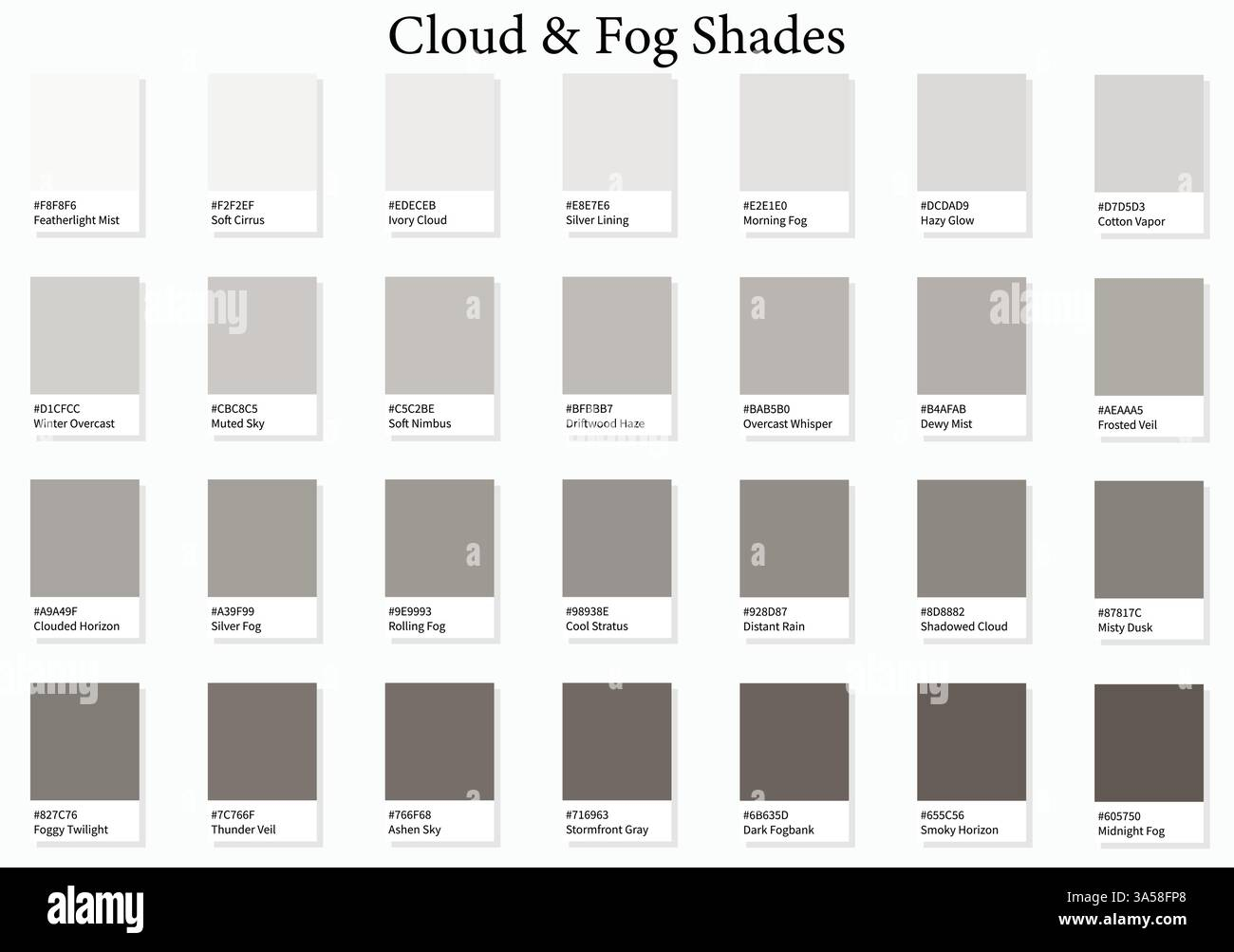
The human brain is a relentless pattern-matching machine, constantly filtering out the mundane visual noise of the everyday world. Step onto a crowded subway platform or scroll through a congested mobile interface, and your eyes instinctively search for a hook, an anchor, something that breaks the visual monotony. Without that point of departure, everything blurs into a uniform sea of grey.
This is precisely where visual storytelling begins. Great design does not whisper; it orchestrates attention through calculated tension. By introducing sharp, deliberate differences between design elements, creators turn static layouts into active stages where narratives unfold organically.
Think of the most memorable visual experiences you have encountered recently—a minimalist architectural spread in a high-end monograph, a gripping movie poster that telegraphs the entire plot through a single silhouette, or a disruptive brand homepage that makes you stop scrolling mid-stride. What unites these disparate mediums is a mastery of contrast. It is the invisible conductor of human emotion, directing where the eye wanders, how long it lingers, and what it ultimately feels.
For decades, digital and print creators have treated contrast merely as a legibility tool—making dark text on a light background to satisfy accessibility checklists. But treating contrast exclusively as a mechanical fix misses its true power. Master designers recognize it as a narrative engine. When you vary scale, weight, color temperature, and detail density, you aren’t just making elements legible; you are establishing a dramatic hierarchy, orchestrating pacing, and forcing a psychological reaction.
Every design decision exists on a spectrum of relationships. A small element only feels small because a massive neighbor towers beside it. A vibrant crimson accent only pulses with urgency because it sits against a field of desaturated slate. By manipulating these relational discrepancies, designers craft immersive visual scripts that communicate character, conflict, and resolution without needing a single word of copy.
The Anatomy of Visual Friction and Narrative Tension
Visual tension occurs when elements within a composition actively challenge one another. If every element in a layout shares the same weight, font size, and tonal value, the eye grows fatigued because it has nowhere to rest and no reason to move. Contrast introduces necessary friction, acting as the visual equivalent of dramatic conflict in literature. Without tension, storytelling falls flat; with it, a static canvas suddenly breathes with life and intent.
Consider how spatial and scalar contrast builds character in branding and editorial illustration. When an illustrator places a tiny, finely detailed human figure at the base of a towering, monolithic skyscraper rendered in flat geometric planes, they are telling an immediate story about scale, isolation, and ambition. The viewer does not need a caption to understand the psychological weight of the scene. The mathematical disparity between the two objects does the heavy lifting, triggering an innate emotional response.
This relational mechanics applies equally to typography and digital interfaces. Editorial designers have long understood that juxtaposing an ultra-light, elegant serif heading with a heavy, industrial sans-serif subhead creates a deliberate cultural friction. It juxtaposes tradition with modernity, elegance with raw utility. When translated into modern UI/UX design, this friction dictates the user journey. By deliberately starving secondary elements of contrast—pushing them down in scale, saturation, and weight—designers clear a wide highway for the primary call-to-action to claim center stage.
Furthermore, contrast operates on a conceptual level, far beyond surface aesthetics. Conceptual contrast pairs seemingly contradictory ideas or visual metaphors to spark curiosity. Think of a luxury skincare brand packaging an organic, earth-toned serum in a sleek, hyper-modern geometric glass vessel. The tension between raw nature and pristine human engineering creates a sophisticated narrative that elevates the product from a commodity to an experience. Master designers do not shy away from these contradictions; they lean into them, using visual friction to make their narratives sticky and unforgettable.
Orchestrating Focus Through the Hierarchy of Detail and Scale
Controlling where a viewer looks first, second, and last is the ultimate test of layout architecture. While color and brightness often steal the spotlight, the manipulation of detail density and physical scale provides a far more nuanced control over viewer pacing. This delicate dance of complexity and simplicity dictates how information is consumed, transforming a chaotic sprawl of assets into a digestible, compelling sequence.
Detail contrast involves juxtaposing intricate, high-frequency textures against expansive zones of negative space or flat, unbroken color fields. In traditional painting, masters like Rembrandt used sharp focal points of meticulous detail—a glint of light on a collar or the texture of weathered skin—while allowing the background to dissolve into soft, impressionistic shadows. Modern UI designers and digital illustrators apply this exact philosophy. By keeping a hero illustration or a primary product rendering packed with rich, micro-textured details while stripping UI chrome and background elements of unnecessary complexity, they guarantee that the user’s focus lands squarely on the conversion point.
Scale contrast works in tandem with detail density to establish immediate visual hierarchy. When an element is scaled up beyond conventional proportions, it breaks the expected grid and demands instant acknowledgement. However, the true magic happens in the negative space left behind. The vast emptiness surrounding a massive, isolated typographic statement or product shot acts as a psychological buffer, giving the subject room to breathe and amplifying its perceived value.
[ High-Frequency Detail / Hero Asset ]
vs.
[ Expansive Negative Space / Minimal UI ]
=
[ Instant Visual Hierarchy & Narrative Flow ]
Balancing these forces requires a rigorous editorial mindset. If every section of a landing page or magazine spread screams for attention with oversized type and hyper-detailed imagery, the entire narrative collapses under the weight of its own enthusiasm. Designers must act as curators, deliberately sacrificing minor details and holding back potential visual treats so that the primary narrative beats can land with maximum resonance. By starving certain areas of detail, you make the moments of high complexity feel earned and monumental.
A Step-by-Step Methodology for Building Narrative Contrast
Implementing contrast effectively is not an intuitive accident; it is a systematic, repeatable design process. To move from random stylistic choices to purposeful narrative construction, practitioners must follow a structured methodology that evaluates every design element through the lens of relational tension.
- Step 1 (Audit the Core Message): Define the single most important takeaway of the piece—whether it is a product’s primary benefit, a character’s emotional state, or a brand’s central ethos—and isolate it from all supporting information.
- Step 2 (Establish the Baseline): Build a neutral foundation using mid-tones, standard scale steps, and uniform layout structures so that any future deviation will register as an intentional narrative shift.
- Step 3 (Introduce Dimensional Divergence): Deliberately push the hero element away from the baseline by increasing its scale, saturating its color, or injecting high-frequency detail while actively suppressing secondary elements.
- Step 4 (Test the Pacing and Visual Path): Squint at the composition or blur the screen to check if the eye moves naturally from the primary focal point down through the supporting narrative beats without getting trapped in dead zones.
- Step 5 (Refine and Strip Away Redundancy): Remove any competing points of high contrast that dilute the main message, ensuring that every visual discrepancy serves a clear storytelling function.
This methodical breakdown ensures that contrast is never deployed as mere decoration. By auditing the core message before touching a single pixel, designers prevent the common trap of making everything look "loud" at the expense of clarity. Each step acts as a checkpoint, forcing the creator to justify why a specific element demands visual prominence and how that prominence moves the viewer further along the narrative arc.
Common Pitfalls and Field-Tested Workarounds in Contrast Application
Even seasoned professionals occasionally fall into traps where well-intentioned contrast devolves into visual chaos. When contrast is applied without restraint or strategic intent, it triggers cognitive fatigue rather than engagement, alienating the audience instead of drawing them in.
- Pitfall 1 (The Max-Contrast Trap): Turning every element to maximum saturation and scale, assuming it will grab attention.
- Workaround: Establish a strict 60-30-10 rule for visual weight—60% neutral baseline, 30% supportive mid-tones, and a sparse 10% reserved exclusively for high-impact focal points.
- Pitfall 2 (Ignoring Contextual Accessibility): Relying solely on color hue differences without checking luminance contrast, making text illegible for users with color vision deficiencies.
- Workaround: Convert your entire artboard to greyscale early in the design phase to verify that your tonal hierarchy functions independently of color.
- Pitfall 3 (Orphaned Focal Points): Introducing high-contrast accents in corners or margins that pull the viewer’s eye completely out of the reading flow.
- Workaround: Align your primary high-contrast anchors along natural reading paths (such as the Z-pattern or F-pattern) to keep the narrative progression intact.
- Pitfall 4 (Overusing Detail Contrast): Packing every square inch of a composition with micro-textures, creating a noisy, exhausting viewing experience.
- Workaround: Pair areas of extreme detail with generous zones of flat, resting color or empty space to give the human eye visual relief.
- Pitfall 5 (Conflicting Narrative Cues): Using scale contrast to emphasize one element while color contrast points to another, creating internal competition.
- Workaround: Ensure all contrast dimensions—scale, color, weight, and detail—collaborate to point toward the exact same hero element.
Navigating these pitfalls requires discipline and a willingness to embrace restraint. The best designers know that what you leave out is often more important than what you put in. By maintaining a disciplined baseline and treating high contrast as a scarce, precious resource, you ensure that when you finally break the rules, the audience cannot look away.
The Broader Implications of Contrast in Modern Digital and Spatial Culture
As digital environments grow increasingly saturated and algorithmic feeds homogenize visual aesthetics, the strategic use of contrast has transformed from a basic artistic tool into a vital differentiator for brands and creators. In an era where users spend mere milliseconds evaluating a digital interface or an editorial spread, contrast acts as the primary gatekeeper of human attention and trust.
Beyond mere conversion metrics, thoughtful contrast design respects the user’s cognitive bandwidth. When an interface or publication uses precise hierarchy and visual friction, it signals professionalism and empathy. It tells the audience that the creator has done the hard work of filtering, organizing, and prioritizing information, sparing the viewer from mental exhaustion. This clarity builds subconscious trust, turning casual observers into engaged participants.
Furthermore, physical and digital design spaces are increasingly converging, demanding a holistic approach to contrast. Spatial designers, exhibition curators, and immersive experience creators manipulate lighting, material textures, and architectural scale to guide human movement through physical environments just as web designers guide users down a landing page. The underlying principles remain identical: tension, release, hierarchy, and focal dominance. Mastering these mechanics unlocks the ability to shape experiences across any medium, proving that contrast is a universal language of human perception.
Actionable Frameworks for Elevating Your Visual Narrative Work
Translating the philosophy of contrast into daily creative output requires practical frameworks that bridge theory and execution. Whether you are designing a brand identity, crafting a complex data visualization, or laying out an editorial feature, organizing your workflow around distinct contrast dimensions will instantly elevate the sophistication of your work.
- Framework 1 (The Four-Dimensional Audit): Evaluate your layout across four distinct axes—Scale, Color, Weight, and Detail. Ensure no single element dominates across all four unless it is the absolute focal point of the narrative.
- Framework 2 (The Squint Test Protocol): Blur your eyes or step back from your screen. If the primary story or call-to-action does not instantly emerge as the most prominent shape, your tonal contrast is failing.
- Framework 3 (The Narrative Arc Mapping): Treat your design layout like a three-act story. Use low contrast and subtle variations for exposition, introduce sharp chromatic or scalar contrast for the climax, and return to a clean, calm layout for the resolution.
By adopting these structured workflows, you remove guesswork from the creative process. Contrast ceases to be an arbitrary styling choice applied at the final hour; it becomes the structural skeleton upon which your entire visual story is built.
Mastering contrast is ultimately an exercise in empathy. It requires looking at your work through the eyes of an audience that is distracted, impatient, and constantly bombarded by visual noise. When you use contrast with intention, restraint, and precision, you cut through that noise not by shouting louder, but by speaking with absolute clarity.
The tools and technologies we use to create will continue to evolve at a rapid pace, but the fundamental mechanics of human perception remain unchanged. Our eyes will always seek out tension; our brains will always crave order amidst chaos. By harnessing the power of contrast to shape visual storytelling, you do more than make things look beautiful—you guide understanding, evoke genuine emotion, and create work that lingers in the minds of your audience long after the screen goes dark.