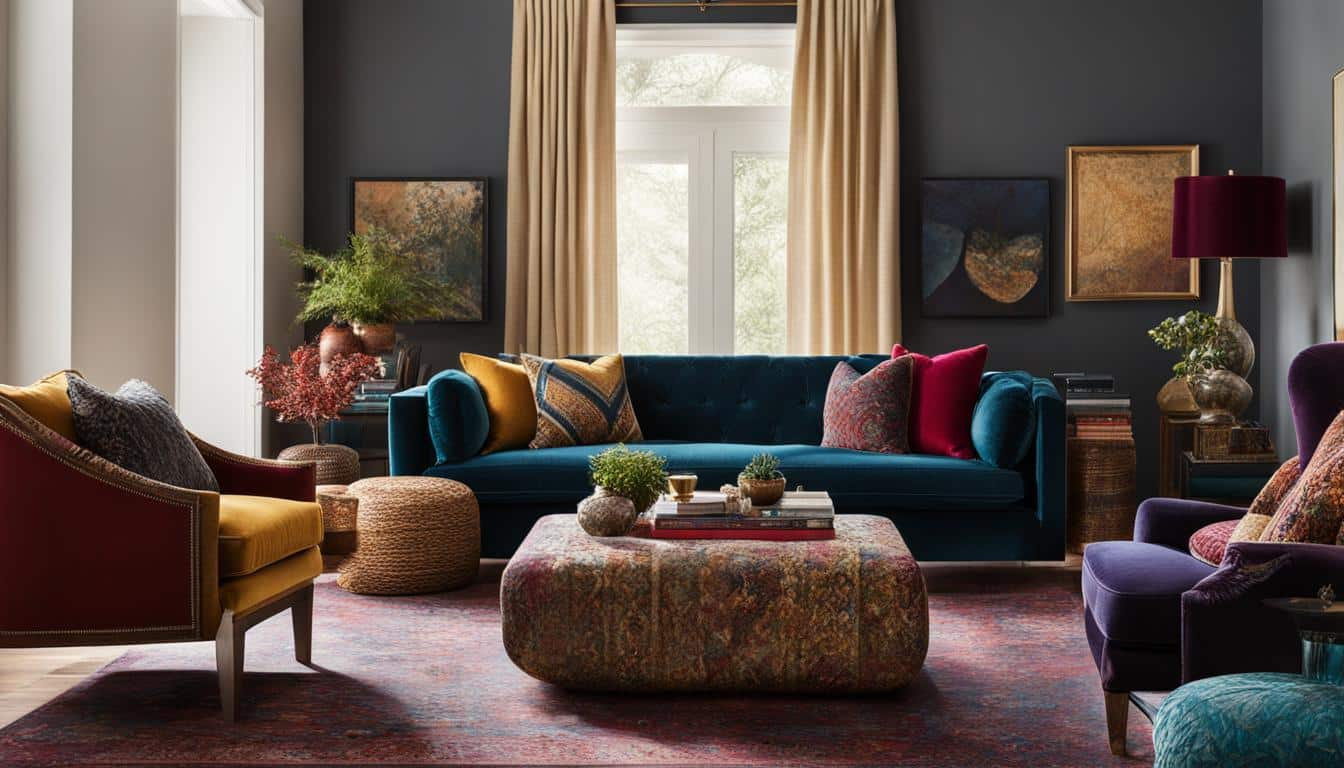
Have you ever walked down a tight corridor in your house and felt totally squished. Most people think small spaces mean tiny decorations. But what if everything we know about styling these awkward zones is completely wrong.
Hallways get ignored all the time. We slap a coat of beige paint on the walls and maybe hang a tiny framed photo and call it a day. Yet these narrow passages connect every single room in our lives. In 2026, interior design trends are finally shifting toward making every square inch count.
Throw Away the Tiny Frame Rule
Conventional design wisdom says small rooms or tight walkways need small accessories. It makes sense on paper because you do not want things crowding your path. But actually, tiny pictures get completely lost on a long, bare wall. They end up looking like lonely postage stamps floating in a sea of empty drywall.
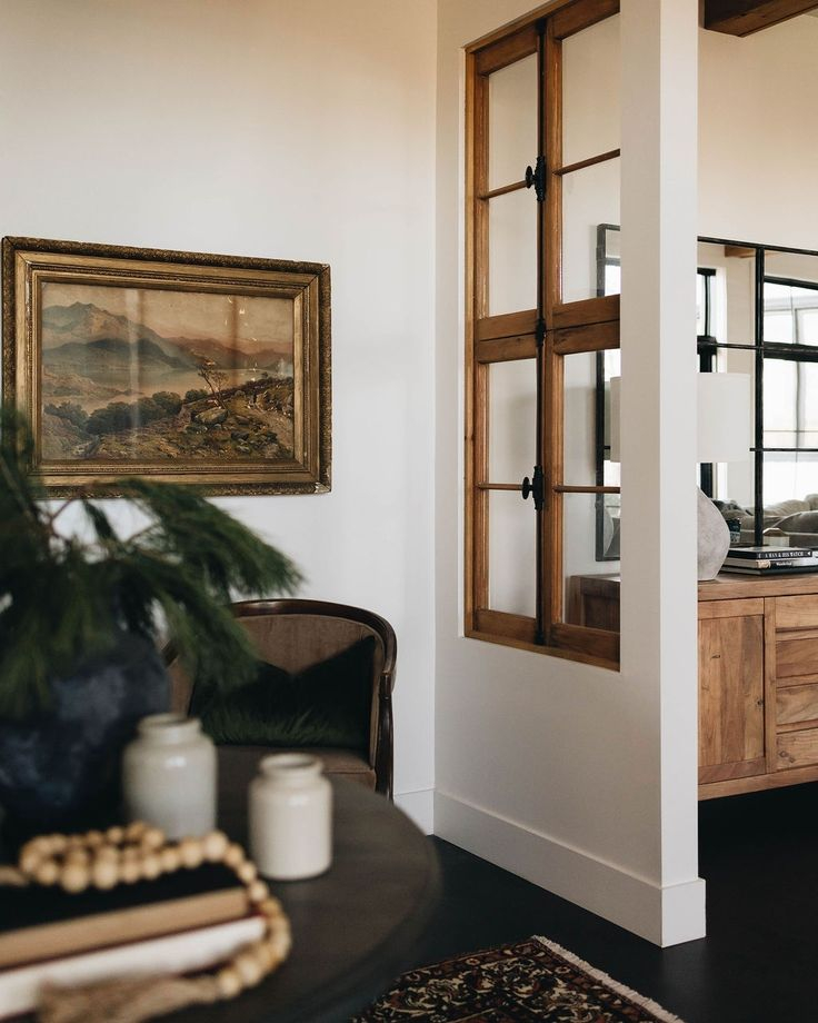
When you swap those dinky frames for one massive canvas, magic happens. The eye stops focusing on how close the walls are to each other. Instead, it gets pulled right into the story of the artwork. Scale plays tricks on our brains in the best possible way.
Creating Instant Depth Through Visual Weight
Tight spaces often feel claustrophobic because our eyes bounce rapidly between close surfaces. Large statement pieces act like an anchor. They give your gaze somewhere meaningful to rest instead of rushing down the tunnel.
Think of a bold, oversized abstract painting or a dramatic photography print hanging right at the end of the hall. It tricks the brain into perceiving more depth. The corridor suddenly feels less like a tunnel and more like an intentional art gallery walk.
Choosing the Right Pieces Without Hitting Them
You might worry that a huge sculpture or thick framed canvas will get knocked over by shoulders or backpacks. That is a totally fair concern. Safety and comfort still matter when you are rushing to the kitchen for coffee.
Flat canvases or slim shadow boxes work best for this exact reason. You want maximum visual impact with minimum physical footprint. Hanging the piece slightly higher than usual can also protect it from everyday bumps while keeping it right in your line of sight.
Lighting Tricks That Make the Art Pop
A narrow passage usually lacks natural sunlight. Without good illumination, even the most expensive painting will look muddy and sad. Fixing your lighting setup is half the battle.
Picture lights or directional ceiling spots can cast a gorgeous glow right onto your statement piece. This not only highlights the texture and colors of the art but also bounces ambient light around the whole corridor. Your dim hallway instantly transforms into a bright, welcoming space.
Playing With Color to Expand the Walls
Dark colors and heavy frames can sometimes shrink a room further. But a bright, vibrant statement piece acts like a window into another world. It introduces energy and personality where there was once only boring paint.
Try picking art that features light backgrounds with pops of bold color. This creates an airy illusion. The walls will feel like they are pushing outward, giving you much needed breathing room in your daily routine.
Your entryway and connecting corridors set the mood for your entire home. Leaving them empty misses a huge chance to show off who you are. A single striking piece of art speaks volumes before guests even step into your living room.
You do not need an endless budget to pull this off either. Thrift stores and local markets are full of oversized vintage prints waiting for a second life. Trust your gut and pick something that makes you smile every time you walk past it.
Transforming your narrow passages does not require a massive renovation or expensive contractors. Sometimes all it takes is a bold shift in perspective and one really big painting. By breaking outdated design rules, you turn a forgotten zone into your favorite part of the house.
Give it a try this weekend and see how much bigger your home feels. You might be surprised at how a simple change in scale completely shifts the energy of your living space.